Frontline Identity
Frontline Ventures were in need of a rebrand, an update, a fresh look for a continuously evolving and fast growing industry. Following our brand strategy workshop, we (together) wrote a brief for their identity that focused on Frontline’s personal approach, financial experience and technical/industry knowledge.
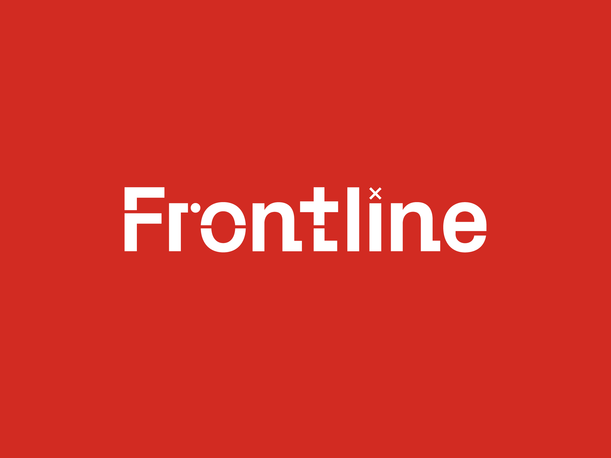
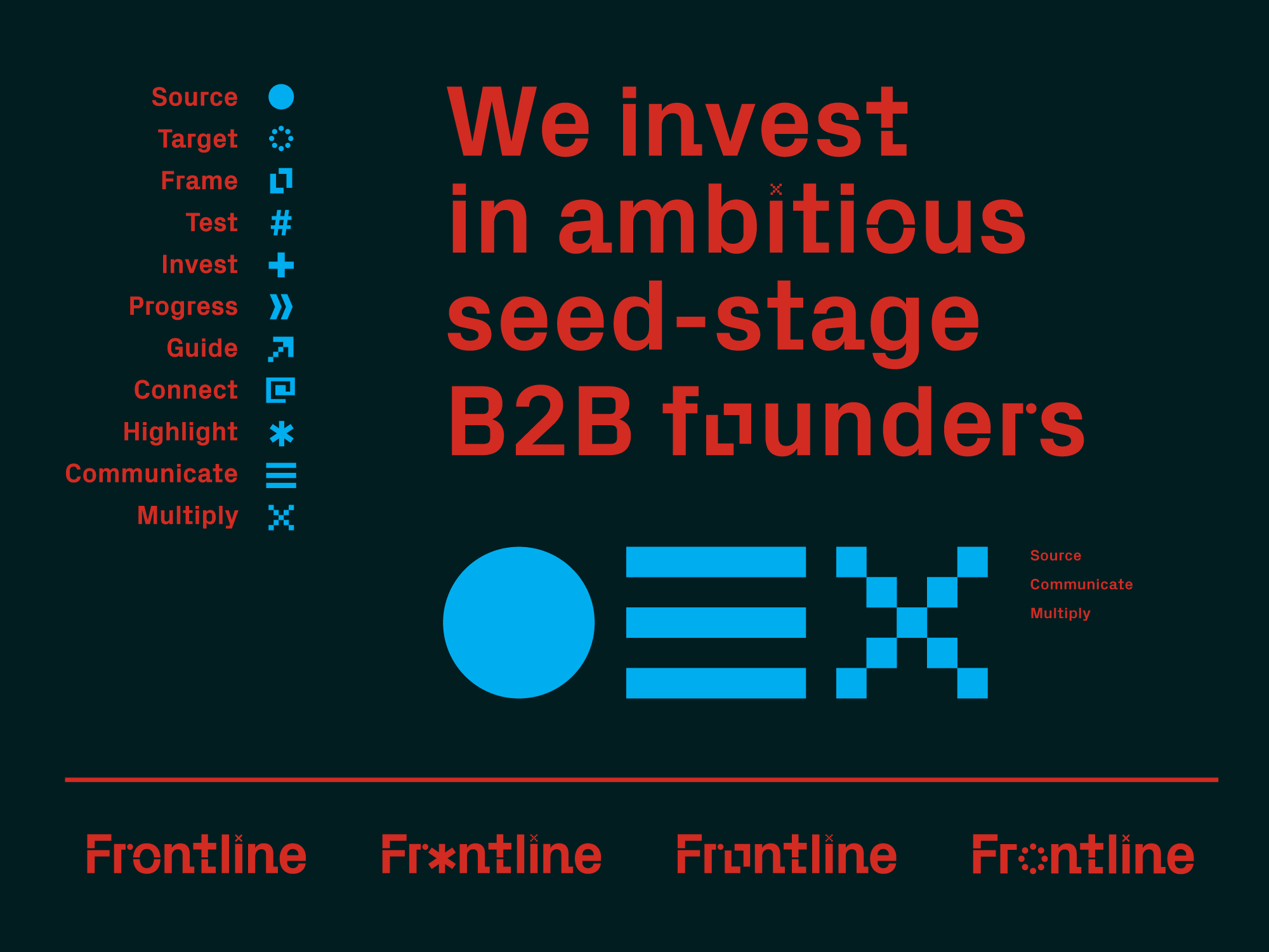
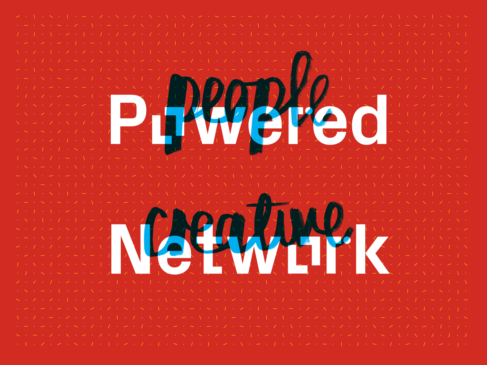
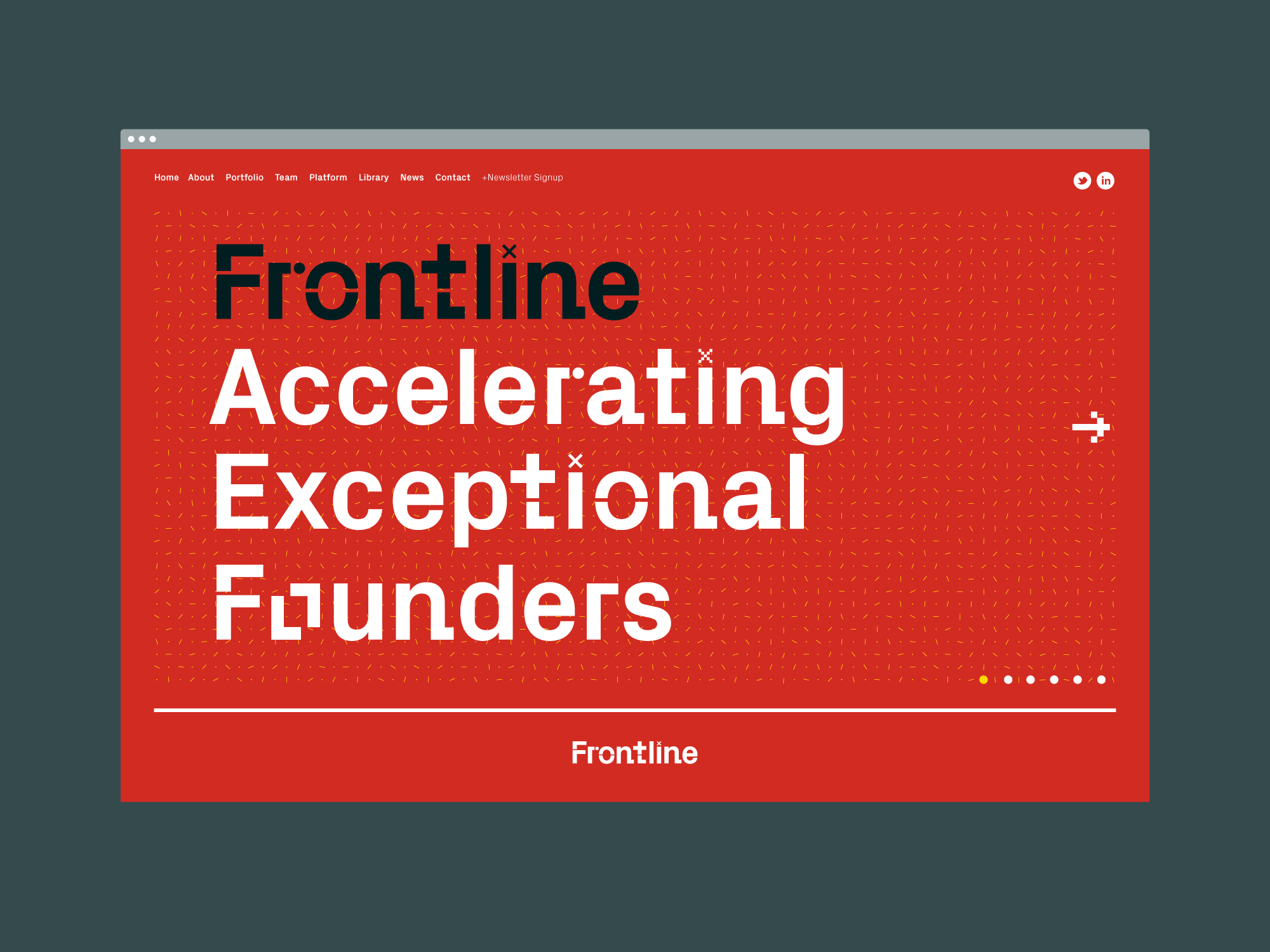
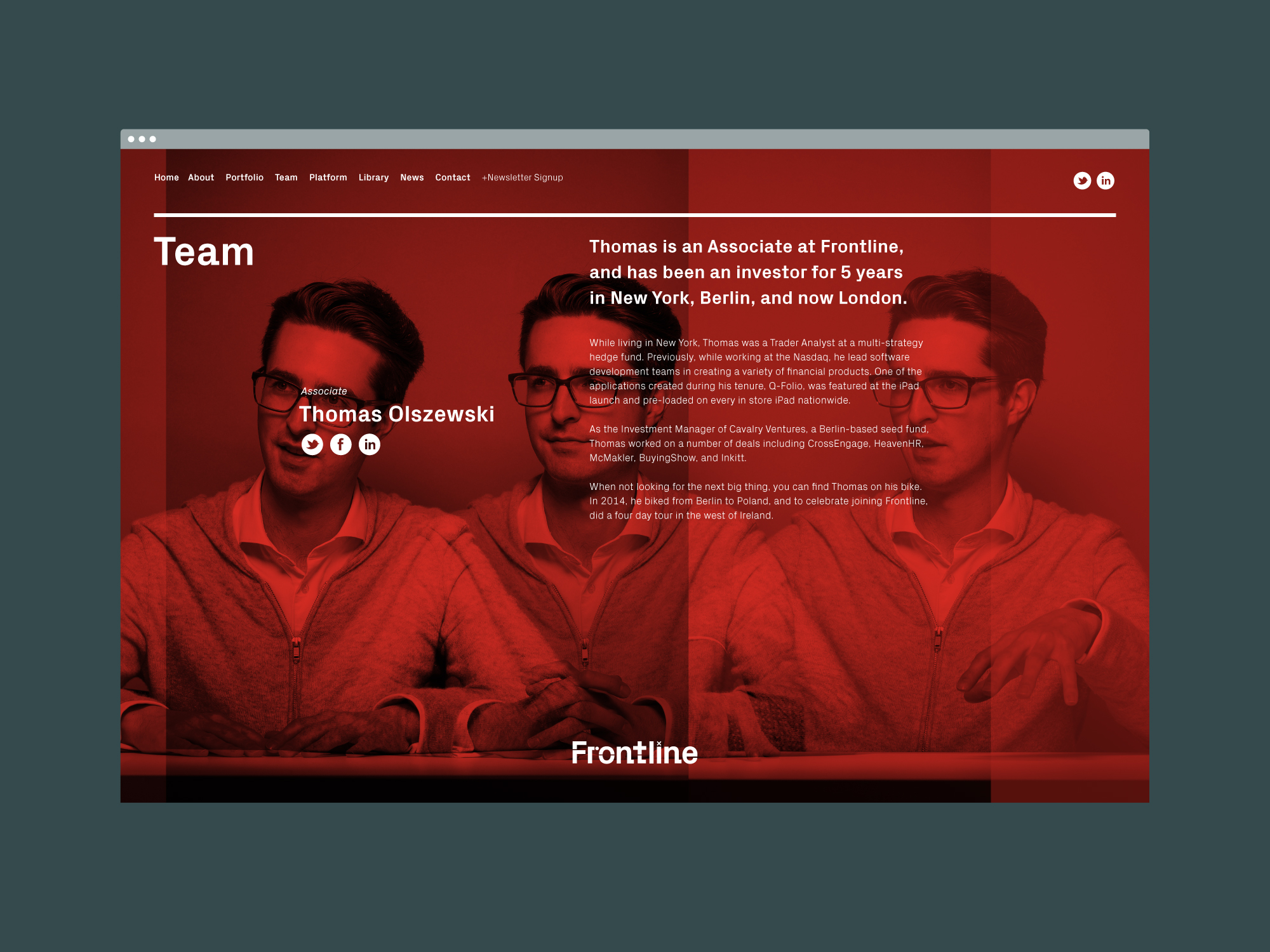
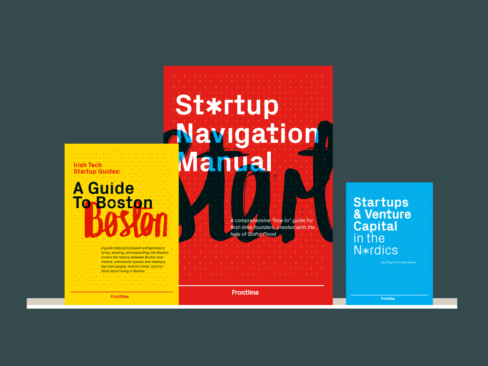
The main aspects of the identity are built around human and technical typographic play. A glyph system was formed from aspects of Frontline’s techniques with various combinations used to explain different processes. These glyphs were then used to form the Frontline logotype(s) and display typeface. A second typeface was created with brush and ink. Overlaying these two typefaces creates a new emergent quality. Along with the typographic systems, a grid system based on controlled environments was also designed to showcase the acceleration of exceptional founders. Added to this was a photoshoot were we created triptych portraits through questioning and conversation. Each person was asked to listen, consider and respond.
Together these items form an adaptable brand identity that aligns Frontline’s visual aesthetic with their dynamic team and growing portfolio of companies.