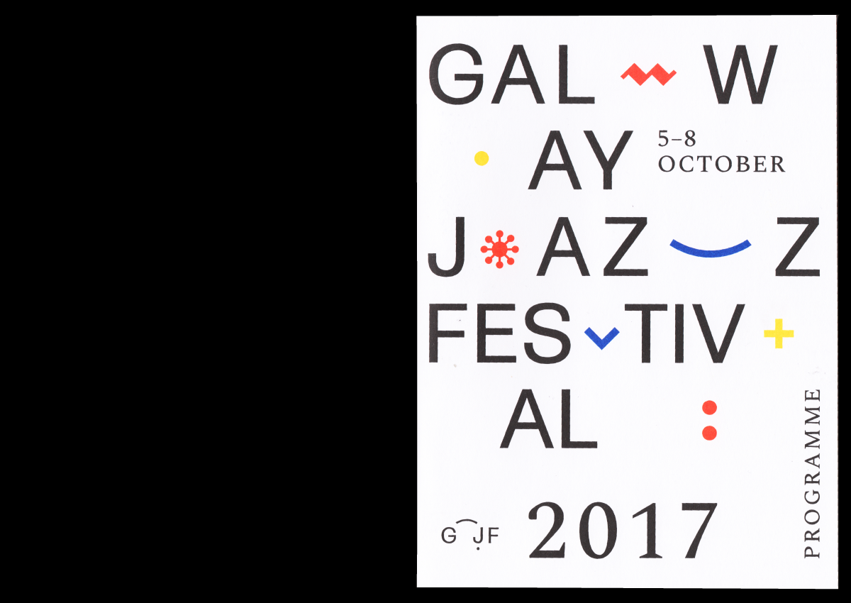
Galway Jazz Festival
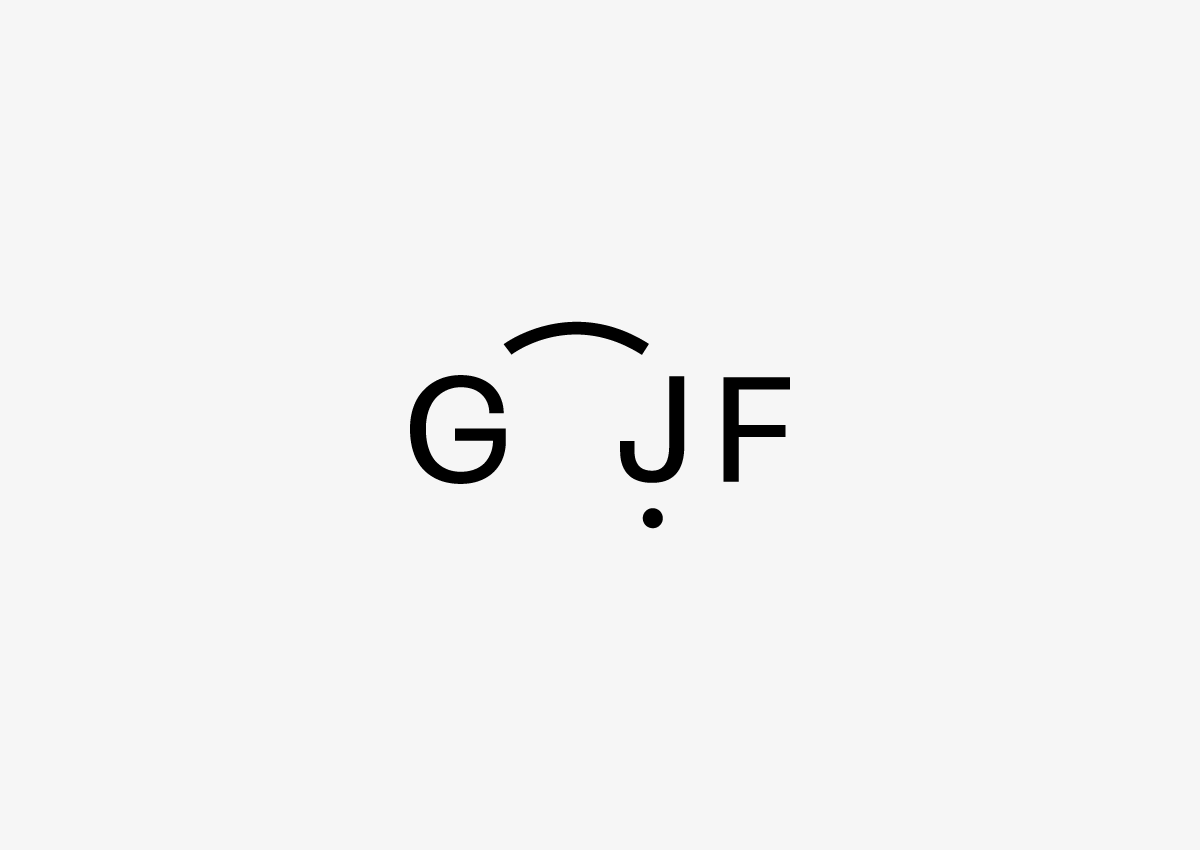
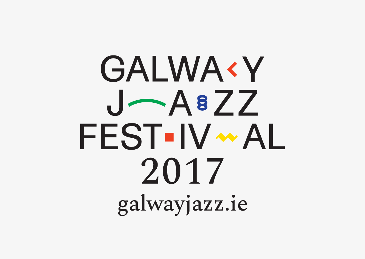
Jazz, at its core, doesn't use any flashy tricks, effects or theatrics to achieve its musical goals. Both a novice and a master instrumentalist are capable of playing all of the same notes on their given instrument—for this reason, the timing, placement and duration of notes played is of foremost importance. To illustrate this idea, an elegant but neutral sans serif was used in conjunction with various timing based symbols found in musical notation. The logo system is presented as a musical phrase, its pace set by the placement of these symbols.
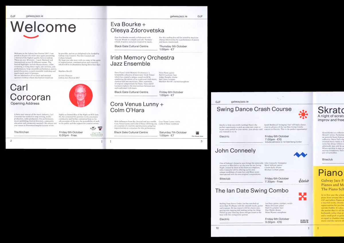
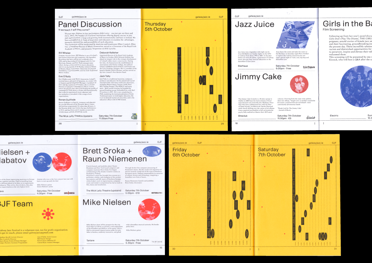
This idea is expanded on in the festival programme, in which various instances of graphic devices, colour and spontaneously placed duotone photography play the role of intervention within a rigorous typographic system.