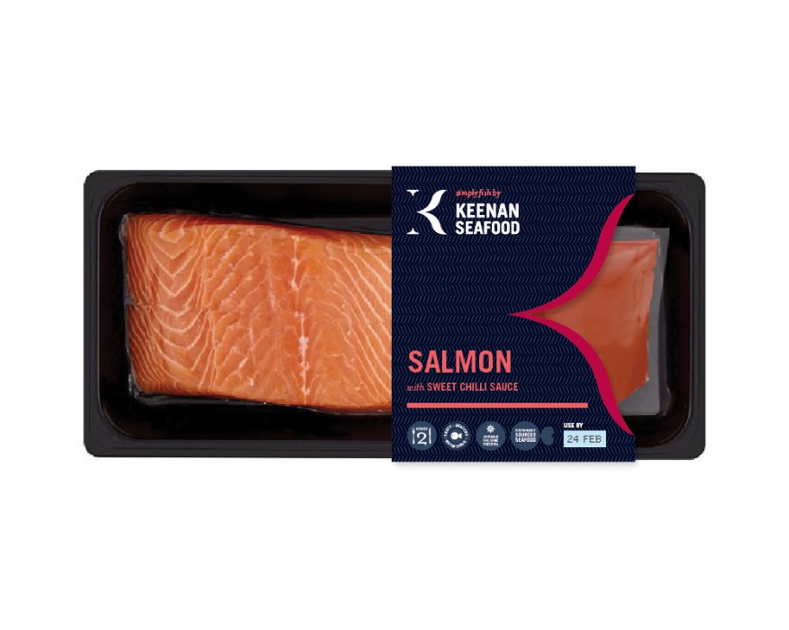
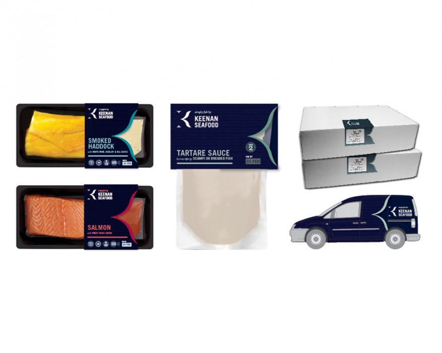
Keenan Seafood
Established in 1942, Keenan Seafood have been in the fish business for three generations supplying the quality seafood to customers in the catering and retail trades throughout Northern Ireland. With the launch of their new range of convenience fish dishes they engaged us to rebrand the company and design the packaging for their new range. The new mark we created uses a fin shape to form a large ‘K’ symbol. This ‘K’ device has become a prominent feature of the packaging and is used to divide the fish and sauce components of the meal within the pack. The symbol has also been used to bring a distinctive feel to livery, packaging and labels.