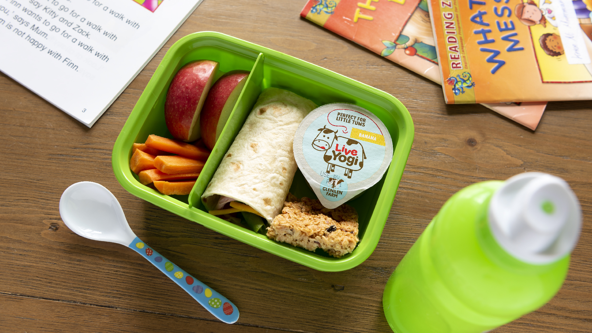
Live Yogi
2019
Designed by Martina Moloney at Bradley: The Brand Agency
Categories: Packaging
Industry: Commercial
Website: glenilenfarm.com/live-yogi/
Packaging Design
What we have achieved:
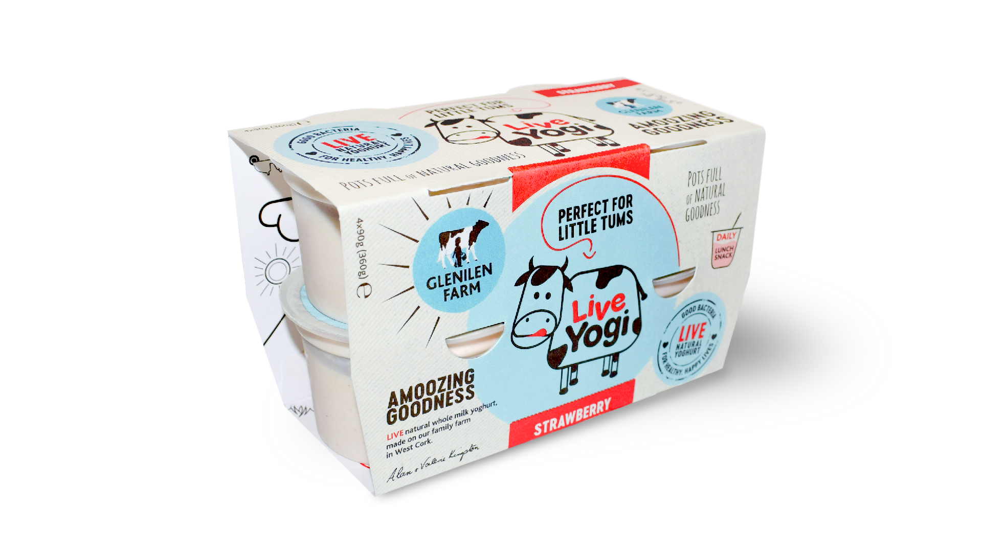
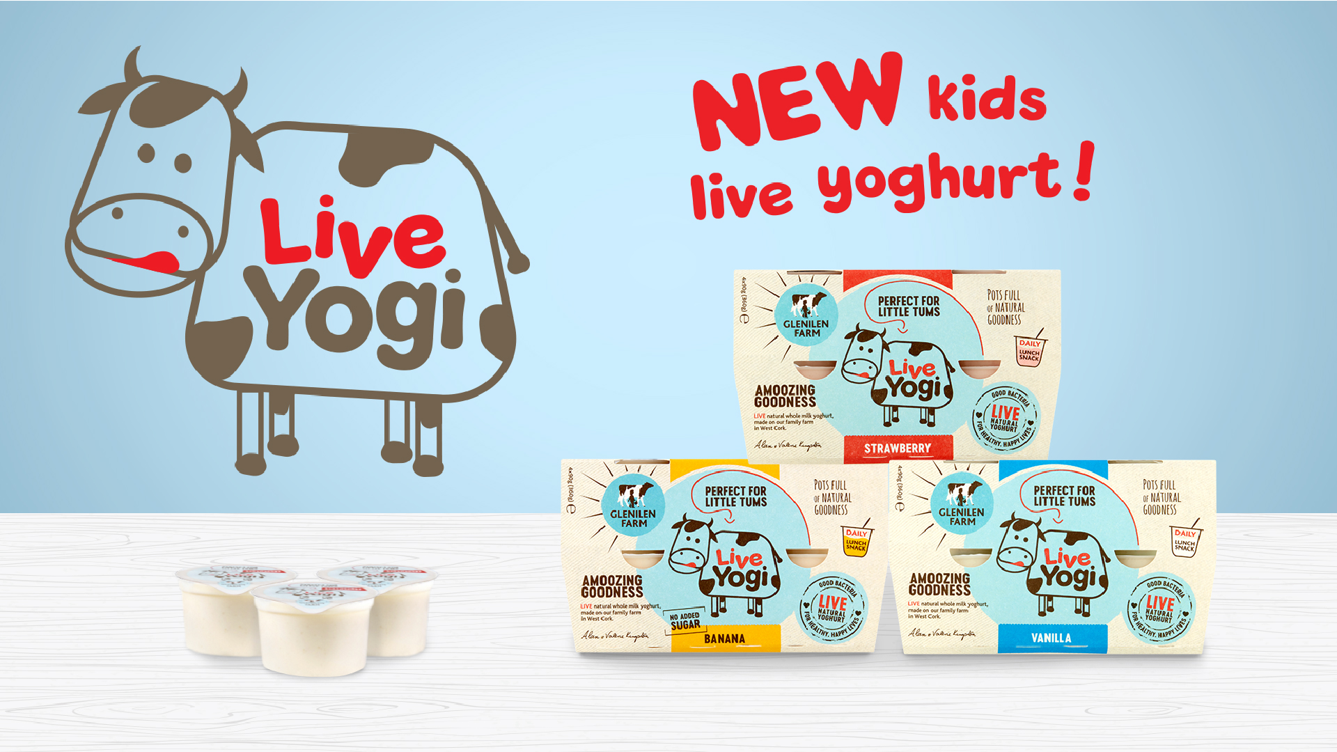
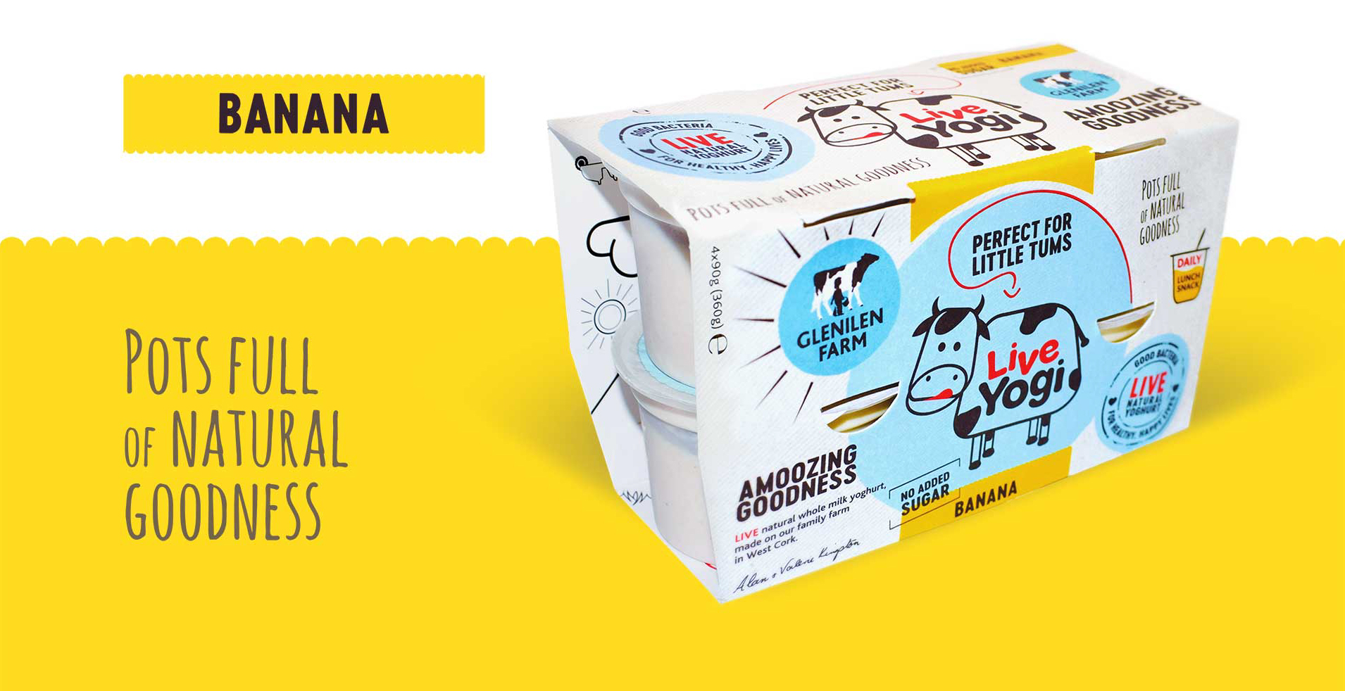
Innovating in the yogurt category requires fresh thinking and bold ideas. We developed a new name and packaging design to reignite a tired category and create an emotional connection with mums looking for a healthy alternative for their children.
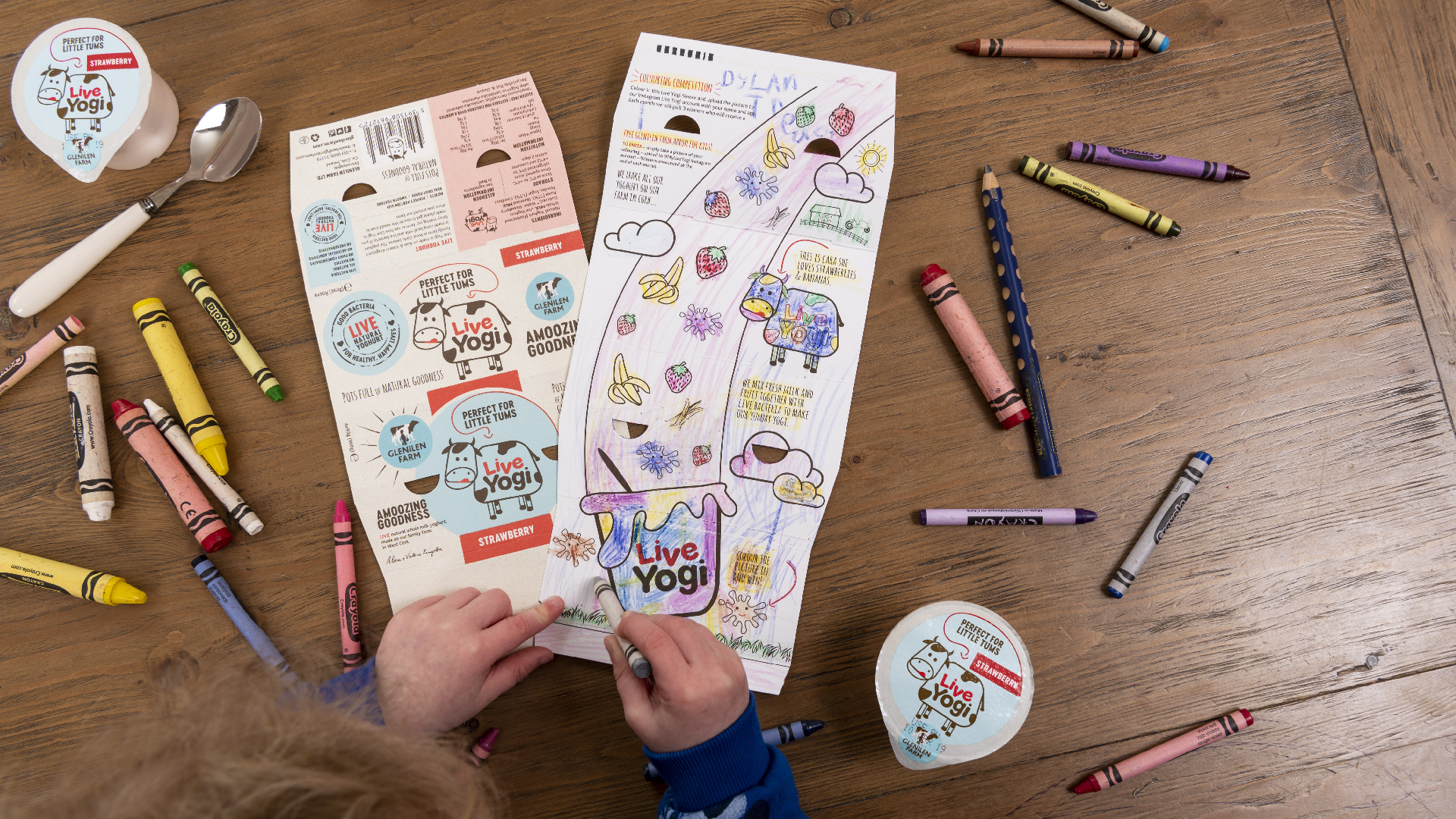
The existing Glenilen brand design is loved by their customers, it’s simple, natural and wholesome. The challenge was to keep this in mind and do something similar in the children’s sector that still appealed to children, kept it fun but moved in on from the usual sugar filled kids yogurt packaging. We developed the cow character Cara, thought about how the design would keep the wholesome textured look and natural palette but also have a fun elements kids could interact with on the inside when at home. The language and copy played a key part here too. Colours are soft but the design is energetic so attracts attention. Kids can colour in the illustration on the inside that tells the Cara and yogurt story.
The result is wholesome and playful and ties in with the natural goodness of the product.