O’Donnell O’Neill Rebrand
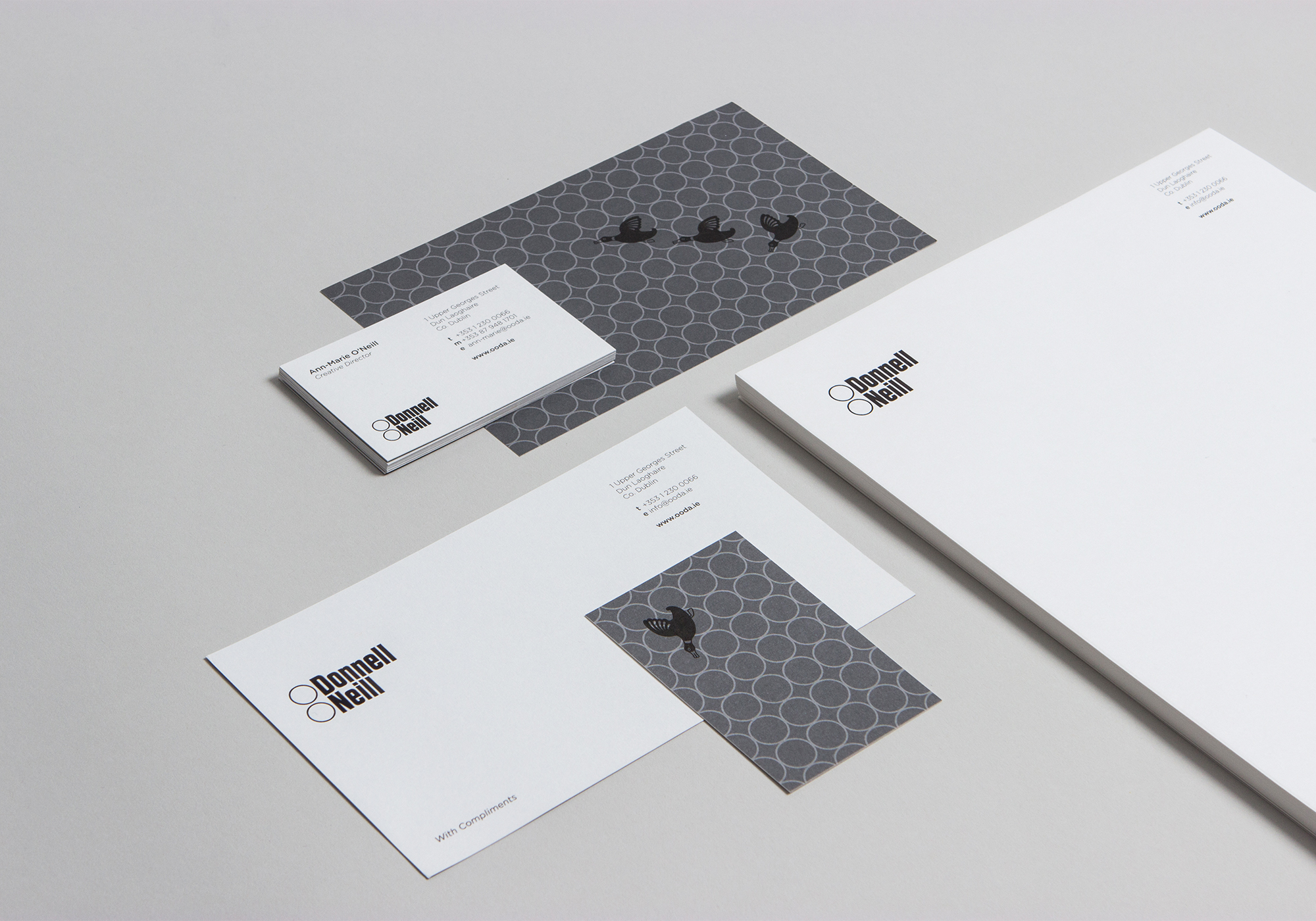
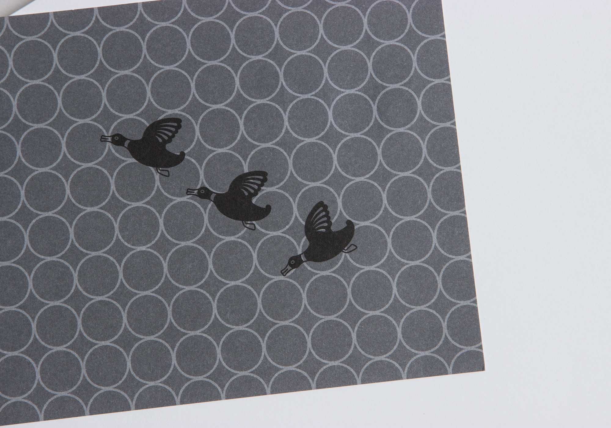
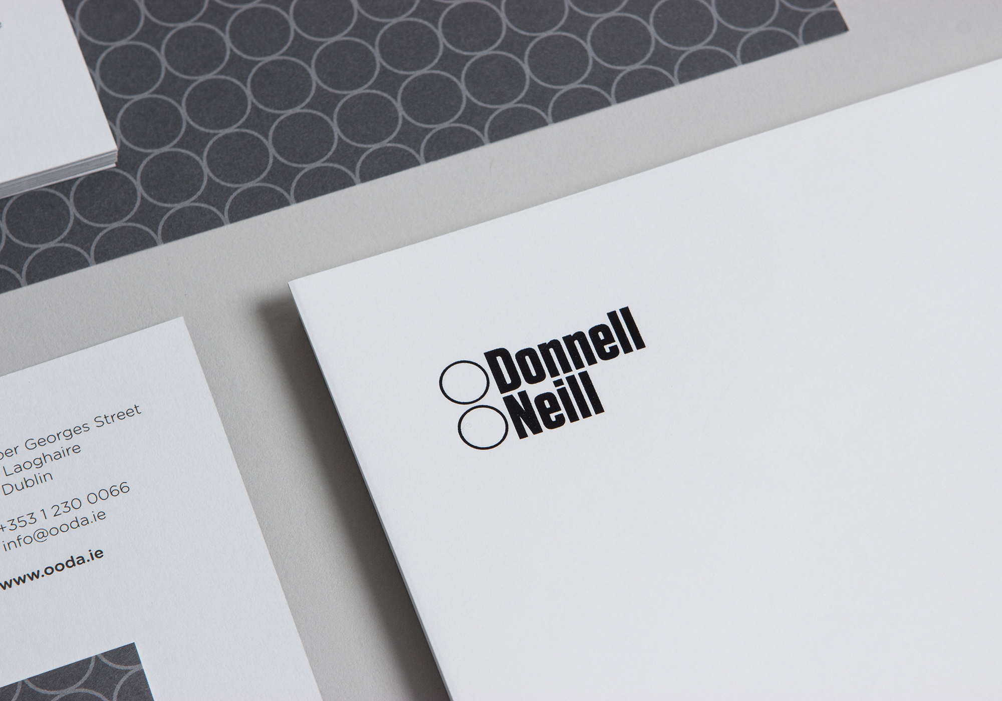
O’Donnell O’Neill’s work marries their architectural background with conceptual storytelling in their approach to the projects they work on. As a way of visually representing this union, we designed both their logotype – a carefully sculpted mark with distinctive symmetrical forms and some classic 70s kitsch icons ‘the flying ducks’ which adorned many a kitchen wall back in this era. The latter representing the more playful and highly personable aspect to their work.
The printed material served as an extension of their approach to projects, resulting in a balanced mix of the highly sophisticated and the wonderfully kitsch.