The Can Bar
2013
Designed by Garech Stone and Declan Stone at The Stone Twins
Copywriting: The Stone Twins
Interior Design: TANK
Website Development: IT-Mannetje
Categories: Identity
Industry: Commercial
Website: thecanbar.nl/
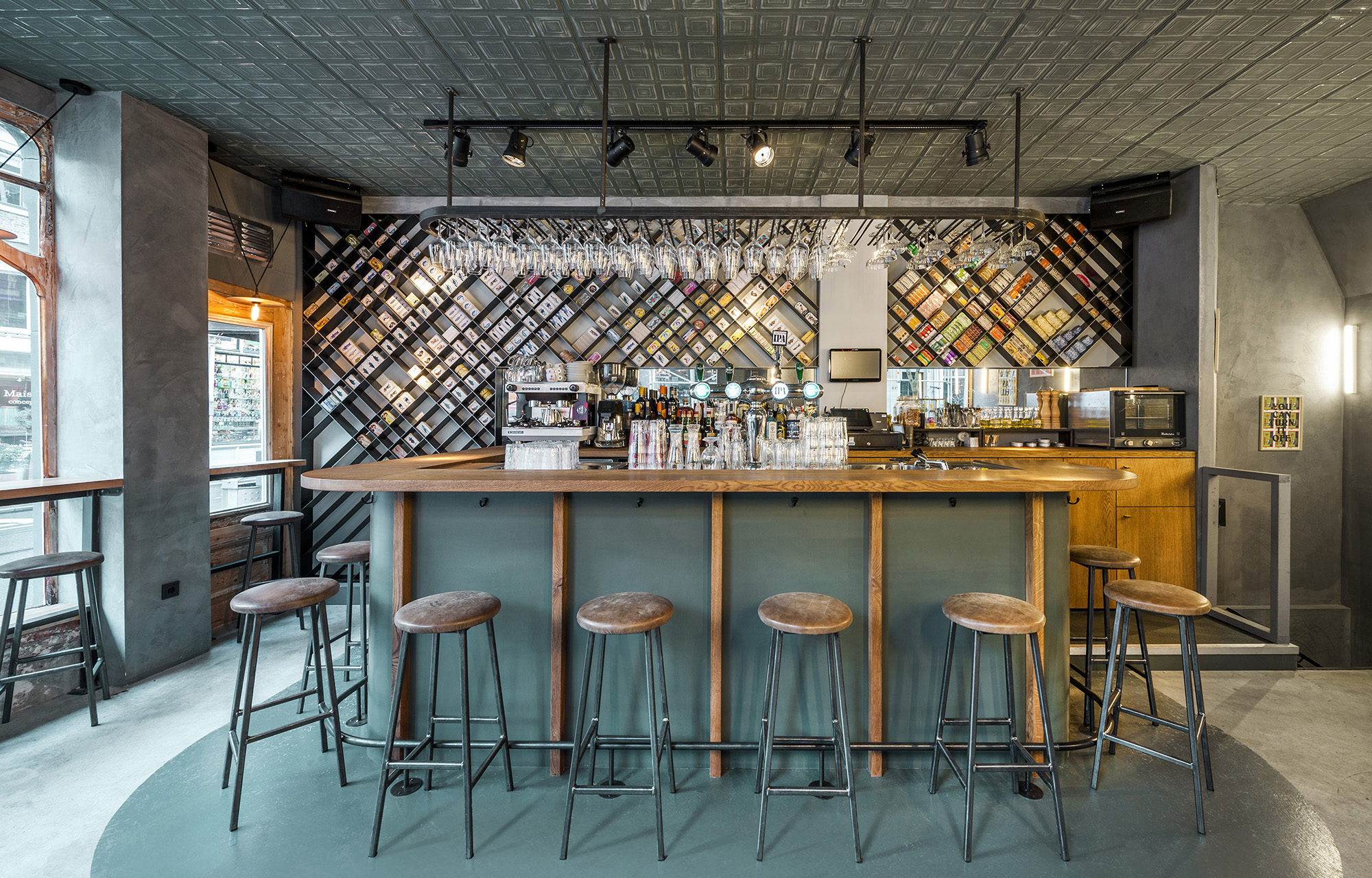
We were asked to create the brand name and identity for a new casual dining concept in Amsterdam that serves gourmet tinned fish. The concept is inspired by Portugal’s culinary heritage - and the brightly coloured tin cans of sardines, mackerel, tuna, anchovies and more, form the centrepiece of the interior design.
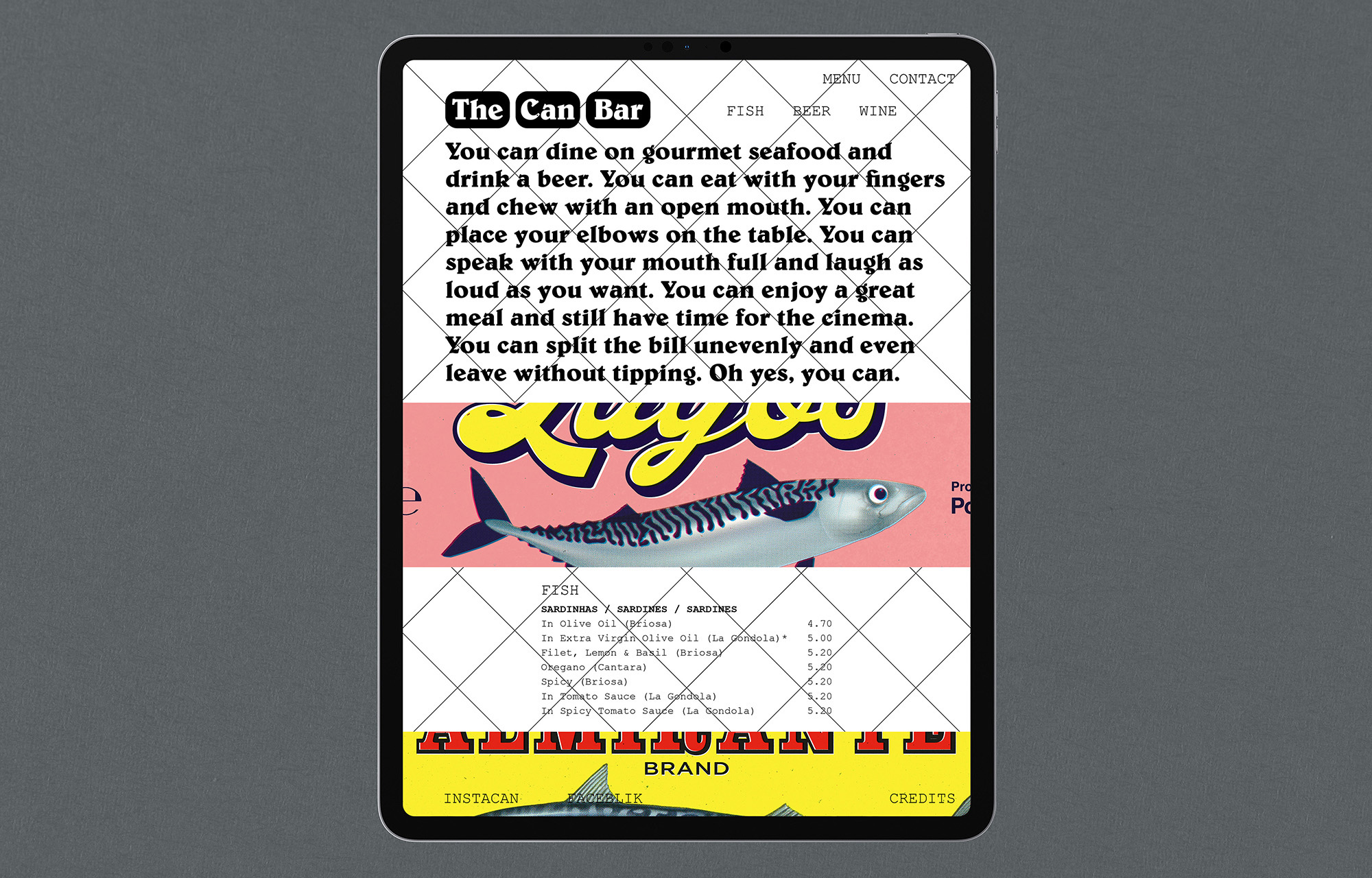
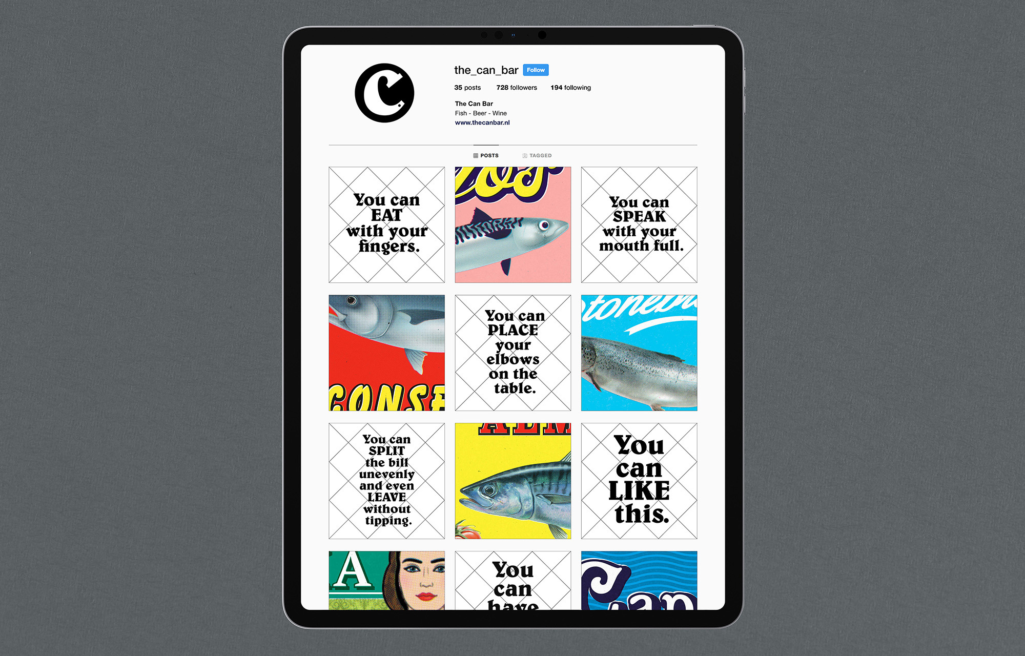
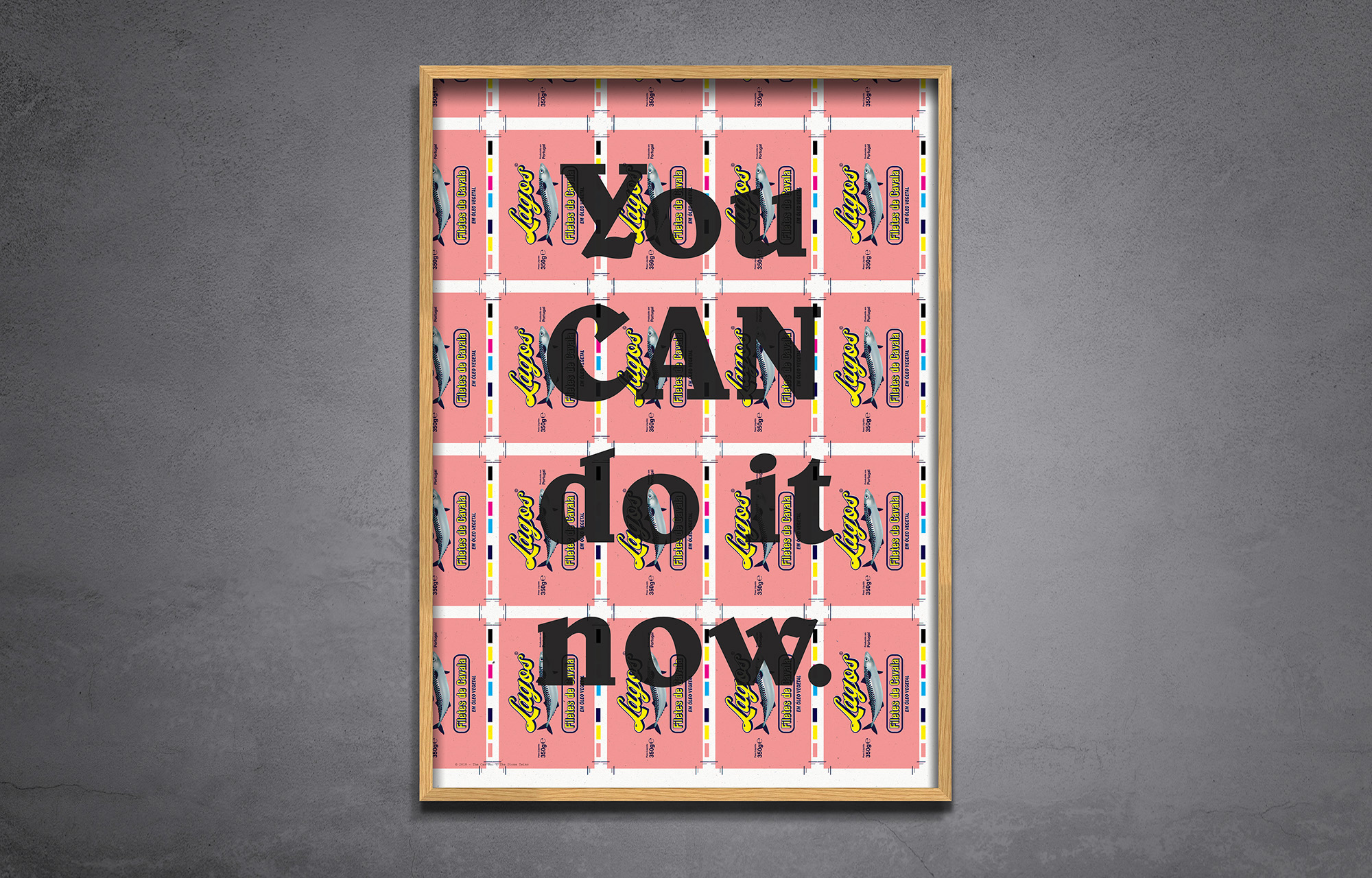
We devised the brand name ‘The Can Bar‘ - and developed a cheeky verbal identity that uses the word ‘can’ as a verb. The launch campaign is about breaking dining etiquette, in emphasising the unique dining experience of The Can Bar. For example: “You can eat with your fingers.”
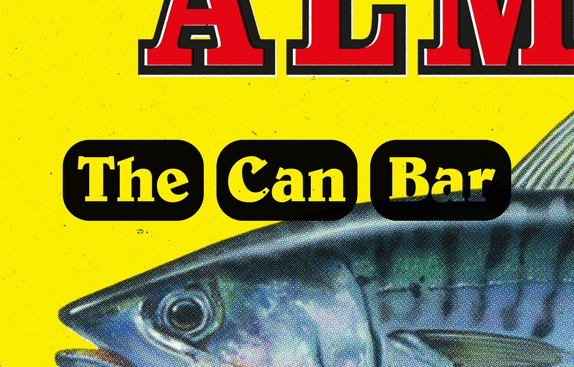
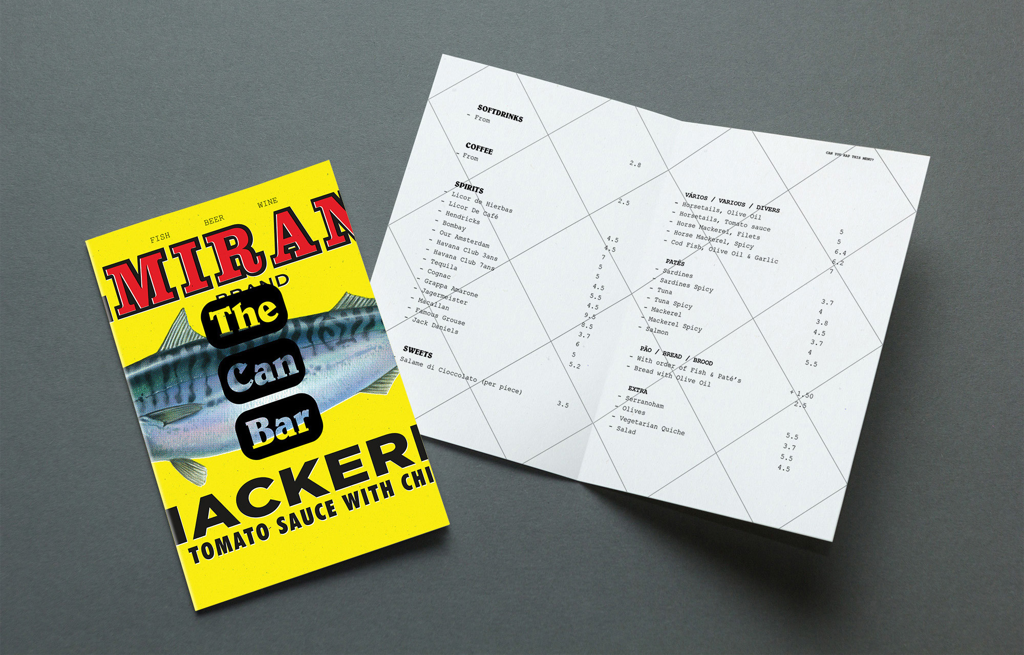
The visual identity is based on the vernacular graphic art of canned fish. Tight crops of the images are used in all applications, such as the stationery, menu cards, website, social media and a series of posters that adorn the interior. For more information, you can visit www.thecanbar.nl - or www.instagram.com/the_can_bar
