UMusic Rebrand
Designed by Catherine Robertson at Red Dog
Motion Design: Cian McKenna
Designer: David Stanley
Categories: Identity
Industry: Commercial
Tags: Digital
Universal Music Group is the biggest record label in the world and home to a diverse roster of artists across an iconic panel of labels. Umusic is the B2C side of the business - it's the fun consumer facing side of all communications which takes the tone of an avid music fan and communicates to its audience of peers both young and old. Their previous brand was outdated, lacked impact and didn't articulate the core essence of what Umusic is about.
Our objective was to develop a new visual identity that reflects what the brand stands for, resonates with the target audience and works across the various touchpoints, which are primarily digital. As the team are constantly pushing out a huge volume of really fresh, engaging content, the ultimate goal was ownership and consumer awareness.
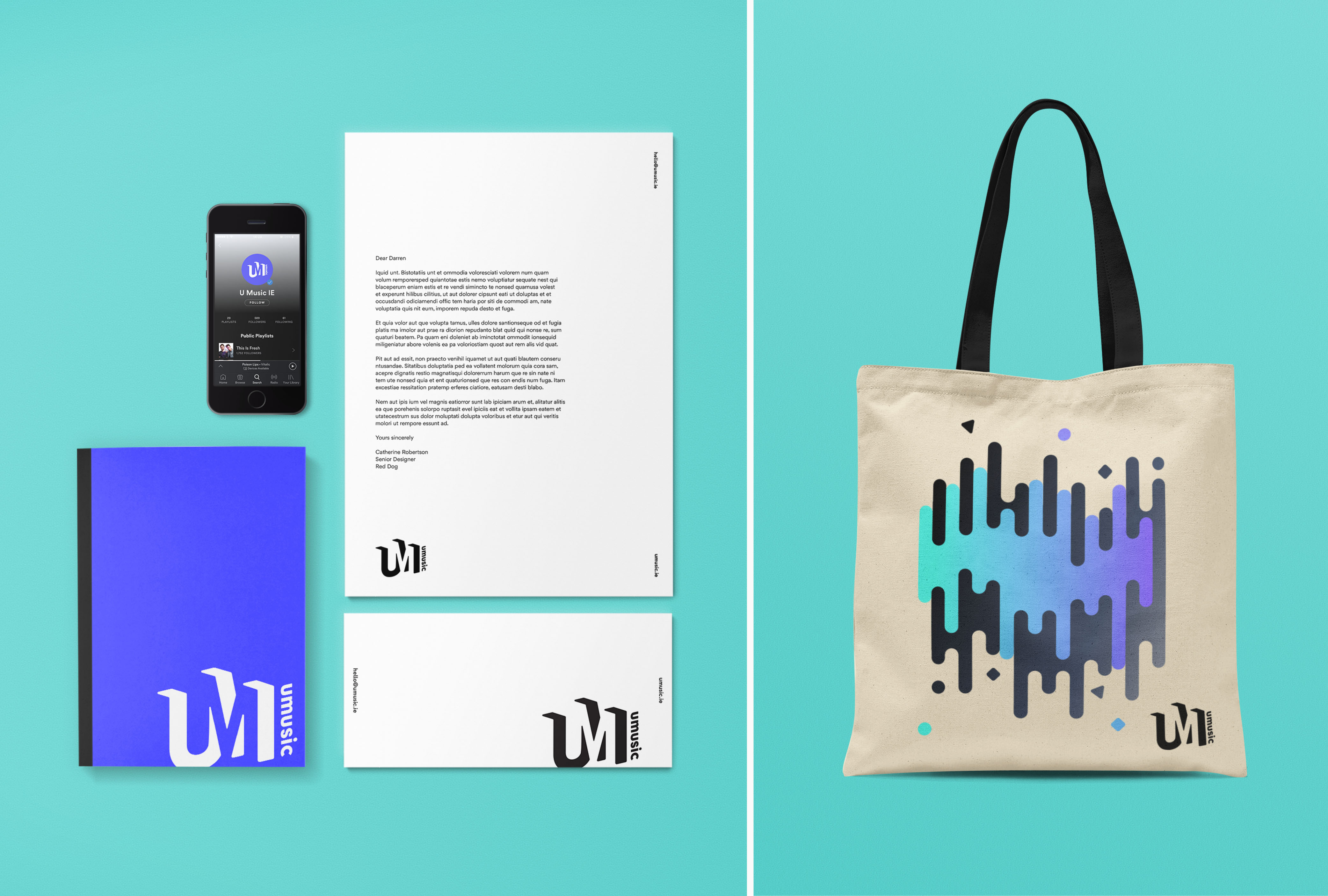
We created a monogram that is versatile and adaptable for screen, both as a static motif and in it’s animated form. This is accompanied by an energetic visual language that is Inspired by beats and movement, that can work across static on screen applications, including Spotify playlists and social media, in animated form on video end frames, and on printed applications, including promotional merchandise. The colour palette plays important role in this identity; the vibrant gradients, ranging from blues to greens, pinks and yellows, are flexible and work to complement the artist photography.