‘Simple’ is one of those overused terms in design. Often masquerading as a purely aesthetic function. As we say here at the Government Digital Service (GDS) – Making something look simple is easy; making something simple to use is much harder. This is the main design challenge faced when designing services for the public domain.
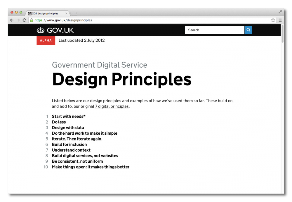
— The GDS Design Principles can be found here
Government websites are needs driven and what people want to do is get in, get what they want and then get out. User needs are interrogated at the start of the design process and form the basis from where we build. Whether it be designing GOV.UK or any of the 25 exemplar transactions we are transforming with departments – the user sits at the core of design decisions and thats the way it needs to be.
— Click here for details on these 25 exemplar transactions
There should be a reason behind everything. Don’t avoid the obvious. Design choices – no matter how ‘simple’ – have to be rationalised and tested. When designing a project like this for the general public there is no place for unnecessary design elements – they only interfere. You almost go through a process of undesigning everything you do. Taking design out of the way. Initially for me this was a difficult but necessary process to go through. In the end you get a more honest and effective design for the product.
The year before I started working at GDS I spent doing a masters where I focused on the study of pictograms. More than I knew it, the processes I went through that year have greatly helped me for my role at GDS. This process of distilling something down to its most concise form to extract clear meaning is something we do everyday.
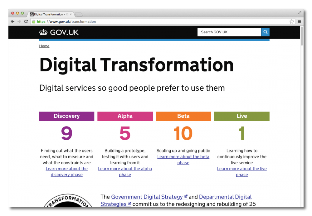
We scrutinise and user test our designs, always keeping clarity in mind. Testing designs with the general public is the best way of knowing if you are going in the right direction and finding out what you need to fix. You have to be open to constant iteration based on feedback. It’s never finished. We build and test in clear discovery/alpha/beta/release product cycles. Always iterating and testing. You can’t be precious, if something isn’t working it needs to be amended.

—This graph highlights the product cycles by which GDS works
The function of design shouldn’t be to hide bad content. The best decisions are often made before we get to designing. That’s why good writing is very important and good typography helps it shine. Being consistent with design patterns and behaviours is important. Simplifying design and language aids comprehension for everyone including disabled users.
When designing for government you don't have the classic designer/client relationship you get working in a studio doing corporate work. In a sense the 63 million residents in the UK are our clients and we owe it them to do a good job – keeping clarity of information as the main goal. Kinnear and Calvert did this when they proposed one consistent system for road signs. In many ways this is what we are doing now for government web services.