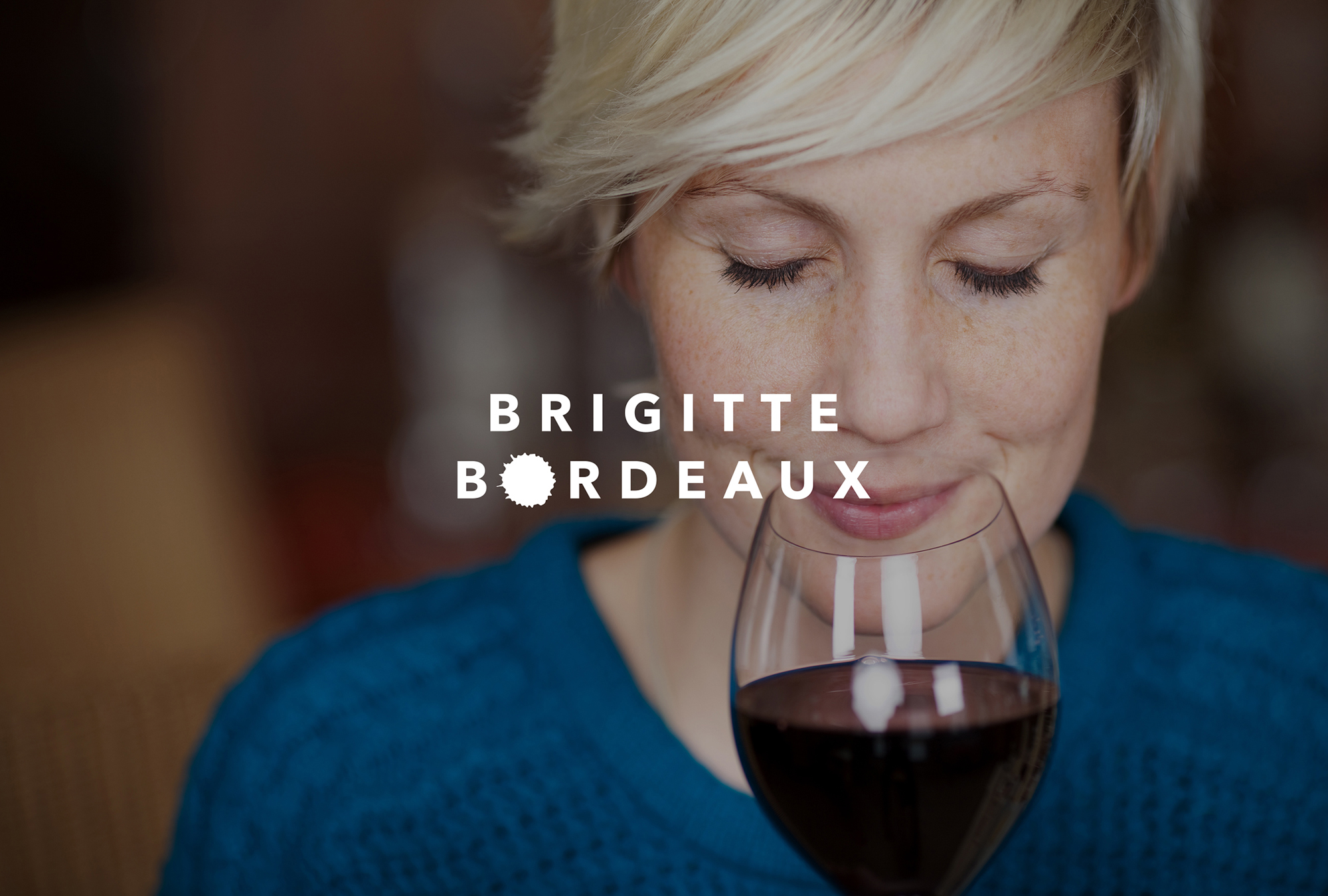
Brigitte Bordeaux Branding
2013
Designed by Karl Smyth at Short Stories
Categories: Identity
Industry: Commercial
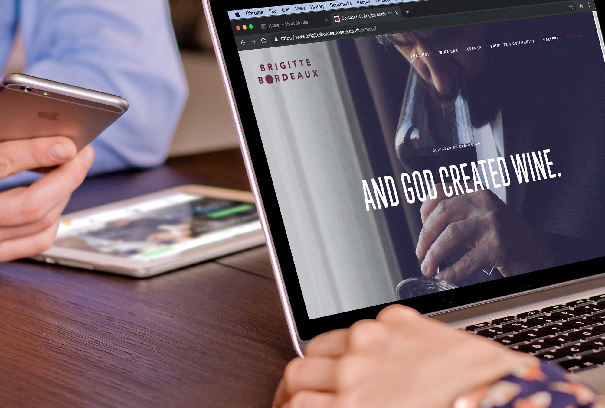
Website: brigittebordeauxwine.co.uk
Launched in time for the Christmas 2018 market, and owned and operated by a young couple with a passion for all things oenological, for owners Kat and Matt Brigitte Bordeaux is about more than just wine, and they place great emphasis on bringing their spirited and independent ethos to Sherwood as the local neighbourhood continues a recent rejuvenation.
Previously an antique and vintage chic shop, an exhaustive renovation turned the space into the wine emporium of their dreams while Kat gave up her career as a secondary school teacher to manage this new project.
With a cheeky, funny name as our starting point, the character of the identity needed to be modern, but flexible and playful with an easy going approach, as the store and wine bar caters to every palate and every pocket among a diverse community.
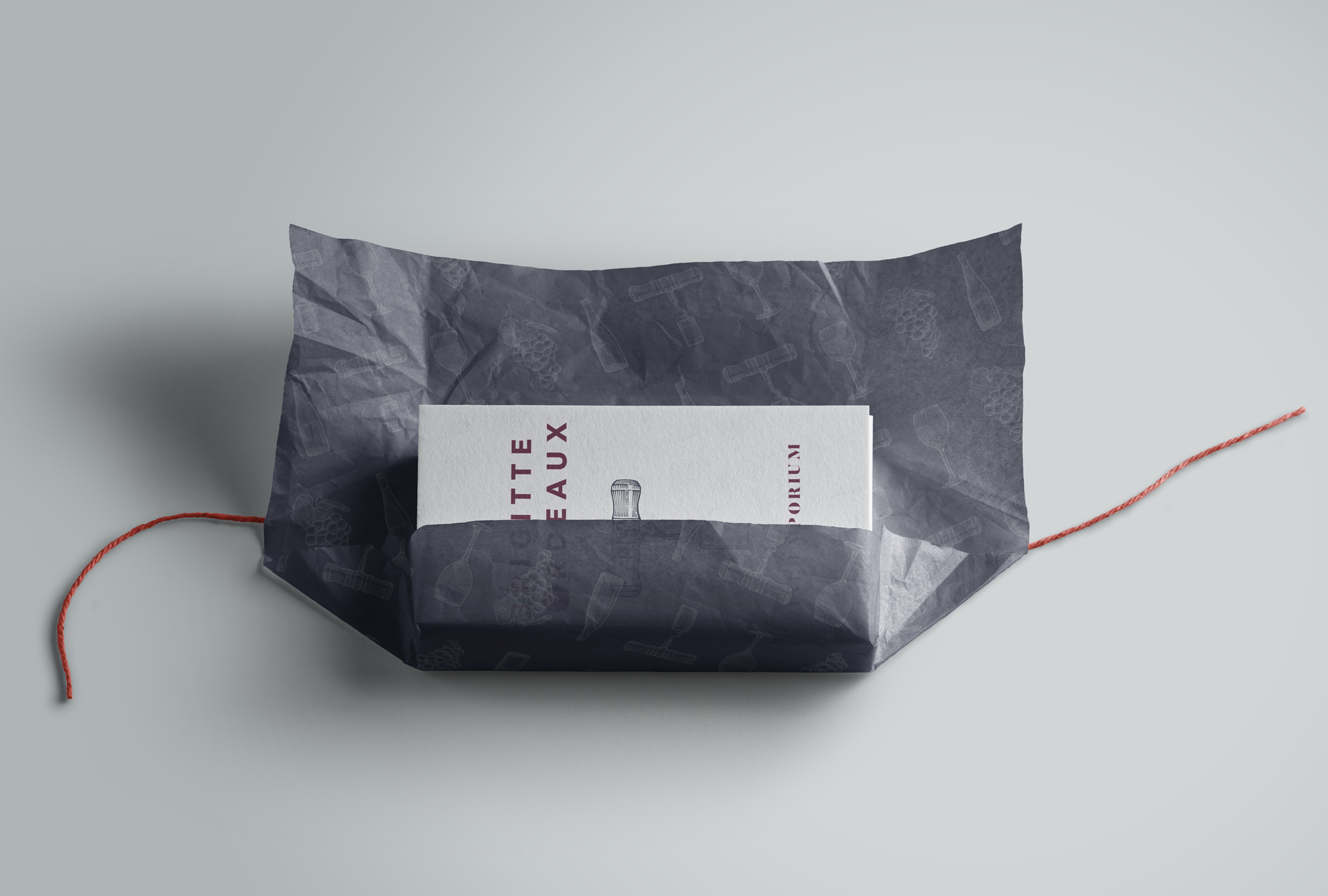
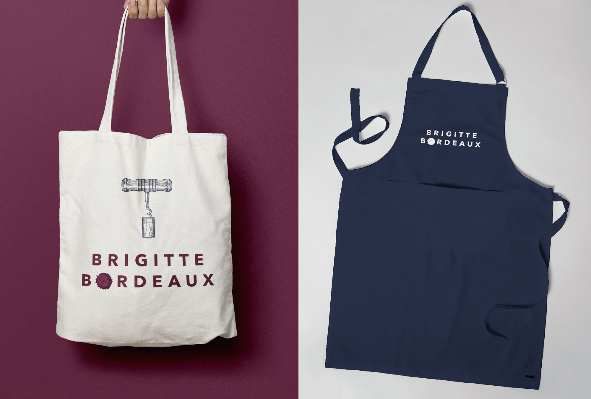
A palette of muted burgundy, off-white and indigo compliments the main logotype with its wine splash feature, alongside a series of etched-style illustrations of the grape, bottle, corkscrew and glass, each deployed where appropriate on print, packaging (including house wines), digital, and interior design and in-store assets, with copy that plays with the original Brigitte's film titles.