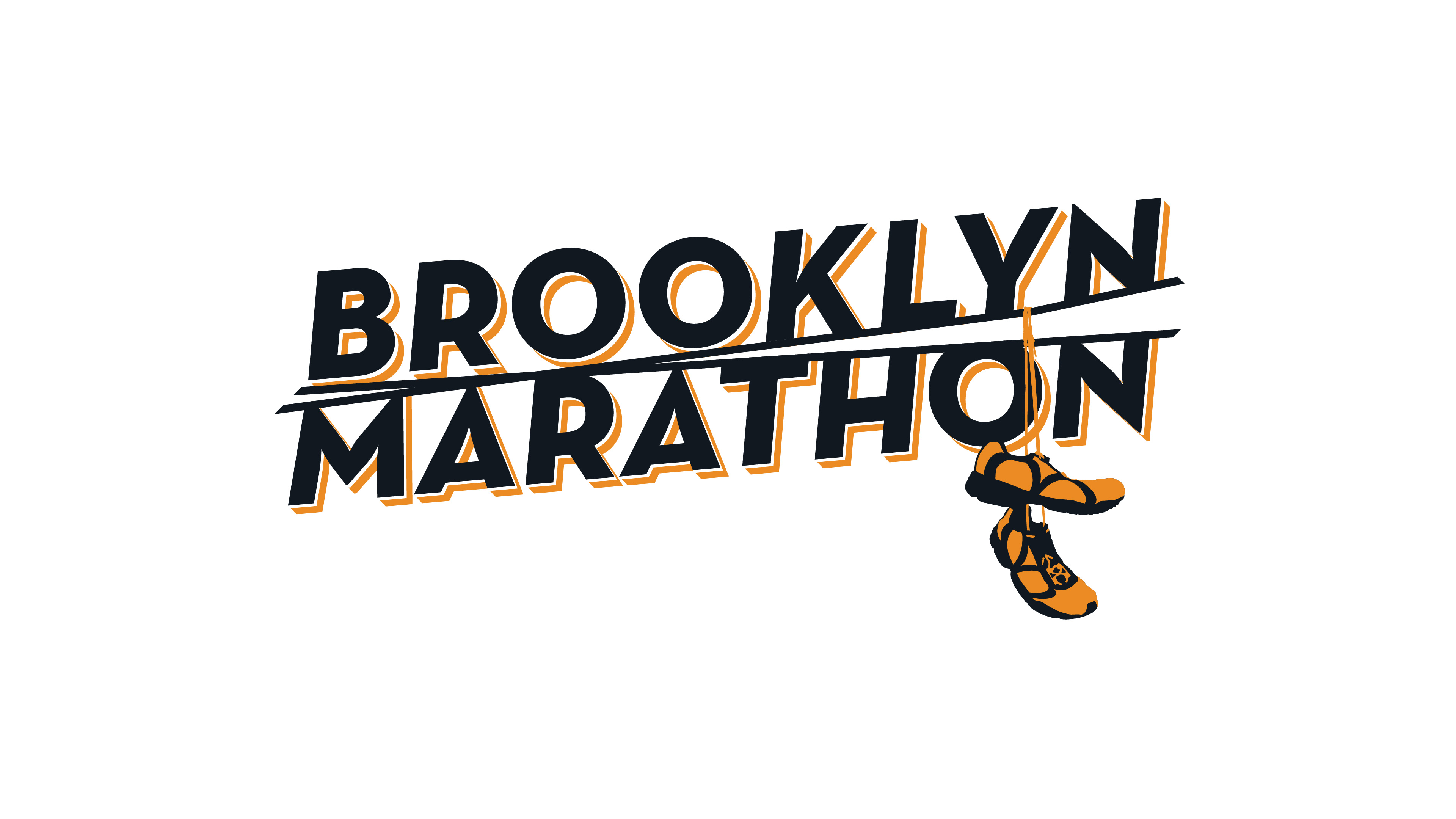
Brooklyn Marathon identity
The Brooklyn Marathon was established to provide an alternative to the renowned NYC marathon, and had to reflect the distinctive culture and vibe of Brooklyn. This identity concept is based on the traditional hand-painted signage seen on the many old industrial buildings, but rendered with a contemporary typeface and styling. The shoes are a nod to the various urban legends surrounding this ubiquitous neighbourhood sight, though here the phone lines double up as the race finish line. The running shoes contain a subtle ‘BM’ as a nod to the marathon, with the bold orange and black palette reinforcing the Brooklyn roots.
