Cancer Trials Ireland Brand Identity
2014
Cancer Trials Ireland, formerly ICORG (Irish Co-operative Oncology Research Group), need a new name, brand and visual identity for the organisation.
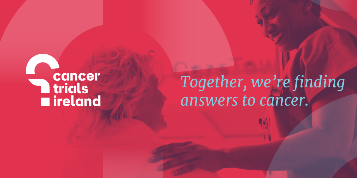
The main challenge was to make the amazing work the organisation does more visible to the public, making it more patient-focused and human while still being reflective of the scientific and research-led legacy of its members. Naming was a key factor, we wanted to make it simple, clear and direct, telling patients, doctors and partners exactly what the organisation does.
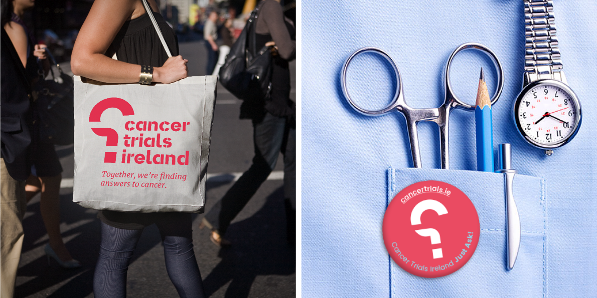
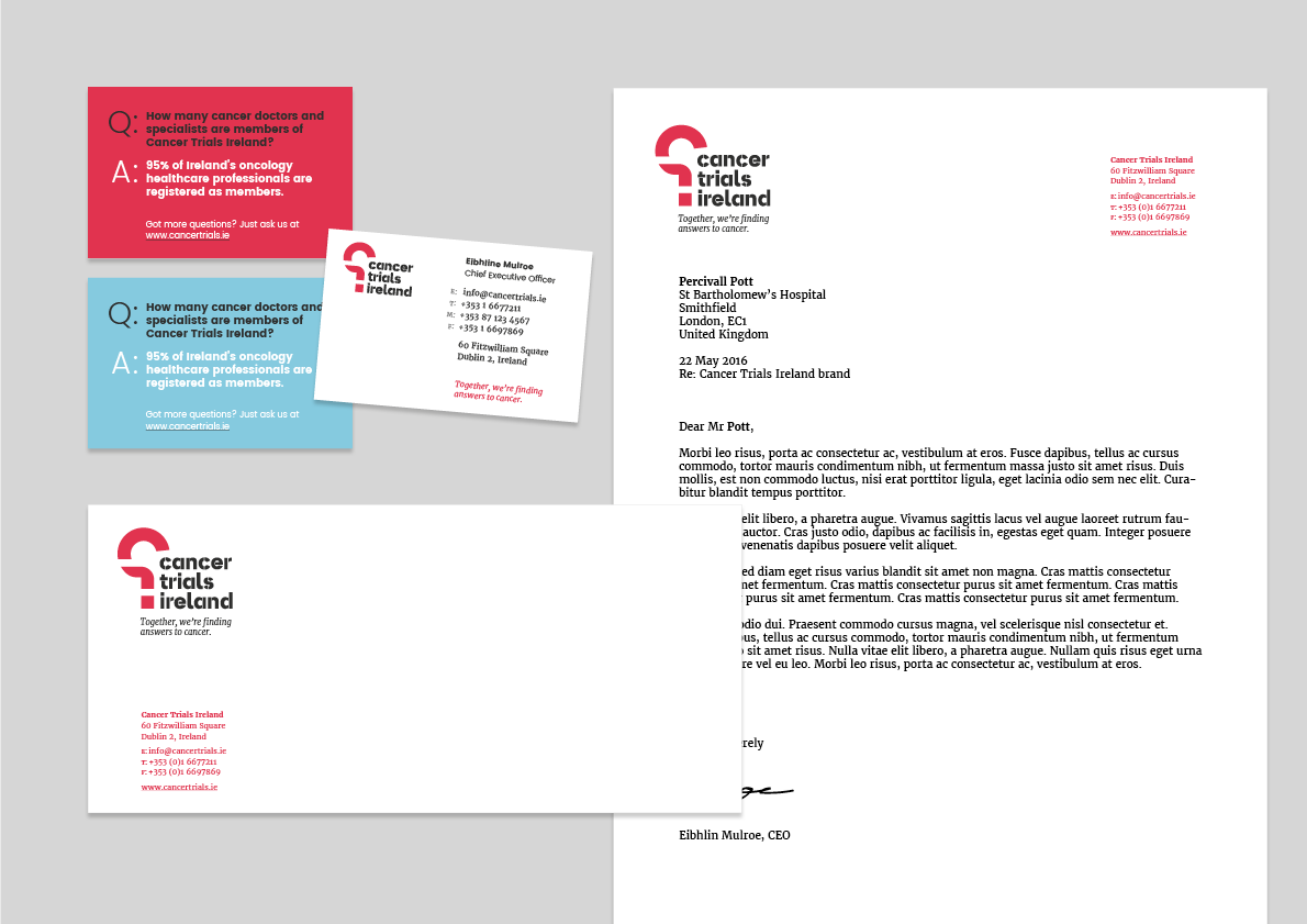
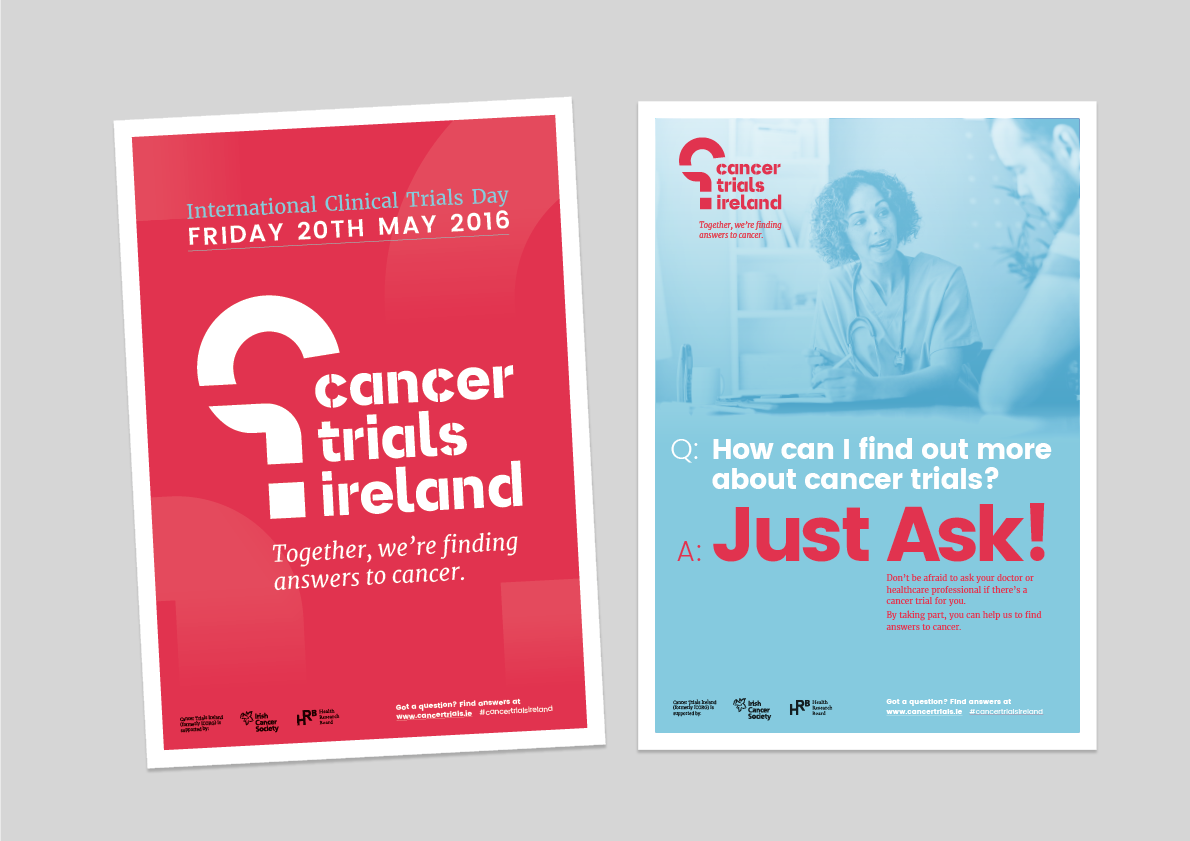
The central idea behind the brand and identity comes from the main day-to-day work of Cancer Trials Ireland – ask questions and find answers to cancer. This is used from simple Q&A devices on individual business cards, to building the launch campaign around the idea of "Just Ask!" to find out more about cancer trials.
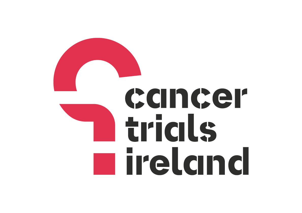
The symbol is a stylised reversed question mark. This represents that they are flipping the question on cancer, from being reactive to proactive. The simple geometric shapes are formed from the initials of the new name – the curve of the C, the crossbar of the T and the dot from the i.
Colour was important as it needed to be bold but welcoming, and at the same time steer away from other well-known brands in the cancer field in Ireland. Simple and usable typefaces were chosen to work easily across print, web and in the office environment.
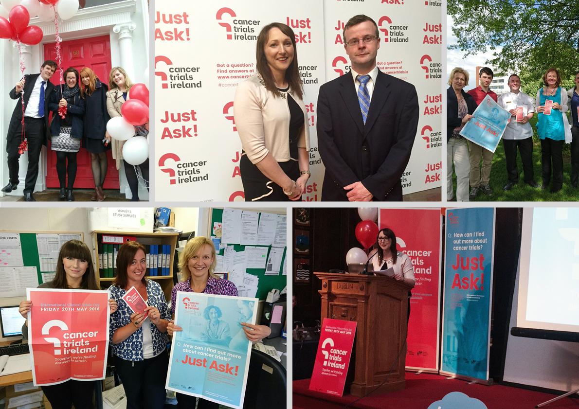
The brand was revealed to coincide with a commissioned report on impact of cancer trials in Ireland, and International Clinical Trials day.