Carrowmore Property - logo design
2014
Designed by Shane O'Riordan (Freelance)
Categories: Identity
Industry: Corporate
Website: carrowmoreproperty.com/
Carrowmore Property is a development management company which aims to bring a fresh approach to the sector with a new level of service, partnership, quality and professionalism.
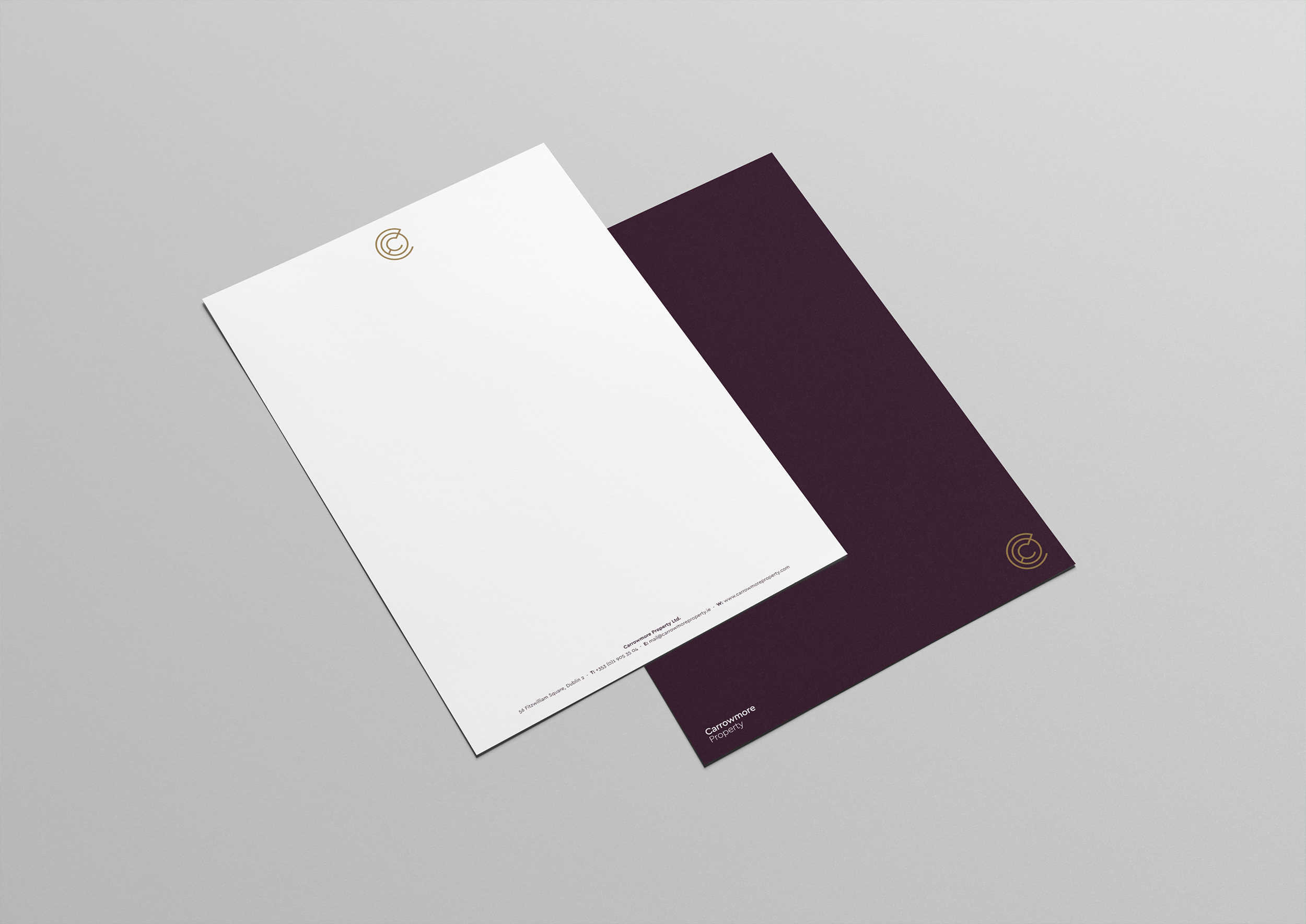
The design challenge was to create a logo that felt new and innovative but would also be perceived as a rival and contemporary to the more established firms in the marketplace.
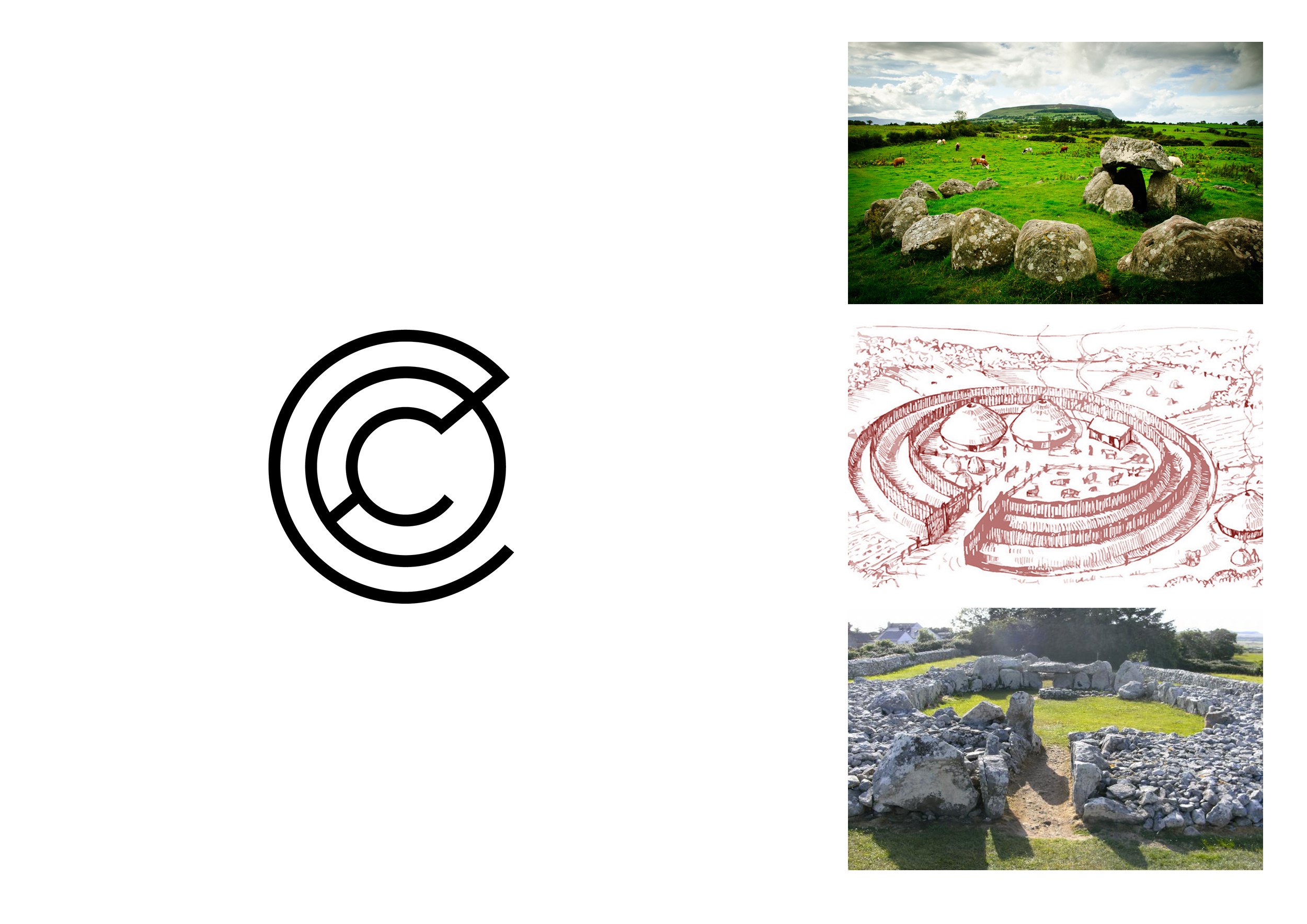
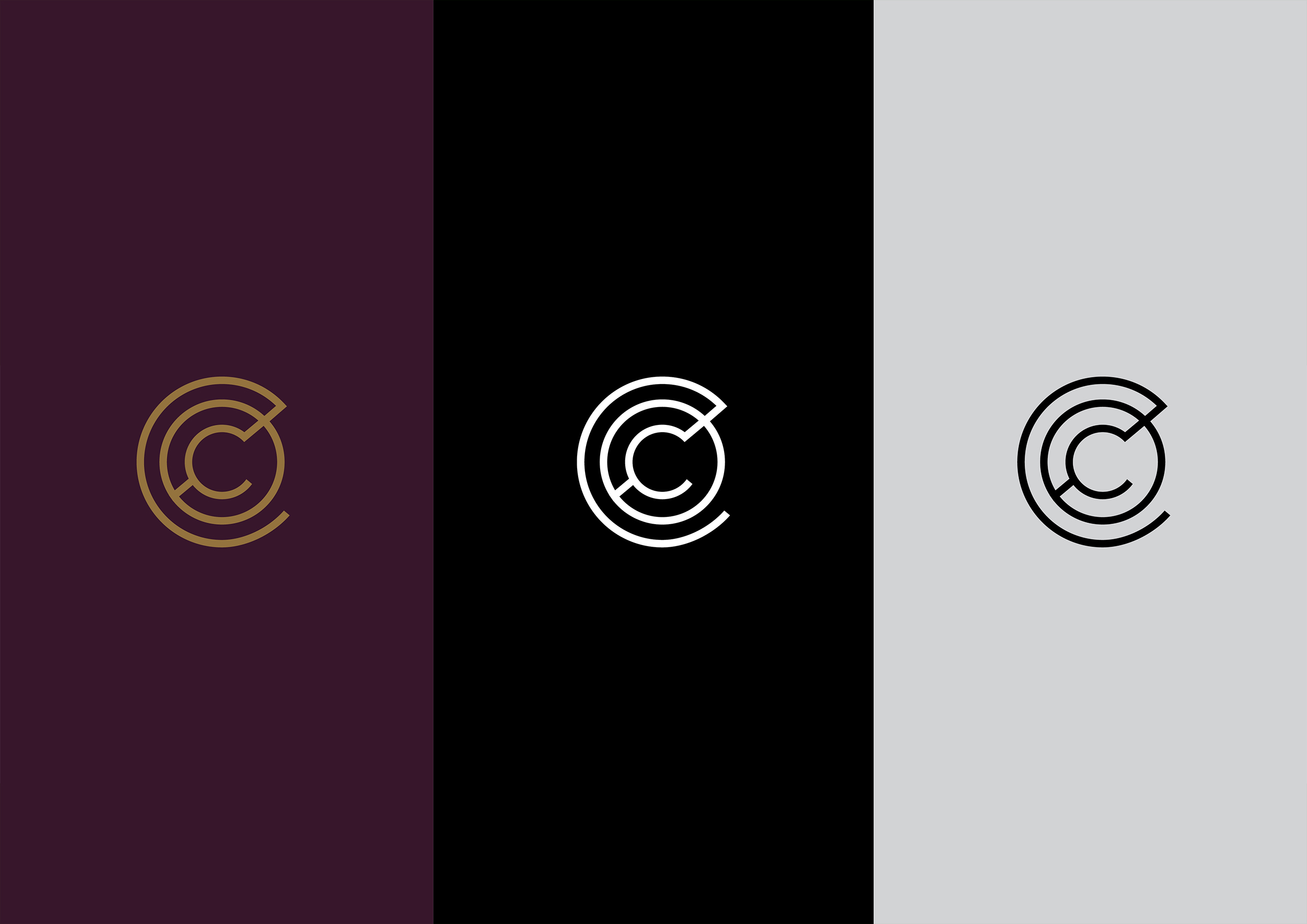
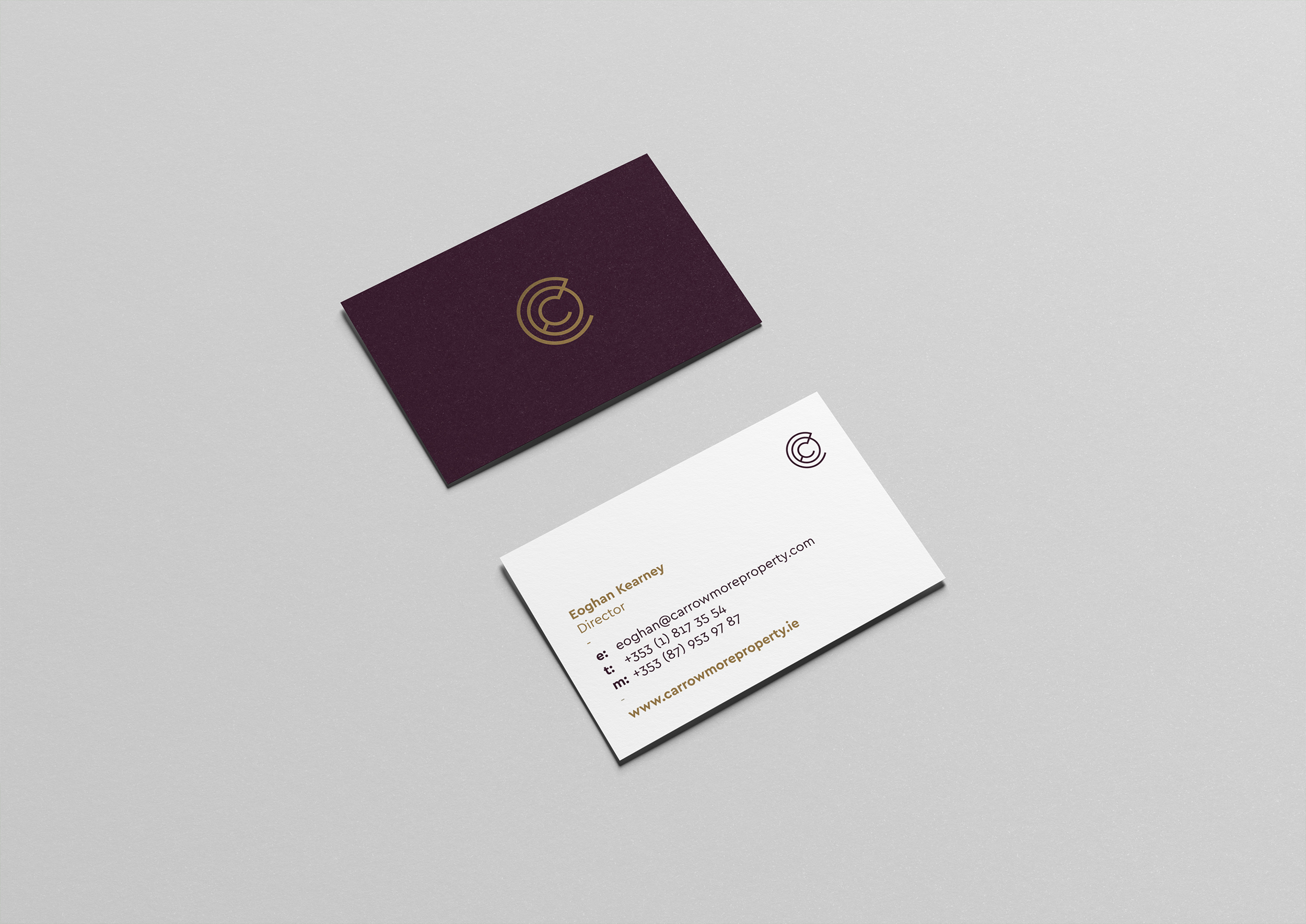
Carrowmore is one of the largest complexes of megalithic tombs in Ireland and so the new identity was inspired by megalithic symbols and icons. The logo design uses concentric circles with a 'C' at its centre. These circles are connected using a bridge representing both the brand name and the strength of partnerships. This approach allowed the creation of a professional and strong brand mark that could be used across signage and stationary as well as on and offline.