DDF16
Designed by Scott Burnett, Brian Heffernan and Stacie Heffernan at Aad
Categories: Promotional / Identity
Industry: Cultural
Tags: System
2016 marked our 9th year working with the dance festival and the first year working with new director Benjamin Perchet. It offered the opportunity to build on the core brand identity and assets we’ve delivered previously and to shape them to fit the vision of the new director.
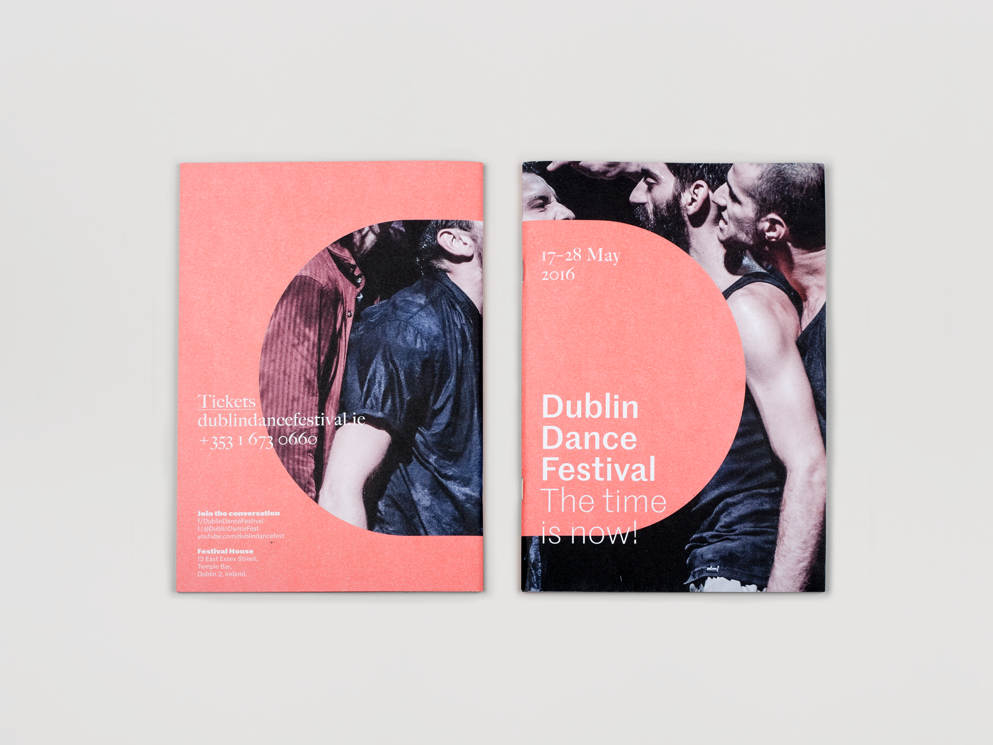
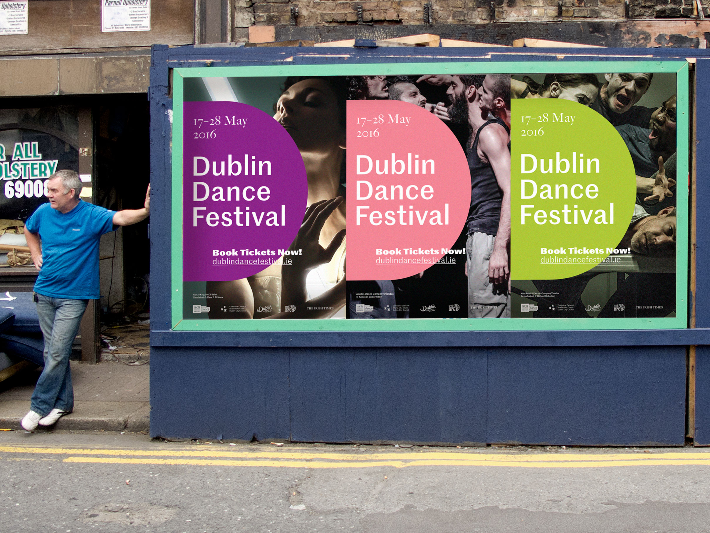
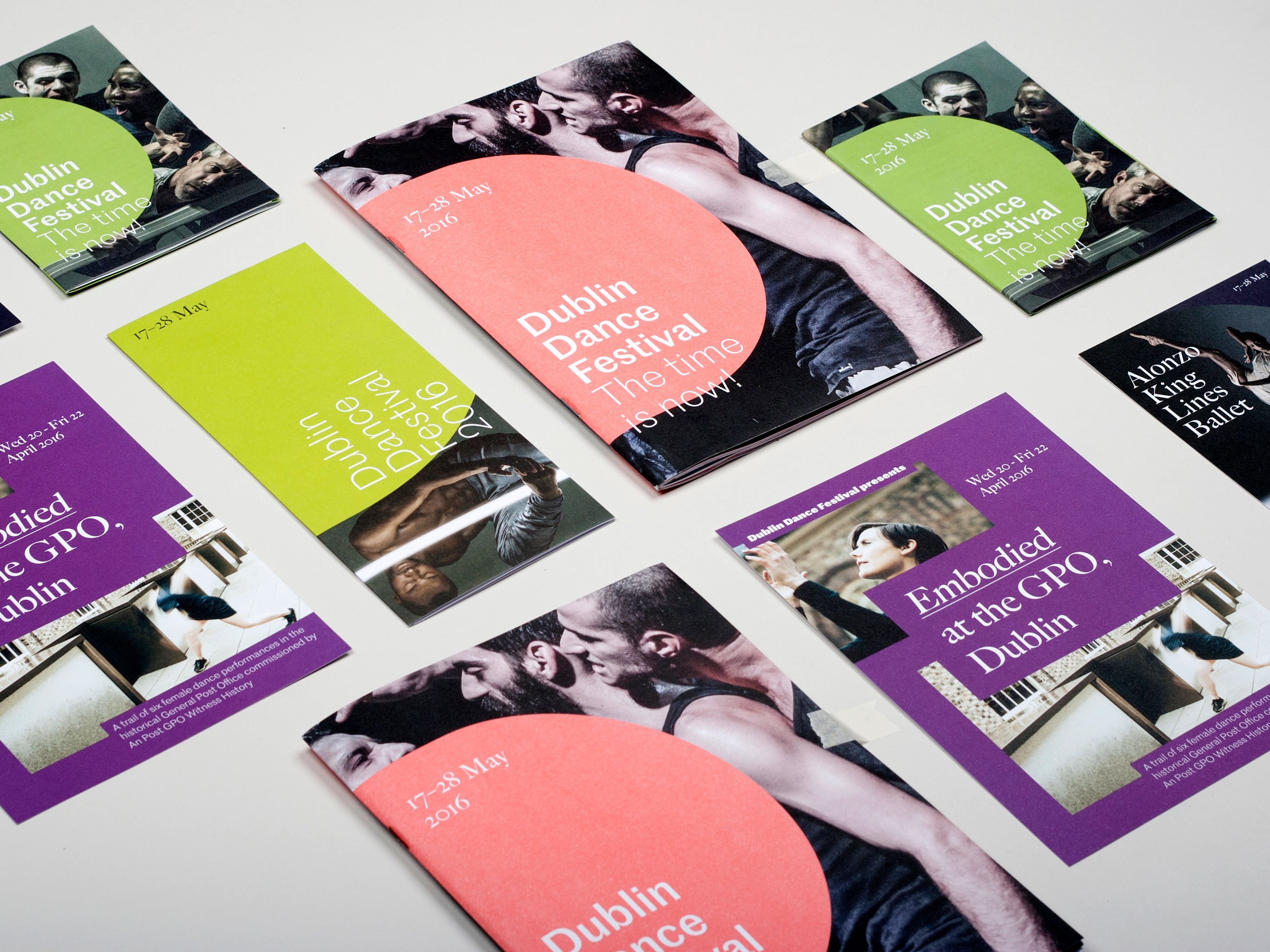
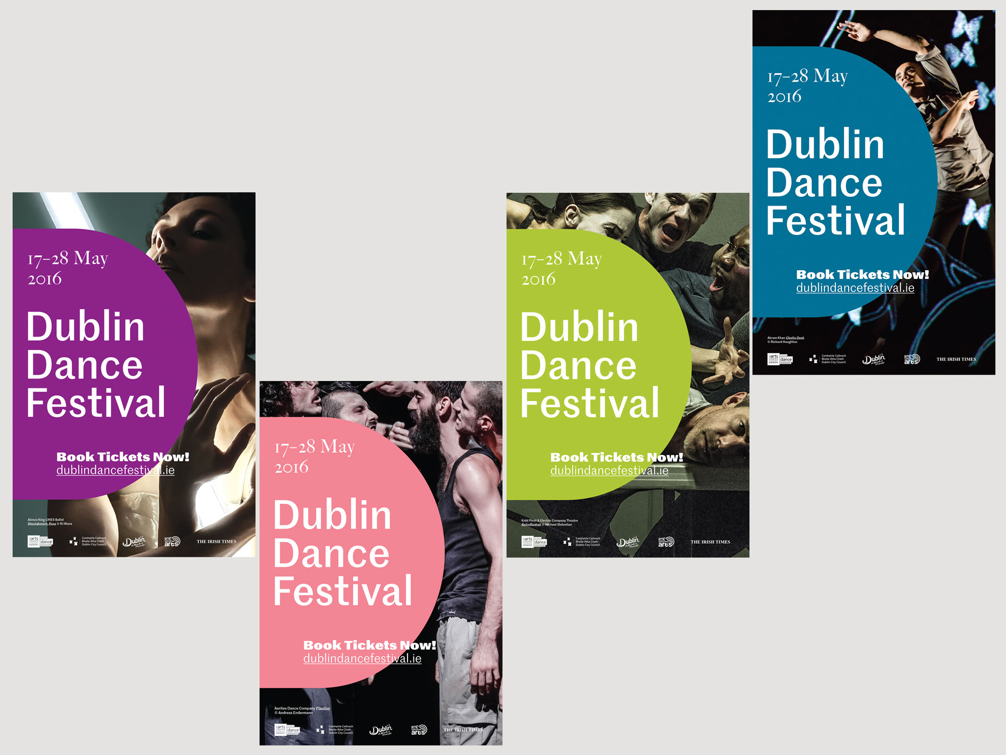
Our core strategy uses a strong simple D to anchor the communications and allow us to use different images, giving the feel of a festival, not just a single event. Benjamin’s vision was to bring the brand much more to the fore, to make it more integral and highlight the boldness of the programme.
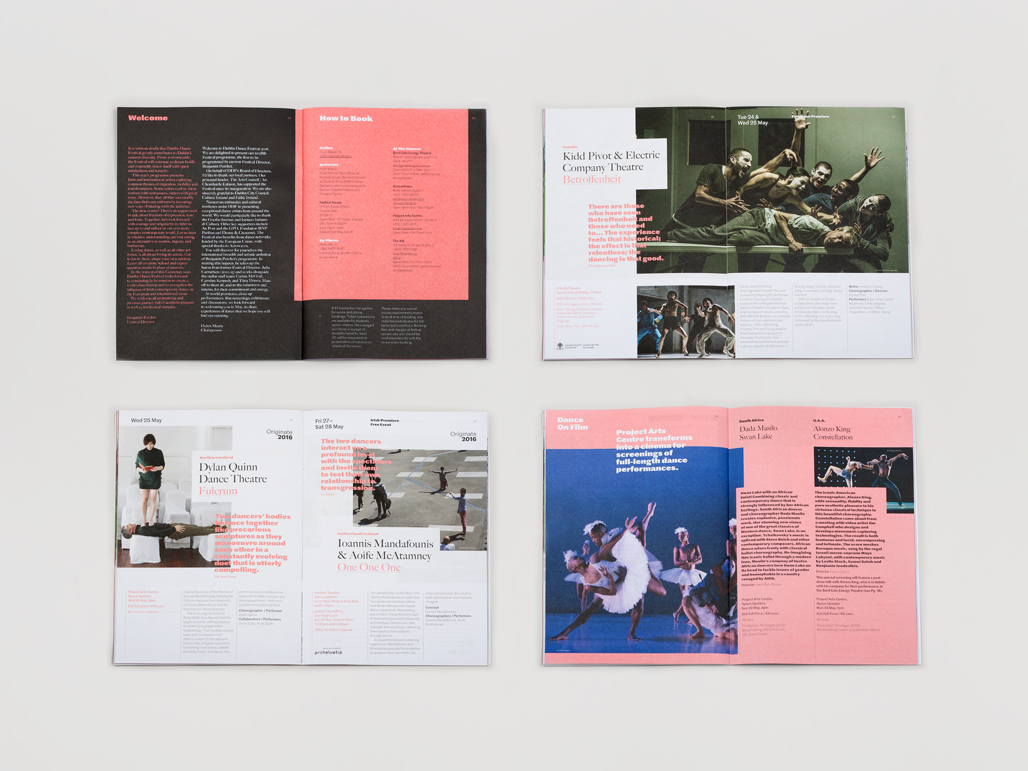
The direction we developed is an anti-frame. Bold, irreverent placement of the logo obscures large areas of production images, highlighting the tension, politics and energy inherent in the programme. Our approach to using multiple colours across communications continued from previous years, choosing colours to relate to the images and provide a balance between tension and harmony.