DoDublin
Designed by Simon Richards and Muireann McNulty at RichardsDee
Illustrator: Emma Wilson
Categories: Identity
Industry: Commercial
Website: richardsdee.com/case-study/dodublin/#project-imagery
Dublin Sightseeing has a solid reputation for providing tours and travel services. The challenge was to re-evaluate the brand and how it engages with its many audiences, enable cut through in a cluttered marketplace, grow market share and reclaim rightful ownership as the “authentic Dublin” sightseeing company.
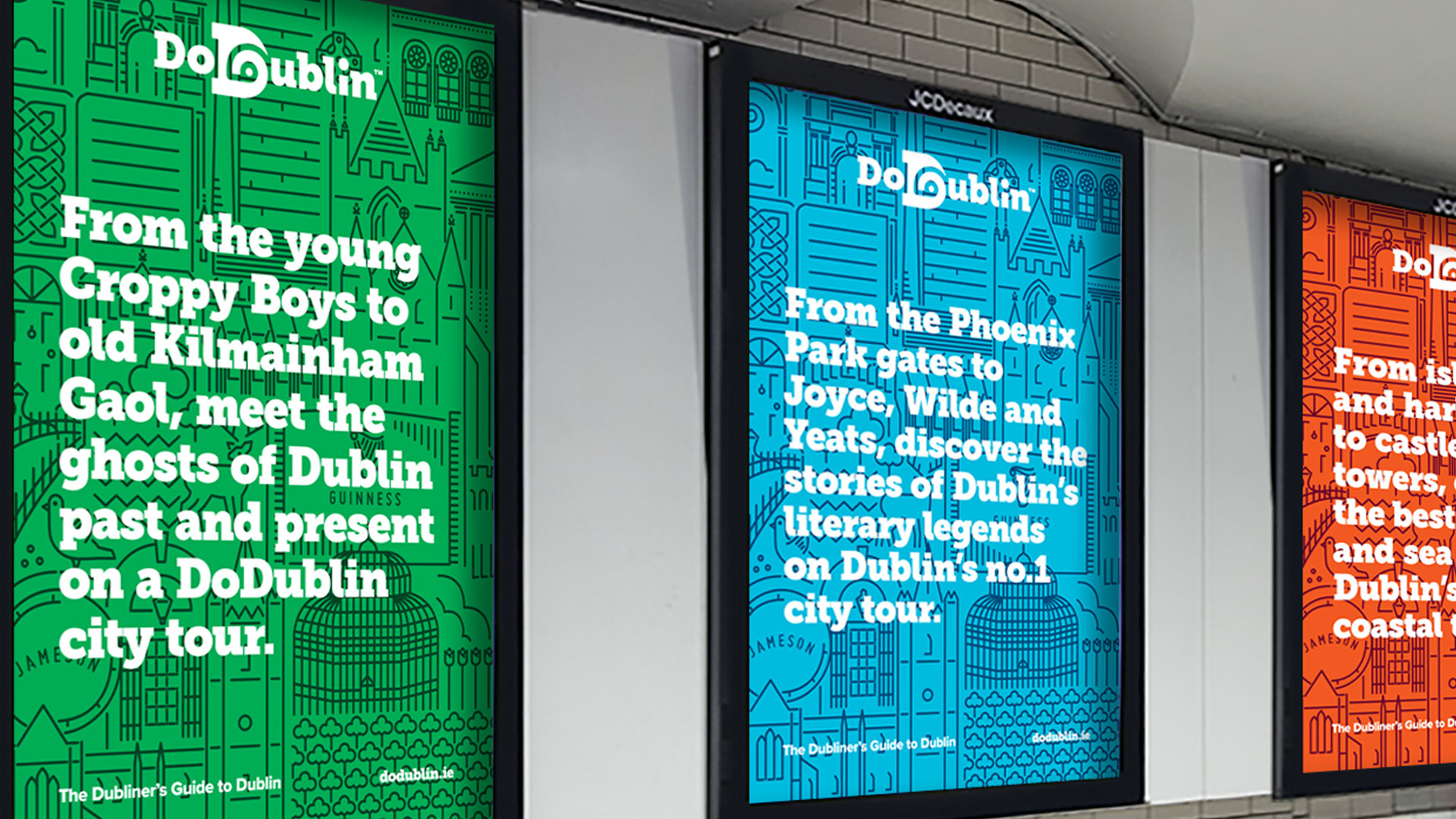
The name of the brand needed to become more active, iconic and memorable – DoDublin. The visual expression and messaging provides a distinct insight into the city, the culture and the people providing an experience that is real, unique and never scripted. The new identity created with Dublin, travel and sightseeing at its core, is visually represented by a confident ‘D’ with the symbol of an eye and a travel route combined. The tagline, ‘Don’t just sightsee, explore’ repositions the brand vs. the competitors and speaks directly to visitors desire to get under the
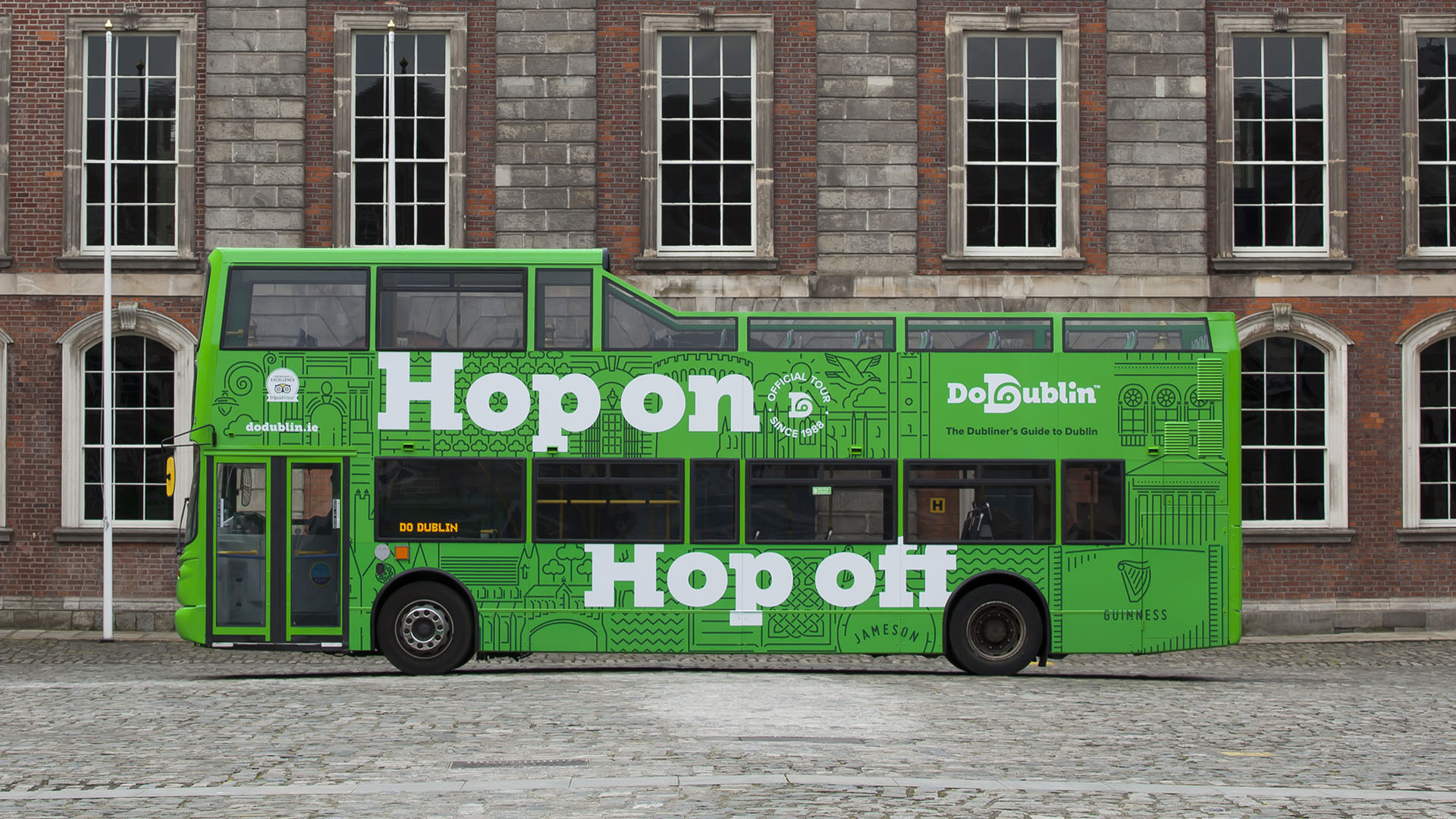
The original ‘Green Bus’ was given a more vibrant green colour, ensuring stand out at street level. The confident visual style stands out on cluttered street furniture and a bespoke illustrative style communicates where the tours go, leveraging the sites that customers want to visit.
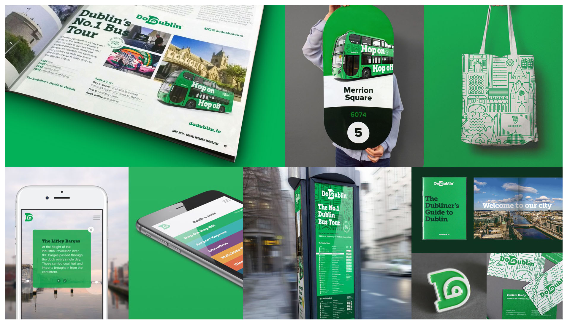
A confident masterbrand approach provides an brand architecture that is simple yet impactful, establishing a family style for all products, making it easier for consumers to shop the portfolio and cross-sell tours.