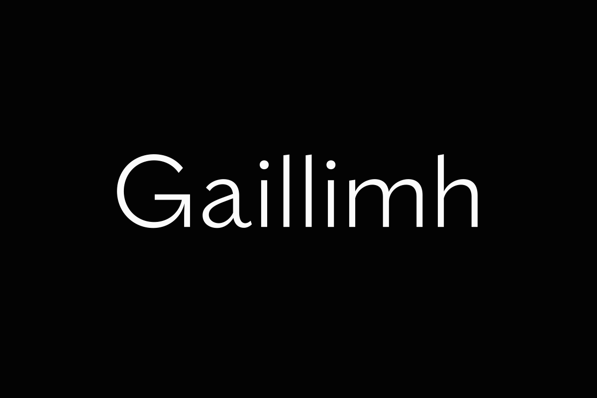
Gaillimh (2018)
Designed by Colin Farmer, Noelle Cooper, Bobby Tannam and Chris Fullam at Unthink
Video: Heavy Man Films
Categories: Typeface
Industry: Cultural
One of the strengths of the original Galway 2020 bid was how the community embraced the brand and got creative with the tools we had provided. This democratic approach influenced our original choice of typeface – Raleway – as it was freely available to download. But in the intervening years, this accessibility had made it somewhat ubiquitous. As the eyes of the world turns to Galway in 2020, we felt we should use the opportunity to create something truly bespoke to Galway.
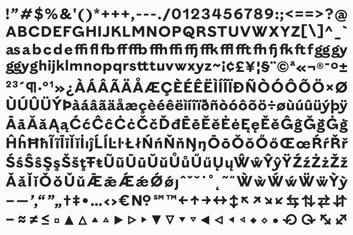
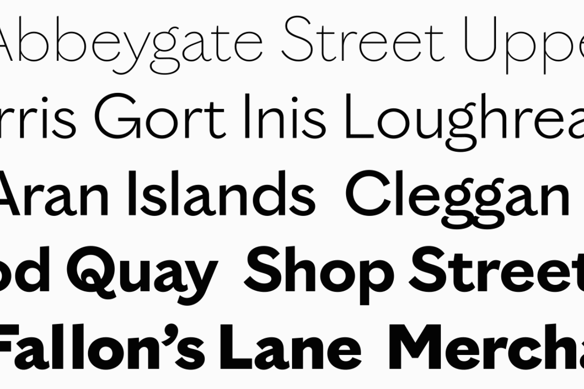
We collaborated with Bobby Tannam to develop a new typeface – Gaillimh – which could embody Galway’s heritage whilst keeping an eye on its future in Europe. During the summer we made many trips to Galway, visiting towns and villages around the county, trying to find original Galwegian typography. These adventures uncovered a host of interesting source material, which we slowly distilled down into the spine from which the new typeface evolved. The initial high contrast display faces, making way for something more contemporary and functional form. The final letterforms are influenced by 18th century stone carving, 19th century sign-writing and the contemporary needs of an Irish cultural organisation. Once it has fulfilled its role of brand typeface, it will become part of the project’s legacy, a gift to the people of Galway.