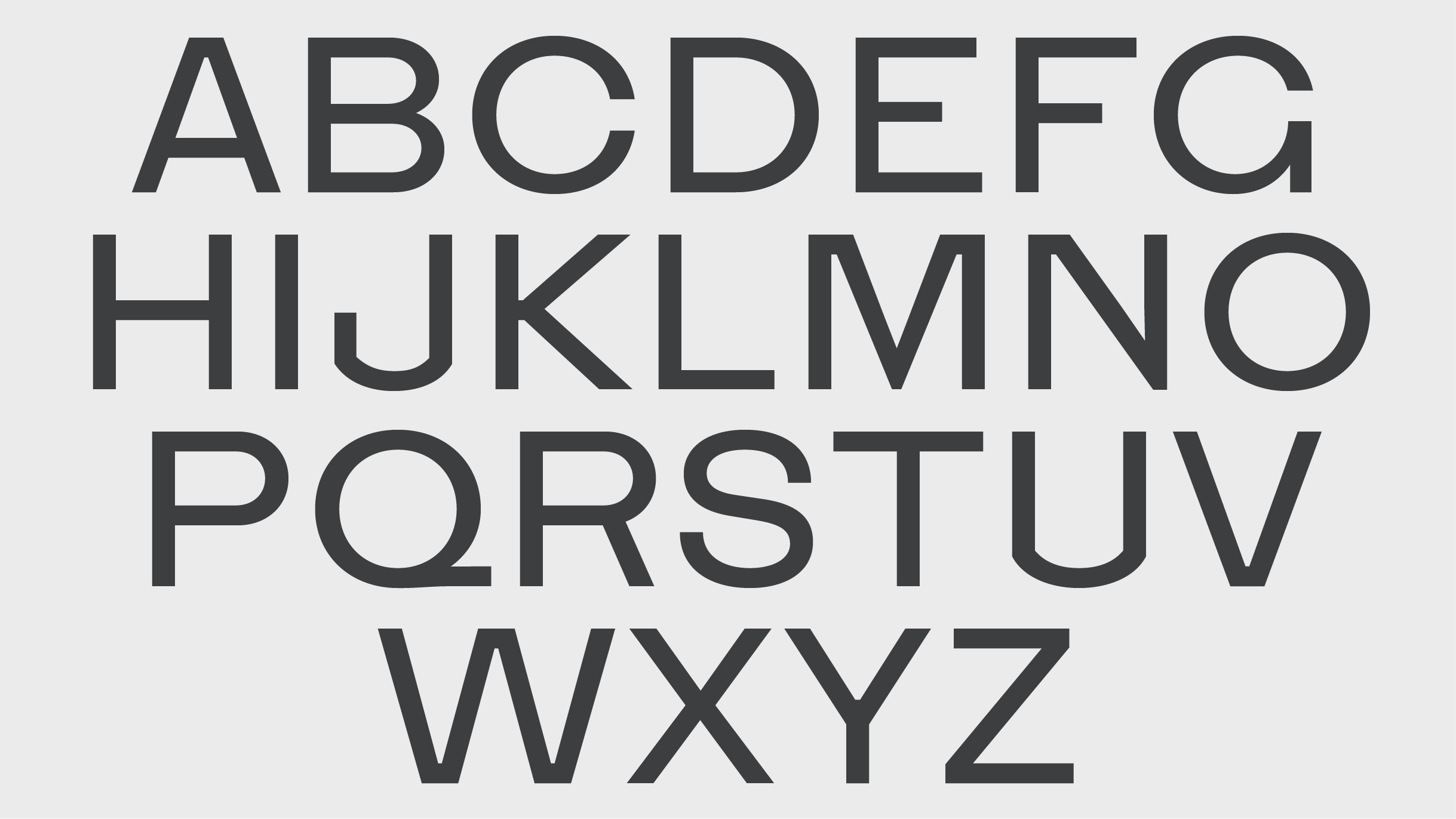
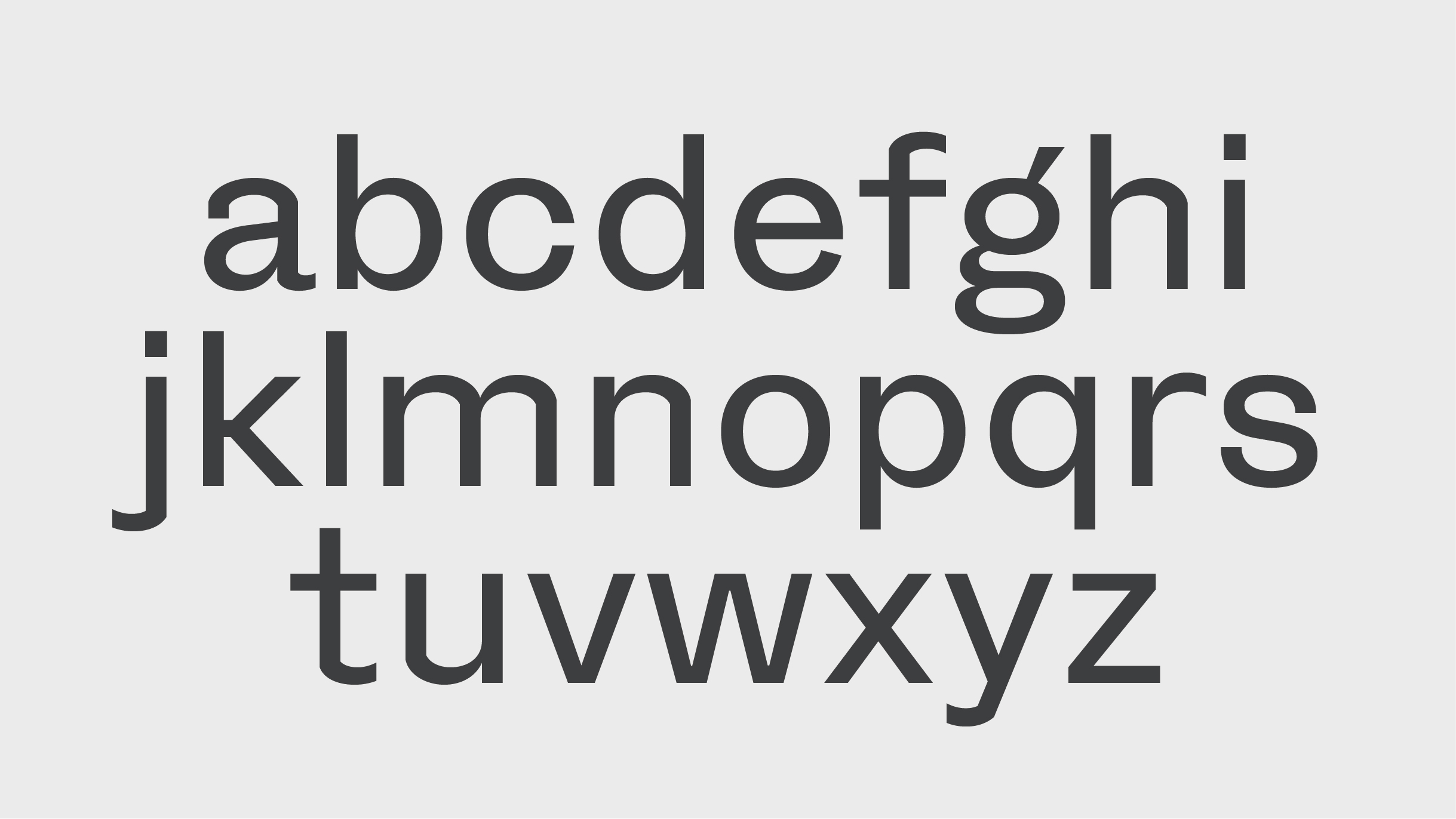
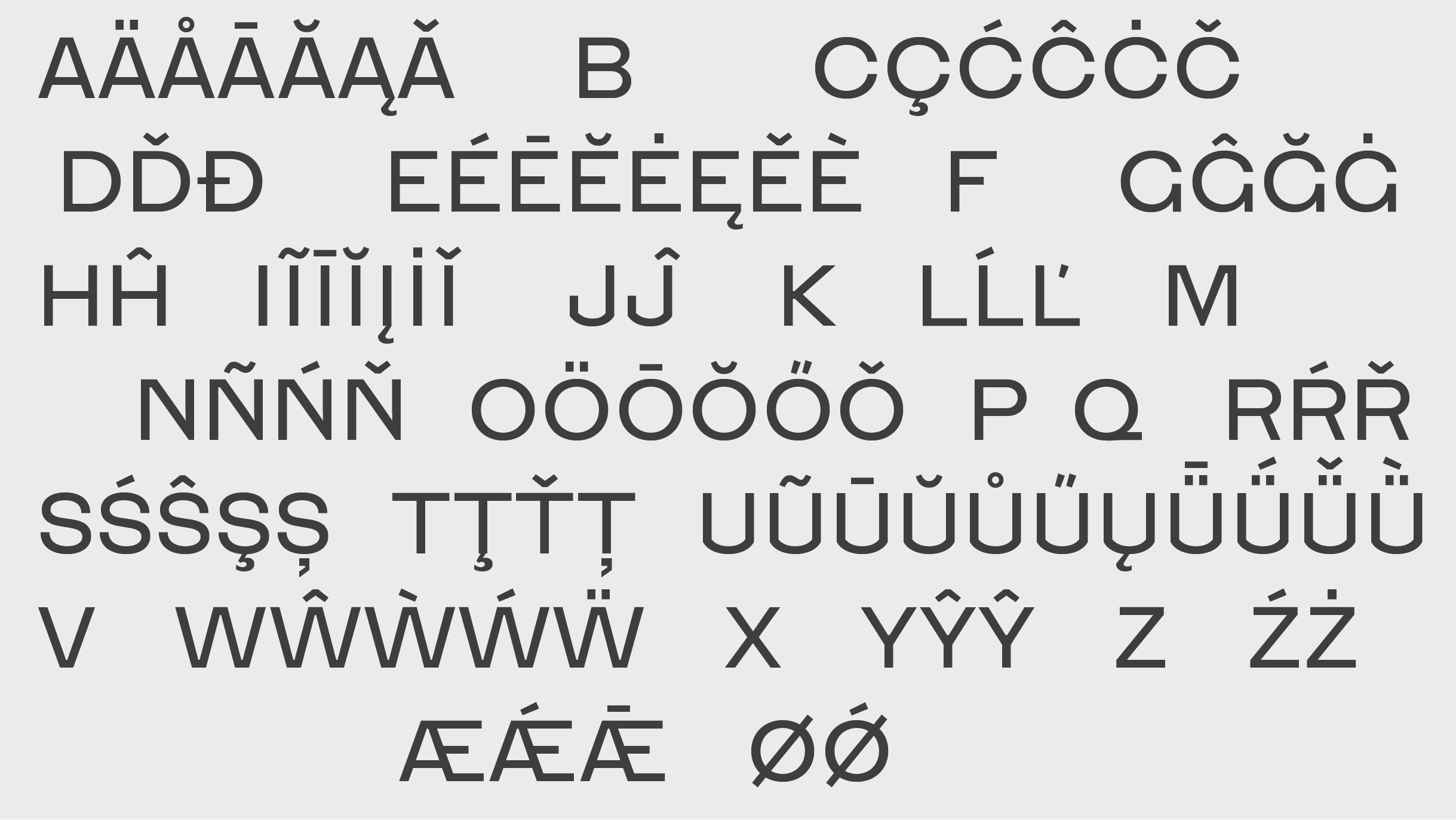
Henry — Typeface
Designed by Evan McGuinness and Bobby Tannam at Bielke+Yang
Type Design: Bobby Tannam
Art Direction: Christian Bielke
Art Direction: Martin Yang Stousland
Categories: Typeface
Industry: Corporate
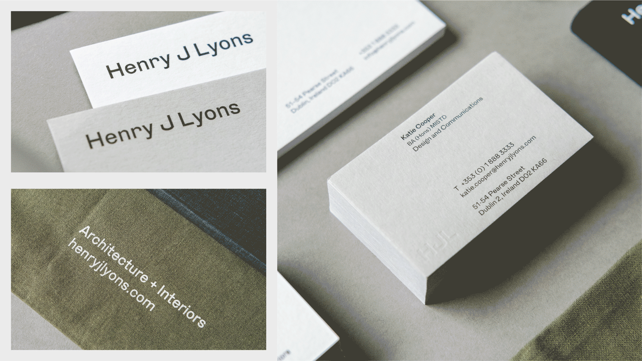
Henry J Lyons (HJL) are one of Ireland’s largest architecture studios with 185 members of staff, and over the past century, they have designed some of Ireland’s most iconic buildings. As part of their rebranding, their visual communications were consolidated and streamlined. During this transition, a custom typeface, Henry, was developed together with Irish type designer Bobby Tannam—blending HJL’s traditional roots with their modern practice.
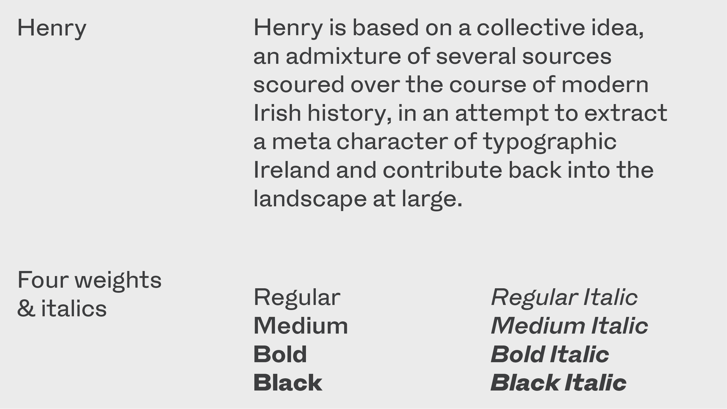
Henry is based on a collective idea, an admixture of several sources scoured over the course of modern Irish history, in an attempt to extract a metacharacter of typographic Ireland and contribute back into the landscape at large.
Henry is based on the study of Irish Architectural letterforms, physical and drawn spanning the last two centuries. Ireland’s typographic landscape is shaped by a multitude of architectural lettering, spanning varying styles from antique, to rational and experimental.
Drawings by Neoclassical architect John Soane played a key role in the shaping of Henry, his hand-drawn sans-serif lettering which dates back to the 1700s laid the building blocks of Henry. It was then translated into a useful contemporary vernacular, retaining the antique period's eccentricities. Henry also takes influence from Michael Biggs, a highly respected Irish lettering artist, whose work is carved in stone across many of Dublin’s buildings.
Number of weights
4 weights & italics