Kombucha Kat
Designed by Stephen Banville (Freelance)
Photographer: James Champion
Categories: Identity / Print / Packaging
Industry: Commercial
Website: kombuchakat.co.uk/
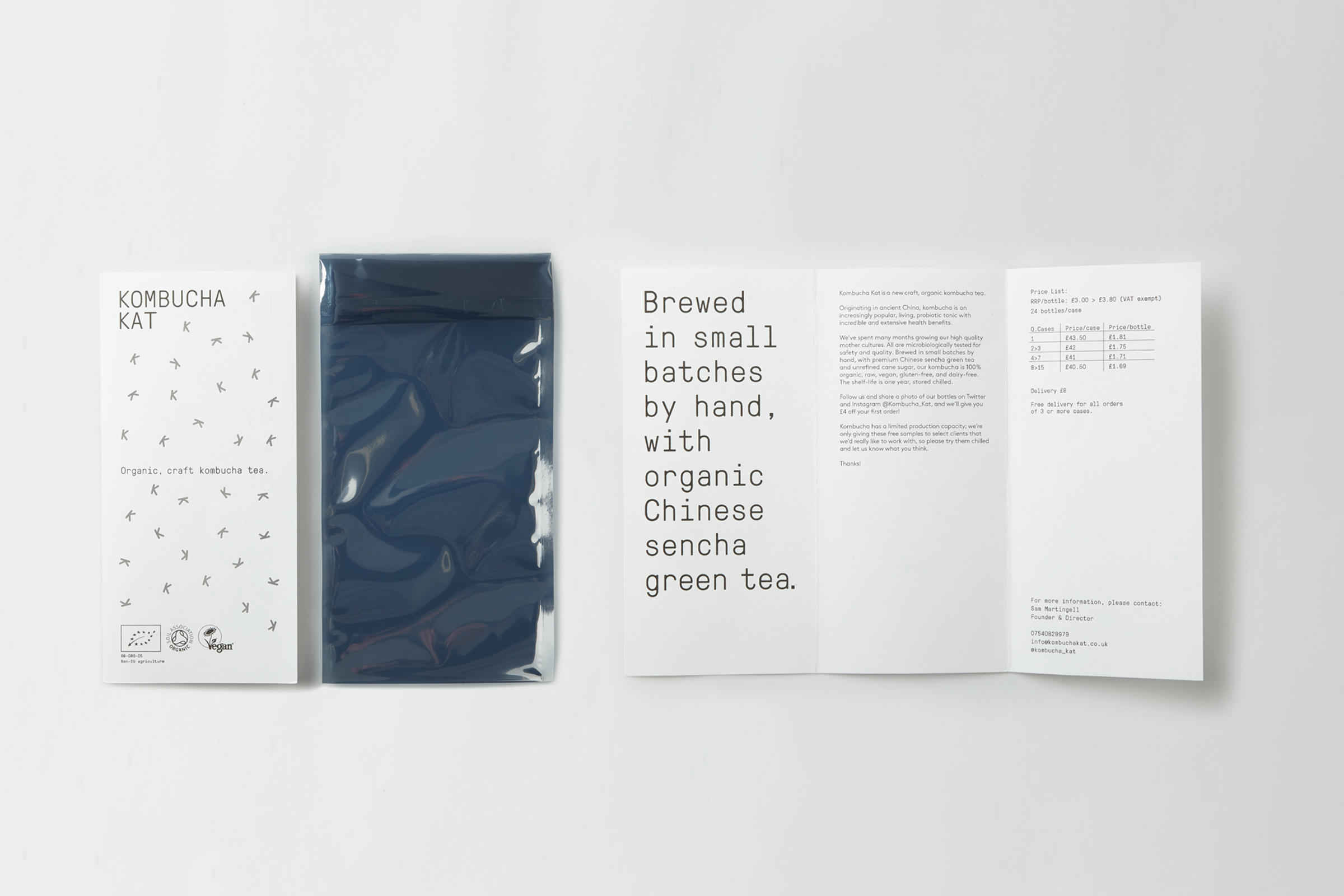
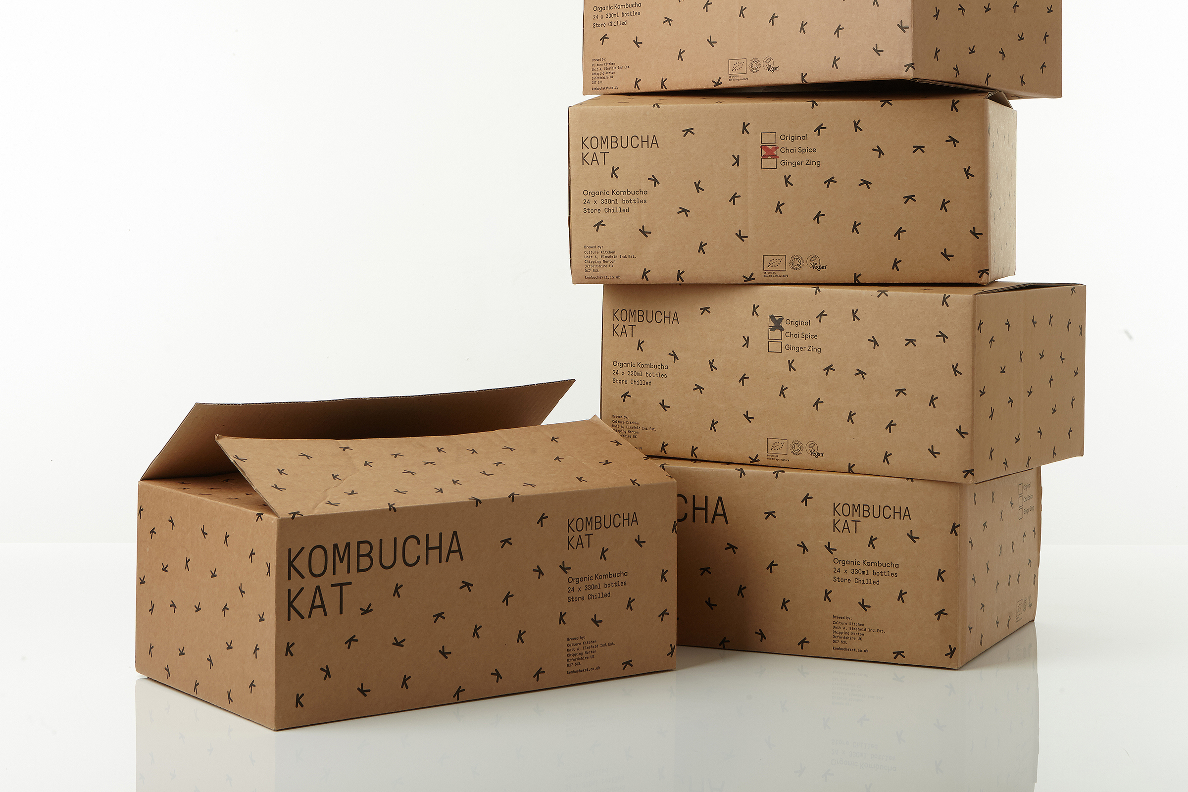
Kombucha Kat is an independent brewer of kombucha based just outside London, UK. I was approached to create a consumer facing brand, for an already developed hospitality product, and then to design the packaging and direct the brand launch.
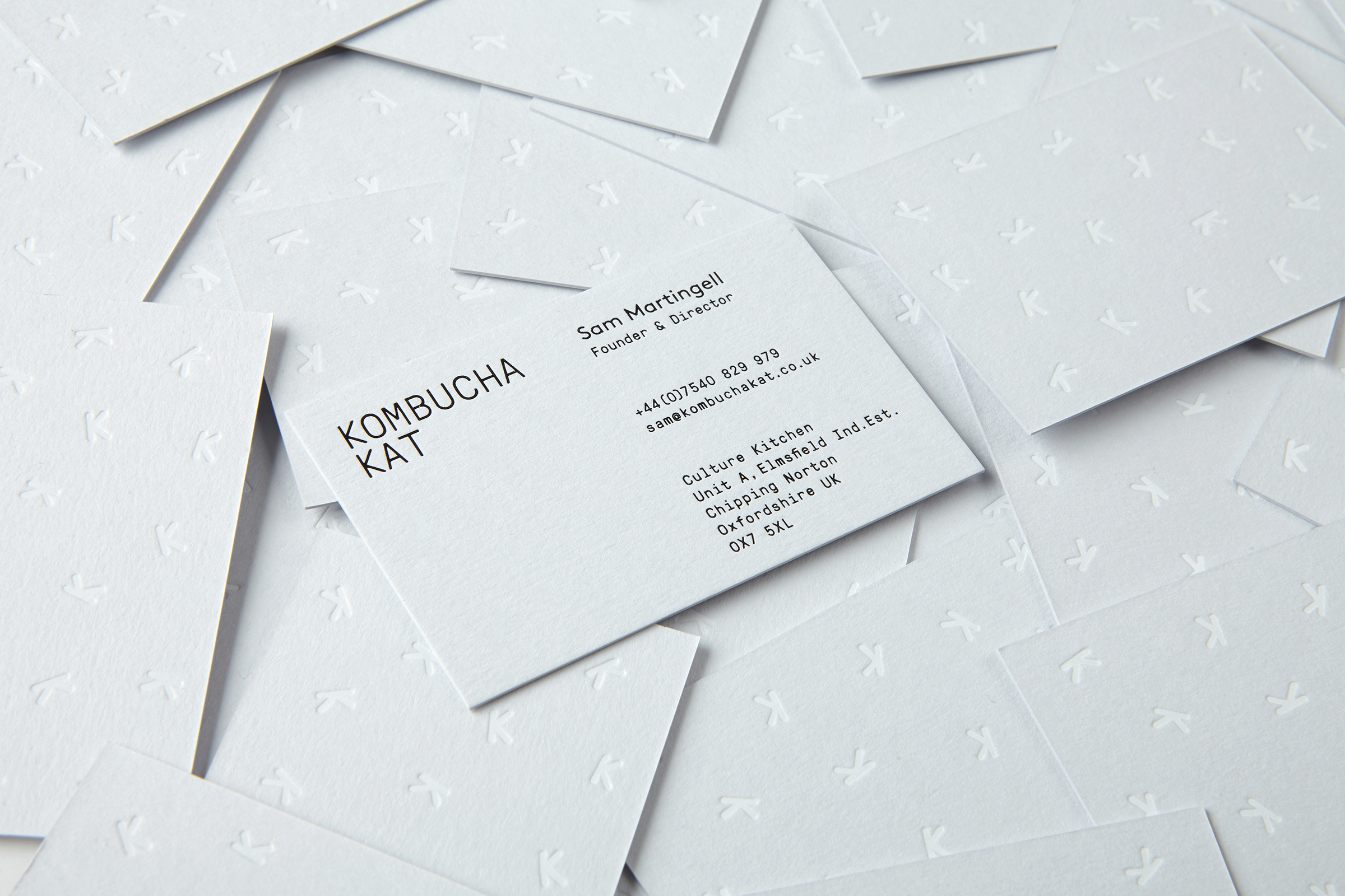
Their are three main elements to the identity; the randomised brand pattern, a quiet palette of greys and a simple mono-spaced wordmark. The palyful pattern is inspired by the kombucha cultures that live inside every bottle and which hold the power to good gut health. The pattern is used as a back drop to the "scientific" typeface and mute palette; a balance which references the health benefits of the drink.
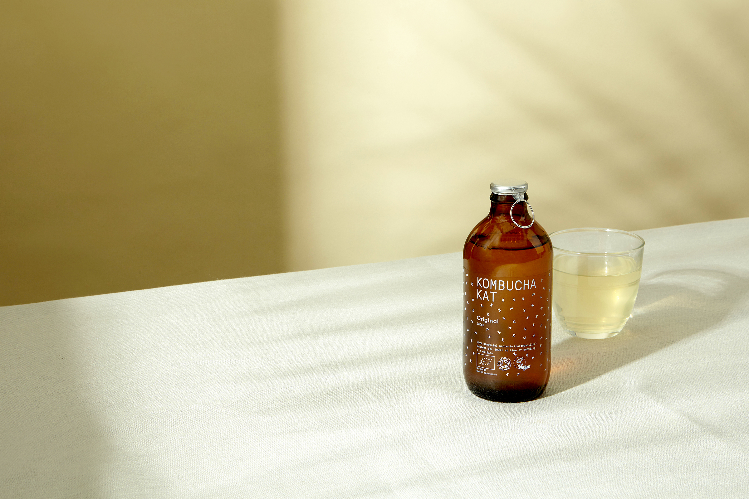
For launch, I developed two art direction styles. The first being lifestyle lead campaign imagery to be used for advertising and the second was developed to support the white out pack shots. With a simple white background and warm graphic shadows, this was used for online retailers as brand headline imagery. Both try to highlight the refreshing nature of the drink.