Look Eyecare Identity
Designed by Philip Mitton at CI Studio
Creative Director: Mel O'Rourke
Photography: Bridget Butler
Photography: Al Higgins
Industry: Commercial
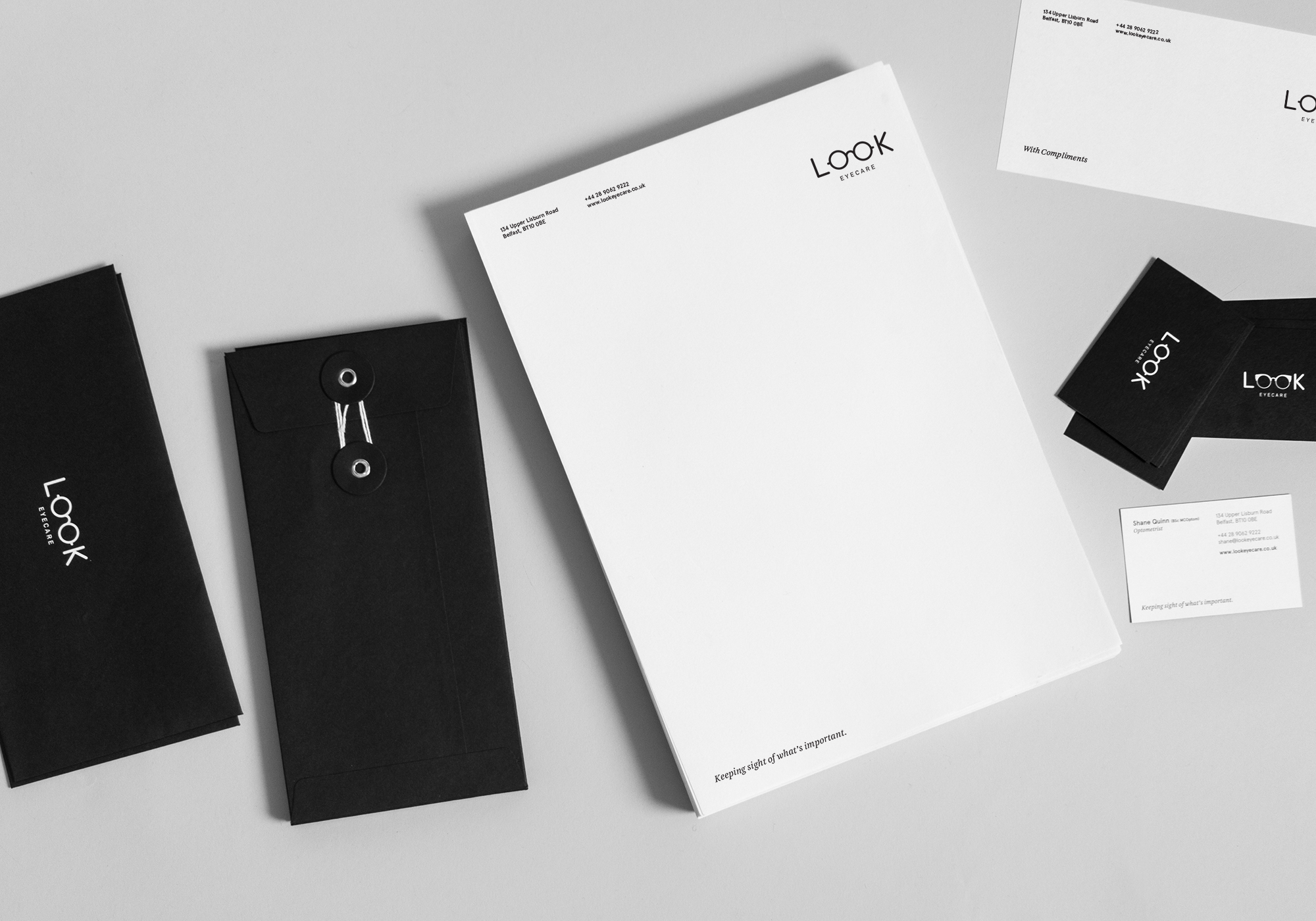
Belfast optician Shane Quinn approached us to help with the design of a brand identity for a new practice he was opening on Belfast’s Lisburn Road. With a limited budget, the challenge was to create an identity which clearly and effectively communicates a high-end offering with a personalised service, very different to the larger, more established high streets brands located in the area. It also needed to be immediately suggestive of the designer glasses on offer and convey the ophthalmic care aspect of the company. The printed material needed to be simple and sophisticated, reflective of the attention to detail that Shane brings to his business and his personable and engaging approach to his customers.
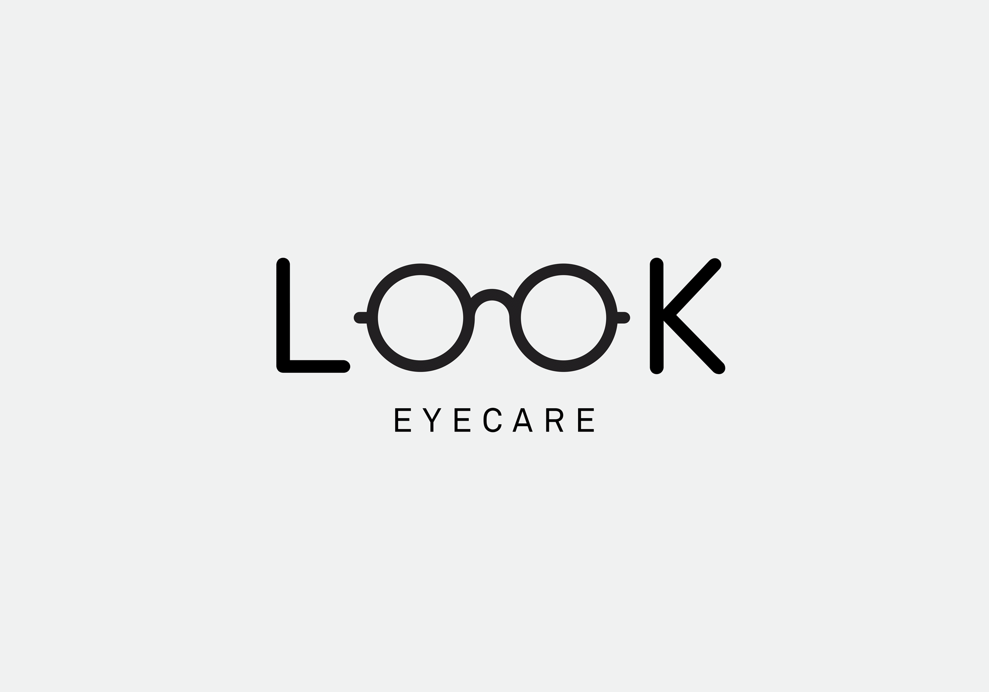
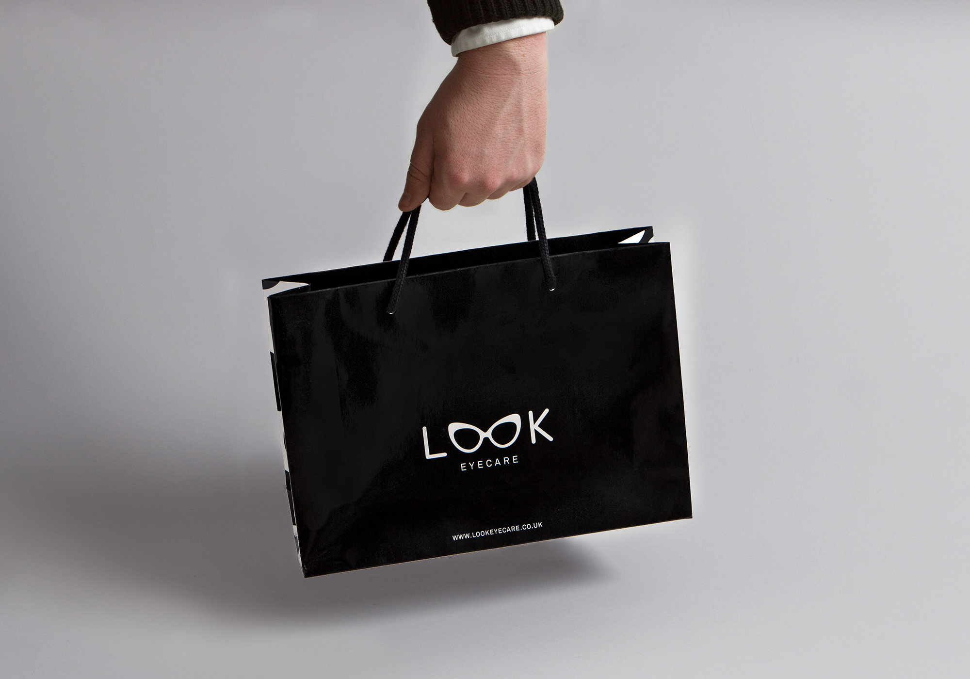
When generating a name for the opticians, our main criteria was that it contained two O’s to allow us to simply replace them with spectacles and in doing so, help with immediate recognition and impact. The word Look allowed us to do that and the Eyecare suggests it’s not just about selling glasses. We chose a friendly rounded typeface for the L & K and built the logo through different styles of frames – male, female and unisex keeping a sophisticated monochromatic palette for impact and cost effectiveness.
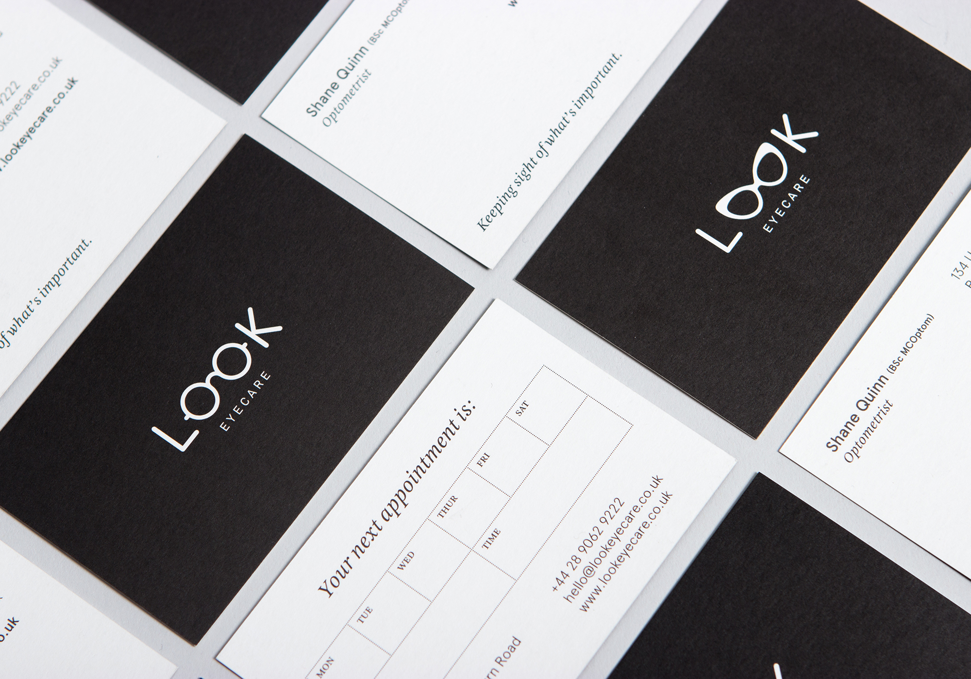
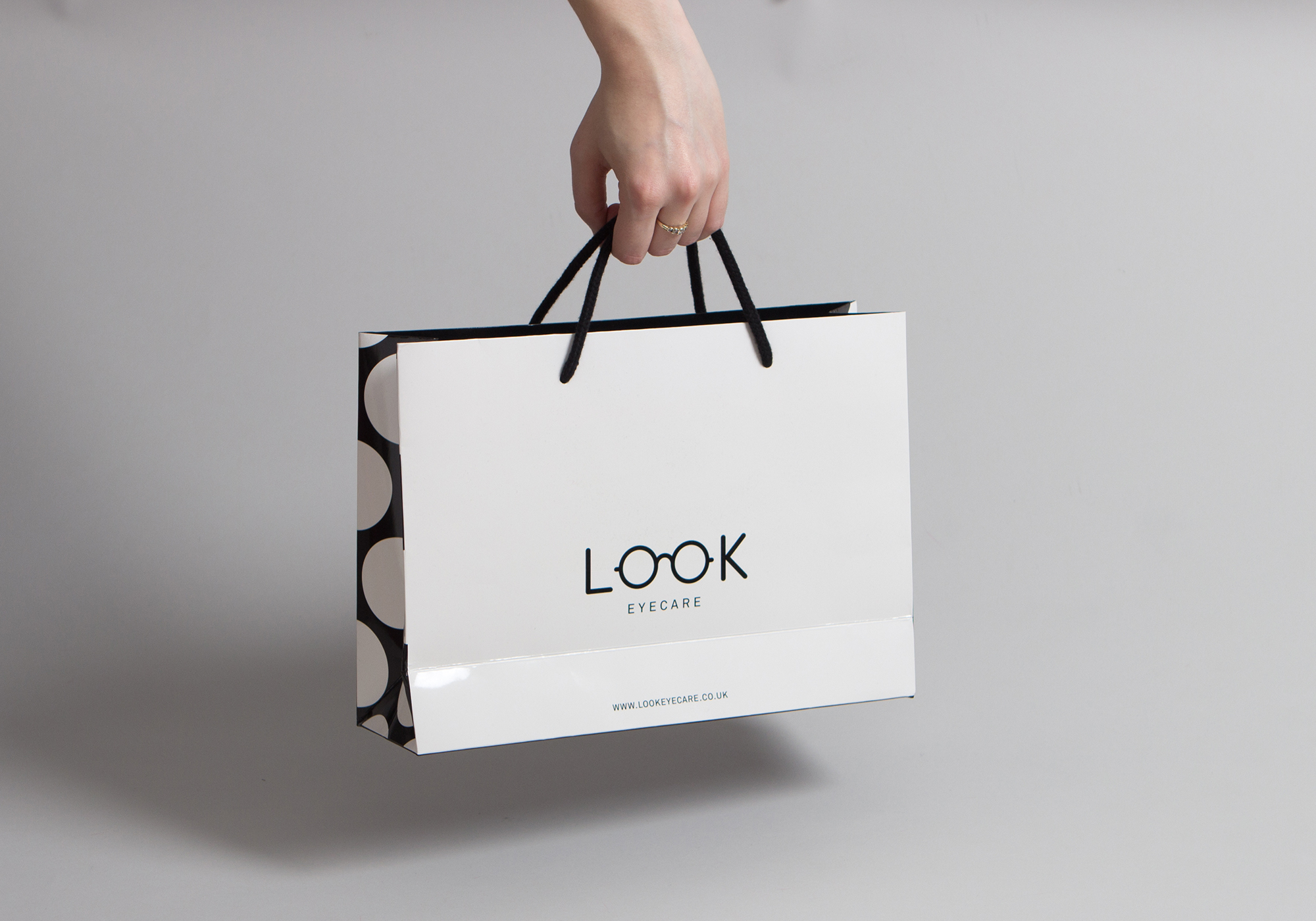
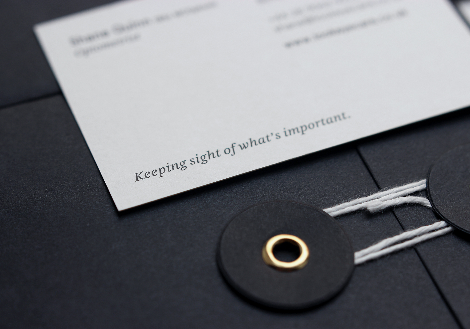
To complement the identity, we wanted the printed material to be tactile and sophisticated with subtle print details and finishes. The envelopes are on 180gsm black Kraft and stationery on Munken Rough with a white gloss foil on both black and white. The bags are laminated with a high gloss finish.