The Wilder Townhouse
2013
Designed by Sinéad McAleer at Slater Design
Interior Architecture: Grainne Weber Architects
Logo Typography: Bobby Tannam
Illustration: Alan Clarke
Naming : Reed Words
Categories: Identity / Signage
Industry: Commercial
Tags: Illustration / Hotel
The Wilder is a 42 room townhouse in a refurbished late-Victorian listed redbrick building on Dublin’s Adelaide Road. This beautiful historic building had many interesting past incarnations. In the time since its construction in 1878, the building has served as a home for unmarried females - or as described on the deeds - a home for bewildered women, a home for retired governesses, and a nursing home for elderly nuns.
The vision for the Wilder was to create something different, an experience for those tired of corporate style hotel chains. The Wilder would offer an experience that is ‘Anything but Ordinary’.
With Dublin being the birthplace of renowned Irish poet and playwright Oscar Wilde, owner Frankie Whelehan liked the idea of referencing Wilde’s understated flamboyance, and unserious sophistication in the hotel brand and interior. We teamed up with copywriters Reed Words, and the name ‘The Wilder’ was created.
While never explicitly referenced, elements of Wilde’s personality were incorporated into the brand, that sense of the unusual, and rejecting the status quo. While researching visual cues around Oscar Wilde in the victorian era, we came across an illustrated women’s publication that he took editorship of between 1887 and 1889. The publication was called ‘The Woman’s World’, and during his editorship, Wilde transformed it from ladies fashion magazine lacking in depth, to a cultural expression piece. His strategy was to focus more on what women think and feel and not exclusively on what they wear.
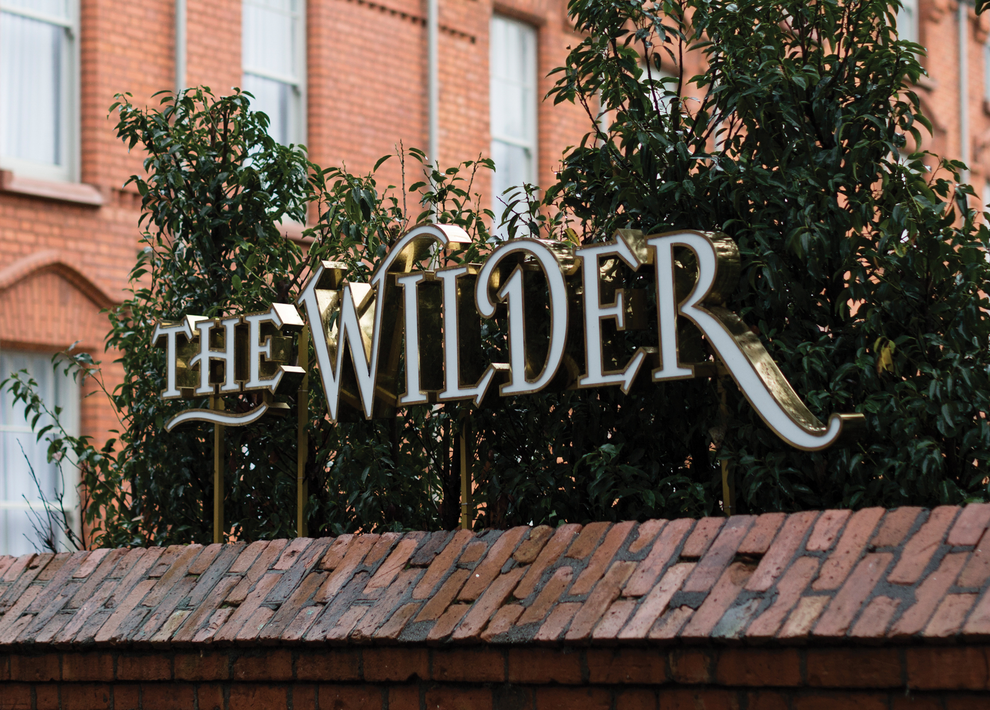
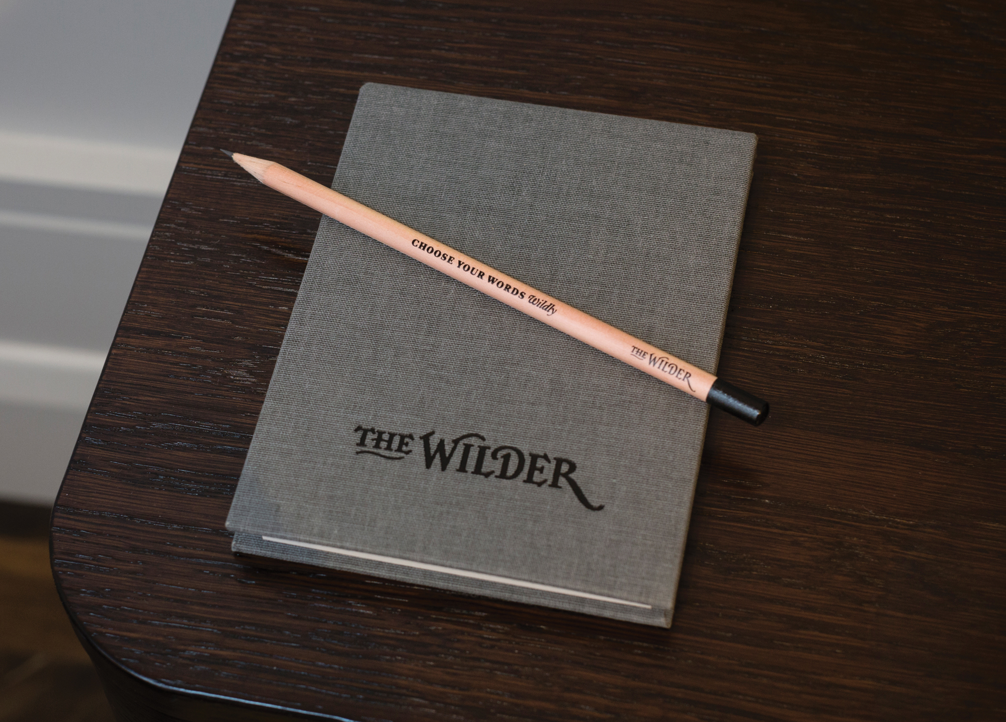
With the female centric history of the building, this link between Wilde and the empowerment of women felt fitting. We commissioned typographer Bobby Tannam to adapt some of the beautiful typography featured on the masthead of ‘The Woman’s World’ to create the logotype for ’The Wilder’. The result being a marque that has as much character and history as the building itself.
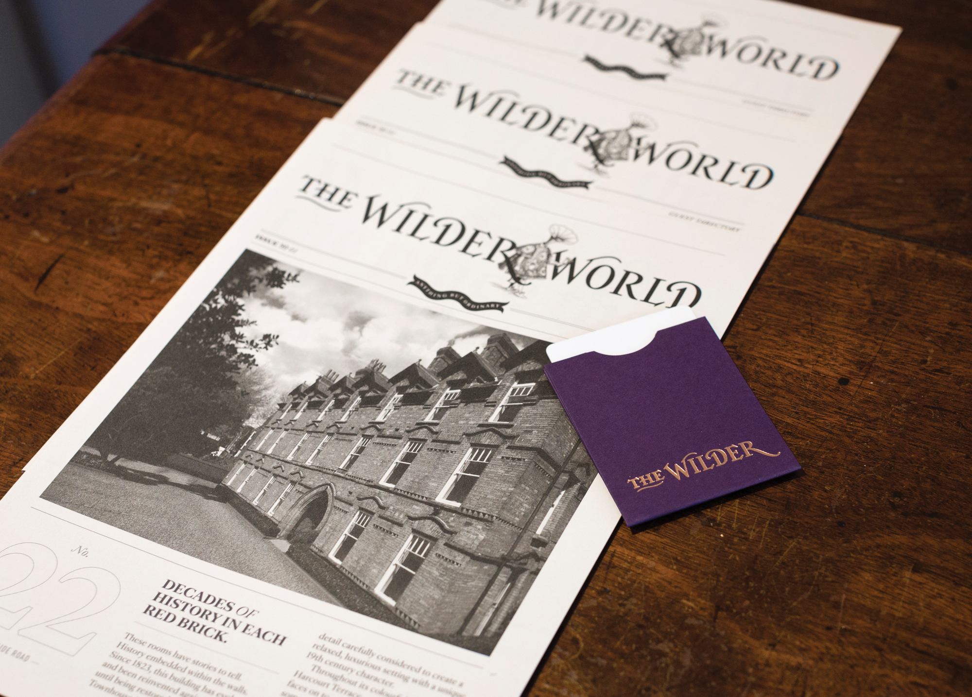
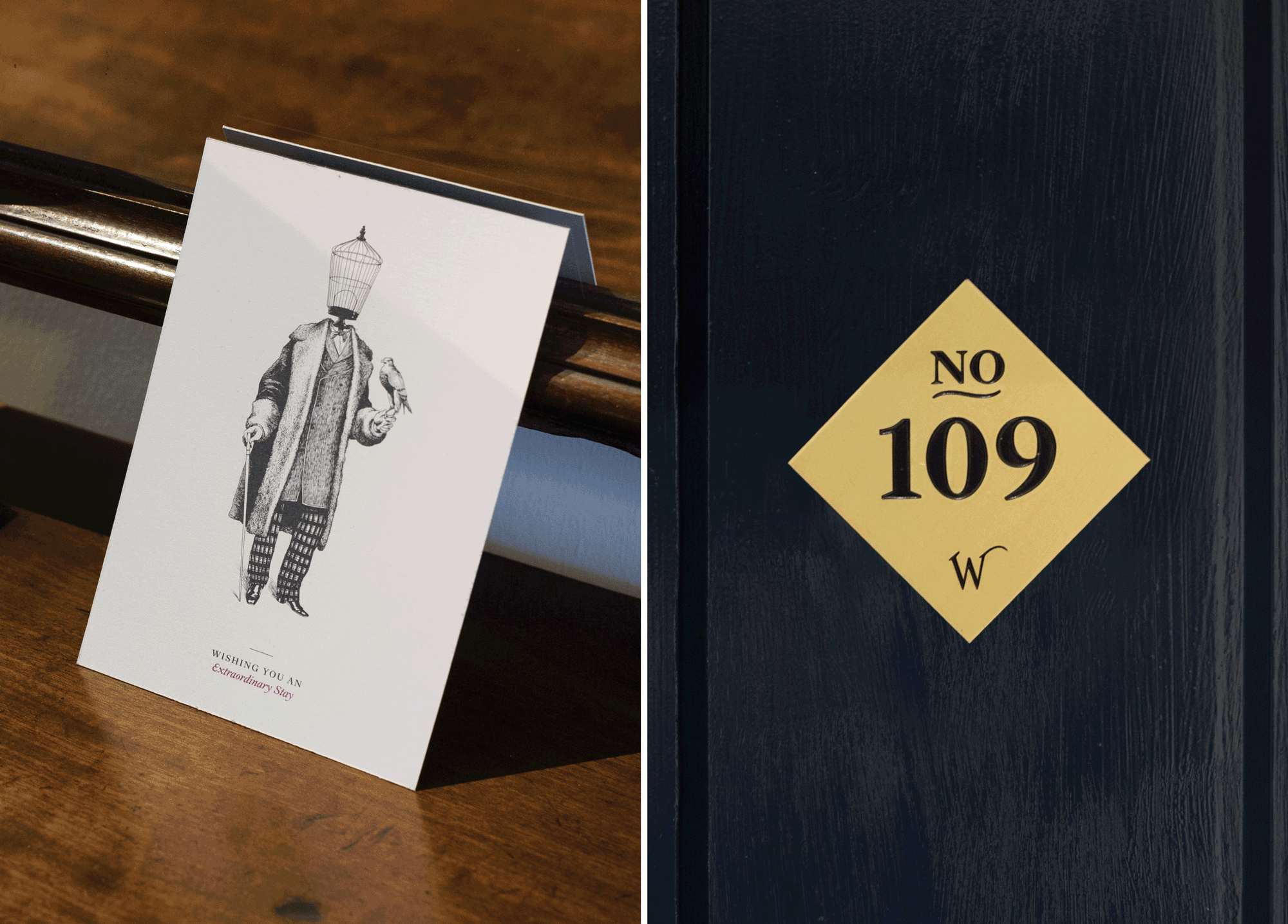
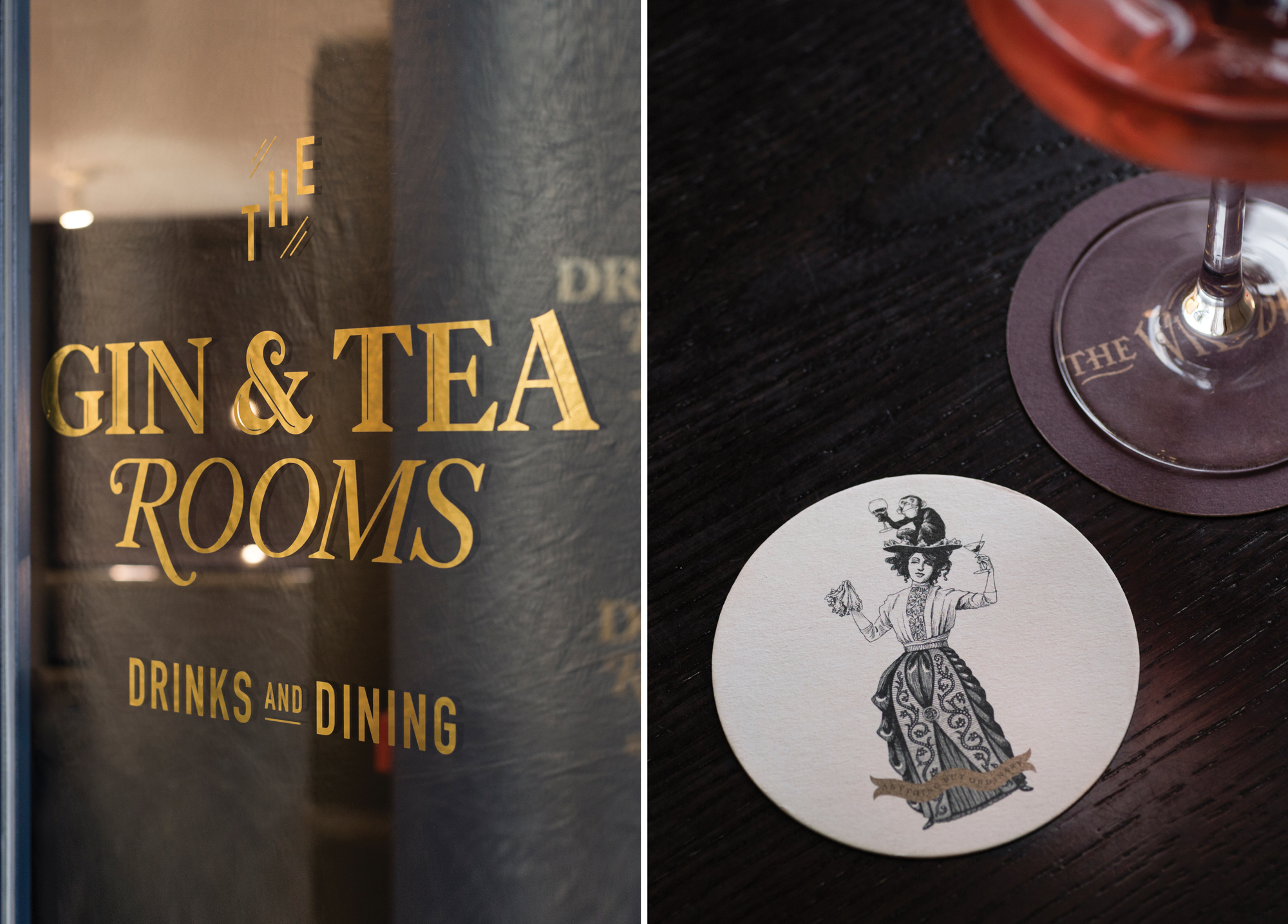
Again referencing the illustrated nature of the ’The Woman’s World’, we had a series illustrations commissioned. We worked with Alan Clarke to create four illustrations of unusual characters with names like 'The Heralder' and 'The Simian Sipstress' These were used on printed collateral like welcome cards and beer mats. In addition to these pieces we designed a room directory and city guide in the style of a victorian newspaper and called it ’The Wilder World’.
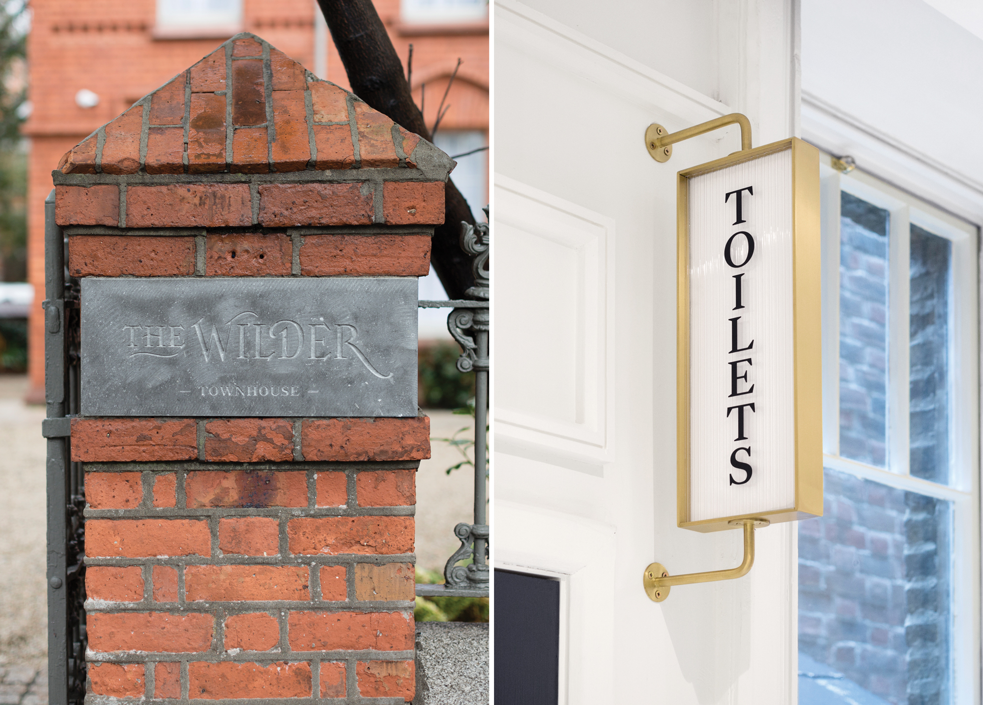
We also created the exterior and interior signage scheme. A feature brass edged internally lit sign sits on the Harcourt Terrace side of the building. Inside we created way finding signage and graphics, as well as signage for the ‘Gin & Tea Rooms’. All were designed to be sympathetic to the building and interior look and feel.