In celebration of 100 Archive marking 10 years of Irish visual communication design, we invited a few good folks to select their favourite piece of work from the Archive and share why it resonates with them so much. With a decade of projects to choose from, we hoped to resurface some golden oldies, reflect on where we are today, and take a moment to appreciate the breadth of design produced over the years. Thanks to our contributors for giving us a whole new, refreshing set of perspectives on these 100 Archive selections...
____
First up, we hear from James Kelleher, Head of Design at Publicis Dublin.
How do I know it’s a great piece of design? Firstly, I feel a profound pang of professional jealousy every time I encounter the logo. I couldn’t have made it. Roundels are my Achilles’ heel. Maybe I could have arrived at the beginnings of it conceptually, but I’d have repeatedly botched the execution until the point of abandonment and then gone elsewhere.
Let’s get straight to the lavish praise. There’s a David Foster Wallace essay, ‘Roger Federer as Religious Experience’, where he describes the otherworldly laws-of-physics-denying elegance of Federer’s game, and that’s close to what I – a nerd who doesn’t know what a sport is – experience when I look at this logo. Conceptually it’s basic. It’s the word ‘District’ and it looks like a compass. That’s it. That’s the big idea. The word itself happens to lend itself perfectly to this treatment – not that you’d know from looking at it written down in its unevolved form. It’s like there was a latent manifestation of meaning hidden below the surface of the word all this time, and it took exactly the right people with the right brains to unearth that meaning for the rest of us.
It feels like a smithing of letters, hammering and bending the characters into an echo of their associations, like the visual puns that a lot of Pentagram partners seem weirdly obsessed with, but with none of the excruciating ham-fistedness that most of those seem to arrive at. There are other beautiful details too. It was brought to life on the mobile site by rotating with the accelerometer on your phone, like the dinky little compass it is. It also happens to be perfectly-shaped for circular Twitter/Instagram profile pics, long before circular profile pics were a thing.
By way of a coda, I’d like to take this opportunity to congratulate District magazine on their recent successful Kickstarter, raising nearly €20,000 to continue their “celebration of Irish creativity” by paying a UK studio to redesign their website.
____
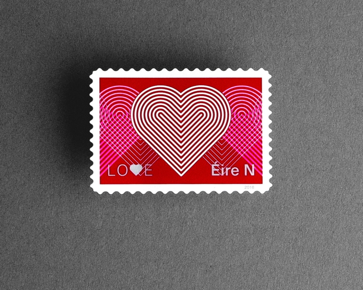
Next, Sarah Fox, Designer at Trainline, shares her love for the Love Stamp.
I love the Love Stamp.
Atelier was invited to design the An Post Love & Marriage stamp in 2016. It was the first stamp in this series following the landslide victory of the marriage referendum vote on March 22nd of the previous year.
Ireland historically had little separation of church and state, being heavily influenced by the Roman Catholic Church which resulted in very conservative social policies. Surprisingly to some, it became the first country to approve same-sex marriage by popular vote. This was a sea-change, to put it mildly, but indicative of a shift to a more socially liberal mindset, and a welcome acknowledgement that love and marriage were no longer limited to the formerly dominant religious definition but rather, big enough to embrace anyone and everyone. The Atelier Love and Marriage stamp feel like a perfect representation to me for this time in history. It is (in their own words) "unapologetically graphic” which I believe celebrates a modern Ireland honouring tradition in a contemporary way.
It is a departure from the Irish stamp design that I, in my limited layperson's knowledge, am most familiar with. I recall Celtic knots and Celtic typography, images depicting Irish heritage, artifacts, and wildlife. And Thin Lizzy of course. An Post, with help from designers like Conor Clarke (Design Factory), has been challenging this staid history for over a decade and this stamp is by no means the first departure (the Science Stamps by Detail DS for example are a gem). It stands out for me though, partly because of the balanced simplicity, and perhaps because of the time that I spent working in Atelier whose output is diverse, but who are probably best known for their distinctive book design. Their often large scale books are a testament to the studio's vast typographic prowess, their design that is a balance of rigour and flair, and their attentiveness to quality print finishes, so I love to see this conscientious craft applied to a mere 38 × 26mm bit of sticky paper. Metallic and fluo inks? Yes, please! What a delightful challenge.
____
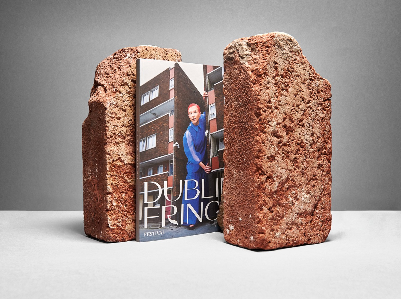
Third in line, Michael McDermott, Editor at Totally Dublin, shares his top pick.
I have a long-standing relationship with the Fringe Festival going back as far as 2002 when Vallejo Gantner was the director. I have hosted events as part of it, been a judge, and covered it extensively whilst publisher of Le Cool Dublin and in my current incarnation as editor of Totally Dublin. It is a staple in the calendar for emerging voices, risk-taking, and fresh perspectives. However, like all things which become too familiar to us, there is the danger of complacency, assumption and drift over time.
I am always on the look-out for the striking and daring aspect of design. Something which stands out and stands tall on its own merits. In this respect, Superweirdos by bigO (designed by Eleonora Bigi and photographed by Hazel Coonagh) truly stood tall and stood out. There is an eccentric, eye-catching, playfulness to the campaign which served as the perfect visual communication for the Festival. It King Konged the ‘Superweirdos’ against backdrops which shun overt familiarity but remain inherently of the city.
All great design needs to move the dial or, in my instance, reset an appreciation for a festival. All great design sparks attention and lingers long afterward. Superweirdos served as the perfect representation of a culture that embraces the brave and bold whilst refusing to be imprisoned by tiny people and their attendant mindsets. Being on the Fringe is about challenging conventions, accepted wisdom, and lazy logic. Indelible marks can be left by delicate footsteps too. This design left the most memorable of imprints in my mind.
____
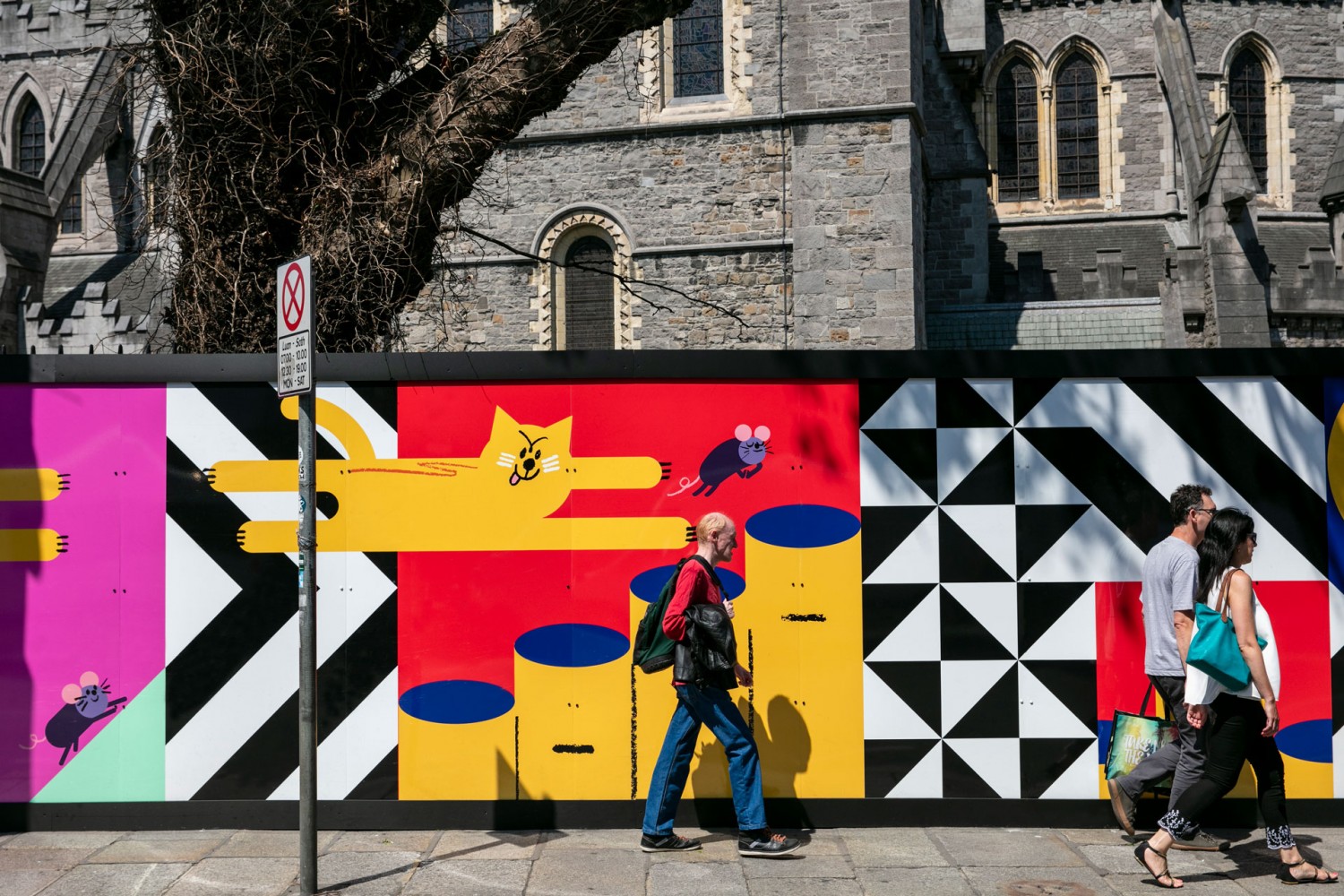
Taking us outdoors, Emma Conway, Dublin-based Designer, walks us through her favourite project.
This piece of design stood out to me as it successfully illuminated the space and illustrated the rich history found at the site at Christ Church Cathedral. For me, it was a burst of colour and joy every time I cycled by it on my way to work in the morning. It stopped me in my tracks and lured me in and I wanted to read and discover the history of the site more. Ruan Van Vliet's joyous and humorous illustrations helped to lift the dense information and Unthink's graphic shapes framed it all, transforming it into one successful piece of design.
The hoarding wrapped around the site while reconstruction was underway for a period of time, sections of it still remain but I will miss the vibrancy it gave the street and would love to see more as it dotted around Dublin city at our important historic sites, helping to draw our attention back to the places and spaces that we pass by every day.
____
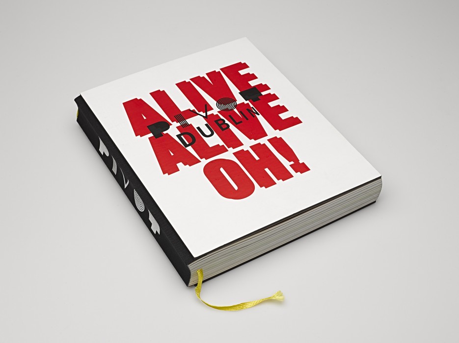
Up next, Noelle Cooper, co-director of Unthink Design Studio and current 100 Archive panelist.
Turning Dublin inside out – Pivot Dublin was just that! Not only a 416-page book, but it is also an invaluable compendium representing the culmination of extensive work by a multitude of contributors from the Dublin design community. It had the ambitious mission to capture Dublin design and present it as a contender for World Design Capital and it helped push an agenda for transformational change through a series of activities and stimulating conversations all organically woven throughout one vast beautifully designed book.
While it was unsuccessful in its bid for the designation, it served its purpose in consolidating the wider design community, provoking dialogue, and becoming an important catalyst for change in the city. It built an awareness that allowed us to rethink how our city works, lives, speaks, and presents itself to the rest of the world. It gave Dublin the opportunity to enhance its reputation as a city rich in design resources across all disciplines from architecture, product, fashion, and graphic design to animation, film, gaming, and interaction design.
Pivot Dublin was a vision for the future of Irish design and undoubtedly laid the groundwork for ID2015 pushing the agenda that enabled the year of design that followed. Pivot Dublin set out to spark a city-wide conversation – giving the people the platform and opportunity to not only recognise but to actively reshape their city through design. Red & Grey's book was the embodiment of that ethos.
____
To get things moving, Jack Collins, Senior Designer at Pentagram New York, shares his love for animation.
As I’m sure many reading this can personally attest – explaining design to a non-designer can sometimes be a challenging ask. I think that’s why the Shape animation has always stood out in my mind as a great reference point for the possibilities of what design can do and the role design has in our everyday lives.
The project, created as part of an initiative to promote a broader understanding of design and its use (specifically amongst young people), resonates first and foremost as a top-notch piece of animation. Its eye-catching visual language of line and form moves across a spectrum of subject matter and scenarios with subdued grace and character. Beyond this, one of the narrative aspects that strikes me most is the successful juxtaposition of the micro and macro throughout the piece. Its 6-minute story neatly transitions between the design of something as (seemingly) simple as a desk chair to the layout of an entire city – bringing a significant degree of charm and whimsy to both. In this journey, it astutely captures so much of the joy of the design process itself – bringing order to chaos, systematic thinking to the unstructured and beauty to the mundane.
Seeing a mess of papers neatly catalogued into a to-do list obviously scratches some kind of Kondo-esque itch we can all recognize. However, the underlying power in the piece is the way it suggests the social and civic responsibility that rests with designers. Seeing a city block transform from the concrete jungle to tree-lined, cycle-friendly parkway communicates how far-reaching the consequences of good (and bad) design can be. It illuminates the role of the designer to push for better intentions, smarter choices, and long term change. On the launch page for the animation, it notes “After exploring several ideas the team did the only sensible thing and decided not to focus on design at all.” This is the real genius of the piece. By showing us the flawed, everyday world we are all intimately familiar with it helps us imagine with ease how that world can be better – and that’s the purest intention of design in a nutshell.
____
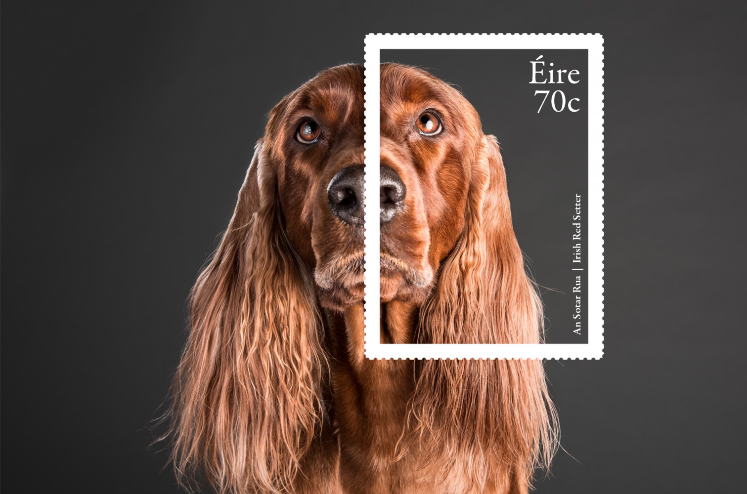
Finally, to bring us to a close, we hear from Barney Whelan, former Director of Communications and Corporate Affairs at An Post and former 100 Archive panelist.
The design and production of postage stamps takes a long time! It was an enjoyable part of my brief when I worked at An Post…diverse, creative solutions, elegance, work-a-day and risky because of “the mistake”…collectors love them, the media love them; we had one close call during my tenure.
The chosen themes must be submitted to Government for approval. The eventual design is also approved by Cabinet, receiving an undue amount of attention in my view! Every year An Post produces about 40 commemorative stamps.
Stamp design remains complex. Apart from the diversity of themes to be interpreted the very things that make it a stamp constrain the designer…the perforations, the country name, the denomination, the year of publication, the title, the need for two languages, and of course the size. Design elements can be expanded on within the suite of add-ons which issue for sale to Collectors.
I chose this set because I am interested in how animals have been depicted over the centuries and how important biological art has been in knowledge transfer. How else would Darwin have known what an American finch looked like without access to the detailed drawings of travellers who subsequently published their works. Of course, this has all been overtaken by photography and video; generations have been introduced to nature through these media. So the brief here was NOT to show the whole animal but to capture an element of expression, as well as illustrating some of the breed characteristics. The really hard part was choosing which images to select along with the orientation of the dogs for presentation as a set. Detail.design did such a wonderful job, the shots are almost anthropomorphic!!!
____
Browse 10 years of Irish visual communication design here.