Design, music and culture have always been inextricably linked. The growing dance culture in Ireland in the late 1980s and early '90s gave many young designers the opportunity to create work in areas of direct interest to them, producing posters, flyers and independent magazines displaying high standards of design and illustration and existing solely to serve a niche within the underground music scene. CODE was one such publication.
Started in 1993 by David Smith, Johnny Moy and David O'Sullivan, the magazine set out 'to produce an independent magazine that reflected the lifestyle and interests of those active in the budding Dublin club scene' which, at the time, was given little or no regard in the mainstream music press.
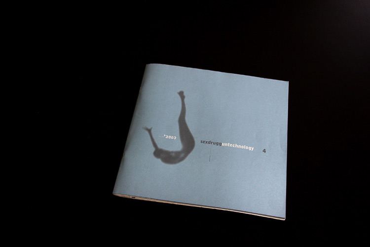
Later, Ian Sen joined the magazine as editor and, after David Smith left, Sen brought Peter Maybury in as creative director. The editorial remit of the magazine broadened to include art, fashion and technology. Their work together on CODE 3 and 4 was widely noted and praised by the international design press at the time.
With a resurgence in the growth of independent magazines of late, I was reminded of CODE and got in touch with Peter Maybury to ask him about his work on the now iconic and influential CODE issues and the impact the magazine had on his future work.
So Peter, how did you get involved in CODE?
Ian Sen, the editor, asked me, simply. I had been designing (and, in some cases actually hand-making) all the promo material for [Rí-Rá] - posters, adverts, flyers (including a hand-made series). Also, the work I was doing with the Douglas Hyde Gallery at that time was pretty exciting, so I guess I was on his radar. There were two issues before I got involved - a pilot, 7” square format, and a 10” magazine, both designed by David Smith. But, to be honest, I wasn’t really too aware of CODE before I met Ian.
Was it a collaborative or commissioned work?
Collaborative. Just for the love of it and the thrill of it.
Do you think that great magazines are evidence of great collaboration between editor and art director?
Sure, maybe, although my principle reference points for this would be i-D and Emigré, although, in both instances, the editor was the designer: Terry Jones at i-D, Rudy VanderLans at Emigré. I think what’s critical to any successful project is clarity of vision, and the integration of the form, or visual language, with the subject matter. I think the energy that was emitted from both i-D and Emigré at their respective peaks was phenomenal. It’s still in there - open up an old copy and you’ll be amazed!
In a contemporary context, I think San Rocco magazine is pretty interesting. I have just published a Gall piece in the issue ‘What’s Wrong With The Primitive Hut?’ with Tom dePaor, which considers the contested ground of the unauthorised development at Slievemore, Dooagh, Keel East, Co. Mayo, and the film we made relating to it. San Rocco published a five-year plan in advance; I like this kind of clarity and directness.
When you came on board, did you have a clear editorial/design direction for the magazine?
Ian wrote or commissioned the articles. My contribution here was more about what was out than what was in - except for that fucking four-page aliens item which I couldn’t make Ian budge on (!). It’s still a blot on the magazine. With the given material, I did extensive work on its development in a visual and conceptual sense in terms of how the material was communicated.
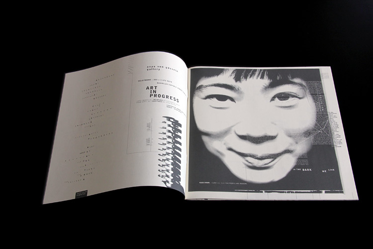
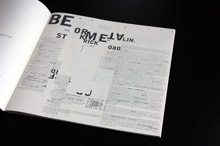
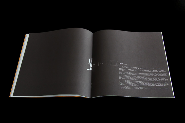
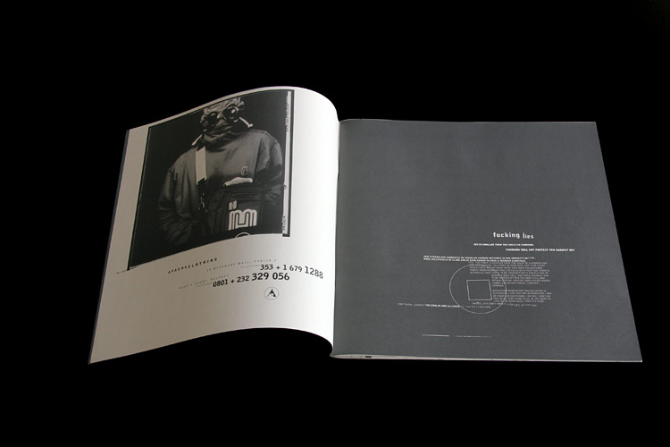
The making of CODE was driven by passion and curiosity. I was metaphorically and literally zooming in on the material and working on it in enormous detail, trying to see more and extract more from the text. Text blocks and paragraphs were atomised for their component words, characters and spaces, in search of integrated form and meaning. I was working in a sea of seven-point type. I think this may have come in part from my experience working with letterpress when I studied at London's Central St Martins. Just as when working with moveable type you pick each letter from the cases, I committed to the idea of using individual character forms - in an expressive way and to achieve dynamism through this rather than conventional typographic hierarchies.
Another aspect is to do with the technology. At the time it was just the conditions, but this magazine was all made on a not-very-powerful machine, with ludicrous storage options - 40MB Syquest disks. Working with lots of large images wasn’t practical, hence I often worked with image fragments and built these into forms integrated with the type.
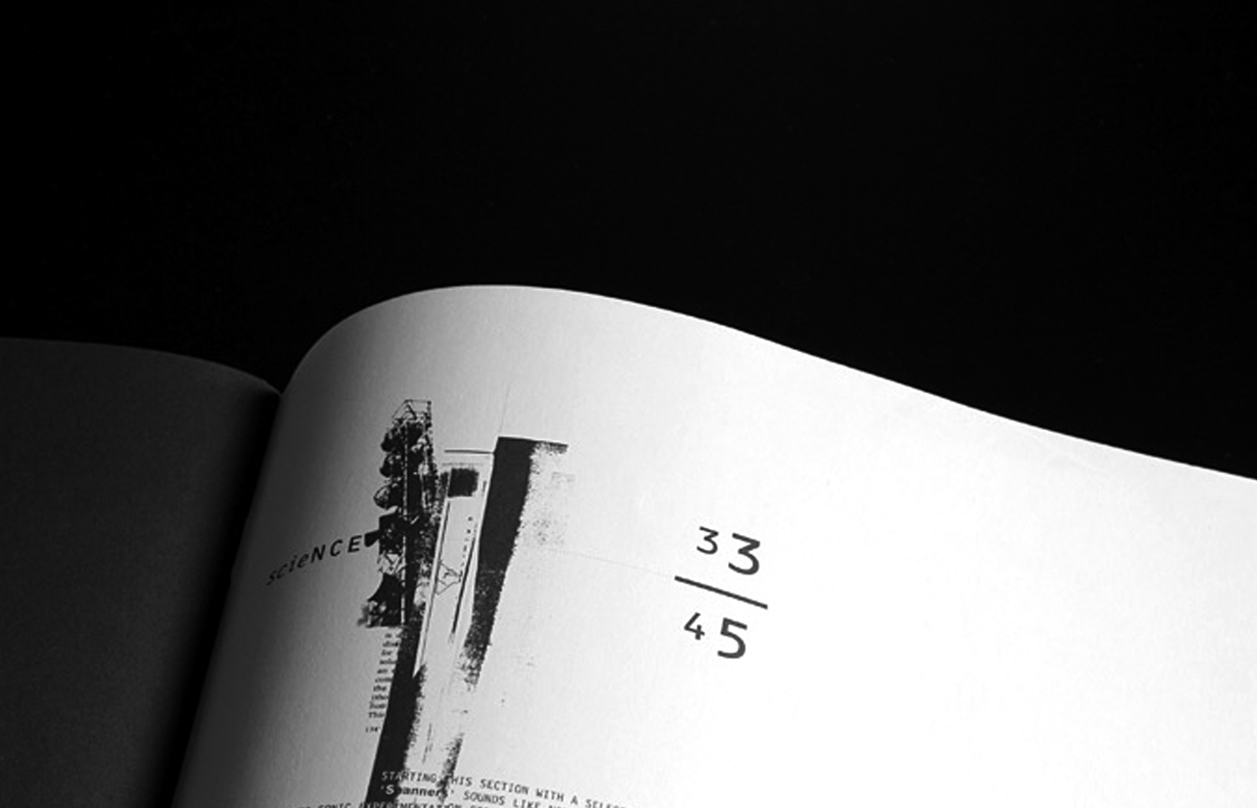
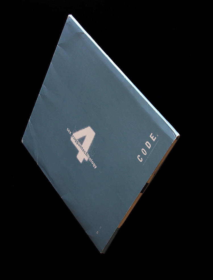
We used one-colour printing as an aesthetic since there wasn’t sufficient money for colour. We worked with what was available and I lucked out with a cheap batch of Huntsman Ivory paper for CODE4 that the printer had to hand, which did a beautiful thing when mixed with the Pantone grey I had specified throughout, giving a complexity similar to duotone to the tonal areas of the photo material.
CODE seems to have informed a template for a new way of working - collaborating with people and areas of personal and cultural interest. Did it inform the way you work now in any way? Has it impacted on your work since CODE?
Graphic design is collaborative by nature. For me it’s an exchange between the commissioner and the designer, so I would regard everything I do in a design context as collaborative. Personally, I’m primarily interested in the subject and material, and giving form to it. Formal concerns are important to me, but only as a means of conveyance.
It’s true that I’ve always worked in areas that are of specific interest to me, most notably working with artists, curators and architects, although I’ve also worked with doctors, solicitors, hairdressers, accountants and mechanics. I’ve been lucky enough to work directly with many artists for a sustained period, particularly with Sarah Browne, Gerard Byrne, Dennis McNulty and Garrett Phelan. This has led to working in a manner outside of the conventional graphic design role, although not quite editorial either. It often means working in a very time-consuming but rewarding way, where we make passes or drafts as a way of exploring the material, and this frequently results in the making of new material specifically for a publication. The development of the form and language of the book becomes activated and integral to its content.
By now, my practice has extended to include music and sound works; editorial, authoring and book production; film-works; curations; sculptural work, and installation considerations, alongside my graphic design work. What I’ve noticed in all of this is that a more or less consistent thinking runs through this. There is considerable 'spill' from one discipline or area to another and the description is increasingly relevant or critical, as I tend to operate at the interstices of several disciplines.
Pursuing personal projects is something I have always done. For example, I have released several solo albums but music collaborations tend to be duos - I’m one half of Thread Pulls, playing drums and synthesisers, with Gavin Duffy, who sings and plays bass and trumpet; and the other half of Rainfear, a duo with David Donohoe, making improvised/spontaneous composition with drums and synthesisers.
Gall, my ongoing practice with Tom dePaor, continues to amass a considerable body of work including sculpture, curation, installation, film and writing. It pivots around the meeting of our combined disciplines and our compulsive fascination for and inquisitiveness about how things are made, structured, spoken of, presented and understood, and how this might accumulate in the poetic. Out of our co-curation of the 2010 Irish Pavilion at the Venice architecture biennale, Gall made the book ‘Of', which is, in essence a metabook. It is a fictionalisation of the making of an exhibition, and a fictionalisation of the making of the book itself. The writing, editing and making of the book were an integrated collaborative process. As co-authors we made a conscious decision early on to make the writing visual, to regard the writing of the text as part of the making of a book object. The authorship of design was not regarded. Instead of writing in isolation, and later considering its visual form, the visual presentation was developed in conjunction with the writing, and images were considered as part of this process. Image and text are given equal weighting.
Was there a long-term plan or a direction (commercially speaking) for the magazine and why did it end after issue four?
Well, there were some brilliant strategies, including how groups of people would move around the clubs selling copies of CODE from their backpacks. It also travelled quite a bit and was picked up by the British press in i-D, THE FACE and Blueprint magazines, as well as Emigré in the United States.
After CODE4, there was one CODE special issue, a roughly seven-inch-square fold-out called Enhance 57:19 (a reference to Bladerunner), which featured work and interviews with Owen Gaster, Tristan Webber and Hussein Chalayan.
I can clearly remember Ian sitting in my office the day we received CODE4 back from the printers, with a fresh copy carefully laid out flat on his knees, saying 'we’re going to do serious damage with this'…