Dialogues is a series of articles capturing opinions, conversations and discourse relating to design theory & practice. In the first edition of this new series, Garech Stone looks for the humour in Irish design and comes up short. In response, Paul Woods suggests this isn't a uniquely Irish problem, and that as designers move into the digital space, personality is being left behind too.
The comments section is open...
____
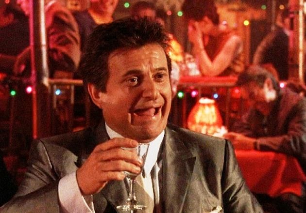
Along with the colour green and the black stuff, the Irish are renowned for their sense of humour. It’s a national stereotype that is actually true. Most Irish people are equipped with quick wit, subversive cheek and a healthy dose of irreverence; and this humour works well on the international stage. Irish comedians dominate British TV, and its diplomats, business leaders, scientists, sports stars, actors and authors are generally engaging, witty – and humorous. Think of airline bosses Alan Joyce and Michael O’Leary (OK, not him), Stripe’s Collison brothers and EU bigwig Mairead McGuinness. Humour powers their brilliant intellects and oils the wheels of business.
But when I look at contemporary Irish graphic design, where are these characteristics? Where is the famed charm and, above all, wit in the 100 Archive? Irish practitioners are, for the most part, humorous but their work is as straight as a Swiss grid. Apart from the beanies, tweed jackets and tote bags, there is not much to laugh about in Irish design. Is there a deficit in humour in Irish design? Are Irish designers too tightly-kerned and justified?
But who’s to say what’s funny and what isn’t? A snappy one liner, the use of irony or a glyph variation on “The quick brown fox jumps over the lazy dog” story can easily divide opinions in the humour stakes. There are countless types of humour, some of which are appreciated more than others, and rarely do we question why a particular joke is funny. To croak Mark Twain: “Humour is like a frog; if you dissect it, it dies”.
Admittedly, employing humour in design is difficult. The rules that govern verbal language do not translate precisely into visual language. Stand-up comedians, for instance, have a larger palette. Comic timing, precision, rhythm, verbal acrobats and body language are not available as Photoshop plug-ins. A graphic designers’ stage is simply a piece of paper or a screen.
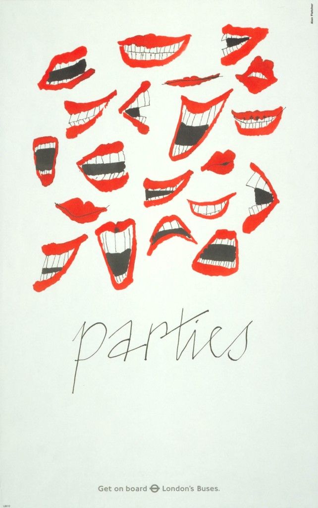
Just to be clear, humour is not belly laughs, nor Comic Sans. Humour in design is intellectual playfulness. Graphic wit. At best, humorous design will bring a smile or cause a double-take. Humour can function to sell a message, but is often subtle or satirical, not side-splittingly funny. By eliciting an emotional reaction, humour is a mnemonic. It can help us to recollect and make messages memorable. Paul Rand, in his book ‘A Designer’s Art’, says visual puns are the keys to some of his most successful designs, since “they amuse as they inform.” Indeed, the goal of graphic wit is to make connections or subvert conventions, and thereby make an idea stick in our mind. Or ‘A Smile in the Mind’, as delightfully described by David Stuart in his seminal book.
Of course, designers are not artists. They’re creative industry mercenaries tasked with top-secret commissions that forbid individual expression (unlike self-initiated projects). Clients demand objectivity, not a free-spirit intervening with a personal or humorous design approach. I get that.
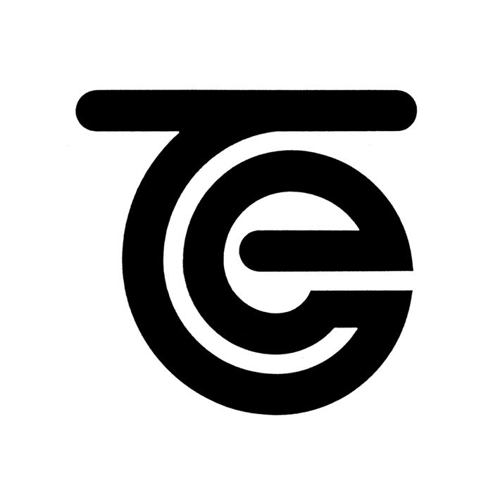
Nevertheless, I still see missed opportunities when I browse the 100 Archive, and pine for the sensibility of bygone times. I miss the comedic artwork and monkish jokes of the Book of Kells, and the witty Modernism of Kilkenny Design Workshops (KDW), as exemplified by Peter Dabinett’s Telecom Éireann logo.
Likewise, the A1 portfolio cases of the 20th Century’s most influential designers are bursting with graphic wit. Alan Fletcher, Paul Rand, Bob Gill, Robert Brownjohn, amongst others, knew a thing or two about humour in design. A more cerebral or subtle humour is even found in the work of Dutch design legend ‘Ootje’ Oxenaar (e.g. just run your nail on the matrix of the 50 Guilder ‘Sunflower’ Banknote and you’ll hear the sound of a bee). Nowadays, humour plays a key role in projects by luminaries Stefan Sagmeister, Anthony Burrill and Richard Turley, whose large-scale commissions are combined with small-scale projects that offer greater scope for personal expression.
If you share Tibor Kalman’s view that graphic design is “a means, not an end. A language, not content.”, then surely Ireland’s graphic designers can be as anarchic, satirical, and funny as its writers? Where is the design equivalent of Dave Chambers, Graham Linehan or his writing partner Arthur Mathews (who pertinently, perhaps, graduated as a graphic designer)? Where are the skillful visual puns that cut through solemn issues? Or the emotionally led design that can make an arts and culture festival something more than design masturbation? Perhaps some Irish designers are gridlocked on the International Style? And become stuck in the cold rational principles of Modernism, where clarity and order suffocate graphic wit, idiosyncrasy, and Grotesk humour.
Whilst the projects on 100 Archive are undeniably accomplished, there is, as mentioned, not much humour and, in fact, nothing specifically Irish about a lot of them. One can question if contemporary Irish graphic design, like much of the rest of the world, is obsessed with style? An infinite scroll of an increasingly purified, uniform, homogeneous design aesthetic. Where vanilla is the new black, and Lorem Ipsum is everyone’s best friend. Insta design for insta likes.
But, this is no laughing matter. Imagine if Irish design looked inward? Beyond the Adobe templates, the geometric abstractions, the analogous colour palettes, the quirky serify-sans typefaces and all the branding and marketing gobbledygook? Imagine if it focussed more on engaging ideas and the witty, informal communication style that its people are famous for? Imagine if Ireland’s famed humour was reflected in its graphic design? The visual manifestation of that would be a specifically Irish form of design. A national design identity with a unique spirit and attitude, underscored in Extra Bold Italic. It would not only be authentic, but more resonant, compelling and purposeful.
____
Garech Stone is literally one half of The Stone Twins, an Amsterdam-based creative brand consultancy. Together with twin brother Declan, the firm specialises in brand identity including naming and verbal identity, concept development and communications. The duo are also authors of the critically acclaimed book ‘Logo R.I.P.’ and former Department Heads at Design Academy Eindhoven. The work of The Stone Twins has won numerous international awards and been exhibited in the Stedelijk Museum and the Cooper Hewitt Museum, amongst others.
Read Paul Woods' response "On 'Design & Humour'"