While the majority of Irish designers are urban-based, both in Ireland and abroad, there are many more setting up shop in rural areas. Last summer the 100 Archive published ‘Beyond the Pale,’ a series of interviews with designers and studios based in a variety of locations around Ireland. But what about up-and-coming designers? Can you live in the idyllic countryside of Mayo while also becoming established in the world of design?
We chatted with Laurie Concannon, who having completed her degree in graphic design at the Dublin Institute of Design, moved back home to Claremorris, Co. Mayo to pursue a career in design. “While I really enjoyed living in Dublin during college, I love being back home. I’m a bit of a home-bird and while I love travelling and experiencing different countries and cultures, I could never see myself settling down too far from my home and family.” Laurie spent four years studying interior architecture in IT Sligo before deciding to switch the focus of her studies to graphic design. “No matter what area of design you have studied, there is a lot of knowledge that is applicable across the board. In each design profession the bones of what you learn are the same. It’s the application of that knowledge that’s varies. I always wanted to have a career as a designer, something creative and varied day-to-day. Graphic design definitely fulfills that. As a graphic designer there is a lot of scope to change focus and experiment. I really enjoy that aspect of it.” You will currently find Laurie working as a senior graphic designer at All In Design & Print, located in Castlebar, Co. Mayo. “Working at All In Design is great. Owners Orla Cunningham and Ronan O’Grady are very talented and knowledgeable in what they do – a total pleasure to work for and with!”
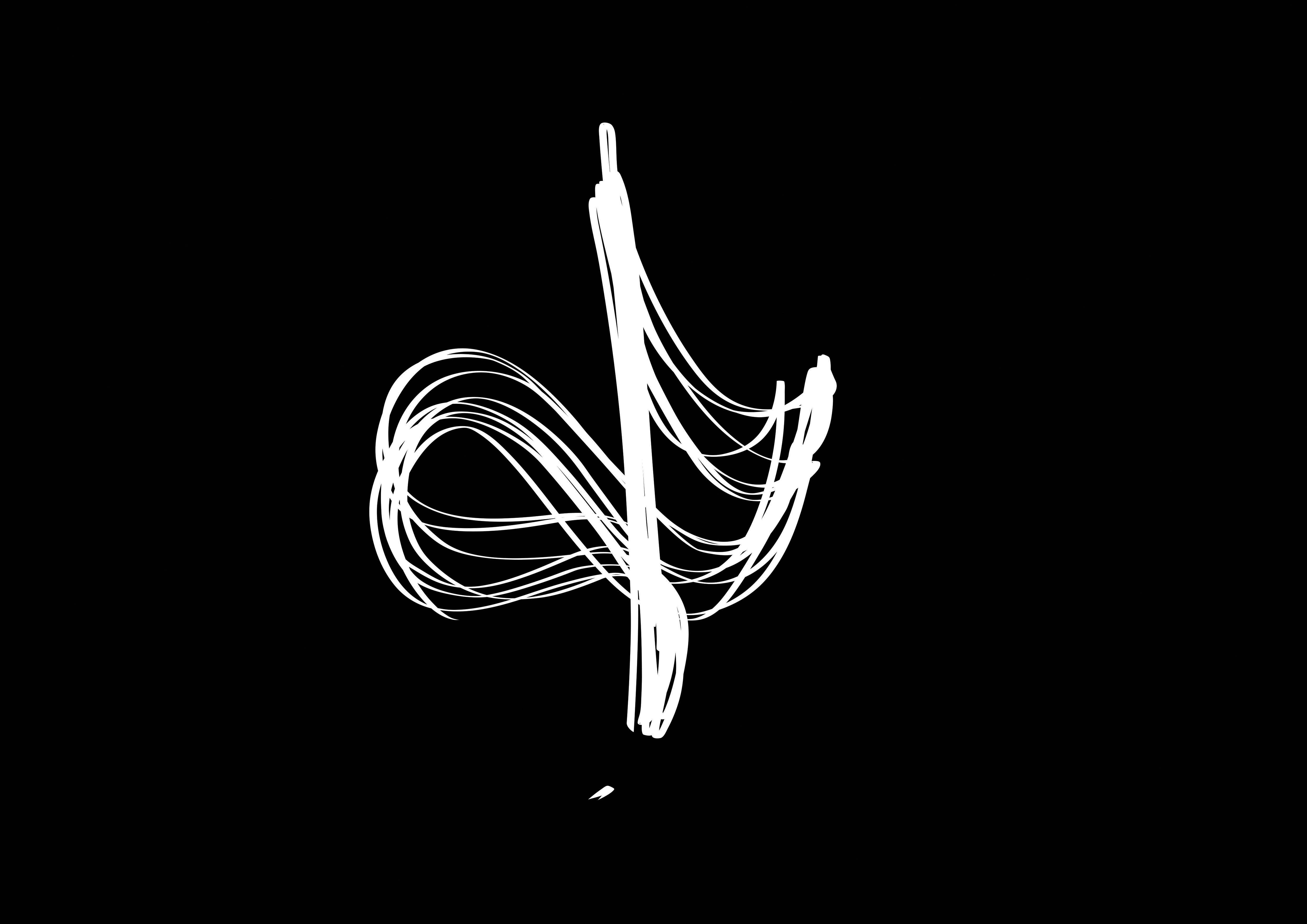
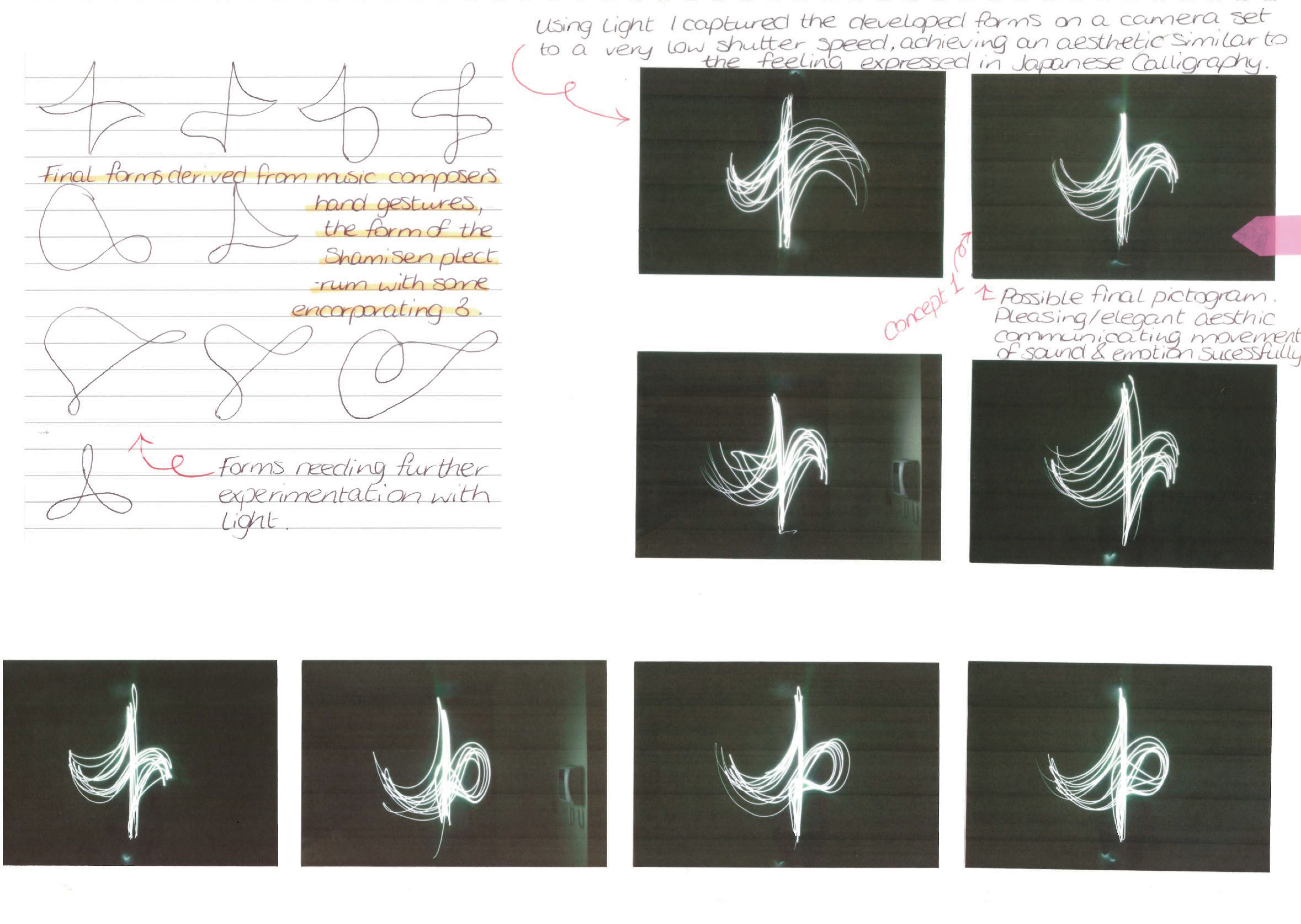
During her final year in DID Laurie and her fellow design students were encouraged to select their own project briefs. “The idea was to reflect on our personal portfolios and expand on areas that weren’t heavily covered in our responses to the briefs. I came across the Yamaha Graphic Design Award brief and thought it sounded really interesting.” Yamaha’s primary design philosophy is ‘Kando,’ which means “for the heart to be deeply moved.” As part of the brief designers were requested to submit marks, symbols and pictograms that would express this ideology and ethos. “I did a lot of research into the core philosophy of the Yamaha brand and what they stand for. My approach grew from that. I created the mark using light, reflecting the fast, fluid movement of a motorbike rider at night. These photographic experiments also aimed to replicate the gestures of an orchestral composer, capturing the emotive qualities of music. There is a parallel in the emotions experienced by musicians and the emotions experienced by motorbike enthusiasts, when engaged in their respective passions. The mark is influenced by music’s universal ability to break down language barriers. The continuous line refers to infinity, unity and harmony evoking Yamahas pursuit of ‘Kando’ and the universal connection of people. The organic nature of the mark is intended to be aesthetically pleasing and comforting, while also evoking a feeling of spontaneity and excitement.” 1,100 designs were submitted from 69 countries worldwide. Out of those 15 were selected for final review by a panel of judges that included Neville Brody and the Yamaha Design Section panel members. “The brief was open internationally so I knew when I was entering that it would receive a huge worldwide response. I couldn’t believe it when I got the email that my entry had been shortlisted and even more so when the video was launched announcing my design as the official Grand Prize winner.”
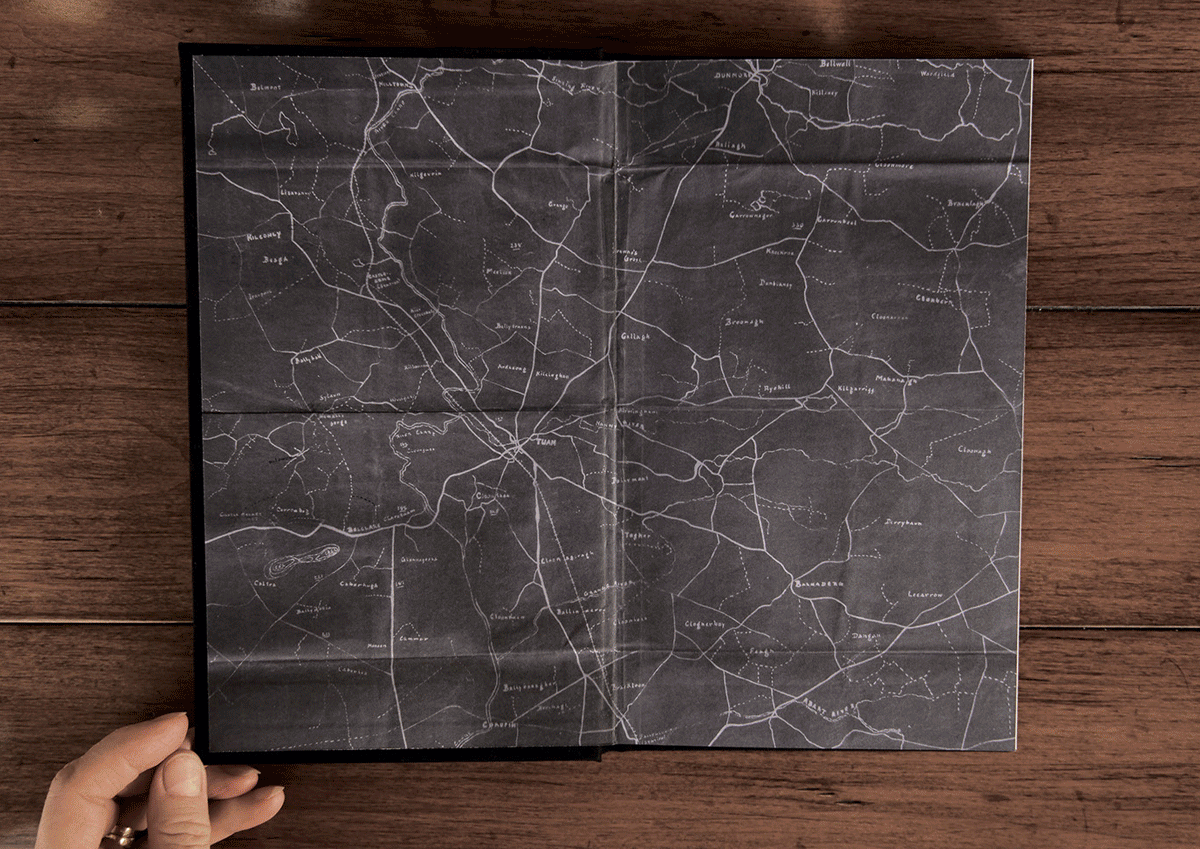
Laurie took a particularly personal approach to the 2015 ISTD brief. ISTD requested a typographic submission that would best represent the theme of ‘Milestones.’ She designed and created a book called ‘British-born Subject,’ an insight into the life of her great grandfather and the small part he played in the Irish War of Independence. “My intention was to pay tribute to the life of my great grandfather, but also the thousands of others who took part in the war.” The book features laser-cut typography interacting with scans of historic etchings and hand-drawn imagery. The endpapers of the book were created using a hand-drawn map created by her great grandfather. With the lead-up to the 1916 centenary just around the corner, Laurie felt it was a particularly fitting subject for the theme of the brief – a monumental milestone in Irish history.
Laurie likes to keep her creative process simple and logical. She focuses on the particular needs of her clients and researches accordingly. “I think when you first start designing outside of the classroom, there is a realization that you are working with real life clients, who have real expectations that you need to fulfill. The creative process is something that changes from project to project. It really depends on the scope and size of the particular project and what the client is looking to achieve. The solution needs to derive from the research and make sense to the client.” Previously Laurie had the opportunity to work closely with printers, press operators and artworkers who work with an array of high-spec printing presses. “In college I was really interested in lithographic print. So, to get the opportunity to work so closely with such experienced and knowledgeable printers was great. It really satisfied my curiosity in that area!”
Like so many emerging graphic designers Laurie has been really inspired by some of the work people have created in relation to current social issues. “I think that art and design are the perfect medium to communicate a silent yet powerful message - especially now, in the time of viral uploads and social media. In my final year at DID I had the extreme pleasure of interviewing the artist Joe Caslin about his project: ‘Our Nations Sons’.” In the run-up to the 2015 marriage equality referendum Joe Caslin created a number of large-scale public art pieces that became some of the most recognizable and controversial images of the campaign. The project focused primarily on the themes of depression, neglect, apathy, anger and emigration, and how these issues affect young men. Printed on biodegradable paper and installed using adhesive made from potato starch, his large temporary artwork featured on many buildings around the country including Trinity College, Cork City Hall and a 15th Century castle in Galway. “I think what he achieved with his murals for the marriage referendum is a perfect example of something silent having a very powerful impact.” Other design influences for Laurie include: Steve Simpson, Jessica Hische, Sagmeister & Walsh, Dana Tanamichi, Brown Bag Films, I love dust, Annie Atkins, Boys & Girls, Pentagram, Steve Doogan...to name just a few. “I could go on and on, the list is really endless!” Every year she makes sure to attend Offset, Dublin’s annual design conference. “Each speaker and presentation bring a fresh, new and exciting contribution to the design industry. It is always unique and inspiring.”
Now that she is based back in Mayo, we asked Laurie if there is anything that she misses about living/working in Dublin? “There are so many talented craftsmen and women just a stone’s throw away! So many people that are willing to get involved in a project and offer their experience when needed. There’s a great buzz about design. At one point during my final year I was re-drafting a book that I had designed for an earlier project. I had my heart set on having laser-cut excerpts running throughout the leaves of the book. By sheer luck and persistence, I finally got in contact with a lovely gentleman called Phillip from the Laser Company who was more than happy to give me his advice and assistance in getting the finish I was after.” Laurie says that there is a strong community of very talented designers in Mayo, some of whom she has had the pleasure to work with since moving back. Quite often when she is looking for advice or guidance on a piece of design that she is currently working on, she will reach out to her college classmates. “We were a really close bunch when we were studying and have kept in touch ever since – offering alternative points of view and words of wisdom whenever any of us need it.”
For the time being Laurie is content to pursue her love of graphic design in beautiful Mayo. “I’m still learning - and I love that! If I’m not either learning or progressing I feel as though I’m going backwards. I think there’s something new to learn from every project. One crucial thing I have learnt is that clarity is key in client communication. It lays down the framework for a clear and concise brief which enables the designer to meet their client’s expectations and translate them into reality. Art and design are constantly evolving and I think that in itself is very exciting.”