It’s the penultimate inspiration chain, where designers pick their peer par excellence! And then that designer picks someone. And so on. You get the idea, right?
Gianni Clifford chose Karl Toomey / Synth Eastwood Logo
Synth Eastwood are a group of pals from Ireland with backgrounds in design, music, technology and production. They are group of lads who deal in cans and not cannots. Since forming in 2007, the lads have brought much joy to Dublin (and further afield) in the form of group submission shows and other interactive projects. If there is something you’d like to see happen (which is currently not happening) in your city the best thing to do is organise it yourself, and this is exactly what Synth Eastwood have done. Providing a source of inspiration for young and seasoned creatives alike.
It is hard to pick one of the lads above the others to credit as a single source of inspiration because Synth Eastwood, like a table, only stands strong with all its legs functioning. But with that in mind, Karl Toomey is the man behind the logo or face of Synth Eastwood if you will. The sticker-like logo is brought together with a combination of typefaces and the delightful little face made from the ‘O’s’ in ‘Wood’ perfectly symbolizing the coming together of uniquely different creatives behind one name or face.
I eagerly look forward to seeing what is next for Synth Eastwood.
![]()
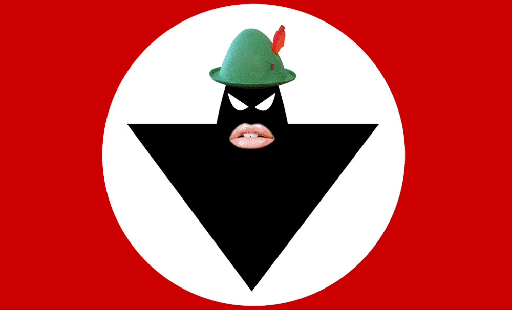
Karl Toomey chose Warolords of Pez / Warlords Logo
I remember seeing the Pez logo for the first time out in Dun Laoghaire college (probably around 2001). It’s a pretty intimidating logo really. A black hooded silhouette that stares right at you. Not to mention the graphic red, black and white colour scheme so reminiscent of another menacing identity.
What I love most about the Pez logo is that its total seriousness is always offset by brilliantly funny copy and imagery. The logo might look unexpressive and corporate, but the way in which it is used is anything but. I’ve seen that logo rendered on everything from fake boobs and holy bread to car bonnets and mass missalettes.
Warlords of Pez must have a very thorough set of brand guidelines.
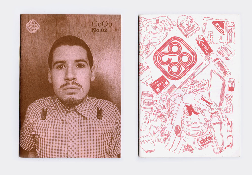
Warlords of Pez chose CoOp Magazine / Johnny Kelly, Micky Kelly, Scott Burnett + cast of thousands
At the time CO-OP came out, we noticed and loved that there was a sea change in the D.I.Y attitude in Dublin (at first), that had its roots in design. It seemed that bands who were self releasing on small budgets were thinking more creatively about design, packaging and making use of interesting printing techniques.
Lots of our favorite bands at this time were making various types of instrumental music, so often visual representations from packaging to music videos to live visuals became even important to them. CO-OP was kind of like a band too. It had that buoyant, friendly, let’s create, collaborate, and put it out there. Instead of music it reflected that burgeoning D.I.Y attitude within the design & illustration sphere. It had the punk heart of a zine but also had production value – and a rocking logo / masthead.
It flew the COOP(!) after a few issues but it remains a great snapshot, and we bet our mint copy of CO-OP’s debut will be worth zillions in years to come.
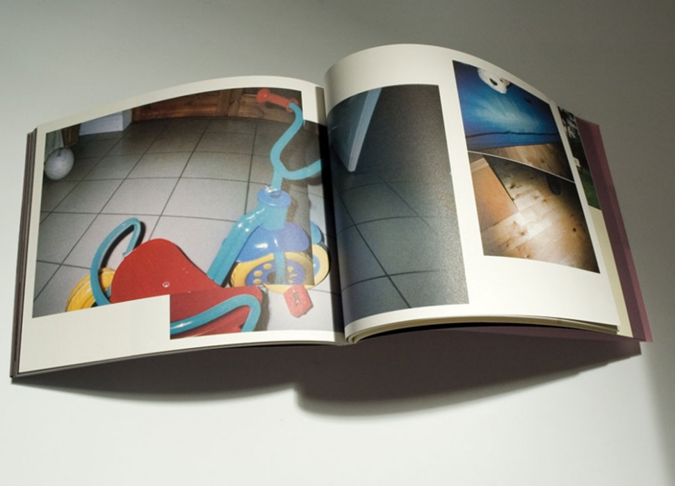
For CoOp, Scott Burnett chose David Joyce / McNaughtons, Designers Choice brochure
Myself and Johnny worked together in Image Now at the time of this project, David asked a bunch of studios around Dublin to get involved, gave them all a disposal camera and told them to do whatever they wanted and it’d be turned into the brochure. McNaughtons had a similar approach to GF Smith in the UK — Focus on designers, but rather than the cool foil block helvetica-ness approach this was inspiring because designers felt part of something, and for it to be about our own voices. That attitude and approach was absolutely an inspiration for what we wanted to do with CoOp, build a little platform for our talented friends to shout from.
David Joyce chose Aiden Grennelle
Aiden is a kindred spirit and I’m inspired by his generosity and willingness to collaborate. This is a piece he made recently for an exhibition we were involved in, In the Light of. In The Light Of is an exhibition of works for screen by four graphic designers, in response to a new publication of the same name, by Ciaran Carson.
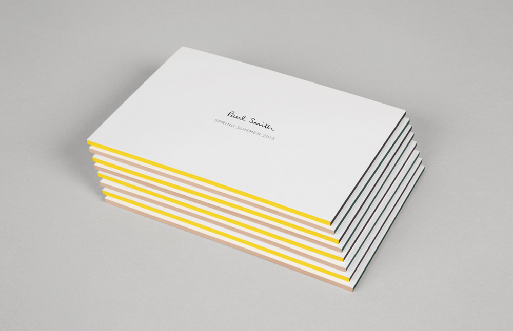
Aiden Grennelle chose Alan Aboud / Paul Smith Identity
For their immaculate identity work for Paul Smith, from the very start to the present…for creating a body of work for fashion supremo Paul Smith that is both “of its time” and “timeless”.