We’d like to thank team offset for having us as guest contributors last week. It’s not goodbye, though, just see you later as we’ll be launching our new site over OFFSET weekend – which we’re very excited about.
Also we’ve had great fun putting together these inspiration chains and one thing has become very clear; there’s LOADS of inspiring designers and work out there that we’d love to know about for possible inclusion in the archive. So we’d love to hear from ALL of you with your ideas for what you think should go in there. Tweet us your ideas @100archive or email us at onehundredarchive@gmail.com
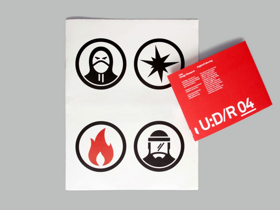
Kathi Burke chose Stephen McCarthy / Icon Newspaper
I’d have to say Stephen McCarthy, and his icons – specifically the Newspaper piece where he translated an entire newspaper into pictograms. Definite inspiration, as I love having a huge concept to start from.
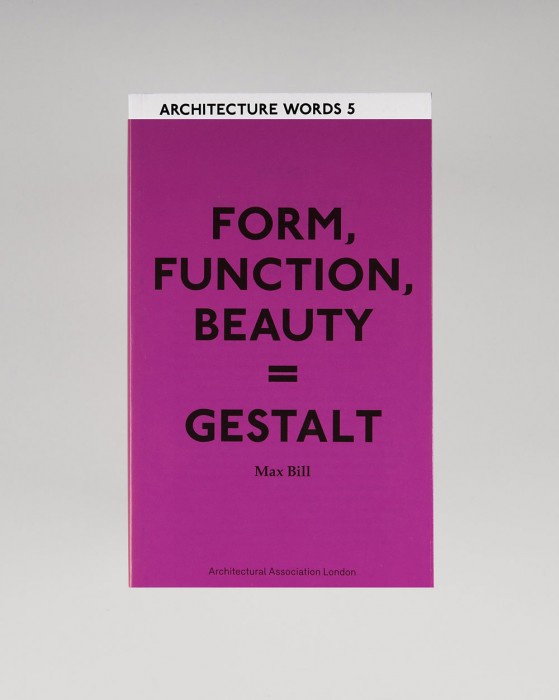
Stephen McCarthy chose Wayne Daly / Architecture Words Books
I admire the work Wayne Daly and his team are creating for the Architectural Association. The output from the graphic design department is consistently strong in that effortless default style they have made their own. I particularly love the series of books titled Architecture Words. There are currently 12 in the series – each one a lovely little morsel.
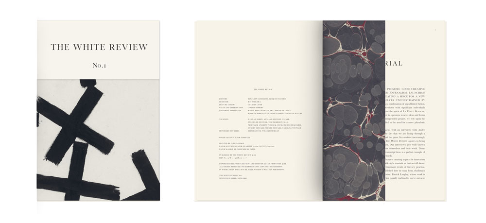
Wayne Daly chose Ray O’Meara / The White Review
Ray’s practice is one of sobriety. The work is unindulgent, precise and elegant. And he has one of the best eyes for how to work with images that I currently know of.
Ray O’Meara chose Jonathan Legge / RCA degree show
The playful nature of Johnathan’s work (particularly his RCA graduate show) is wonderful.
Jonathan Legge chose The Stone Twins / Logo R.I.P.
Inspired that there was Irish designers out there working at an international level doing intelligent work.
![]()
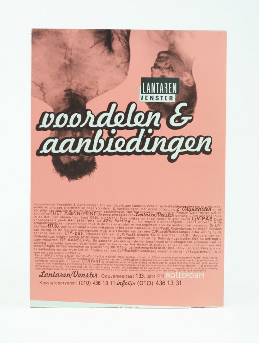
The Stone Twins chose Ciaran O’Gaora / Lantaren Venster Identity
Way back in 1993/94, Ciarán worked at Proforma in Rotterdam. Amongst much outstanding work, we really admired the visual identity and promotional items he created for the Lantaren Venster, an art house cinema in Rotterdam. The experimentation and playfulness in the graphic design was a joy to behold, and something that immediately demystified a design culture, and opened a world of possibilities.
Ciarán OGaora chose David Bothwell / RCA prospectus
The person who I found most inspiring was an NCAD graduate from a few years before me called David Bothwell – he went to the RCA after NCAD and ended up working on the design of their prospectus in the late-eighties. (I was introduced to his work by my tutor Frank Bissette). His work has a range of influences from the textured illustration of Russell Mills to the letter spacing exercises and typographic playfullness of Wolfgang Weingart. He also embraced process in creating images and informing the final design solution and that really attracted me as an approach. Most of all, he illustrated to me that there real influences outside of Dublin that could be sublimated rather than parroted as appeared to be the case with much of what I saw in Dublin at the time.
I have never met David Bothwell but he is someone who really influenced my impression of what design could be when I was a student and I thank him for that.
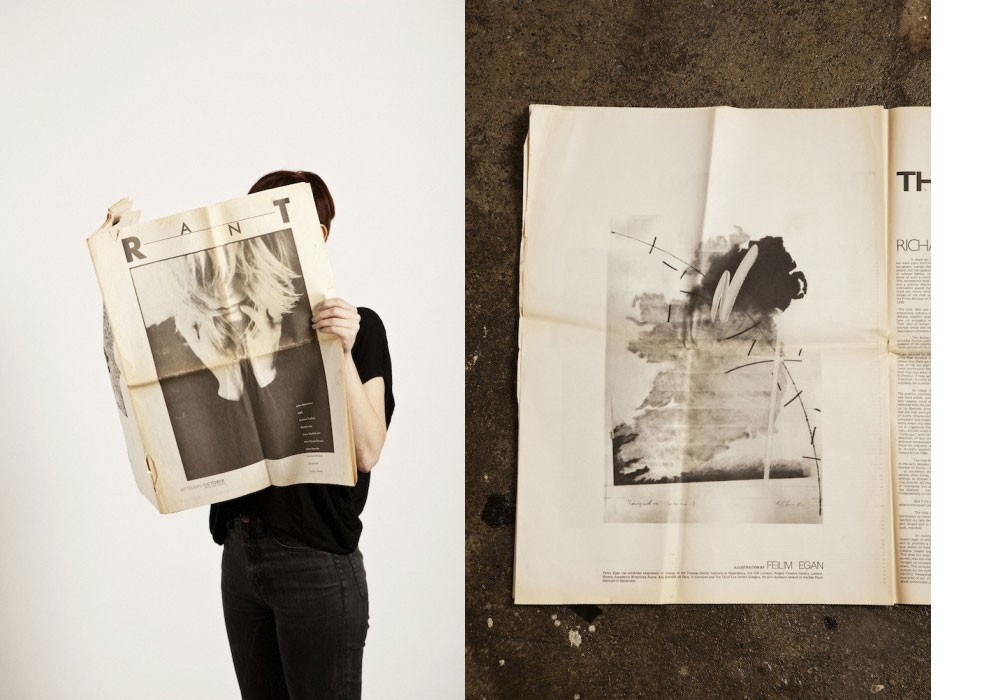
[We were unable to reach David and get images in time for this post, images shown are of RANT magazine, another project David worked on at around the same time. Images by Philip White for Thread magazine]