As a student in the early 1990s I was greatly taken with the FUSE publishing project and its expressed intent on testing the boundaries of digital design and digital typography. Amongst those early FUSE designers who piqued my attention was Dutch illustrator and designer Max Kisman. In particular his Tegentonen series of posters for the Paradiso club in Amsterdam with their distinct ‘word images’ and play on positive and negative space. These ‘quasi-digital’ typographic abstractions – I was later to learn that the digital styling was simulated and generated using analogue methods – had such an influence on myself and my peers as we consumed the new wave of typography emerging through Émigré and other journals of contemporary design. Little did I know at the time, that the DNA of these avant-garde designs was to be found in printing works in Cork, Longford, Roscommon and Donegal.
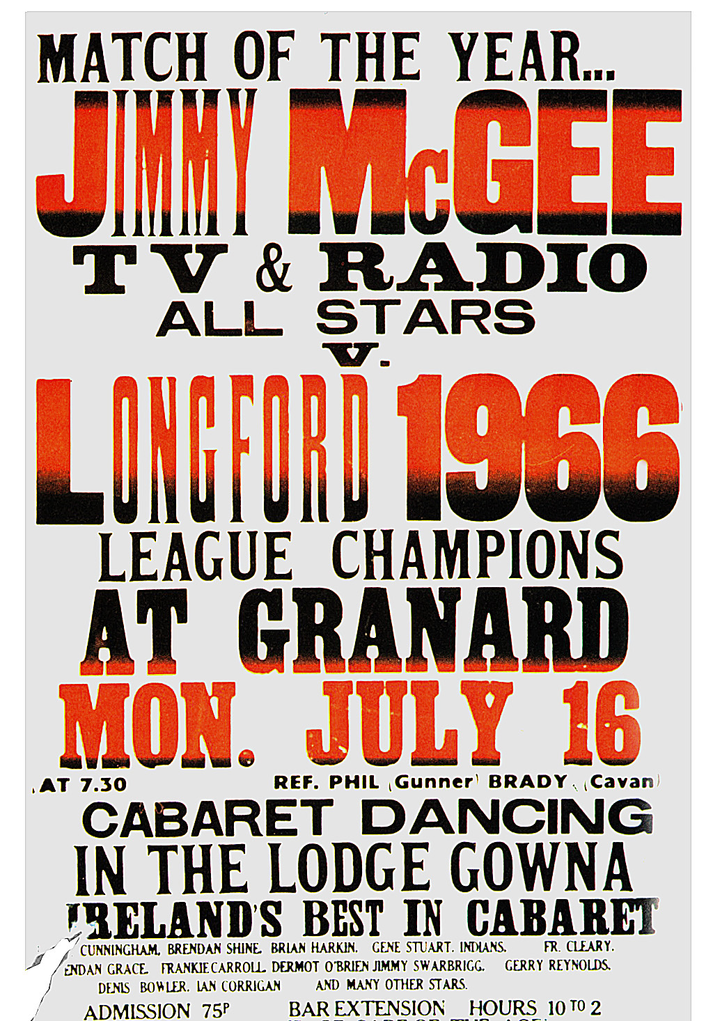
I became friends with Max in 2011 and he was immediately supportive of the then nascent 100Archive project providing expertise and encouragement through his insights and association with the Dutch Graphic Design Archive (NAGO). However it was only during his talk in Smock Alley in October 2013 that Max revealed the enduring influence of the typographic vernacular of Irish letterpress posters (in particular posters produced by Macroom Printing Works, Cork; Dann’s printing Works, Longford; The Strokestsown Democrat Printing Works, Roscommon; and the County Donegal Printing Company, Letterkenny). Due to both my age and the fact that I’m a ‘Jackeen’ the presentation of the posters in October was the first time I became aware of their existence and their clear and explicit influence on Max’s work. An example being the usage of a bold initial capital – evident in many of the Irish posters – which to my eye has clearly inspired his identity and poster series for the Paradiso and arguably this may have informed a more recent exemplar by another designer – Paula Scher’s typographic identity for the Public Theatre.
In our conversations after his lecture I learned that, overtime, Max has accumulated a fine collection of posters and ephemera that extends to French and Scottish examples of this particular style. He has also written and lectured on the subject in the Netherlands and I’m grateful that he has taken the time to translate an early paper that acknowledges the influence and inspiration of Irish typographic design for him. (DS)
––
Lead & old wood; Irish, English and French letterpress posters
by Max Kisman
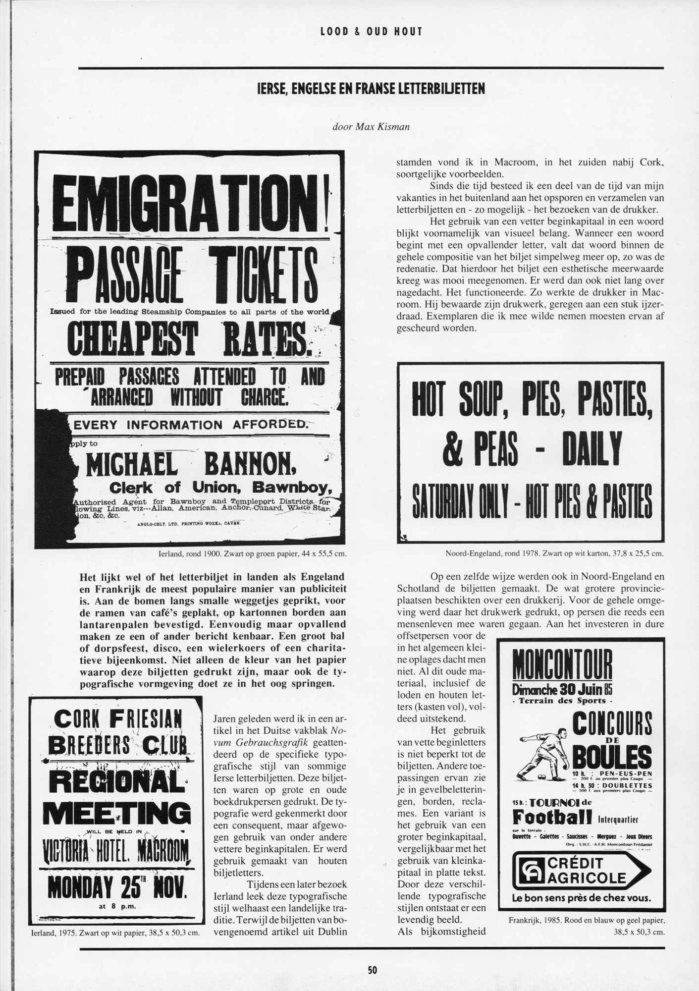
It seems that in countries like England and France the letterpress poster is the most popular way of publicity. Nailed on trees along narrow roads, stuck to the windows of cafes, attached to lampposts on cardboard plates. Simply but striking they make their messages known. A dance or fun fair, a disco, a cycle race or a charitable event. Not only the colour of the paper on which these notes are printed, but the typographic design makes them stand out.
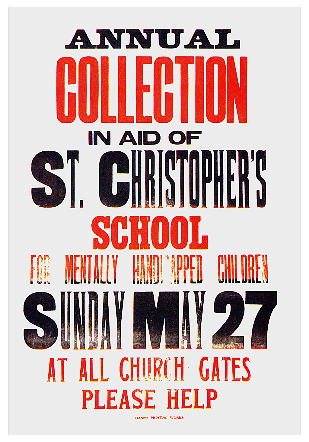
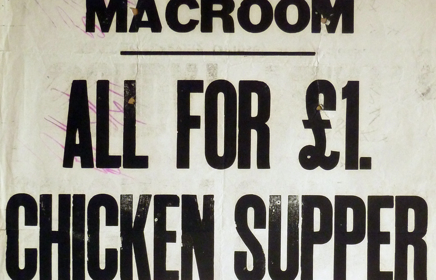
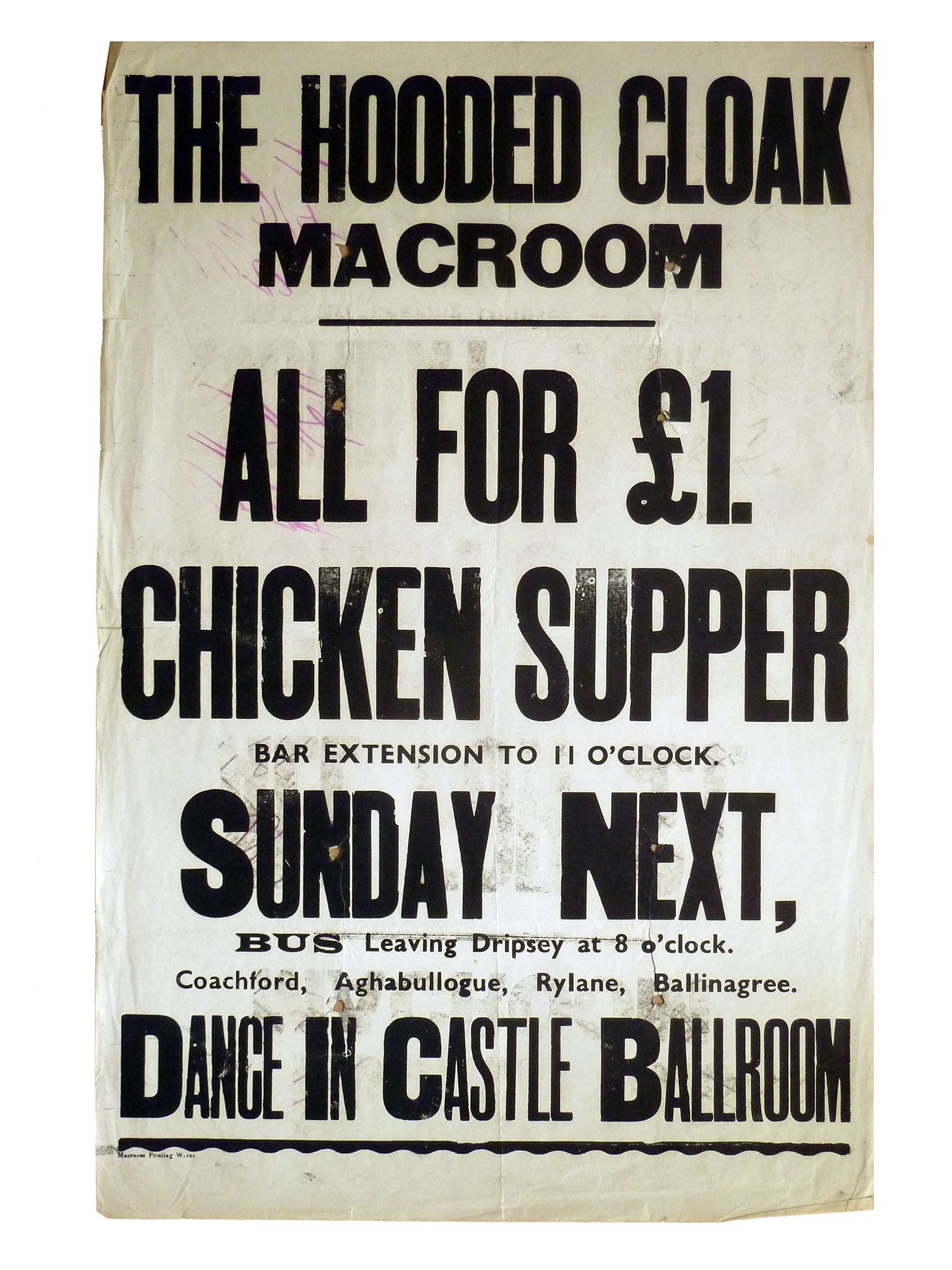
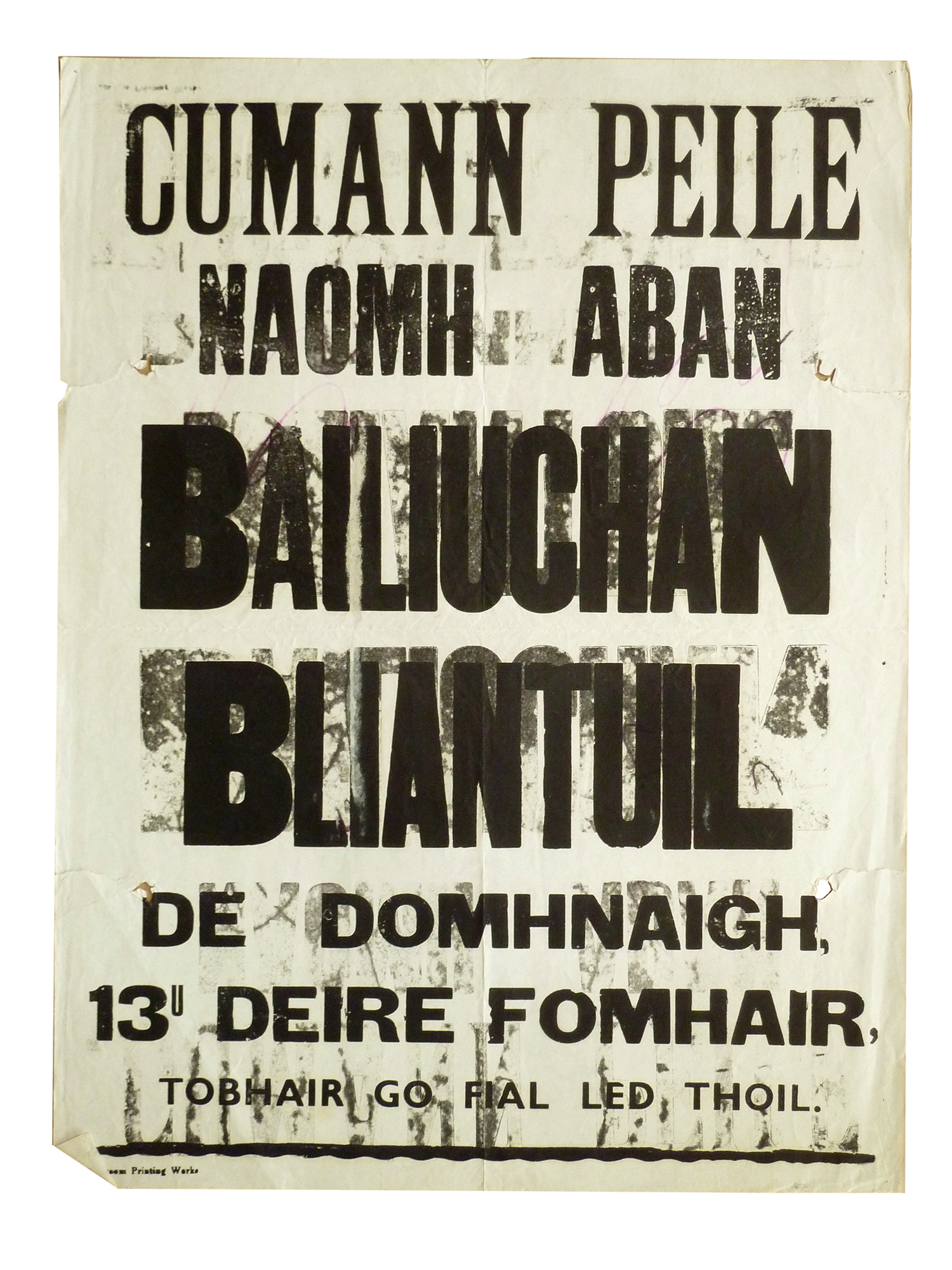
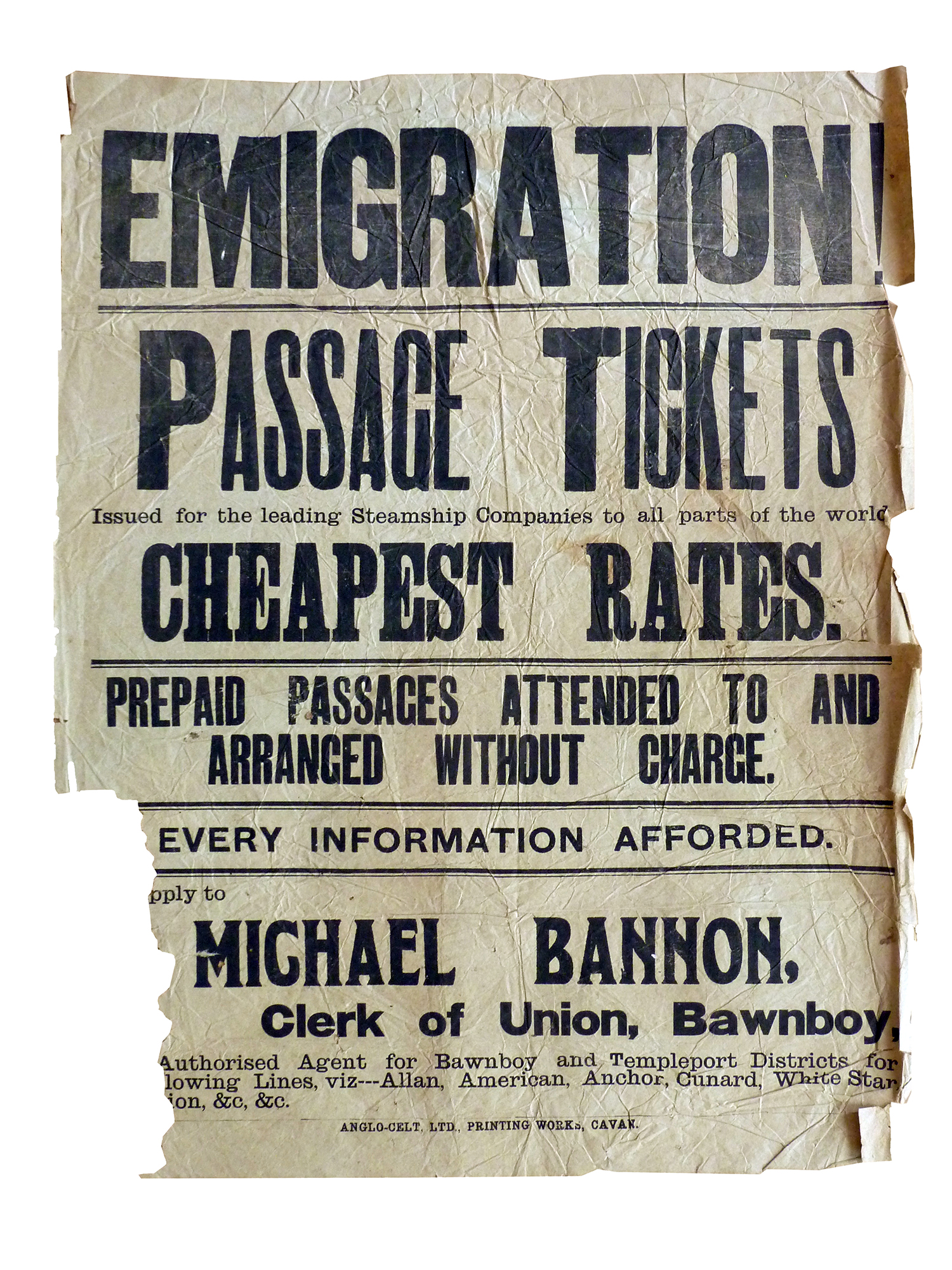
Years ago I was attended to the specific typographic style of some Irish letterpress posters by an article by Gerd Flesichman in the German magazine Novum Gebrauchsgrafik. He is also the author of the book Irish Country Posters [see note] These bills were printed on large and old book printing presses. The typography was characterised by a consistent but weighed use of initial capitals. Large wooden letters were mostly used.
During a later visit to Ireland, to me this typographic style seemed almost a national tradition. While the bills in the above article were mainly from in Dublin, I found in the town of Macroom, in the south near Cork, similar examples.
Since then I spent part of the time of my holidays abroad in finding and collecting of Letterpress posters and – if possible – visiting the printer.
The use of a fatter initial capital in a word appears mainly for visual interest. When a word begins with a striking letter, the word simply will be noticed more within the entire composition, so was the reasoning. That the bill got an aesthetic added value was a bonus. There was therefore not much thinking about it, it just functioned. That was the way of working by the printer in Macroom. He kept his test prints archived, strung on a piece of wire. Specimens I wanted had to be torn from the wire.
In a similar manner, letterpress posters were also produced in Northern England and Scotland. The somewhat larger country towns had a printing press. Printed matter for the entire surroundings were printed on presses that already it had done so for a life time. Investing in expensive offset presses for the generally small orders was not in consideration. All this old material, including the lead and wooden letters (cases full), were doing the job perfectly.
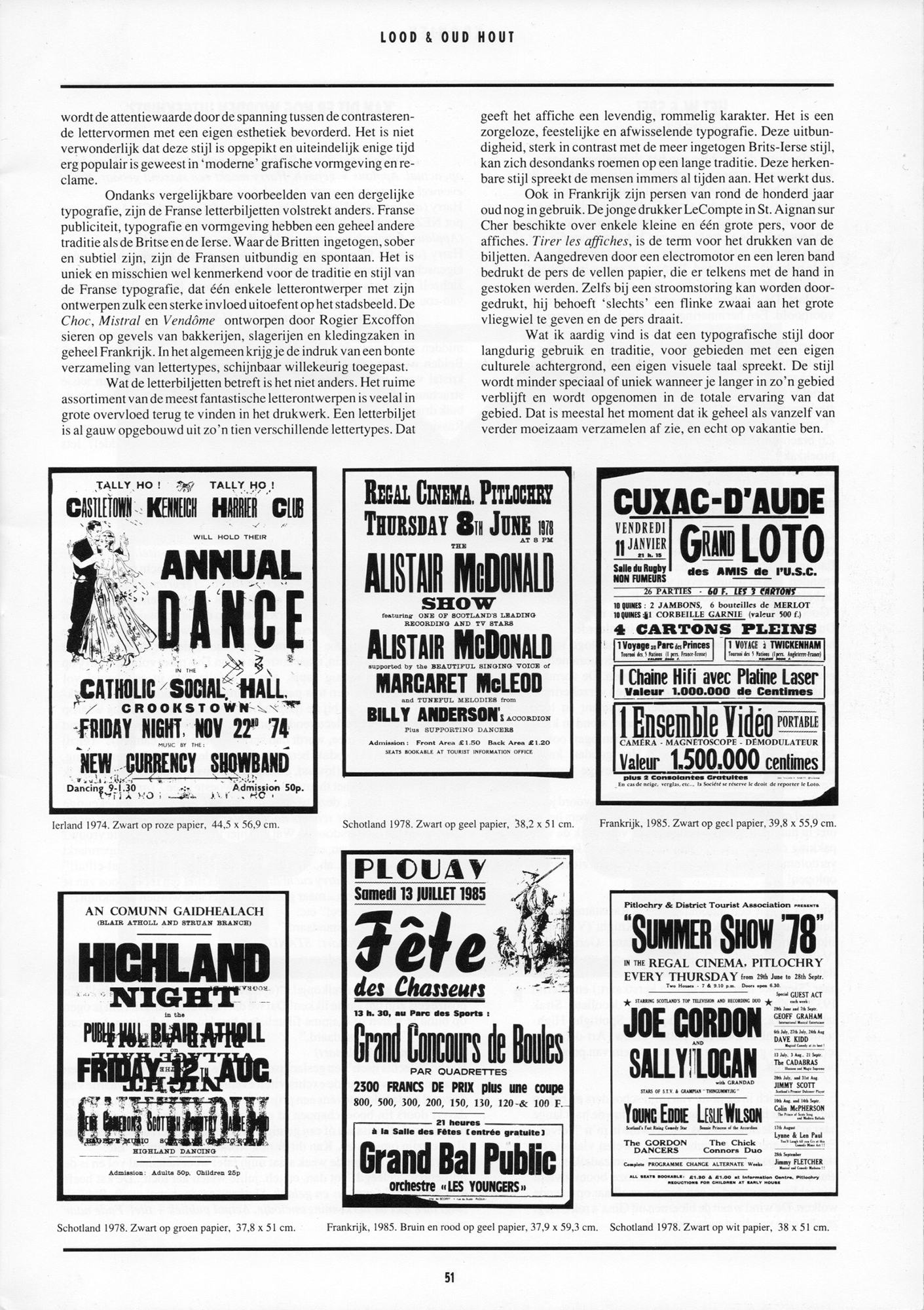
The use of bold initial letters is not restricted to the bills. Other applications of this style is seen in facade lettering, signs, advertising. A variation is the use of a larger initial capital, similar to the use of small capitals in plain text. These different typographic styles create a vivid picture.
As a side effect, the attention value gained by the tension between the contrasting letter shapes is increased with its own aesthetic. It is not surprising that this style is picked up and became very popular for some time been in modern graphic design and advertising.
Despite similar examples of such a typography, the French letterpress posters completely different. French advertising, typography and design have a completely different tradition as the British and the Irish. Where the British style is understated, sober and subtle, the French are exuberant and spontaneous. It is unique and perhaps typical of the tradition and style of French typography, where a single type designer exerts such a strong influence on the cityscape with his designs. The Choc, Mistral and Vendôme – designed by Roger Excoffon (1910–1983) – decorate the facades of bakeries, butcher shops and clothing stores throughout France. In general you get the impression of a colourful collection of fonts, seemingly applied at random.
What the letterpress posters are concerned it is not quite different. The wide range of the most fantastic type designs is often to be found in the printed matter in great abundance. A letter bill is easily constructed with ten different fonts. That gives the poster a lively, messy character. It is a carefree, festive and varied typography. This exuberance, strongly contrasts with the more subdued British-Irish style, nevertheless boasts a long tradition. This recognisable style speaks to the people for ages. So, it works.
Also in France printing presses from about a hundred years old are still in use. The young printer Le Compte in St. Aignan sur Cher owned a few small and one large press for the posters. ‘Tirer les offices,’ is the term for the printing of bills. Powered by an electric motor and a leather belt the press prints the sheets of paper, that are inserted by hand. Even if the power fails printing continues – he ‘just’ needs to give a big swing to the large flywheel and the press is running.
What I like is that such a typographical style, by its long-term use and tradition, in regions with their own cultural background, speaks its own visual language. When you are staying longer in the area, the style becomes less special or unique and will be included in the experience of that area. That’s usually when I automatically stop completely with further collecting and am finally on vacation. (MK)
© Max Kisman 1987–2014. Translation provided by Max Kisman, from original paper published for TYP / Typographic Paper, Amsterdam, NL 1987
[Note] In the early 1980s, German designer Gerd Fleischmann – a visiting professor at NCAD – initiated a series of typographic workshops with his students of the Faculty of Design of the University of Applied Sciences Bielefeld. In co-operation with NCAD these workshops explored the vernacular of the ‘Irish Country Poster’ more specifically large wooden type posters and announcements for shows, carnivals, auctions and sales. The resulting materials formed the basis of an exhibition at the Douglas Hyde Gallery in January 1982. The DhG exhibition was the successor of Plakate aus Irland a touring exhibition initiated by the Department of Design, Bielefeld which travelled to a number of German cities from 1976–1980. The accompanying publication – which is still widely available – Irish Country Posters (Plakate in der Irischen Provinz) was published by the Deutsches Plakat Museum, Essen in 1982 (ISBN 3-923199-007). (DS)
About Max Kisman
Max Kisman studied graphic design, illustration and animation at the Academy for Art and Industry in Enschede and the Gerrit Rietveld Academy in Amsterdam (1972–77). In 1986 he co-founded TYP/Typografisch Papier, an alternative magazine on art and typography. At the same time, he pioneered digital technology for Language Technology/Electric Word magazine and designed the 1986 Red Cross postage stamps for the Dutch PTT. In 1992 he began designing animations for programme announcements on the progressive Dutch public television broadcasting station VPRO.
In 1996 he received the H.M. Werkman award and the (audience) Design Prize of the City of Rotterdam for his work in television graphics and animation. Kisman taught and teaches at various international art institutes and has been involved in various international projects, like Tribe, Building Letters (UK, USA), AIGA’s Spaced Out (USA) and Fleurons of Hope (USA). He lived in California from 1997–2006, worked for Wired Television in San Francisco and founded Holland Fonts, a foundry for his typeface designs. Currently he resides in the Netherlands with a studio in Amsterdam. He is a member of the Alliance Graphique Internationale since 2002.
www.studiokisman.nl