Stephen Kelleher is an Irishman in New York, via Dublin and L.A. Aesthetically, his work is cleverly reductive, delivered with a sharp wit and a taste for wordplay. He has worked at Buck, was named an ADC Young Gun in 2010 and now is a freelance designer with a client list that includes Google, IBM and The New York Times. I spoke to him about departing Dublin for the USA and his working and documentation practice.
In an experience common to many graduates, the steep learning curve of studio life came as something of a shock: “I was cocky, ambitious and completely out out my depth!”. Having found his feet he was eager to continue growth at that pace. It was personal work, (created under the moniker Frankenstyles) that drew the attention of the then-startup Buck, and his path was set.
“I left for Los Angeles on New Year’s Day 2006 with a bag of clothes and big hopes! I was lucky to leave when I did. I met some of the best people in the business and started at a foundling company (Buck) which is now recognized as one of the premier studios doing motion work in the world. I also avoided the economic downturn in Ireland and established myself in the US long before I may have been forced to leave for those reasons.”
Notions of Irishness are not at the heart of his work, and moving outside of the country offered an opportunity to step beyond them completely. As part of a “multi-cultural global staff … I shed any design identity I may have had due to my background … it was liberating to be seen as a peer and equal with super talented people from Venezuala, the Ukraine, Spain, Korea and the US.”
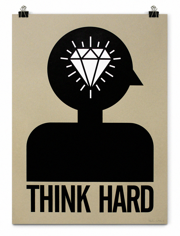
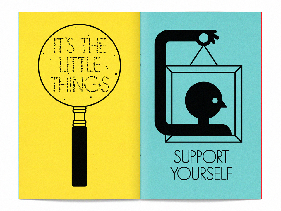
Kelleher’s distinctive style is applied in even measure to his motion and illustration work. Motion work “combines most of my interests in design – visual problem solving, illustration, typography and a time-based narrative … My general direction has been towards simplicity – being okay with the minimal, the fewest words which answer best.” His own work archive online, carefully maintained since his street art days “gives voice to personal projects I want to create, which are often starting points for commercial projects in that vein. Curating and editing your output is extremely important in my mind in order to navigate towards where you want to go and away from work which no longer speaks to you personally.”
This direction is towards a more personal expression at present.
“We are taught that a subjective eye is preferable but the best design for me has always had a heartbeat. I have always supported graphic activism and this is an area which is often under-nourished or sidelined for exhibitions. I’m interested more and more about the political awareness of young designers. I’m extremely worried about what the NSA continues to do and the ongoing unsustainable US foreign policy – I hope to tackle some of my frustrations with issues like these this year.
“I recently re-watched the 2005 Hillman Curtis (RIP) profile of James Victore who is my neighbor here in Brooklyn. I love his line about what graphic design is best for and need to remind myself of this more often: It’s good for selling socks but it’s not for that… graphic design is a big fucking club with spikes. And I want to wield it.”