Before I start I must ask your forgiveness, in short I cannot write, I do not understand grammar, or tense, my spelling is erratic and I often lack focus, so with that out of the way I’ll begin my rambling dirge, stroke homage.
When I was a kid I didn’t really know what I wanted to do by way of a profession or career when I got older, I was an academic disaster, but I liked a lot of things and was handy at the drawing. I liked movies, art, comic books, sleeve art, stories and weirdly enough logos, although I didn’t know they were called logos, I would doodle them all endlessly, my favourite was the British Rail logo. I was taken backwards and forwards to Glasgow by my family every year and there would be this device at the train station and I was obsessed with it, it was train tracks, it was arrows, it was the same forwards as backwards, it was an optical toy and I loved it, I still do. Now moving on a bit, and now I know what design is, I am still obsessed with logos (or identity as we now claim it in the broader sense), and as a young man on the verge of a design career I discover the V&A logo. A lot of designers cite the V&A logo, it’s a cracker, timeless, people always call it timeless, it’s timeless not because it’s classical, but because it’s simply clever, and clever doesn’t get old it continually tickles us. The V&A is a masterful piece of reduction, expertly finished and it should last as long as the institution itself does.
So what has all this personal preamble and nonsense got to do with the Museum of Ireland logo, well partly this is a personal response so it's my take on it, and I can’t keep personal influences out of it, and partly its by way of yardstick. As an older gentleman now I find myself more often than not happily doing logos, whether by accident or by, ahem, design and for whatever Freudian reason the logos I seem to create are optical tricks akin to that BR logo I fell in love with as a child. These are the marks and systems I involuntarily gravitate to producing, however they are not the ones I envy. I envy the simply clever ones and that is what the Museum logo is.
![]()
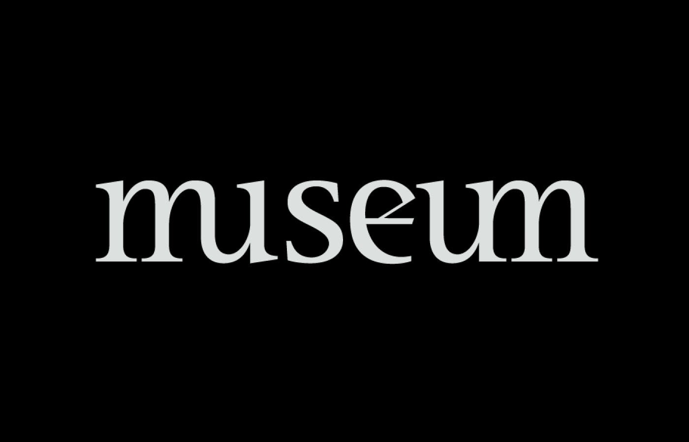
The Museum logo, and I am going to stop using that capital ‘m’ now, the museum logo is an understated giant, not shouty, not flashy, but really clever, very brave and beautifully executed. The first piece that often goes unrecognised in how clever it is, but for me is a real gem and shows if needed where designers really earn their corn, is the name. There is no Irish attached to the name, now you will rarely see that sort of crystal clear thinking applied to national museums or institutions anywhere, the museum does not move, it is located in Ireland, saying Ireland or Irish is therefore redundant. Beautiful clear thinking, but you need to convince a client to do it and that’s the whole business side of design that goes unrecognised.
The thoughtfulness of the execution is also a peach, so often we get a harp slung on to anything Irish, no harp here, no device at all, just type. The type choice, Trinite, so often we get some awful ill considered Sans, characterless (pardon the pun) and no sense of a local vernacular, or worse, some book of kells diddly-aye nonsense, but here we get a font with a calligraphers hand at its heart. The type feels Irish, but in a contemporary sense, it pulls on a tradition without mindlessly mimicking it. The ligatures are a gift, a friend of mine says he is always looking for the gift in any job, well there it is and beautifully executed, and finally it stacks as nicely as it sits horizontally.
![]()
This is a flawless identity, timeless, it tickles me and inspires me, it’s as good as anything you will see internationally, cleverness, conviction and craft all coming together. I envy its maker but I think its one everyone should be proud of.