When the 100 Archive team tweeted ‘what do you think should go in the archive?’, I asked myself what’s the earliest piece of design I can remember having an effect on me? Monaghan Champion Milk stickers (featuring Barry McGuigan) aside, I suggested the NCAD ‘egg-prostectus’ – as it became known – by Carton LeVert.
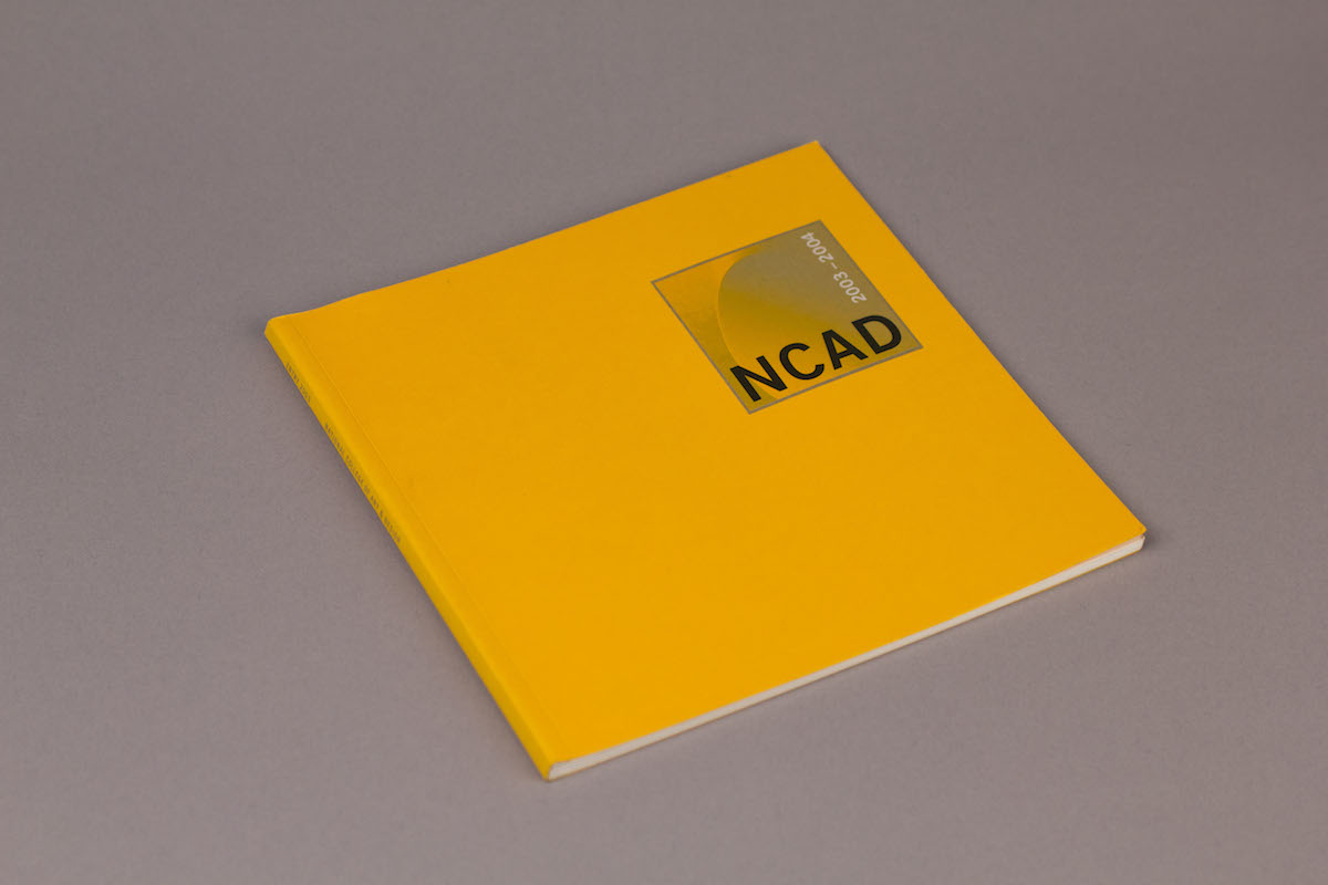
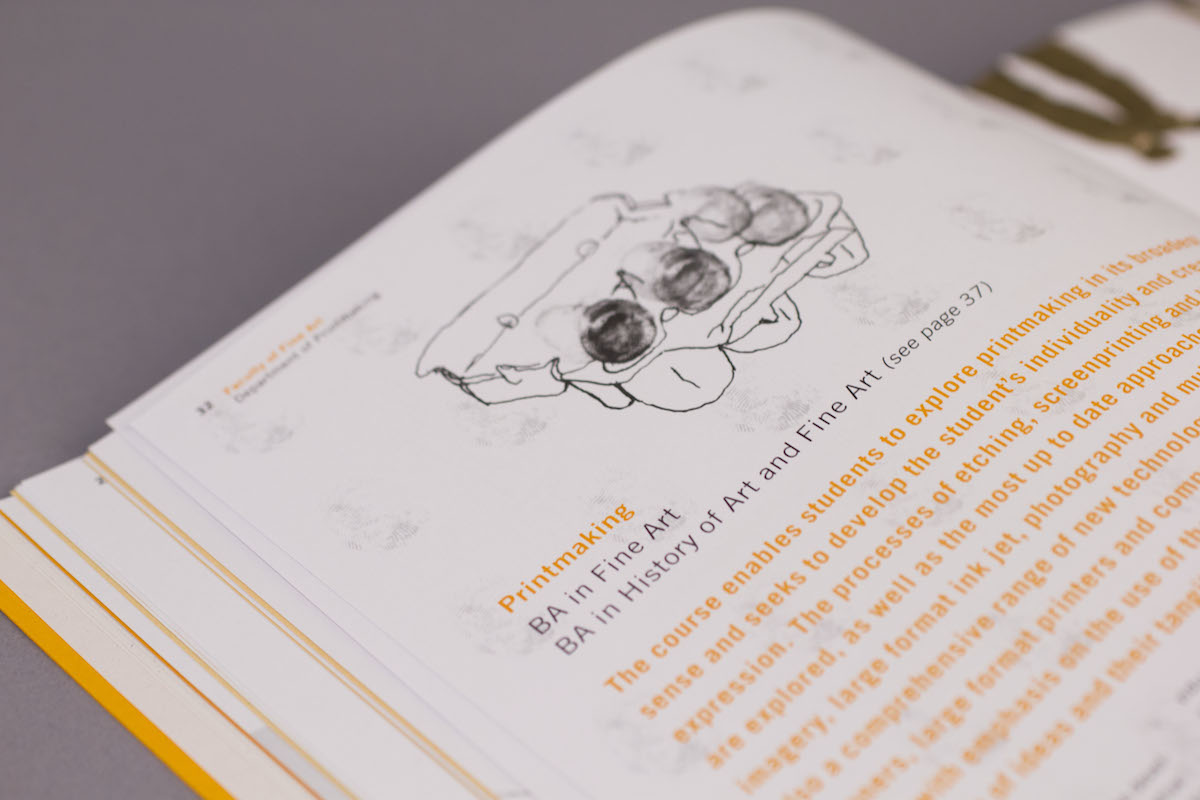
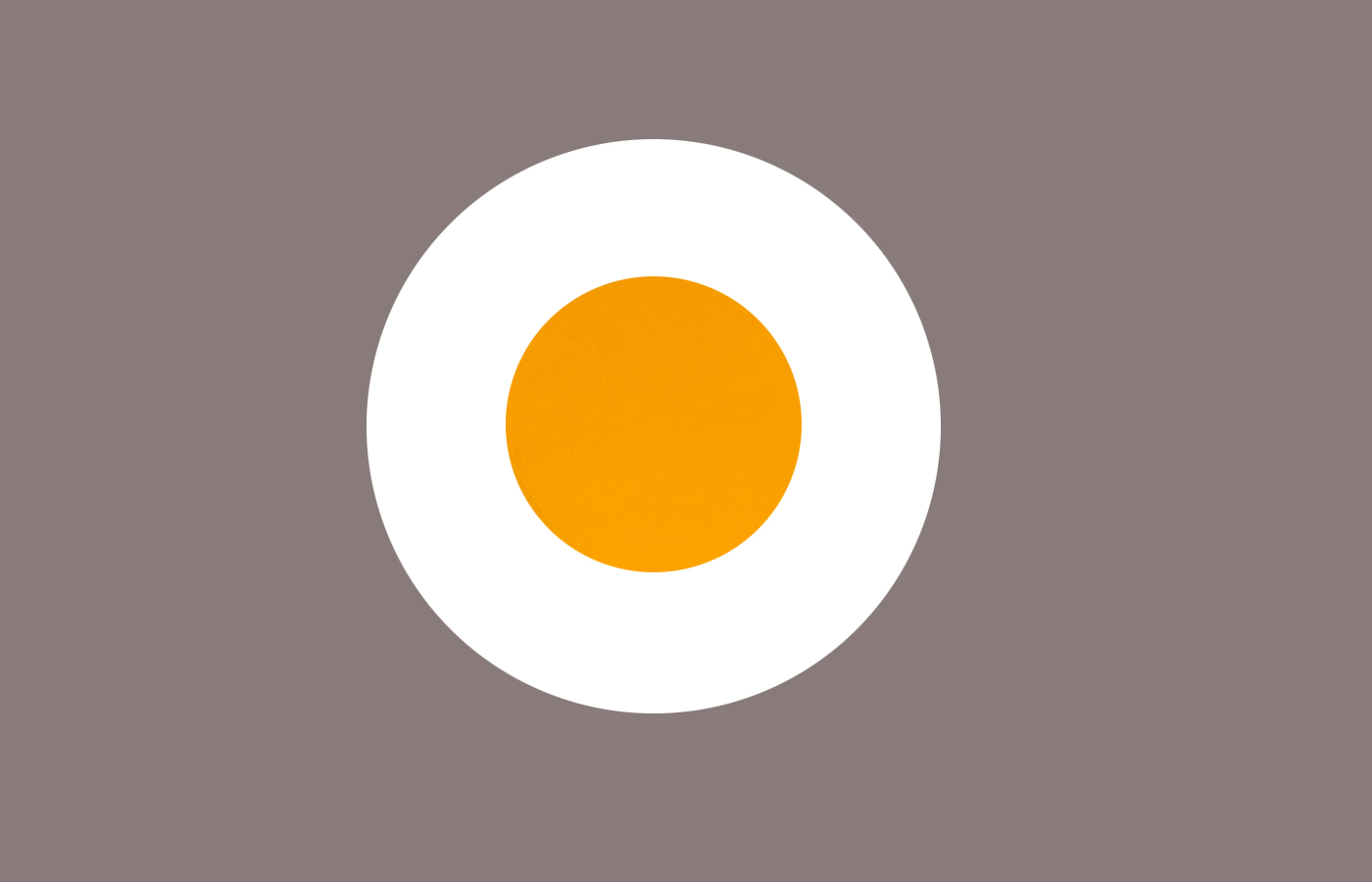
In 2003 I was half way through my second year in Graphic Design at LYIT. During a research trip to the library, I happened across a bright orange publication among a group of other ‘normal’ looking college prospectuses? Aware of but knowing much of NCAD, I flicked through the pages. A series of eggs with doodles on top. One turned in to a rocket, another with a hat scribbled on top – an egg being used to communicate creative investigation and experimentation. This had a real and immediate effect on me. ‘Holy shit... this is somewhere in Ireland and this is how they communicate’. At that time I had no real grasp on the who or what of Irish design, but to me this felt different. Their prospectus had a clever idea running through it that helped communicate and distinguish one course from another. But mostly I remember smiling at its sense of fun, the sense of play. A rubber chicken, more adventures of Rick the rotten egg, fingerprint eggs, an egg-and-spoon race with a wooden anatomy figure. I mentioned it had an effect on me... literally three hours later I had filled in a direct entry application to NCAD.
Before writing these few words, I asked Libby Carton to send on a copy – hoping it would be as good as I remembered. While it doesn’t stop me in my tracks now and I don’t think of it every time I see a chicken, I still regard it as an excellent piece of communication. First published in 1999 (and republished a further 8 times), some elements may feel a little of their time now, but the idea is still as fresh today. Appropriate, inventive, clear, extendable and memorable. What I love most is that it is obvious the designer enjoyed creating it. Their hand is visible, but they are not saying look at me, not trying to be trendy, they are saying look at our client, look at what they have to offer. It embodies the creativity that NCAD has at it’s heart.
For me anyway, it is a great example of Irish design.