There are few Irish designers who have had as deep and lasting an impact on the Irish graphic design landscape as Tony O’Hanlon, a designer whose influence and esteem goes far beyond these shores. In the first of a two part piece, he talks to Eamon Spelman about his student days at the London College of Printing and his experience working at Kilkenny Design Workshops.
Tony began his graphic design career in the early 1970s, after he abandoned an architectural course in the Crawford College in Cork (now CIT Crawford College of Art and Design). Deciding on a change of direction, he realised that his interest lay in graphic design. Following a move to London, he was successful in landing his first job with the publishers Marshall Cavendish. His time spent working in the design studio brought him to an appreciation of how much there was to learn in order to be able to produce the kind of work that interested him. “I knew enough to know that I knew nothing.” he says. This became the root of a decision to return to college and he enrolled on the graphic design course at London College of Printing (now London College of Communication).
“This was an era of pre-Thatcherism, during which the ideology of a Labour Government was reflected in substantial funding in health and education, and created an enormous teacher/student ratio. It was a very buoyant period,” Tony explains.
“The LCP (LCC) was, at that time, one of the best schools anywhere. The Swiss/German aesthetic was tempered by a London accent - actually, by many accents, among them Indian and Australian and American. Tom Eckersley was head of the design college and it was evident from the start that the college had access to a large teaching pool of freelance designers working in London at the time. Bob Gill's partner, Bobby, was a tutor and well connected to the design community. Saul Bass, Alan Fletcher and Lou Klein were visiting tutors, along with Bob Gill. As with all colleges, the variety and diversity of tutors was fundamental to the experience one garnered from the years spent learning skills, developing visual and creative thinking and simply getting a sense of what was ‘out there’.”
“Although the LCP had its roots in Swiss typography, it was not remotely similar to Basle or Zurich; it was much more pragmatic and concept-oriented. The college attempted to deal with the sort of problems that occur in the marketplace and, unfortunately, gave too little time to theory. We were immediately subjected to Swiss typography – highly structured, controlled, easy to comprehend and, above all, unemotional – all traits diametrically opposed to our lives as students. I used to think of the contrast between our student lives and that of our tutors living in white rectilinear rooms equipped with Bang and Olufsen hi-fis, minimal Italian furniture and accent use of colour. The reality was that they lived chaotic lives in surroundings marginally better than ours. Tubes never ran on time, the city seemed tatty, arrangements were flexible, life was just about as predictable as the weather: Switzerland remained a mystery!”
For Tony, Brian Grimley, a typographer and student of Anthony Froshaug, stood out among the staff. “An exponent of modular design and detailed typography, he might steer you in a direction linked with a theory that kept you on track. He kept the tangents moving, he kept you on the circle. He had that rare ability of interpreting a complicated text, understanding the key messages sequentially and transforming the text appropriately. He was impressive.”
“While the opportunities at college were evident, so too were the expectations. An understanding of the basic fundamentals and theory of design was taught in year one, followed up by project work in the remaining years. Looking back at those pre-Apple Mac days, the process of making was tedious. Display and composition fonts were finely rendered with clutch pencil, rapidograph, depth and type scales, adjustable set-squares, a parallel motion drawing board and cow gum. Now, thankfully, those tools and methods are firmly confined to history. On completion of projects, the criticism could be vicious from tutors. If your work, and your confidence, managed to survive the first stage, you were then expected to compose the work using a ‘letterpress composing stick’ and then print the project yourself at the end of each term – therefore, having completed the design project through all stages.”
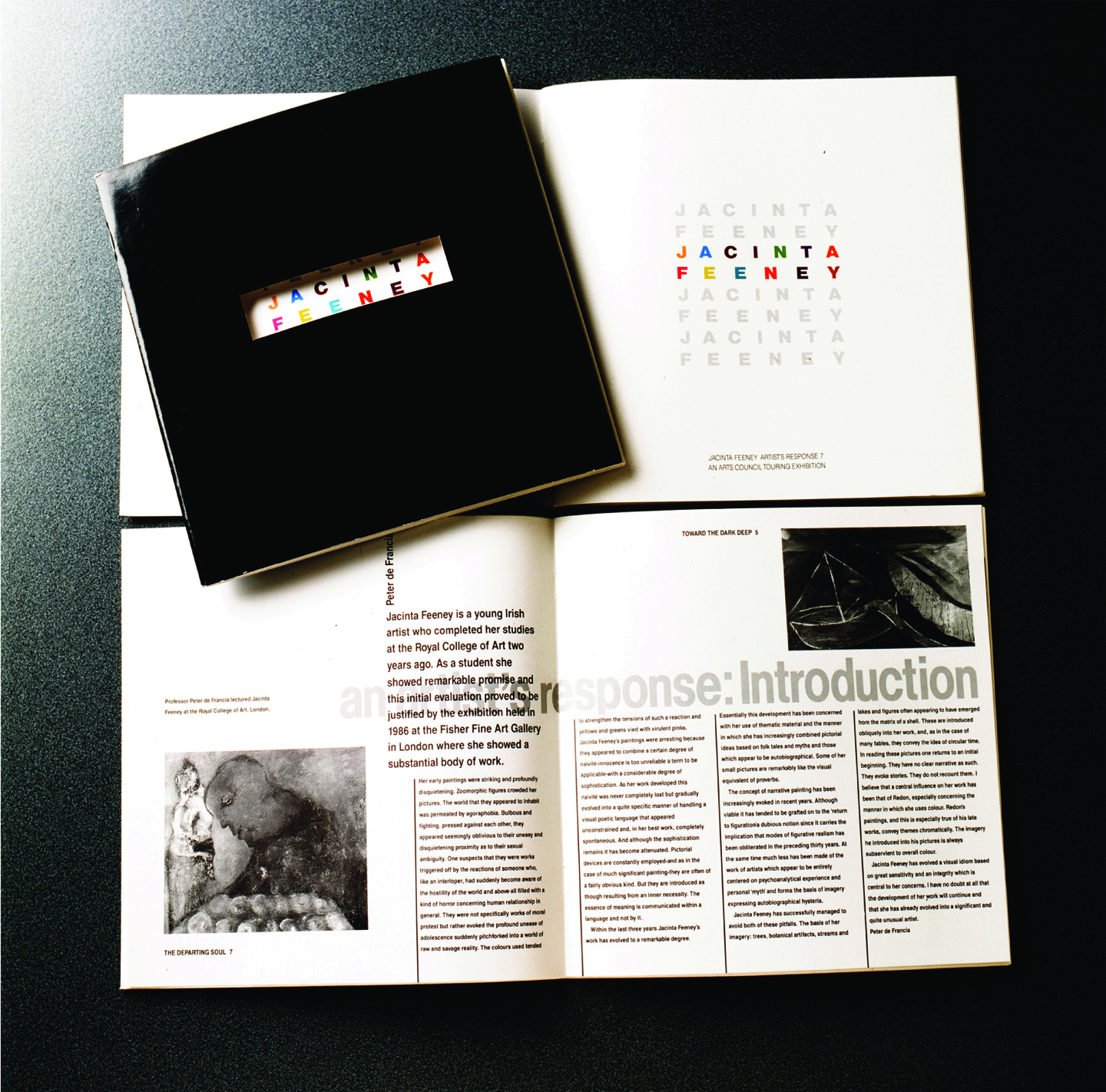
While at LCP, Tony met Richard Eckersley, who was later to become a work colleague and close friend. One afternoon, his tutor, Trilokesh Mukherjee, had invited him to join a small group in the canteen. Recounting the event in an earlier 100 Archive post, Tony wrote, “The poet Robert Graves had returned from Spain to meet his son (a fellow design student) and was recalling life under the Franco dictatorship, which ended in 1975. Across the table, I saw this austere individual in a corduroy Maoist suit. I got a nod from him. It turned out to be Tom’s (head of the design department) son, Richard.” It wasn't long after that meeting that Richard wrote to Tony, reminding him to apply for an upcoming position at Kilkenny Design Workshops (KDW), following the departure of designer Betsy Fitzsimon.
Kilkenny
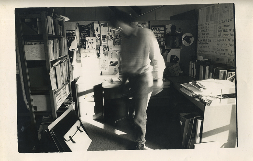
Richard’s letter came at a key time for Tony - he was already aware of the impact KDW was having and was beginning to acknowledge that his time in London was coming to an end. Following an interview in London - with Jim King, chief executive KDW; Nicholas Marchant and the painter Patrick Scott - he was offered the position of graphic designer. Recalling his first day there, he says, “I remember being struck by the beauty of the buildings, the converted coach-houses, the stables, and of being impressed by the standard of renovation. In the courtyard, I was surprised to find the enormous original blocks of limestone with the stone-cut letterforms from the inscription of Nelson’s Column (detonated in 1966) casually stacked on top of each other in a corner of the yard, these large pieces of our history have now been incorporated in the gardens of Butler House. The open-plan graphic design studio workspaces were located on the first floor of the clocktower section of the Castleyard facing Kilkenny Castle. Individual design ‘stalls’ were constructed from modified scaffolding rods, which were in-filled with fabric panels to absorb sound. The work environment was one to be envied. There was a degree of privacy but not so much as to catch the humour or sarcasm flying over the low stable arrangement from the other internees. Gazing across at Kilkenny Castle...my first studio out of college!”
Tony initially shared this studio with three other designers - Richard Eckersley, Peter Dabinett and Damien Harrington. Soon they would be joined by a rotating number of graduate students from the Butler House Project. These were pre-Apple Mac days, and the design process, from concept through to print, could be ‘painfully’ slow. As he says, “Typesetting, photography, illustration – these all had to be sourced in Dublin. FastTrack (the Irish Rail delivery service) became a critical part of the process. I had learnt early on that cultivating a good relationship with the Kilkenny FastTrack attendant could prove vital to reaching a design deadline. One of the first fax machines in the country arrived in the studio in the late 1970s – this was the first piece of technology to which we were introduced (note: at that time you could be waiting years to have a telephone installed into your house) – so this totally revolutionised the way we worked. Local print houses, such as the Wellbrook Press in Freshford, The Kilkenny People and The Carlow Nationalist, were used for typesetting and for printing small-scale projects. We became masters of the two-colour design solution.”
“In the early ’80s, a small press (Boethius Press) made the serious decision to move to Kilkenny and invest in Mac publishing-based technology. Previously, all typesetting commissioned locally used the Starphoton and the PhotoTypositer. This was a major resource for the output, scheduling and quality of work being produced in the studio at that time. Next was the arrival one of the first Apple Macs in the country. This crossover into technology can, in no short measure, be attributed to the foresight of the studio manager, Jim Dunne.”
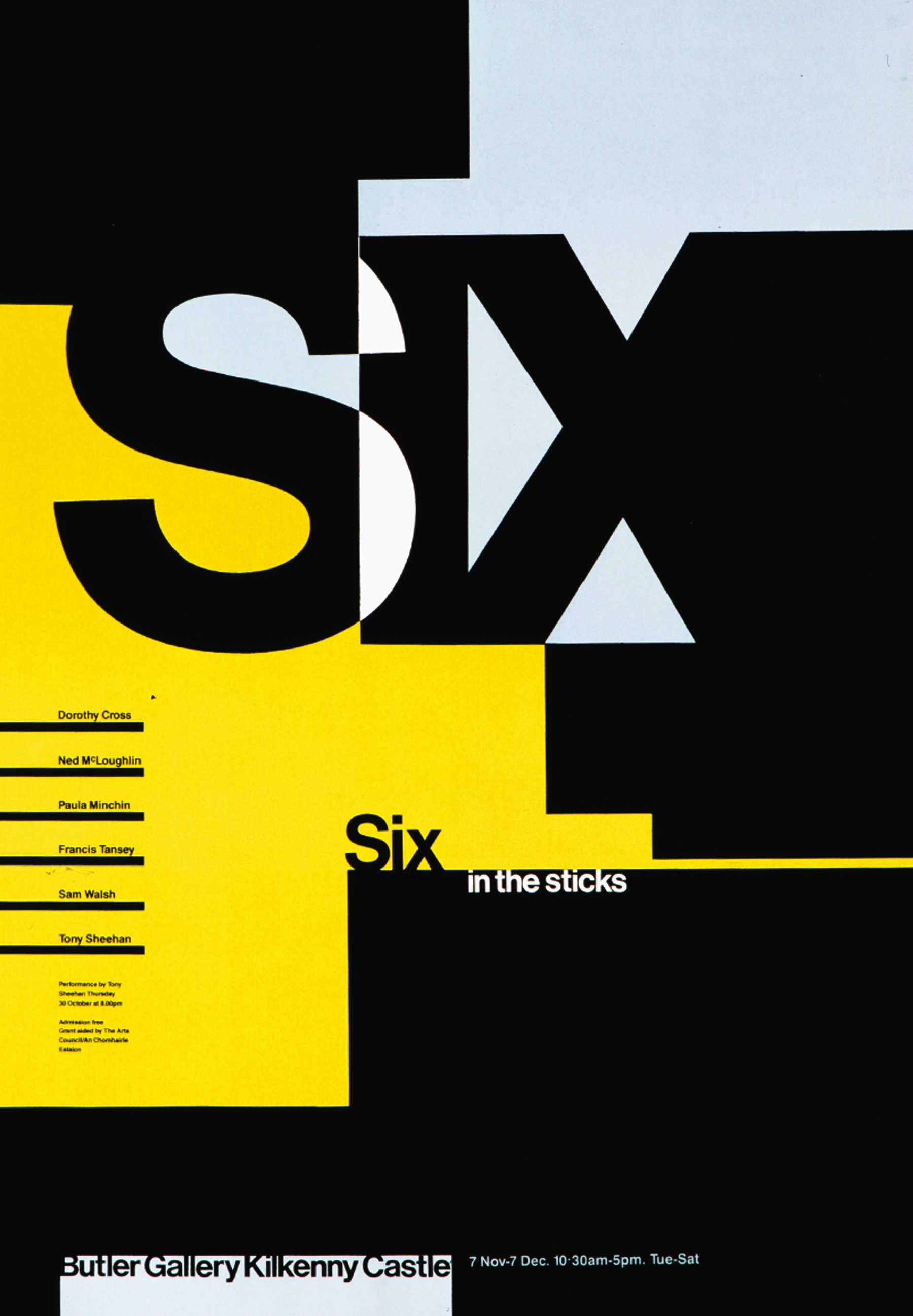
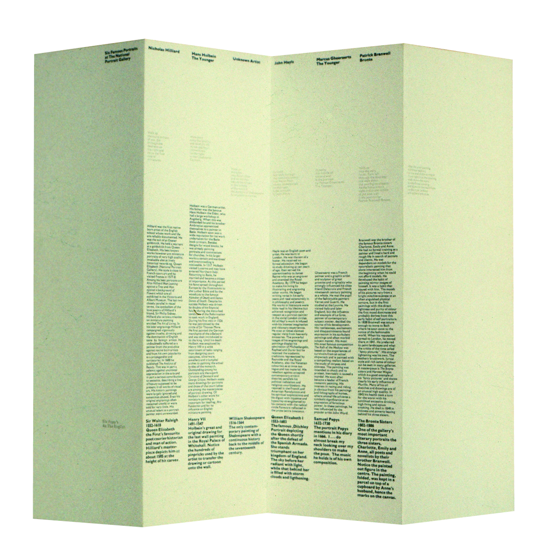
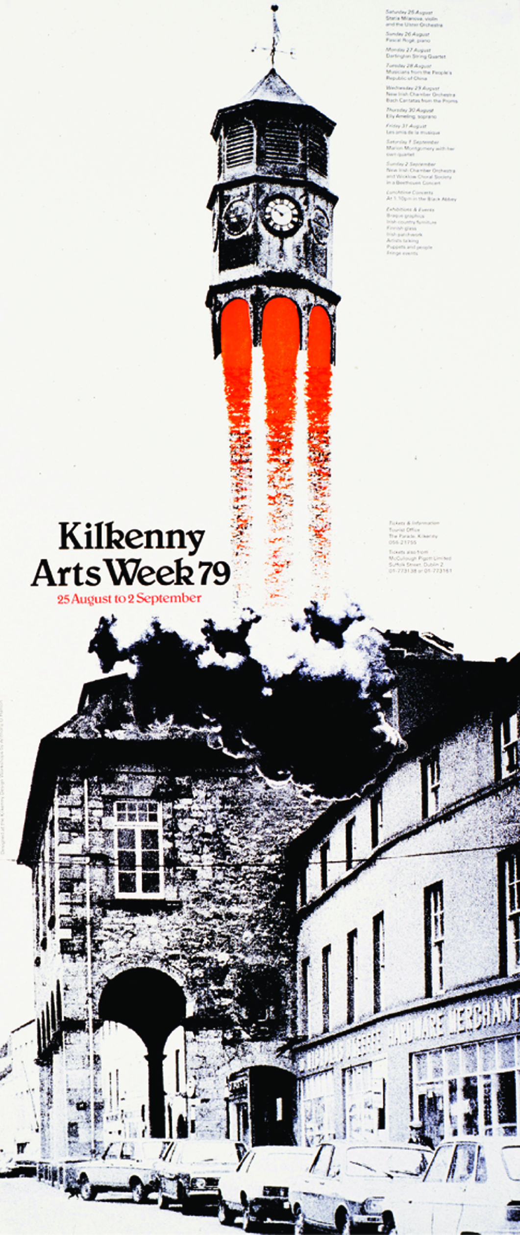
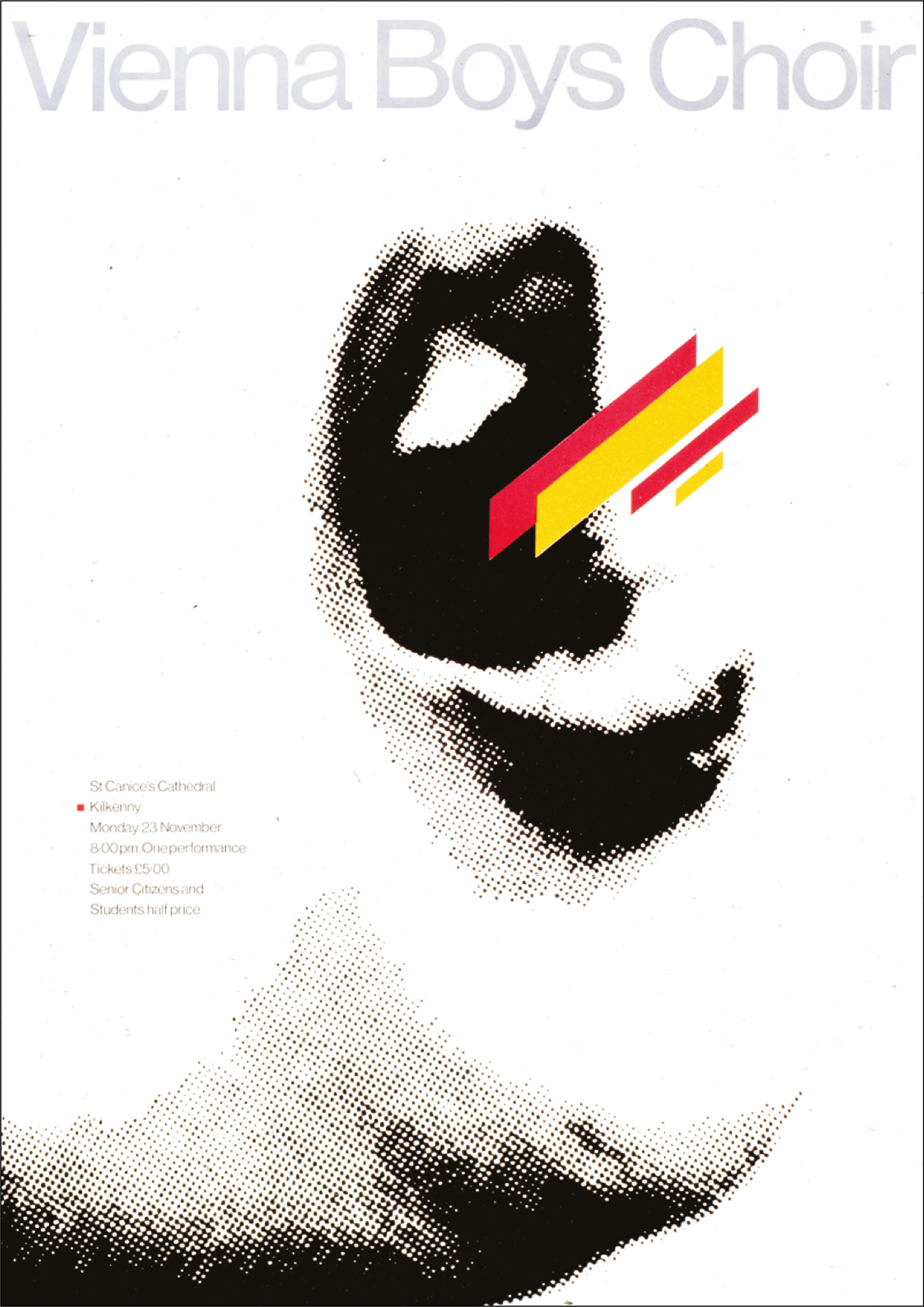
Prior to Tony’s arrival, the practice of submitting projects for acceptance to international journals and exhibitions was already much in evidence at KDW. Each year, designers were encouraged to submit work to design journals - Graphis, Novum Gebrauchsgraphik, Leipzig, Lahti - as well as British publications, including the now defunct Modern Publicity. Work was also included in several design biennales. In Ireland, the studio made submissions to the Irish Book Design Awards (hosted by KDW) and the Society Designers Ireland (Institute of Designers in Ireland) Mont Kavanagh Awards.
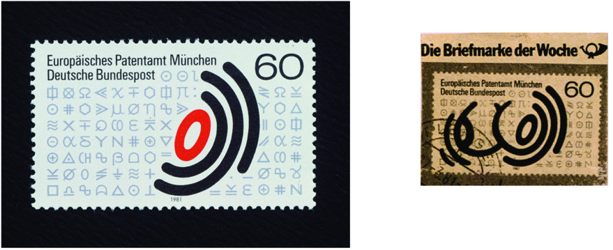
One project that holds particular significance for Tony from this period is the identity designed for the European Patent Organisation. This was a competition open to all design groups from all EEC (European Union) countries. The mark designed by Tony and selected as the new identity for the EPO was based on a stylised fingerprint. The mark was comprehensively applied throughout the EPO headquarters in Munich and its European offices. Soon the mark was applied on a postage stamp, which later was satirised as ‘stamp of the month’ in a well-known German magazine in the late ’80s [ref. article Novum Gebrauchsgraphic 09/82].
Design work for small and medium businesses, promotional materials for craftworkers and consultancy work for developing design communications strategies were central to the design work at that time in the studio. There was little collaboration on projects, with designers dealing with clients autonomously. “The practice of ‘graphic design’ was a bit of a mystery in those days and had the drastic tagline of ‘commercial art’ in some circles. Murphy and Kyne and Dara O’Loughlin, along with Cor Klaasen, were among the very few design groups in Dublin, with much of the graphic design work falling to the advertising agencies,” Tony says.
There were few distractions on the streets of Kilkenny in the late ’70s, which made for late working hours in the studios, with a considerable amount of time also spent travelling to meet clients, mainly to Dublin. When asked if it would have been better to move to Dublin, Tony's answer is clear: “That’s exactly what made sense. The reality was, because KDW was set up as a crafts organisation, the idea of applied design only came into play at a much later stage.”
Kilkenny Design Workshops gave Irish design a public profile. It also created an address for design in Ireland, meaning that designers visiting Ireland would travel to Kilkenny. Through such visits, KDW designers were afforded opportunities to establish professional relationships with individuals and institutions outside of Ireland. For many, these relationships outlived the demise of the ‘workshops’. Kilkenny Design had a unique and identifiable profile. As the government agency for promoting design in Ireland, it gained much recognition throughout Europe. Tony feels that KDW allowed design to be “pure, creative and, for a period, unpressurised by commercial reality: a strong, idea-based philosophy began to take shape and the ‘Kilkenny’ approach to design became evident”.
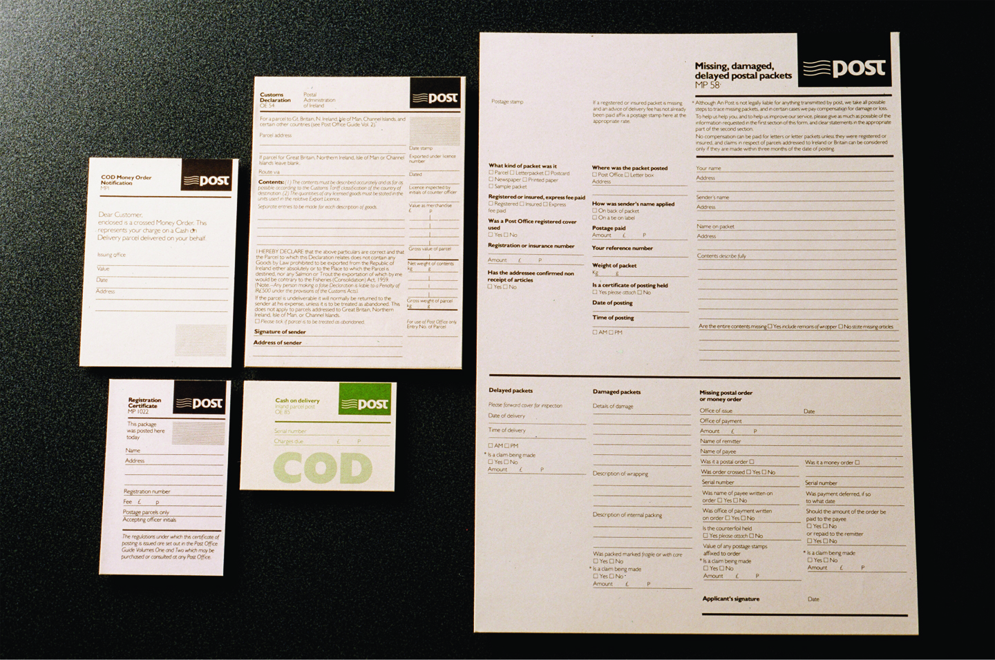
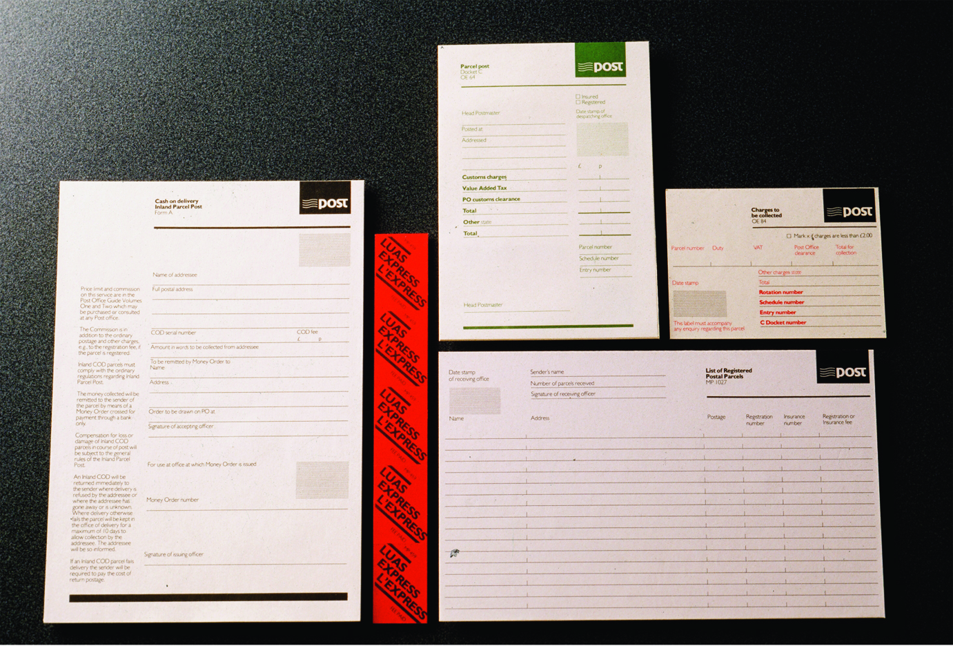
He continues, “Government forms, bus timetables and other similar type documents used in the public service were the street urchins of design in those years. The importance of applying design thinking to what appeared to be the mundane was viewed as being unnecessary. The public service was full of forms, duplicating information and often incomprehensible. In 1984, An Post replaced the Department of Post and Telegraphs. Their first objective was to rationalise the number of forms being used. An Post commissioned a pilot re-design of forms selected for their high usage and high processing time. The intention was to improve public relations, internal systems and cost control. Initial research showed that 17 forms could be reduced to 11. Within one year of usage, feedback from An Post suggested that one form alone recouped the total cost of the project, as a result of reduced spoilage and time spent by post-office clerks answering questions about how to fill it in.” [ref. article Novum Gebrauchsgraphic 12/86]
A recurring pre-occupation of intellectuals and design forums in those years was the question of whether there was actually a distinct Irish identity within design. A lot of ‘guff’ was thrown about, questioning ‘the Irish identity’ in design and how KDW should be doing more to promote this. The mid-1980s saw major changes in the studio, with the introduction of what was to become known as ‘Corporate and Information Design’. Design ‘method’ was replaced by design ‘management’ and the workshops moved into a new phase, with large identity projects being backed up with extensive corporate manuals. “In the '70s, clients tended to be unsophisticated in design matters (although not in other respects) and unaware of the potential that graphic design could offer. In the early '80s, there was a sense that Irish design was still a fledgling profession and that UK-based design groups would offer a better service for the requirements of large Irish organisations - for example, Aer Lingus and Allied Irish Banks.
![]()
In becoming a member of the European Economic Community (later the European Union), Ireland grew out of the shadow of its main trading partner - the UK. However, much of the funding came from the State and, as a result, KDW was obliged to take on political clients. Notable work was produced for Irish Life, Irish Steel, Telecom Éireann and the Department of Consumer Affairs. However, during this period, with so many changes in government, these were the exceptions. “For the amount of effort invested in many design projects, the results were never justified. Bureaucratic fumbling reduced so much good work to a stale compromise,” Tony notes. He adds, “At times, there was a certain animosity among the design community in Dublin that KDW was being partially funded by the State and therefore had the edge when quoting for work. This was completely understandable.” However, public design programmes, such as the An Post and the Companies Registration Office forms projects, along with industrial design projects, “could not, in my opinion, have been undertaken by a commercial studio by virtue of the amount of man-hours invested in research”.
Eventually, Kilkenny Design suffered from a lack of direction. It opened a retail outlet in London’s Bond Street. It struggled with the economic recession and bowed to the necessity of becoming more commercial. It disappeared as a unique entity. As for Tony, it was time to look for a new challenge, which we will hear about in part two.