As a traditional Irish musician I have always had an interest in Irish traditional and folk music. For my thesis I decided to explore the design of LP record sleeves emerging from the Irish music industry between the 1950s and 1970s. I found that during this period Irish designers looked to European and American graphic design for inspiration. The use of symbols that distinctly refer to Irish national identity and origins, re-contextualized and placed within modernist compositions suggest the development of an outward-looking Ireland at this time. These developments coincided with the inception of a number of politically independent and progressive organisations interested in preserving and renewing Irish traditional and folk music for contemporary traditional musicians. These cultural movements included Comhaltas Ceoltóirí Éireann and Gael Linn.
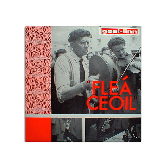
LP record sleeves produced in Ireland during the 1950s and 60s are undeniably modernist as can be seen in the LP titled ‘Fleá Ceoil.’ The sleeve composition includes photographic elements situated in a grid-based structure and accompanied by geometric bands of colour. The subject matter depicted in the photography refers to the experiential qualities of the music. There are visual connotations of street performance and the pub-music scene. The typography is restricted to the album title and the Gael Linn logotype. For the title the designer employs the modernist, sans serif typeface Futura designed by Paul Renner in the 1920s. The contemporary spelling of the phrase ‘Fleá Ceoil,’ is not serendipitous. It indicates the endeavours of Gael Linn to promote the Irish language and Irish music for a contemporary audience.
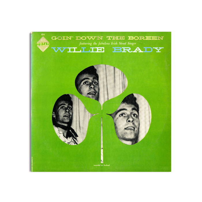
Elements of the LP sleeve titled ‘Goin’ Down the Boreen,’ by an unknown designer, demonstrate the influence of American modernist designer Paul Rand. Inspired by “early modernism” Rand’s work often comprised of collage techniques, conceptual narratives and visually intriguing abstractions through photography. Here, the stereotypical shamrock motif is used as a framing device with experimentation in repetition and halftone photography depicting the musician. The elements of collage and negative space create a conceptual narrative while the symbolism and colour reference the music origins. The use of nineteenth century slab-serif typeface Lonestar echoes the use of classic and decorative typefaces from the eighteenth and nineteenth centuries in twentieth century American modernism.
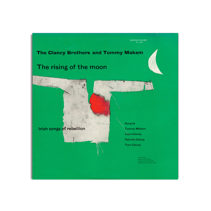
In their first album ‘The Rising of the Moon: Irish Songs of Rebellion,’ the Clancy Brothers and Tommy Makem re-contextualised politically based and well-known Irish songs for an American audience. The popularity of Irish folk music in America was pivotal in renewing Irish folk music for a sceptical, post-colonial Irish audience. The sleeve was designed by Louis le Brocquy. While primarily known for his painting and textile design, in 1954 he established Signa Design with Irish architect Michael Scott producing work in logo, textile and packaging design. Here le Brocquy references both European and American modernist conventions with modernist principles such as sans serif typography, “bright colours, flattened perspective,” and collage techniques. Negative space also plays an important compositional role. The use of green, the frayed white fabric shirt and the bright red bloodstain symbolize the violence and political associations of Ireland’s past. The symbolism of the image reflects a narrative based on the thematic nature of the music.
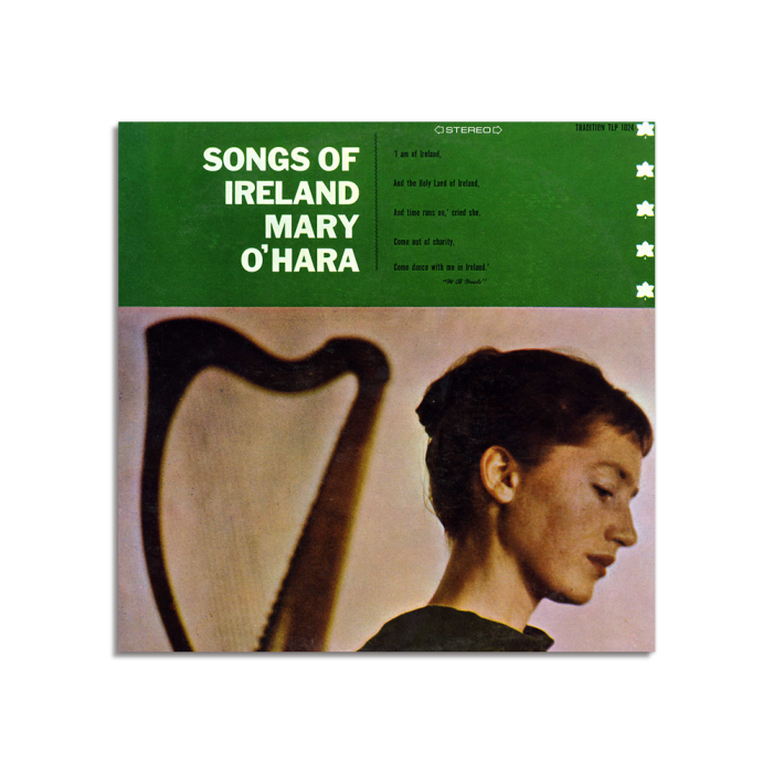
Elizabeth Clancy was responsible for a number of modernist LP sleeve designs on the Tradition Records label during the late 1950s. In ‘Songs of Ireland,’ from 1958 we see a number of characteristics that clearly define a modernist influence. Advances in printing technology in the late 1950s led to the widespread use of photography, particularly in LP sleeve design. The LP sleeve composition uses a gridded structure where photography is dominant. One third of the composition is comprised of a green banner containing the album title and a short poetic paragraph. The typography of the title is a bold sans serif typeface, while the paragraph is a small, condensed sans serif with generous space in the leading. The integration of Irish symbolism with modernist conventions is obvious here with the use of green and the inclusion of the harp. The Tradition Records symbol is also present, a five-pointed leaf repeated on the left side of the composition. The use of narrative and conceptual design is important in Elizabeth Clancy’s design considerations referencing the experiential aspects of traditional Irish music. In ‘Songs of Ireland’ the narrative is emphasized with the inclusion of the small poetic paragraph:
I am of Ireland, And the Holy Land of Ireland, And time runs on,’ cried she. Come out of charity, Come Dance With Me in Ireland. W.B Yeats
This narrative is reflective of the thematic nature of this album and is echoed in the connotations of the photograph. The musician is portrayed in the photography but remains anonymous, the music being more important than the musician. The work of Elizabeth Clancy demonstrates an adherence to symbolism and visual narrative to promote Irish traditional and folk music. As the 1960s progressed however, self-image became the primary means of promotion for Irish folk music with less emphasis on symbolic and metaphorical imagery.
Rosanne Lancaster is a recent graduate of IADT.
‘Goin’ Down the Boreen’ and ‘sounds of Ireland’ images Courtesy of the Irish Traditional Music Archive