20 Kildare Street
2020
Designed by Rachel Kerr at CI Studio
Design: Philip Mitton
Creative Direction: Mel O'Rourke
Hoarding: AD Design
Industry: Commercial
Tags: Logo / Print / Hoarding / Brochure / Development
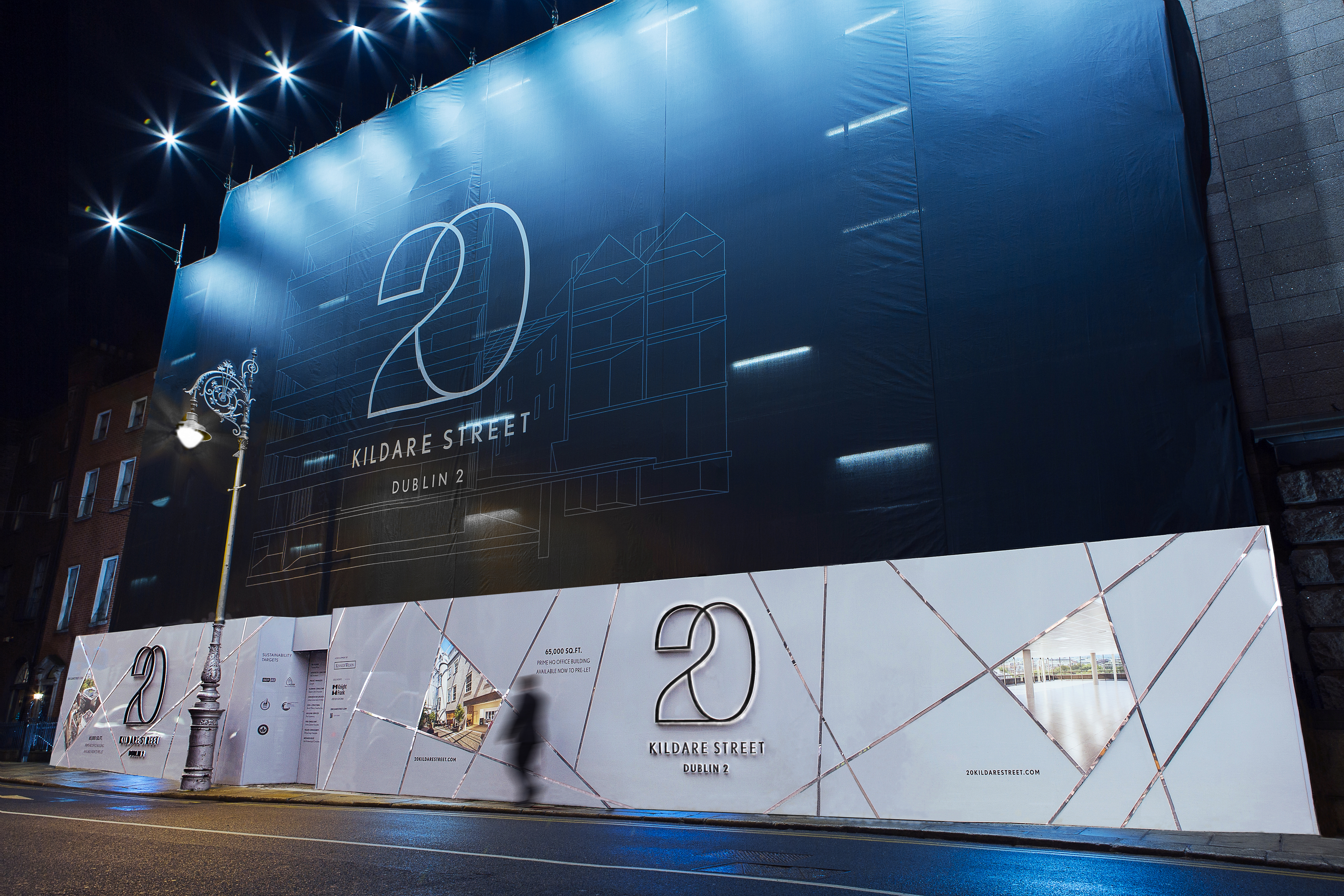
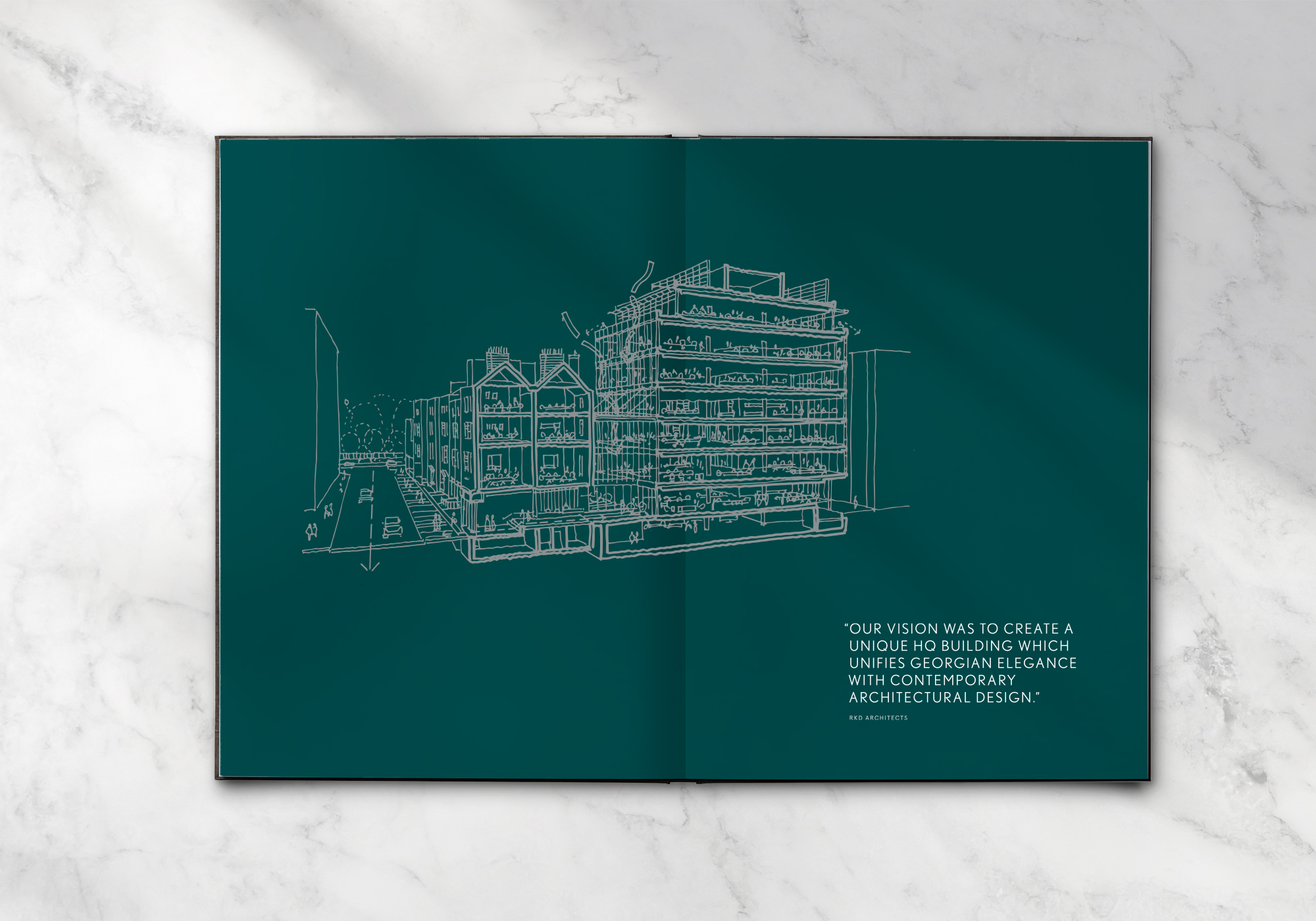
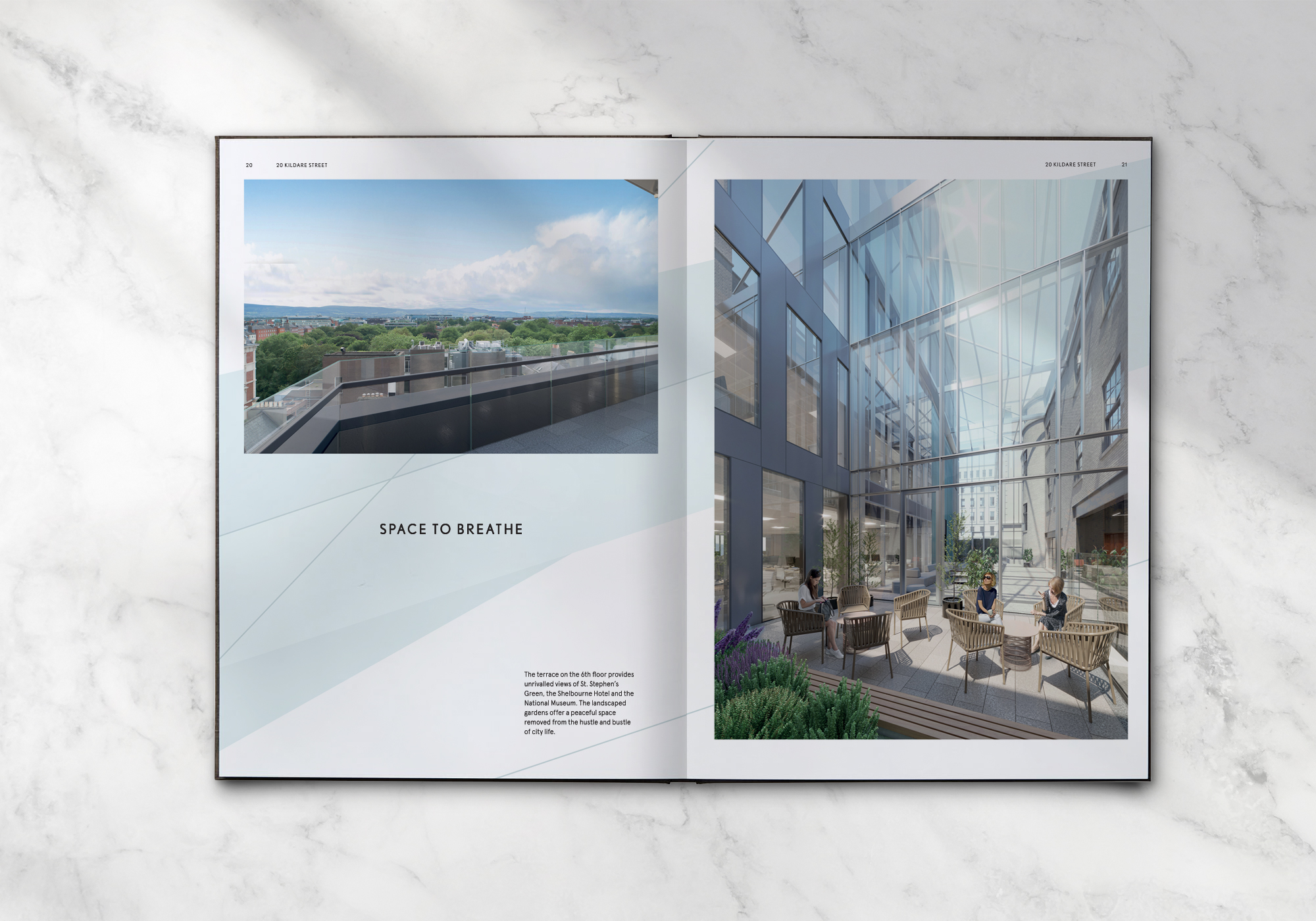
20 Kildare Street is a landmark HQ by Kennedy Wilson, on Kildare Street. A truly unique development which marries Georgian elegance with contemporary architectural design in perfect harmony. From the street, the development appears to be a row of Georgian houses, which house the reception and more intimate offices. Once you walk through the stylish reception, you arrive in a stunning light filled triple height glazed atrium, which gives a true sense of the twenty first century aspect of this development.
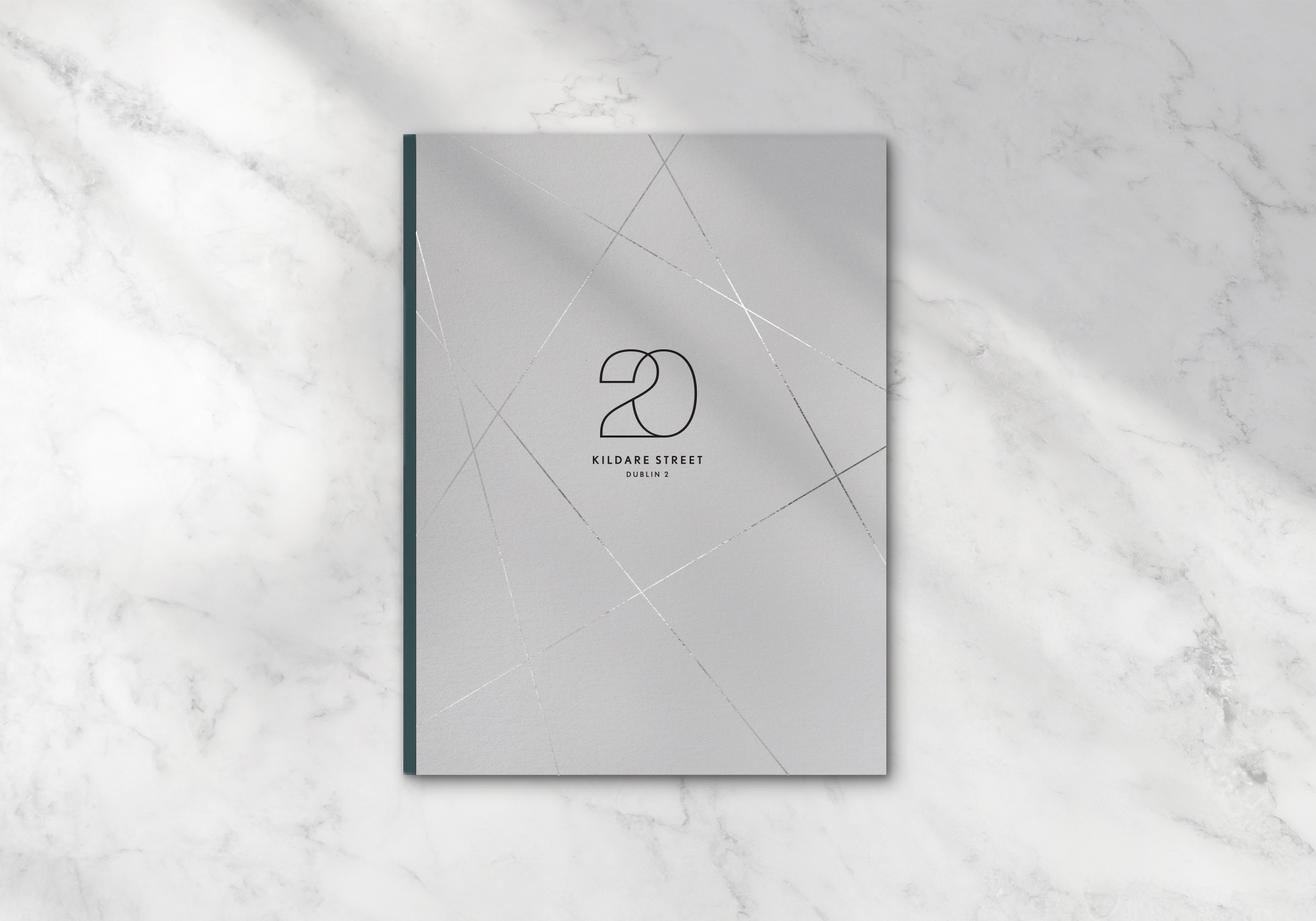
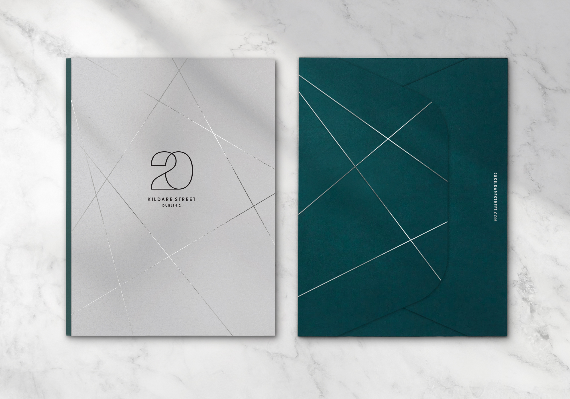
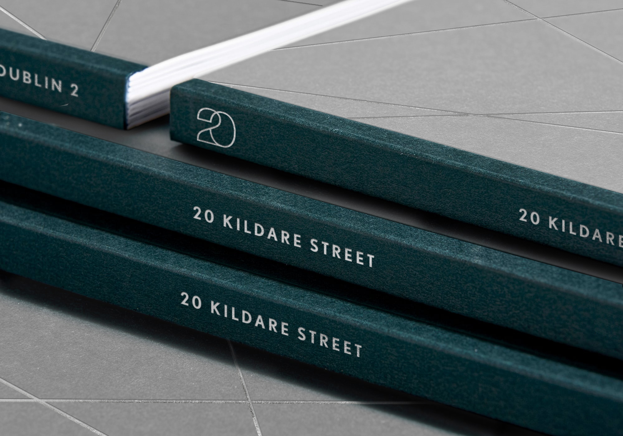
The visual identity conveys the contemporary style of the interior, as it is not visible from the street. An elegant, modern ‘20’ was crafted, which features the ‘two’ intersecting the ‘zero’. A visual metaphor representing the juxtaposition of heritage and modernity. Light and space are key features of this development, so the logotype is deliberately very thin. It is complemented by thin silver lines which allude to the shards of sunlight that shine through the atrium.
This simple palette was used across the hoarding, for a high-end, modern and eye-catching finish. It is also carried through to the brochure, where the gloss silver foil contrasts with uncoated stocks, another play on the coming together of opposites. Layout and design is deliberately spacious across all touchpoints, to allude to the sense of space and light for this iconic HQ.