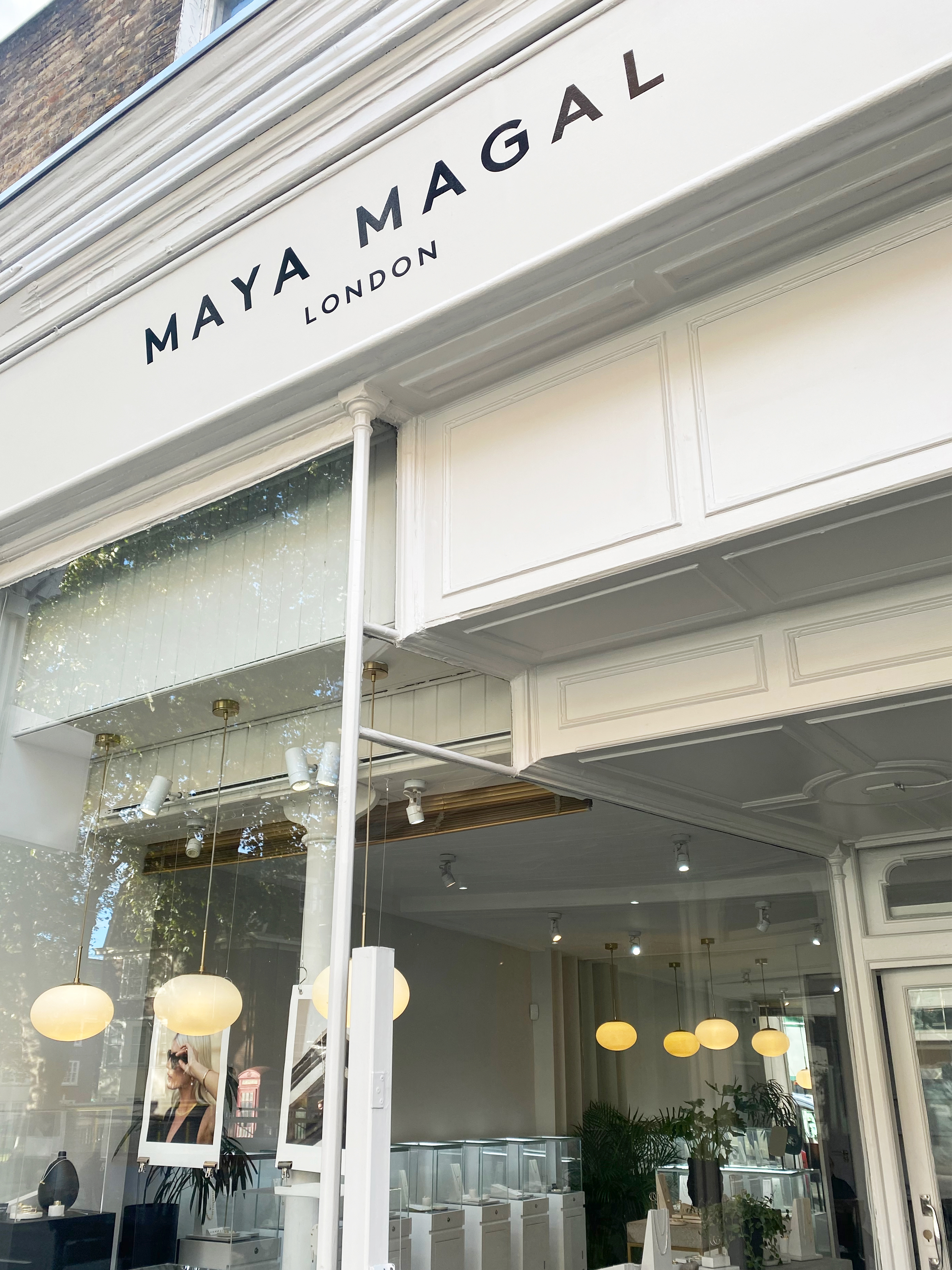
360 Rebrand: New Identity and Creative Direction for Maya Magal
2023
Designed by Grace Margetson at GRACE MARGETSON STUDIO
Agent: Valentine Avron
Assistant Art Director: Josipa Orašanin @ Grace Margetson Studio
Production: Flo O'Malley @ Grace Margetson Studio
Categories: Promotional / Printed Publication / Print / Identity / Typeface / Object / Prop
Industry: Commercial
Tags: Poster / Photography / Typography / Visual art / Art direction / Campaign / Fashion / Art / Advertising
GMS is an independent multidisciplinary practice that collaborates closely with brands, photographers and artists.
We were approached by Maya Magal Jewellery for a full 360 visual rebrand: a new logotype, design, messaging, art direction and styling direction. Maya the Founder, prides herself on her sustainable, ethical practice - the jewellery is made in front of you in her central London stores, she does not sell seasonally and what is not sold is melted down and made into another piece (and onwards repeated)
Key objectives for us as a studio was to ensure our visual process upheld their sustainable values, elevate the brand with the minimalist approach Maya uses in her work and to ensure we curated a new timeless, non-trend focused visual world for the brand.
------
The typeface was elevated from the previous, to a more timeless one that reflects her minimal jewellery designs. One the local neighbourhood store customers would still recognise but more refined.
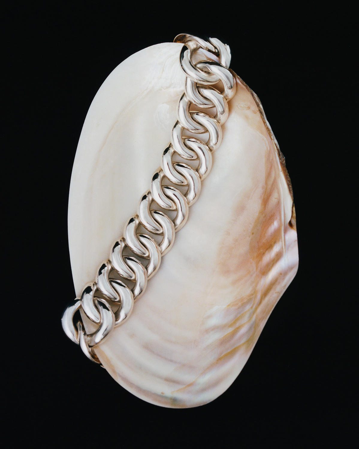
For the imagery, I first spoke with Maya about what inspired her new collections, she mentioned water reflections and very minimal use of organic shapes. I loved the idea of contrasting something woman-made with organic forms, how the shape, texture and lighting elevates the pieces and the relationship between the two structures. In keeping with the minimalist theme, we shot singular shells. The product was carefully placed to create an intertwined relationship. Lighting was one of the most important aspects of the shoot, done with a lot of time, care and consideration, with the use of plates, I wanted specific parts of the shell to be lit and bounce off the light. Given the colour of sliver jewellery, I wanted very small parts of colour to naturally arise from the shells, but not to overpower.
Maintaining responsibility for our production carbon footprint, our (all female) team only used public transport throughout the entire process and we walked between locations during shoot days and using shells as the set design also meant they are re-used in the store (you can find the ones from our campaign in her Islington store) and have also featured again in other campaigns.
For the messaging, I wanted it to it be a succinct, one-liner that people instantly took in. It was important it fit in one line across all printed matter and digital comms. Involving the community, we spoke to most members of her staff across London, as well as some local store customers for what they felt was most important. The feedback we received was the fact the stores were in local neighbourhoods, and jewellery was all crafted in front of you in their shops.
For styling, again reflecting minimalist approach, I wanted to just show skin, in a non-sexy sense, that complimented the organic nature of the shells, with natural light and little to no make up on the face.
The printed matter was designed to reflect minimalism carried throughout the rebranding: minimal type and a small gloss coated image centred on uncoated stock. For the print production, our studio introduced GF Smith's recycled ethical range and to print locally in London.