&Alex Identity: Brand refresh of Alexandra Dental
2023
Designed by Éanna O_Shea and Rachel Broaders at Image Now
Brand Strategy: Darrell Kavanagh
Design Support: Ellie Stone, Max Kruseman Aretz
Project Management: Holly Henry, Eimear Boushel-Payne
Categories: Promotional / Website / Environmental / Identity / Packaging / Signage / Social Media
Industry: Corporate
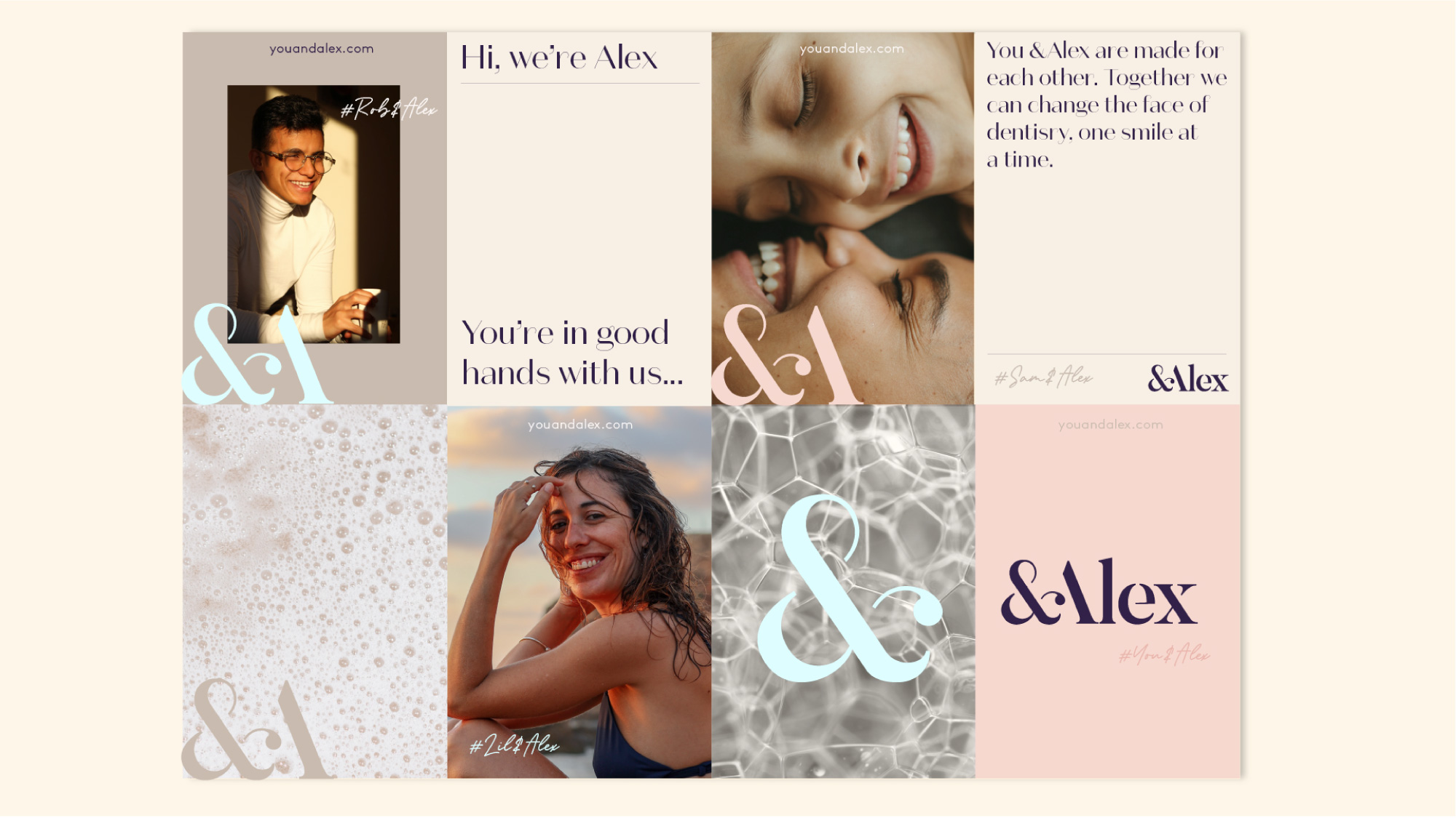
When developing the new identity for &Alex, formerly Alexandra Dental, our core objective was to instil a sense of genuine care, consideration and human connection into the brand; to communicate the high quality of service and care provided to patients from beginning to end of each experience. The rebrand was to represent a fresh, contemporary approach for the business and a reframing of the typical dental experience as they grew their offering to include a range of aesthetic and skincare services.
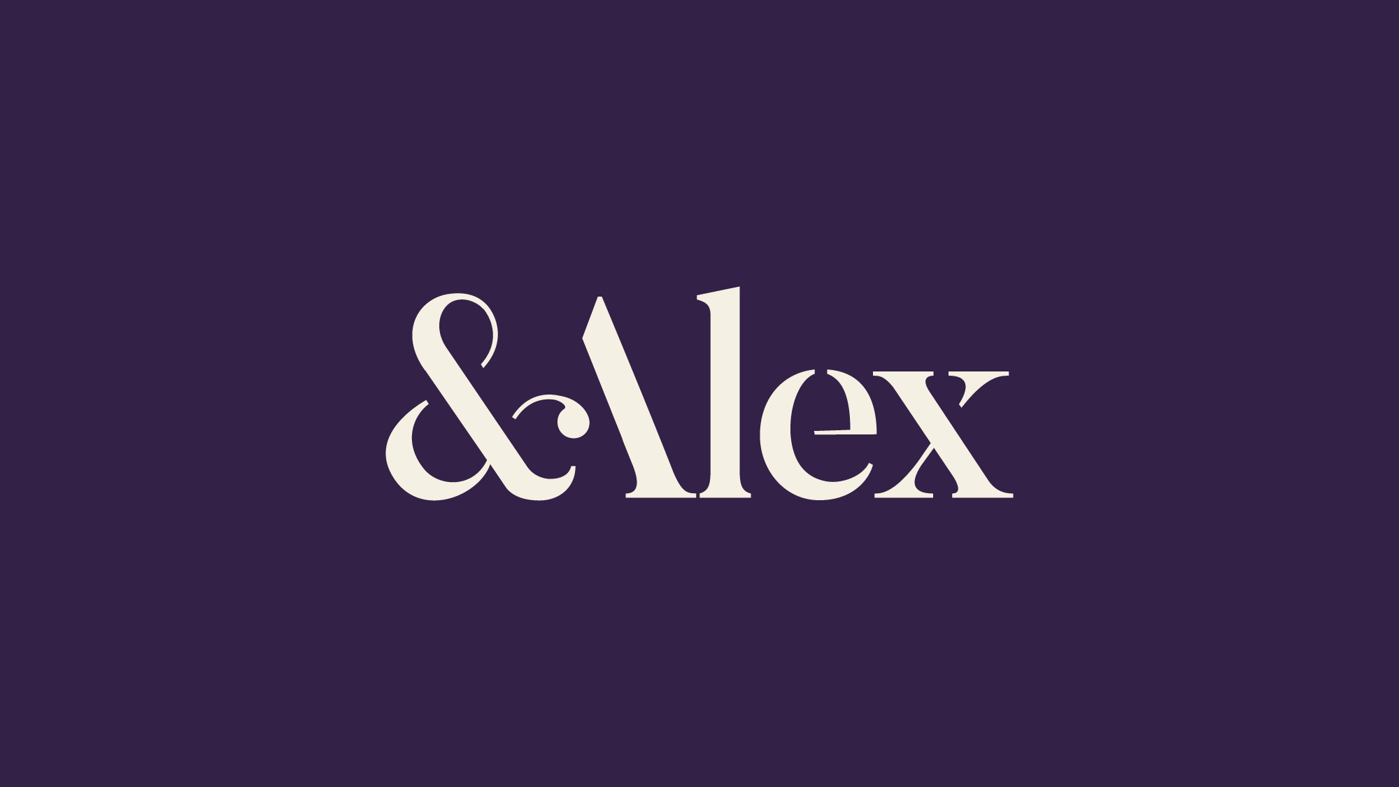
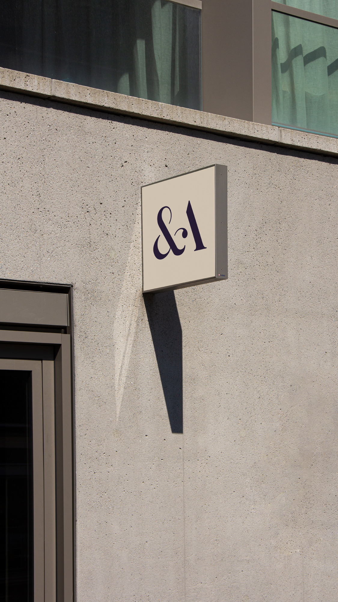
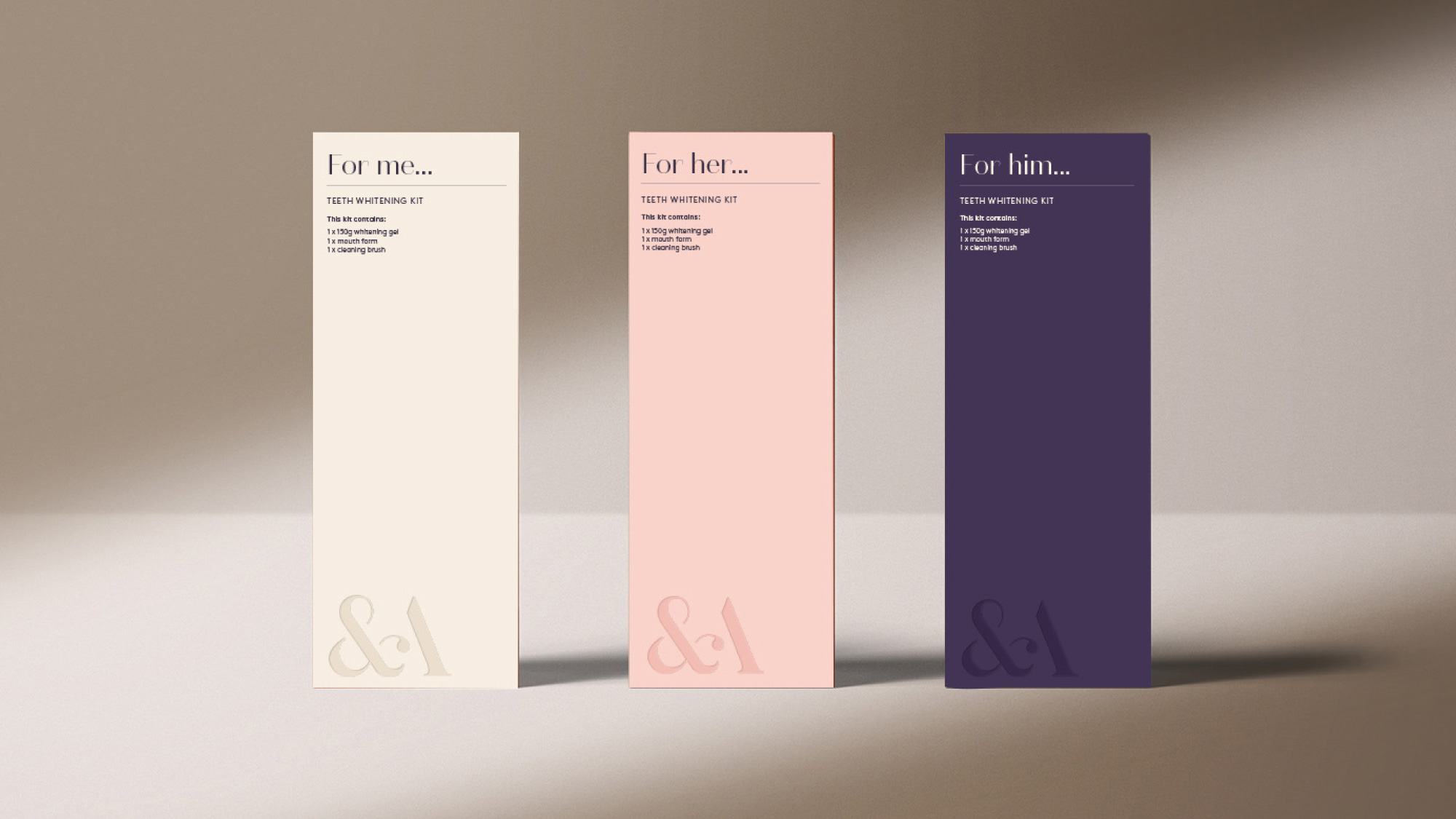
Our identity was built on key characteristics such as sensitivity, care, simplicity, attention to detail and freshness. Our renaming of the brand to “&Alex” was to signify inclusivity, new possibilities, an expanded service range and a contemporary approach. The new logo embodied these traits through the use of an elegant stencil serif typeface, alluding to the idea of facial curves and dental impressions through light and shade. The presence of a single quote mark joining the ‘&’ and ‘A’ represented the ever-present qualities of genuine care and connection.
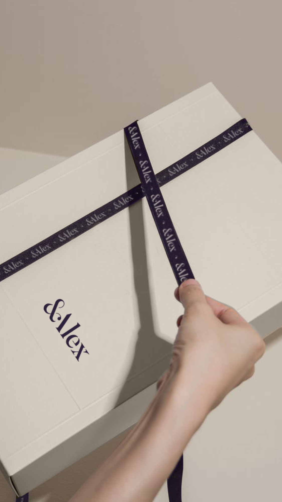
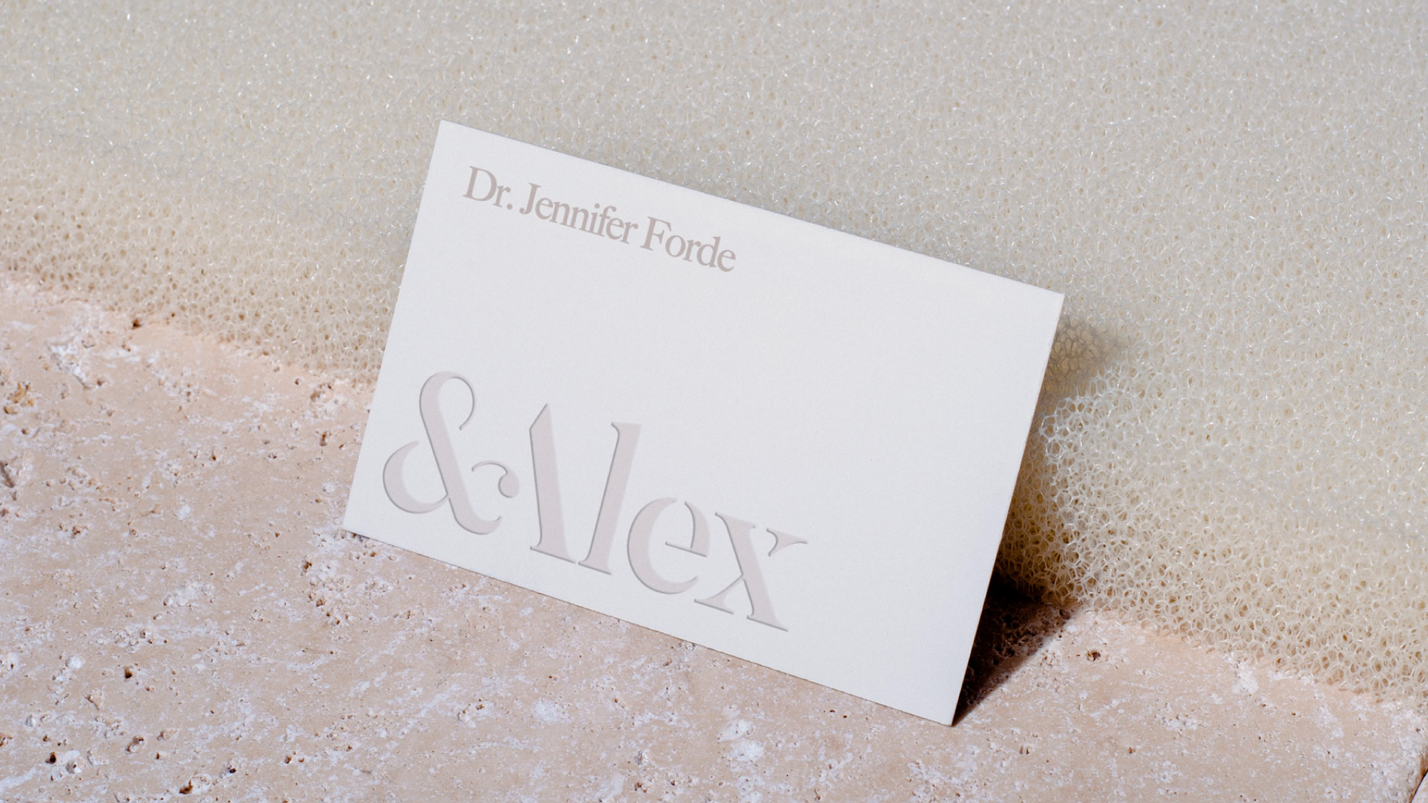
The colour palette was composed of a range of soft neutral shades which supported a sense of warmth, luxury, ease and humanity. The core cream and aubergine were accompanied by whites, browns, pinks and a fresh wash of icy blue to cut through and add energy to the palette when needed. Our art direction style was natural, inclusive, joyful and grounded, showcasing the beauty in every face.
Natural textures related to cleansing and freshness such as bubbles, water, creams, pastes and serums were used in communications to convey tactility, attention to detail and freshness. A subtle embossing technique was used in packaging to carry through the theme of care, elegance, light and shade.
A minimal, pared back approach to signage and interiors allowed the practices to be relaxing, pleasant and comfortable spaces which contrasted with the cold, clinical feel of the traditional dentist’s office. The final rebrand provided &Alex with a renewed relevance to their target audience, a contemporary and focused approach, and a revolutionised patient experience centred around care, quality and genuine connection.