ANDCHIPS
2012
Designed by Deirdre Breen, Deirdre Corcoran, Kieran Rigby and Mark Quirke at Chapter.
Categories: Identity
Industry: Commercial
Website: andchips.ie/
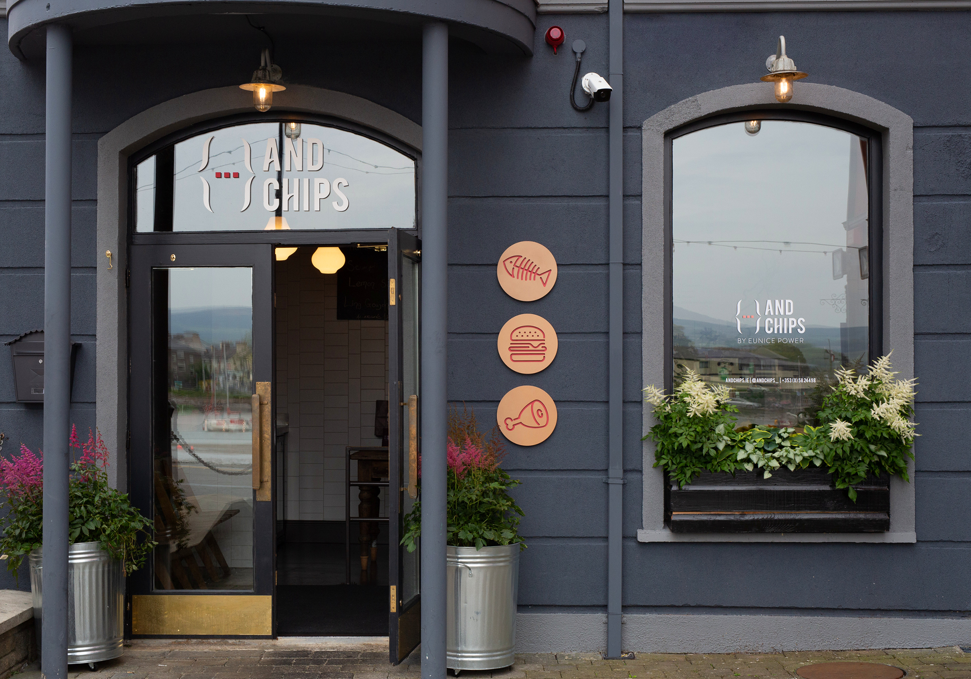
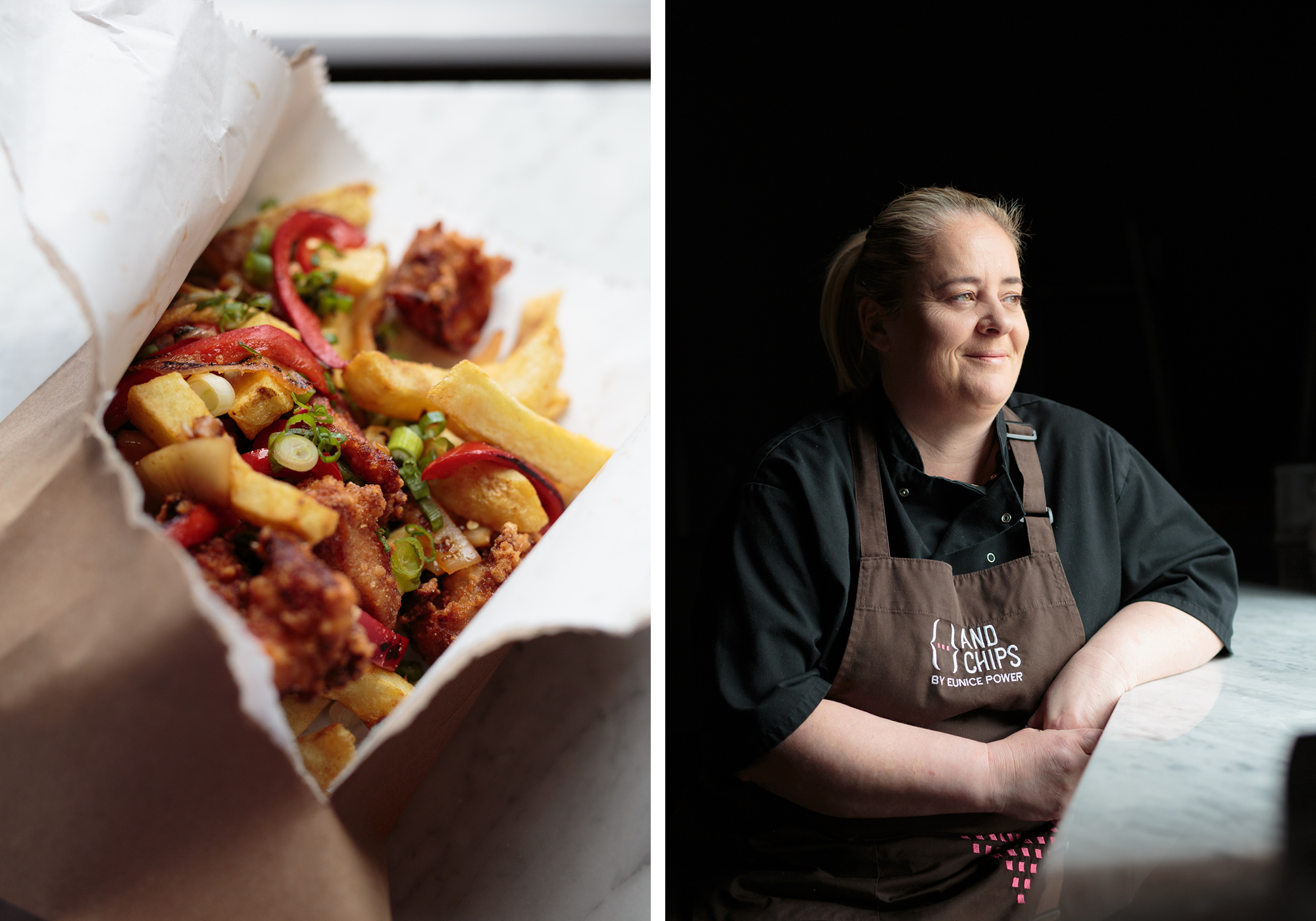
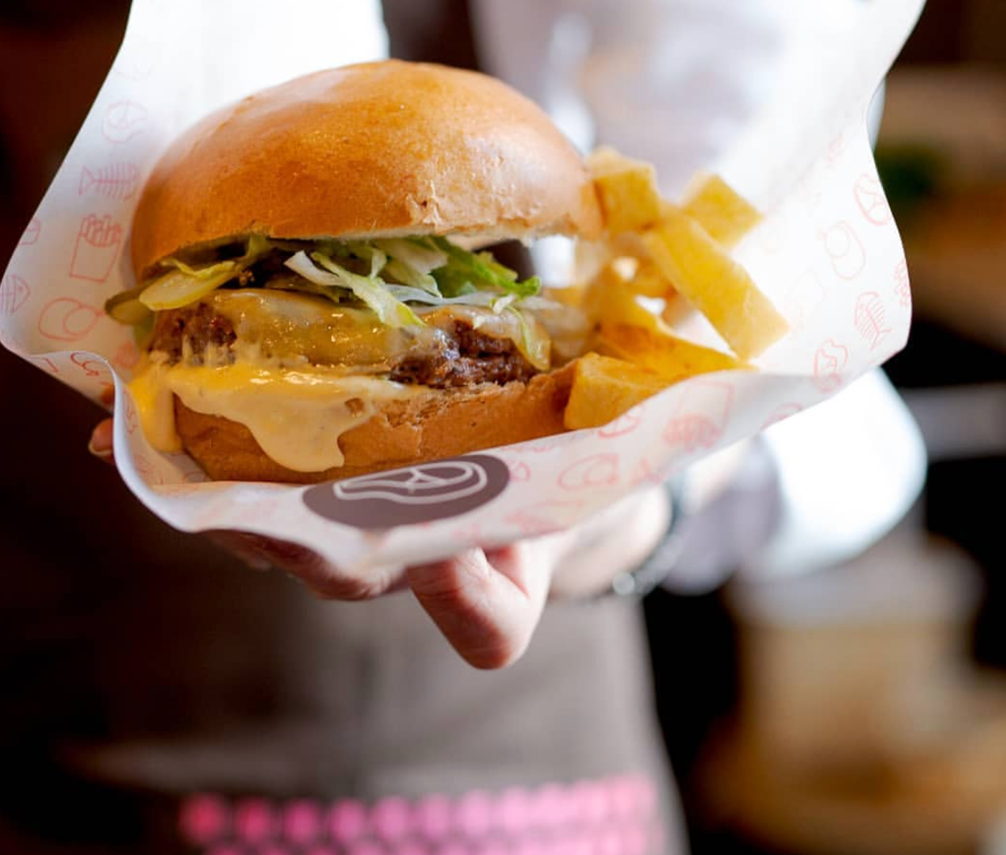
ANDCHIPS is a new venture launched in 2019 by renowned Irish chef Eunice Power. Eunice came to us with an idea to set up a chipper dedicated to creating delicious fast food using local ingredients from the rich West Waterford countryside.
We worked with Eunice on brand strategy, giving the restaurant a name that highlights the core part of any trip to the chipper... and so ANDCHIPS was born. The new name heroes chips, and all the wonderful things chips can accompany — a burger, a cycle, a trip to the seaside... the list goes on.
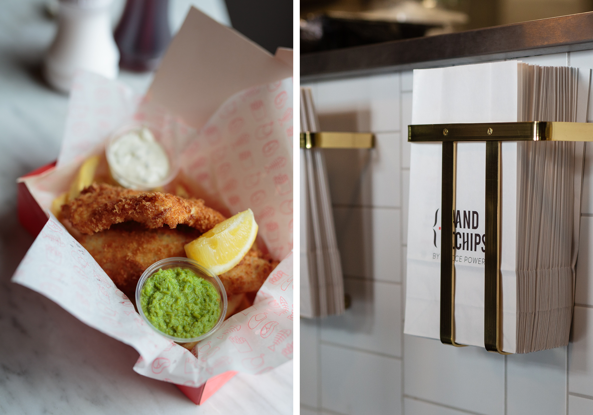
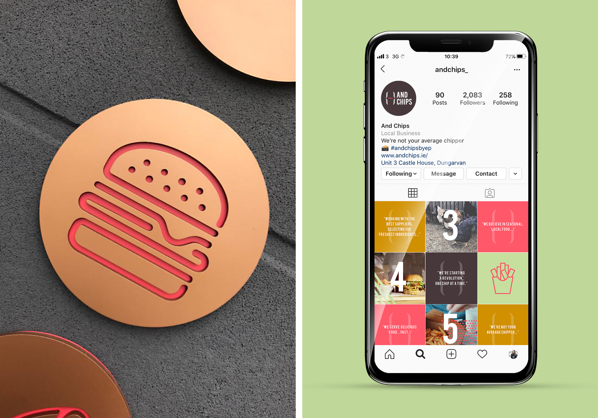
The dynamic logomark illustrates how versatile chips are, and the animation shows the many pairings you can have with them, in both word and icon format. We created a series of icons that work within the curly brackets of the logomark, and graphic devices that are bold and fun. Our five colours in the palette are based on the five established basic taste sensations: sweet, sour, salty, bitter, and savoury. The brand identity worked across packaging, signage, menu boards, posters, printed menus and digital experiences.