Arup in Ireland LXXV
Designed by Caitlin Quinn at Vermillion Design
Concept director: Anne Brady, Vermillion Design
Creative director and project manager: Caitlin Quinn, Vermillion Design
Project writer: Catherine De Courcy
Master calligrapher: Tim O'Neill
Proofreader: Kate Murphy
Craft binder: Pascal Flynn, Antiquarian Book Crafts
Lithographic printer: Ciarán Smith, Plus Print
Fine art print and finishing: Colin Reid and Robbie Holland, Colorman
Hand print finishing: Rory Breen and Carmel Breen, Canpack
Arup project team: Sean Clarke, Amy Fishbourne, Jenny Igoe and Eoghan Lynch
Categories: Printed Publication / Print / Exhibition / Experience
Industry: Corporate
Tags: Architecture / Typography / Art direction / Bookdesign / Publishing / Craft / History / Storytelling / Exhibition / 3d / Education / Design / Publication
Mentioned in:
Arup in Ireland LXXV was created to celebrate the 75th anniversary of Arup in Ireland, and delivered as a gift to the staff while they were working from home during the pandemic.
We were commissioned to create a retrospective to mark 75 years of Arup in Ireland because of our book design expertise, however the client project team knew from the outset that they didn’t wish to create a ‘tome that would gather dust on people’s shelves.’
Arup in Ireland had an archive of thousands of projects to choose from, which would have been undigestible for the audience, so we guided the team towards a much more refined object which would include a far smaller number of projects. The gift was not designed to be an encyclopaedia of Arup in Ireland projects, but rather to be representative of the work being delivered at the time and to help explain how they diversified into more and more sectors. Arup in Ireland were always willing to take on new challenges and grew very much in sync with the modernisation of the State.
It was important that Arup in Ireland LXXV was physical and tactile rather than digital, as the staff were becoming weary of digital formats and platforms as a result of over a year of remote work. The Arup project team wanted to create a gift that brought the employees together with the firm and one another at a time of physical disconnection.
We assembled a specialist creative team with skills in publishing, paper engineering, design, typography, calligraphy, copywriting, printing, hand finishing and craft binding. As we were not working to an established format, we were flexible and adaptable with the design of the gift; experimenting and discovering how different elements would work as the project progressed.
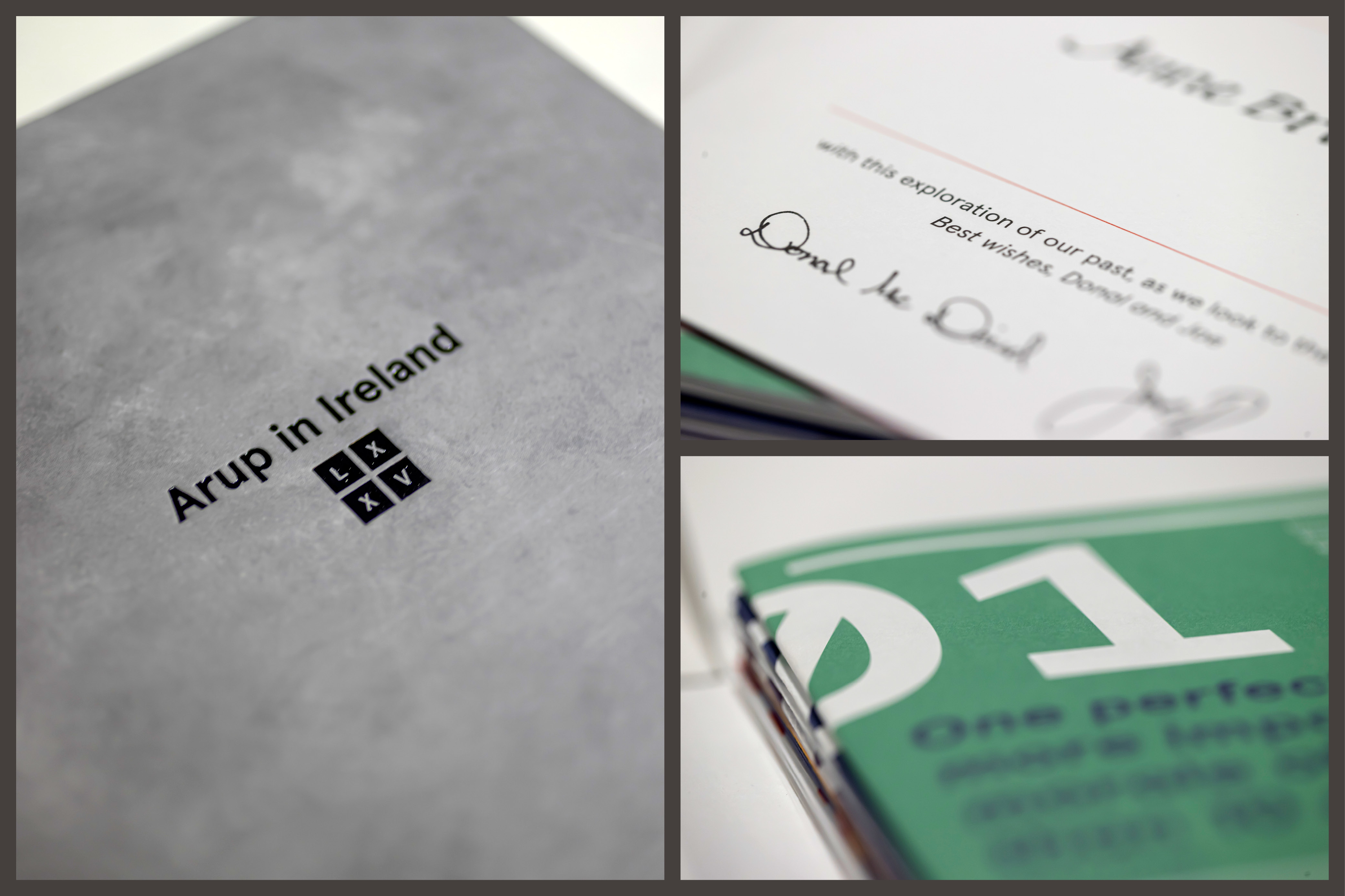
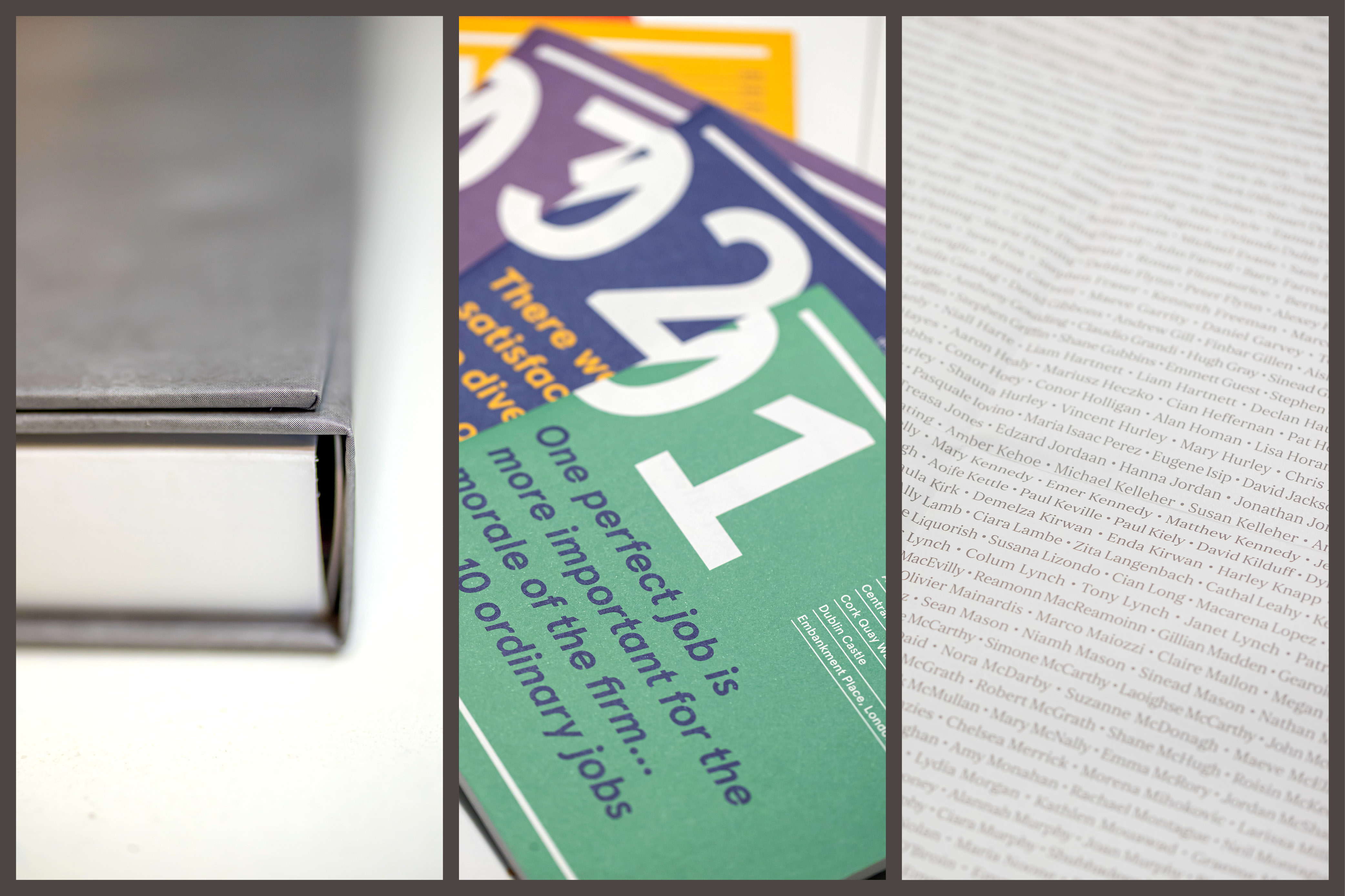
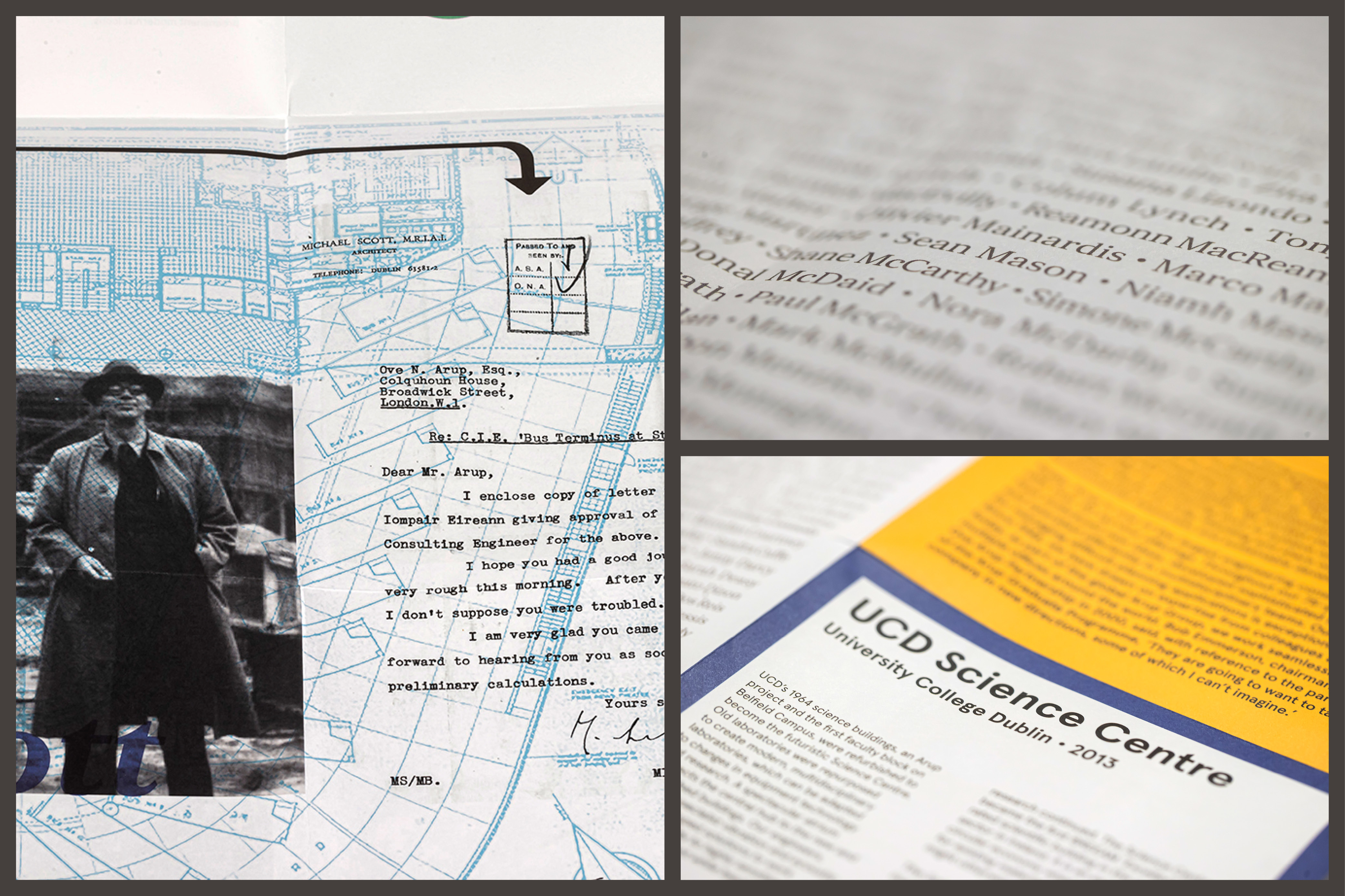
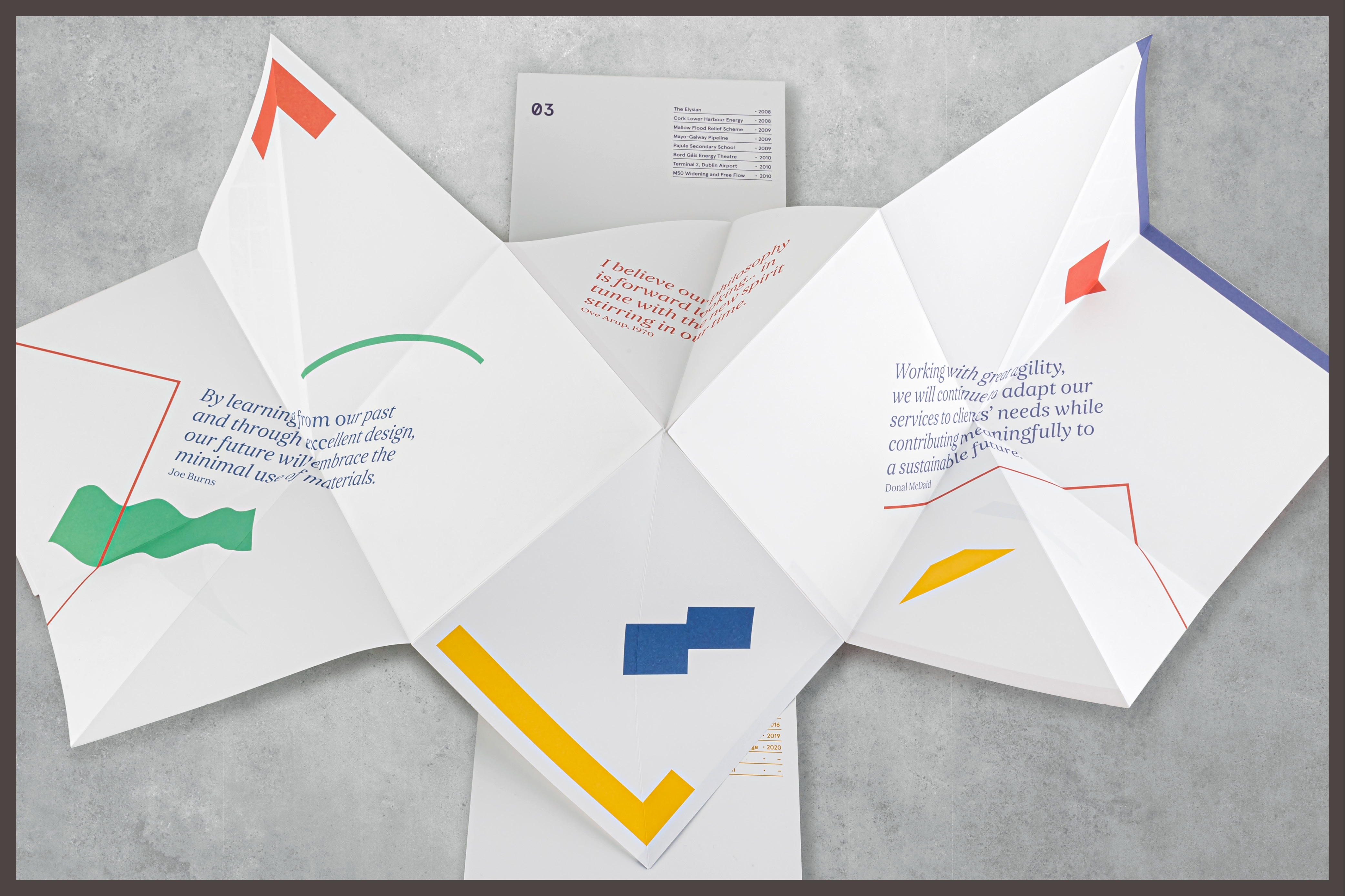
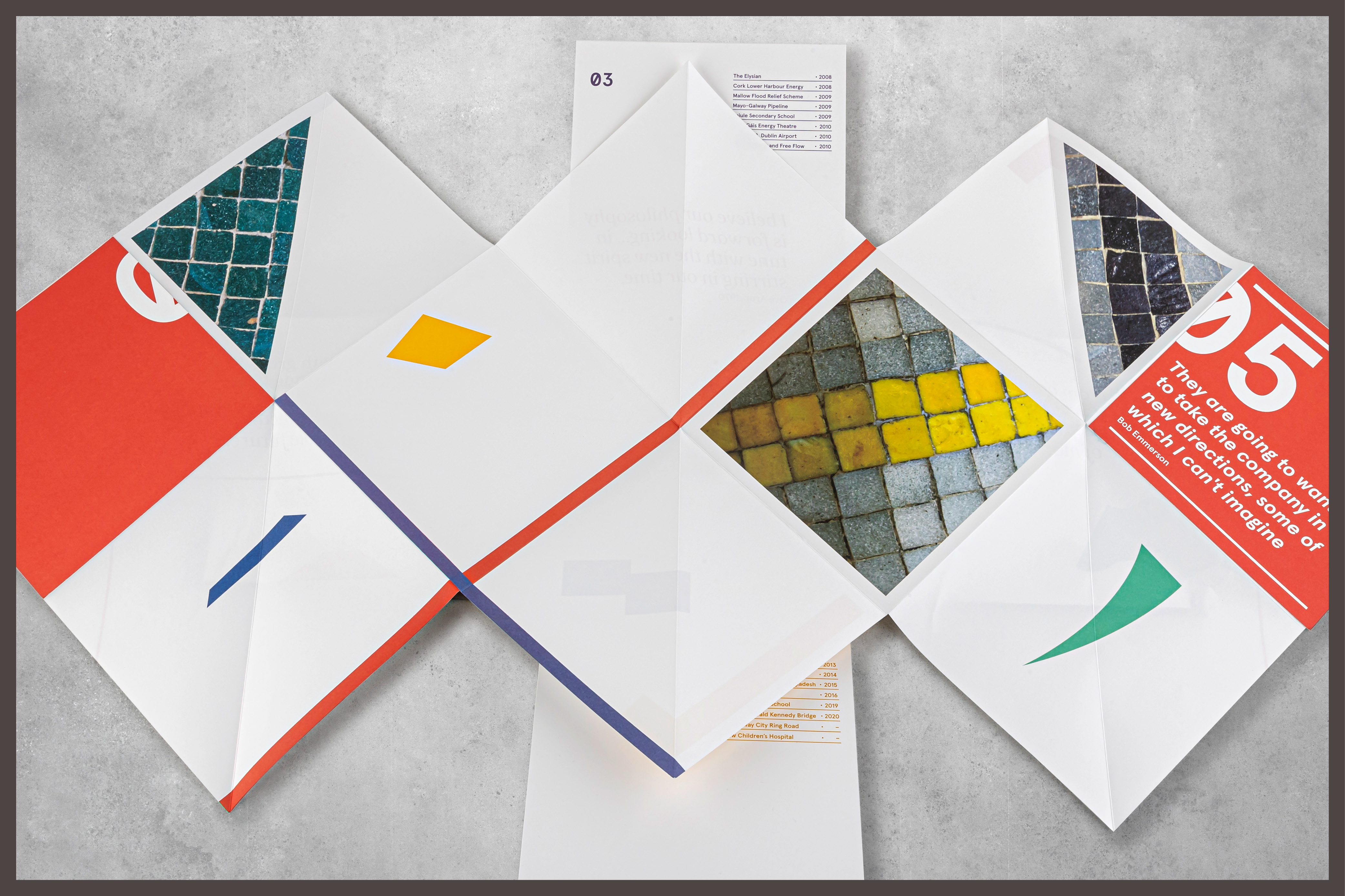
The gift is bound in a specially designed outer cover with an invisible magnetic seal, covered in concrete-print (as reinforced concrete was Arup founder Ove Arup’s signature material) with black foiling. It opens to a die cut Maltese cross, which contains a duplex introductory card and a stack of five folded sheets. Each duplex card was personalised, addressed to the recipient by our master calligrapher and signed by the CEOs of Arup in Ireland.
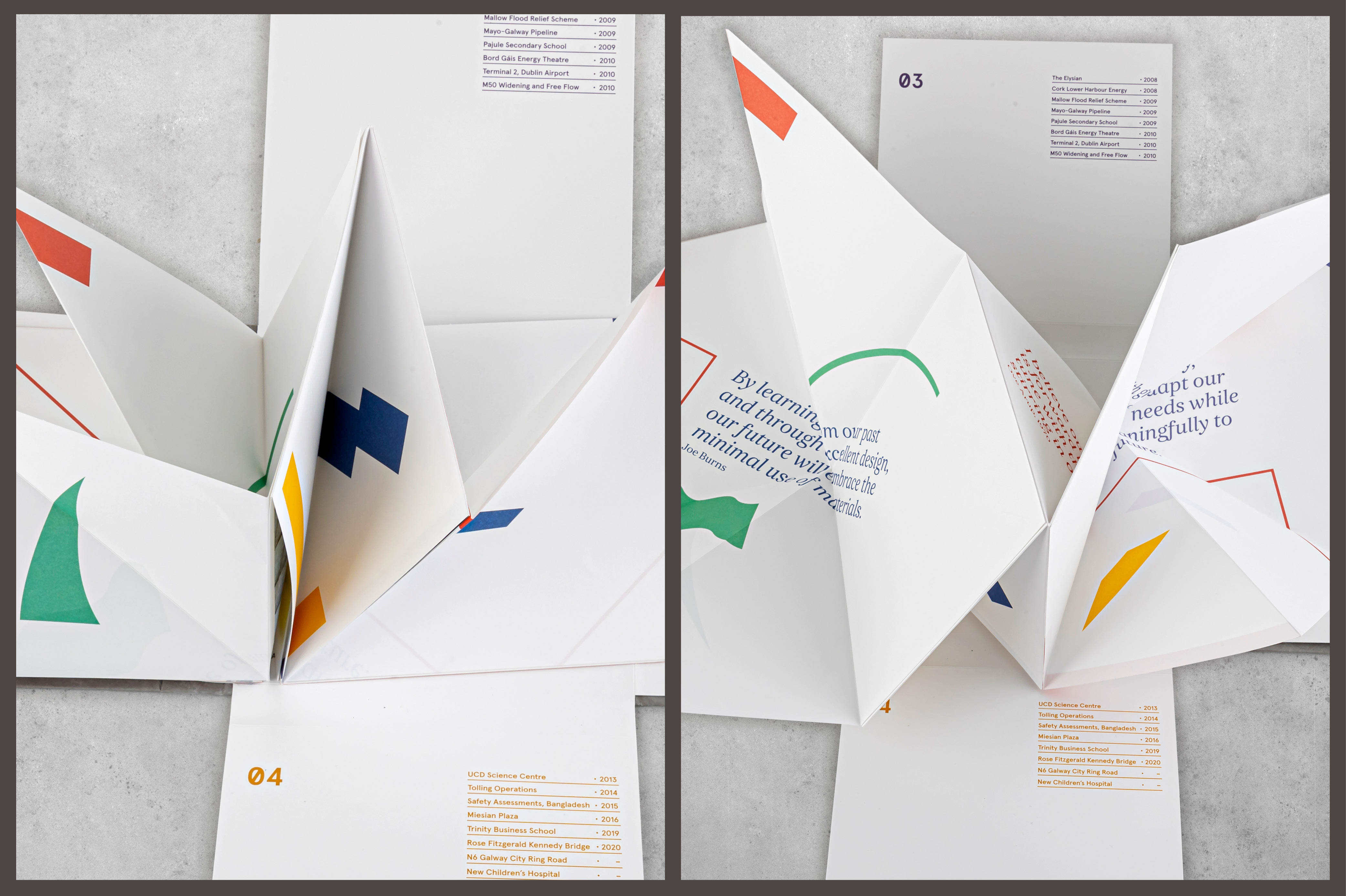
The design approach was based on the concept of Roman mosaics, a form of ancient interactive narrative storytelling. Sheets one to four (740 x 555mm) are each made up of twelve 185mm-square panels per side. Every sheet features eight chronological projects which unfold in order, along with additional written, visual and historical information to provide context, detail and tone of voice. Each sheet unfolds differently, each more complex than the last, to guide the reader through the journey of Arup in Ireland and make up the complete picture of the company; greater than the sum of its parts.
The reverse of sheet 4 features a ‘typographic snapshot’ of the Arup in Ireland staff names, typeset alphabetically as of 01 July 2021, to further connect the audience with the gift, the firm and one another. Sheet 5 is the final piece to be unfolded, and represents the future of the company, abstract and full of potential. The name Arup in Ireland LXXV includes Roman numerals as part of the mosaic concept.
The colour palette was inspired by Arup in Ireland’s iconic early project Busáras, which features distinctive colourful mosaics. Photographs of the mosaics can be seen on the reverse of sheet 5, to reference the inspiration for the palette and acknowledge the history of Arup in Ireland while looking to the future. We used quad tones from the colour palette in the photographs throughout, to visually unite all the projects in each narrative, though they spanned decades and were of varying quality. The graphic devices are based on abstract shapes found in featured buildings.
We received overwhelmingly positive feedback to Arup in Ireland LXXV from the Arup in Ireland team and staff, past and present, with recipients describing being transported back to a different time, being proud to be part of the history of the company, and being excited about where Arup in Ireland will go in the future.