Atlantic TU
Designed by David Wall, David Hussey, Cian Pawle-Bates, Kimberly Goes and Bren Byrne at McCann Dublin
Motion Design: Aiden O’Brien
Motion Design: Ellie Lyness
Project Director: Mariana Nevado
Project Manager: Lisa Haran
Senior Copywriter: Luke Wright
Categories: Identity
Industry: Education
Tags: Brand
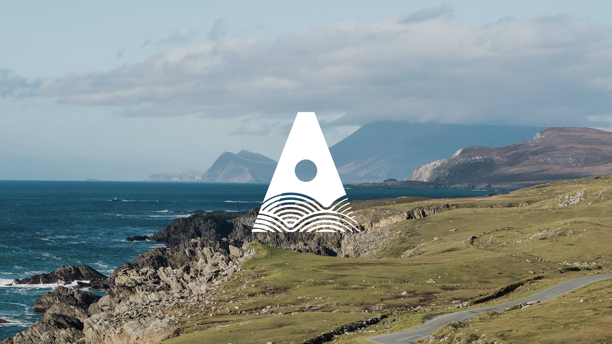
Atlantic TU is a multi-campus technological university in the north and north-west of Ireland. Its 20,000+ students and 2,000+ staff benefit from a combination of academic and research excellence, quality of life and opportunity – all of which can be experienced in an exceptionally beautiful part of the world. Formed by the amalgamation of three regional institutes which have been in operation since the 1970s, it launched in late spring 2022.
We led the process of naming, positioning and visual and language branding for the new university. The large client and stakeholder team was a defining characteristic of the project. We worked with four working groups, academic and support teams, students, and contributors from politics, education and industry. We interviewed dozens, presented to hundreds and surveyed thousands of stakeholders.
We took the process – which began with naming – as an opportunity to ensure that stakeholders always had clarity on our overall intentions, and an understanding of how we would draw upon their insights in our work. This dialogue allowed us to balance practical and conceptual needs in a unified solution with space for variety and nuance.
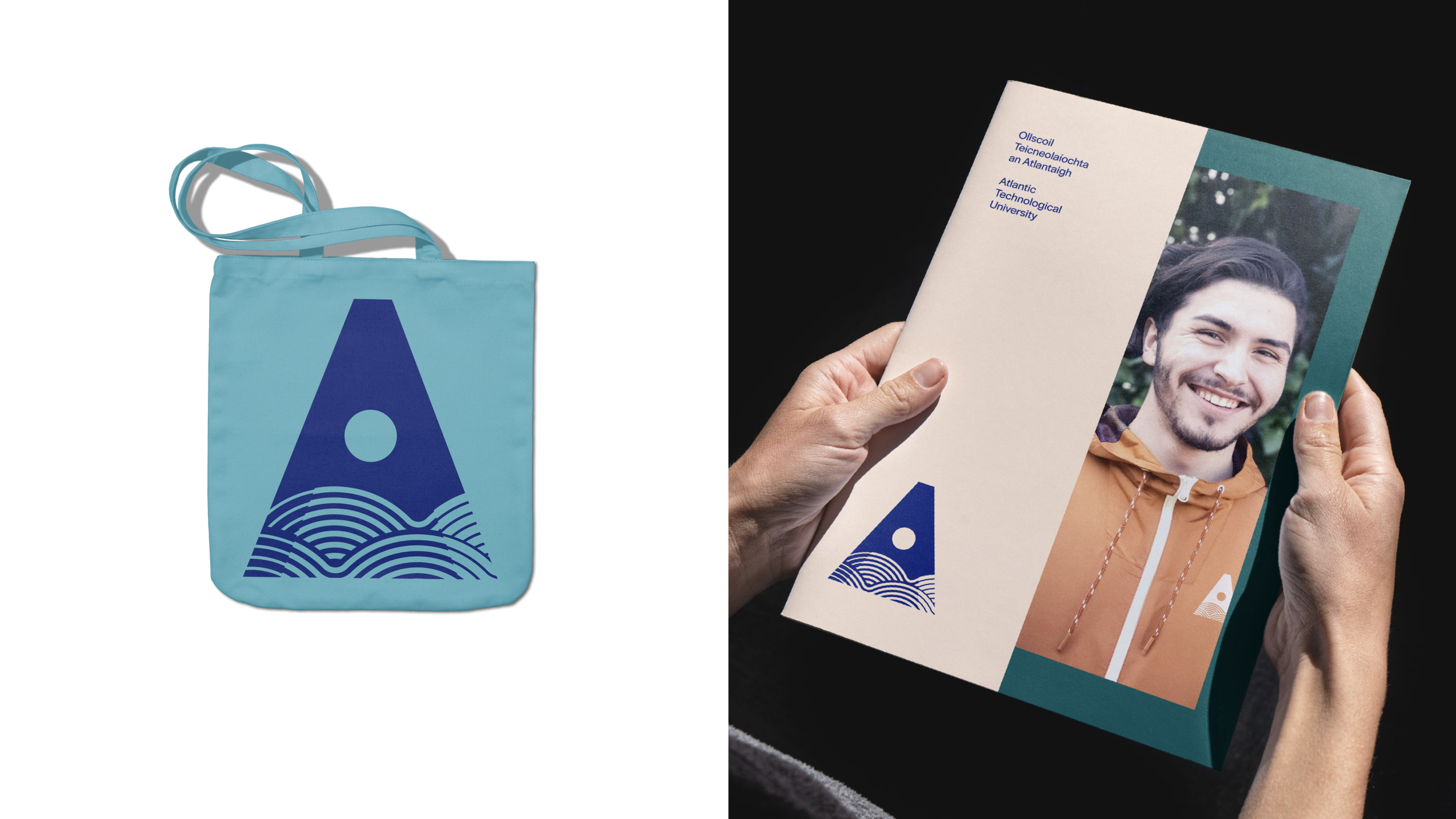
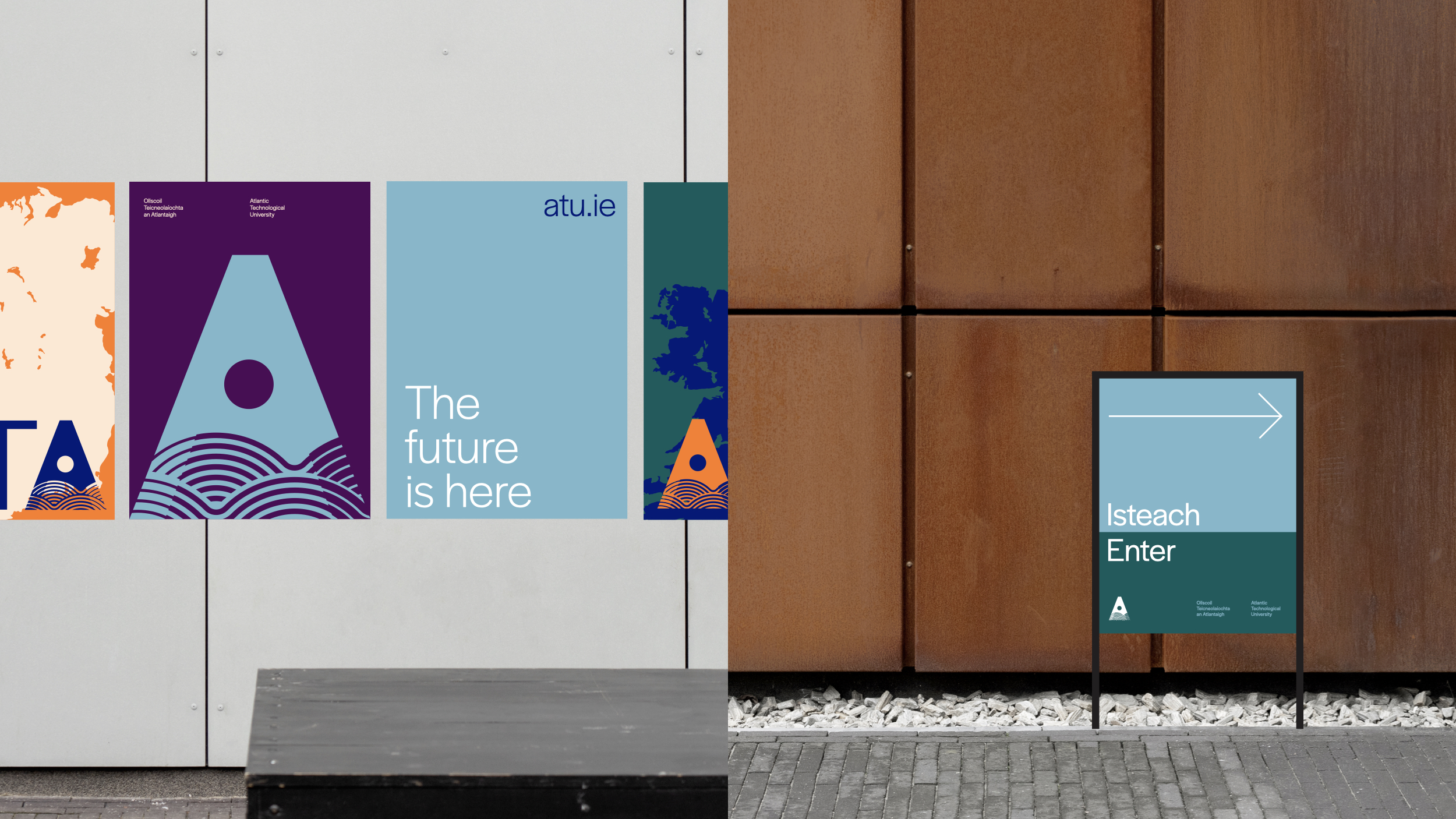
The resulting visual brand is built for use across campuses and contexts, and a unifying language brand centres on the brand idea: The Future is Here. Every component part has a connection to the idea and to the overall system, so that applications can respond to specific needs and context.
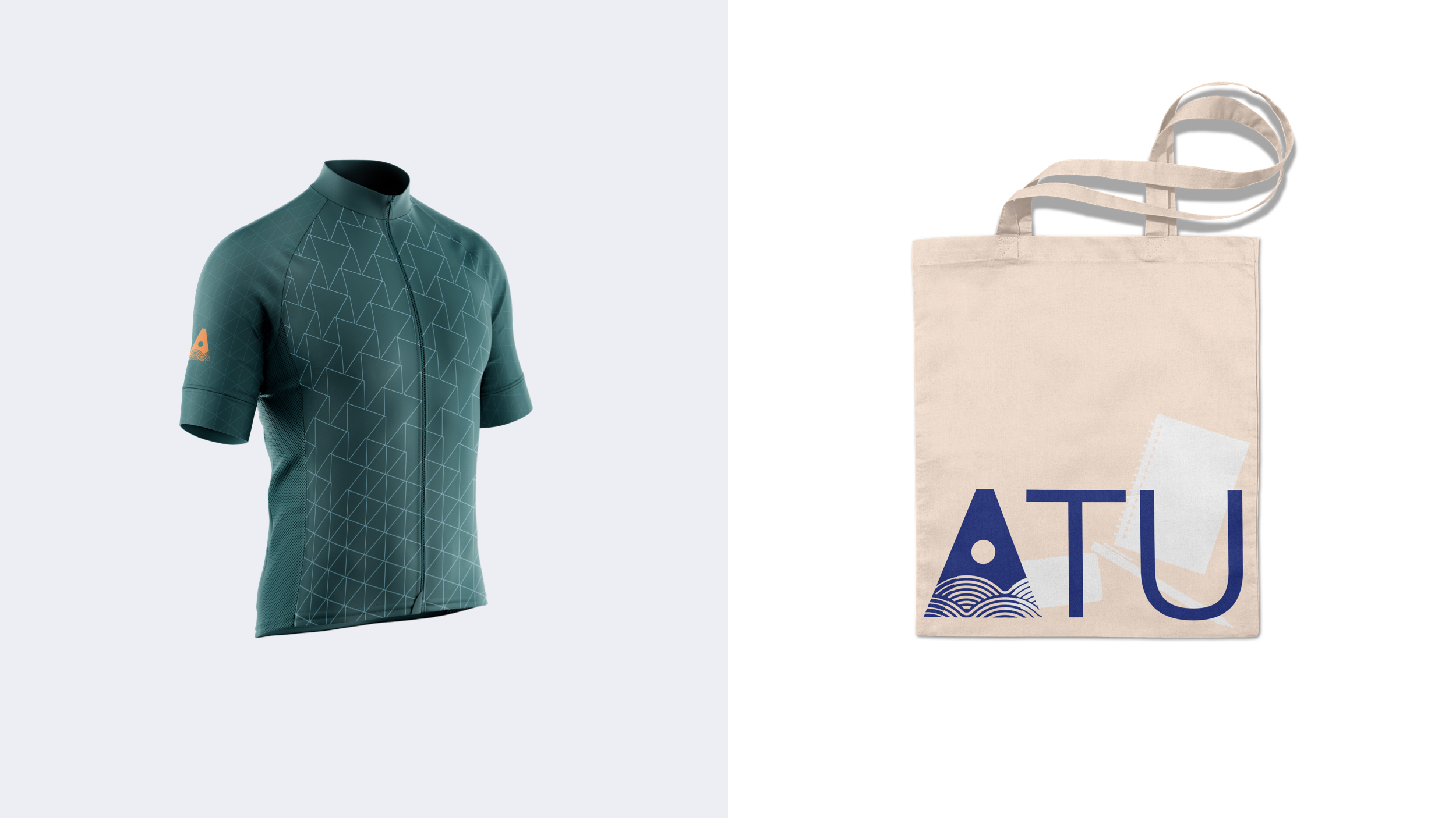
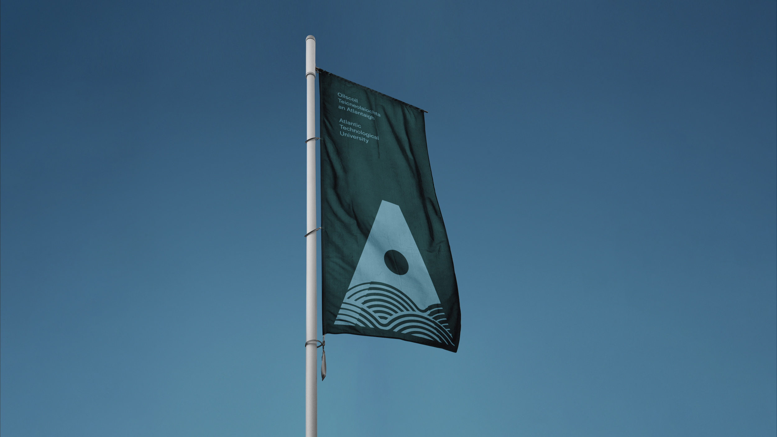
The logo evokes the letter A, cut through with an abstract depiction of the waves and sun. It can exist as a standalone icon, or as part of lock-ups (ATU and OTA) in English and Irish. A set of icons to represents the university campuses and fields of study, as a partner element to typography to provide clarity and differentiation. These sit comfortably alongside the brand typeface Halyard, which was chosen for its simple elegance and broad range of weights and styles. The brand uses colour inspired by the unique landscape of the Atlantic coast, starting in the sea and surf, across the beach and into the land.
We brought the brand to life with an extensive set of guidelines and associated templates. The brand was applied to livery, sportswear, merchandise, video call backgrounds, social profiles, permanent and temporary signage, stationery, and to a host of marketing and promotional outputs.
Our approach has contributed to a warm reception for the new brand, and a hugely encouraging launch for the new university.