Auger Mono
Designed by Seán Mongey and Max Phillips at Signal Type Foundry
Categories: Typeface
Industry: Commercial
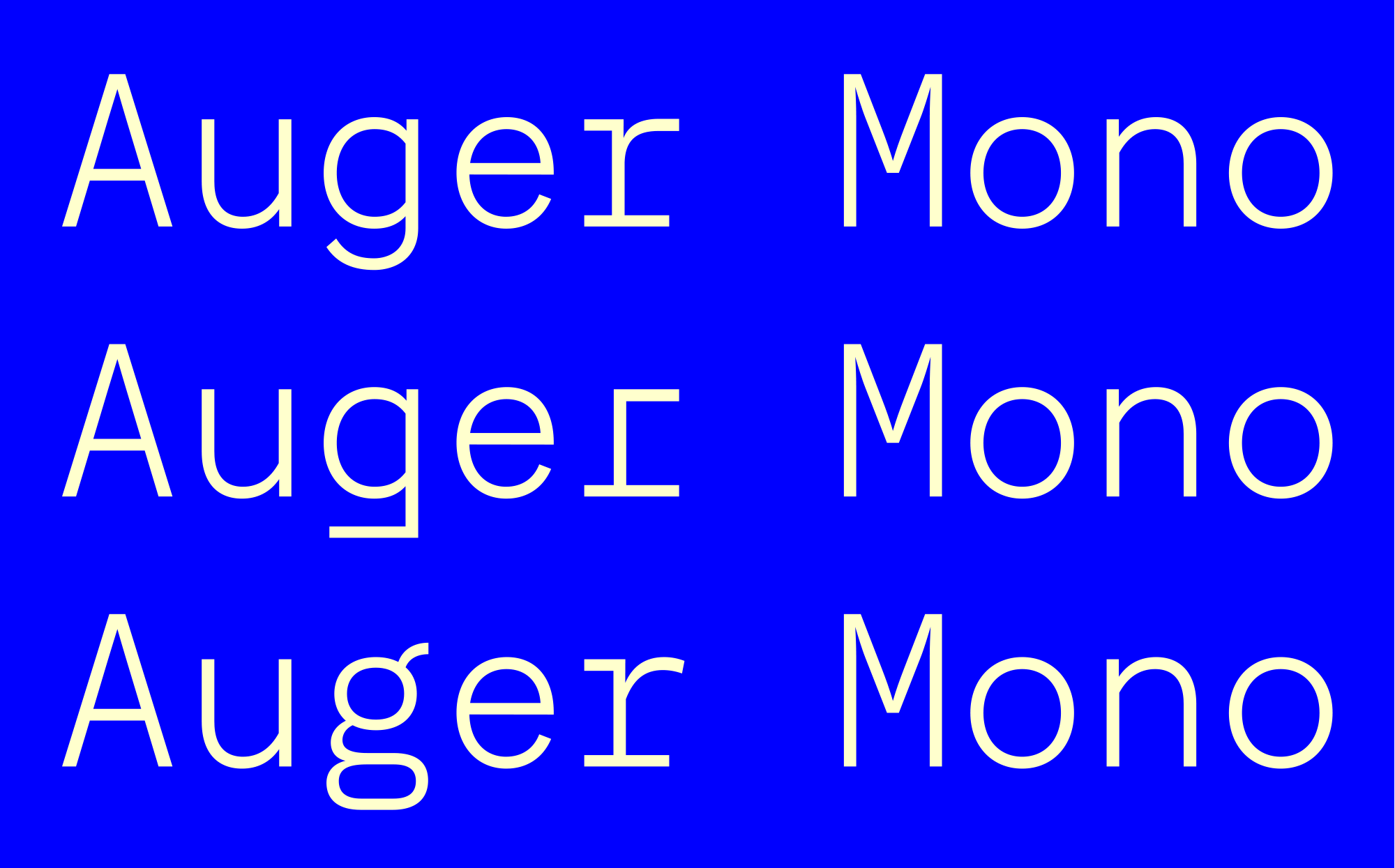
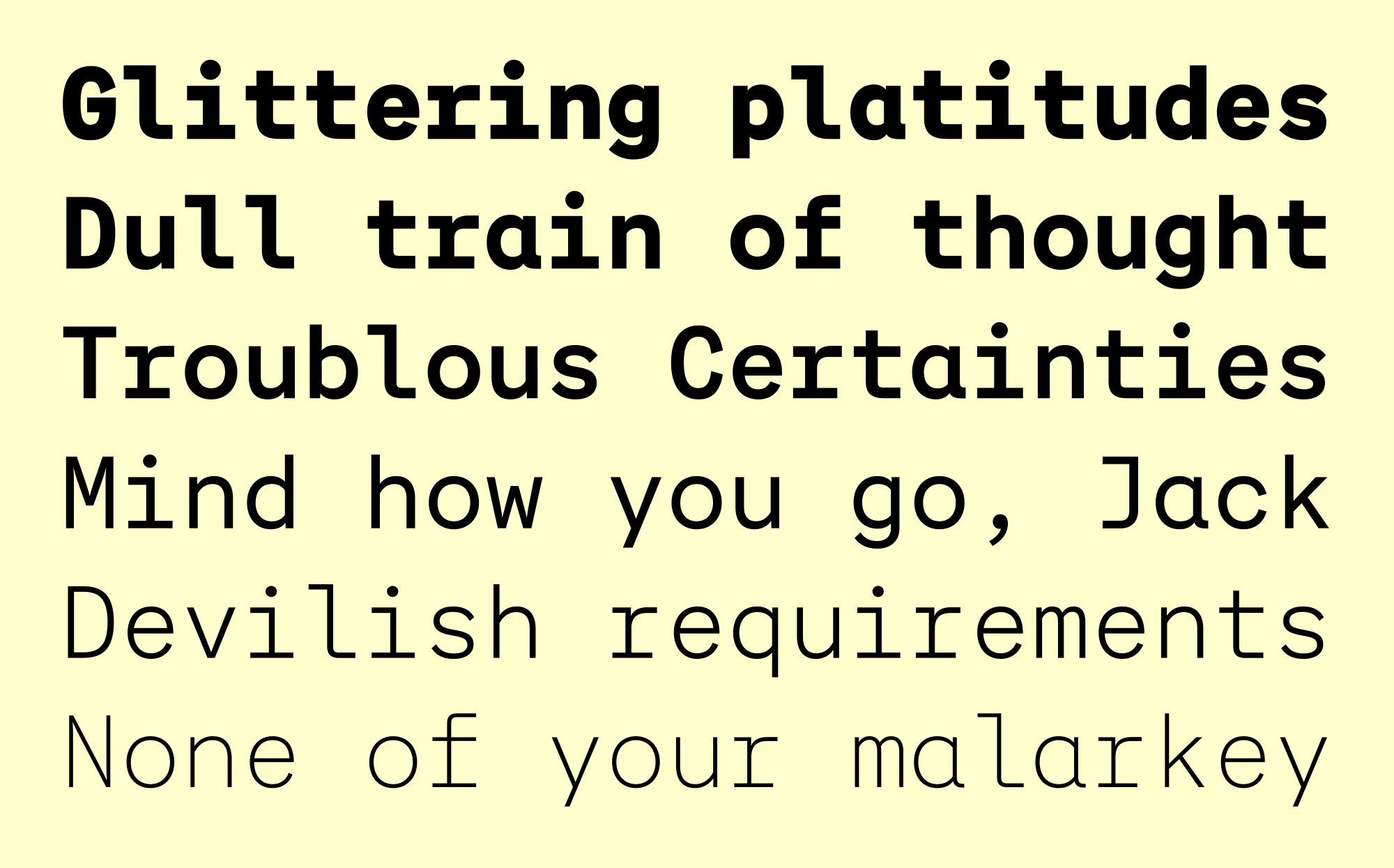
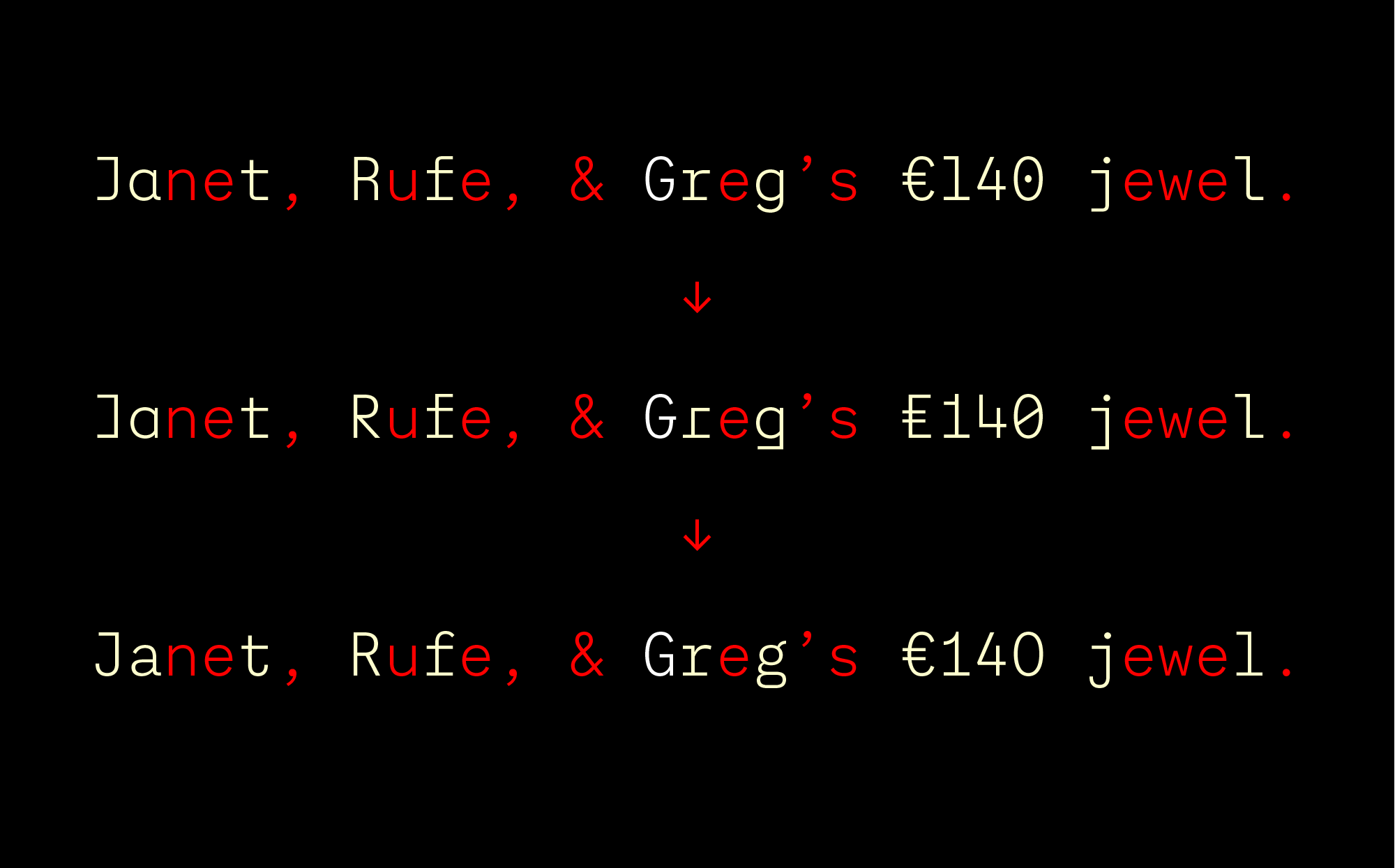
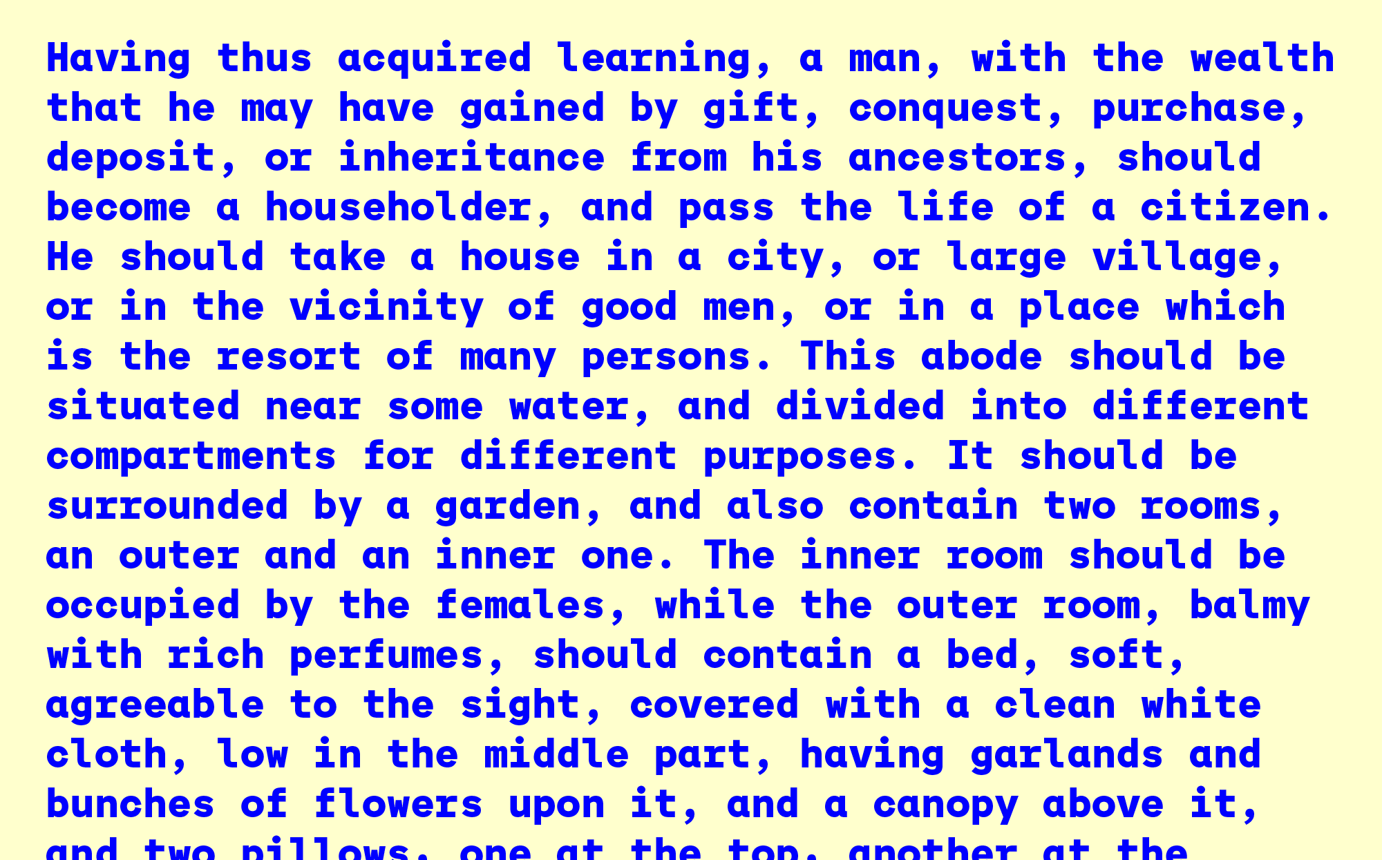
When two roads diverge in a wood, Auger Mono takes both. An array of alternates gives it unusual stylistic flexibility for a fixed-width typeface, ranging from plain and practical to aggressively geometric. Influences include old Leroy lettering templates, Fortunato Depero’s Bolted Book, and classic grotesk jobbing faces. But even at its quirkiest, Auger Mono’s open proportions and workmanlike construction keep it balanced and readable. Six weights ranging from a gossamer X-Light to a beefy Black provide additional versatility. Designed by Seán Mongey at Post and Max Phillips at Signal.