Avista
2021
Designed by Al Murphy, Susan Carberry, David Stanley, Elena Stevant and Kim Robinson at Red Dog
Design: Ian Hammond
Developer: Open
Categories: Website / Print / Identity
Industry: Charitable
Tags: Website / Logo / Print / Charity / Not for Profit / Brand identity
Website: avista.ie/
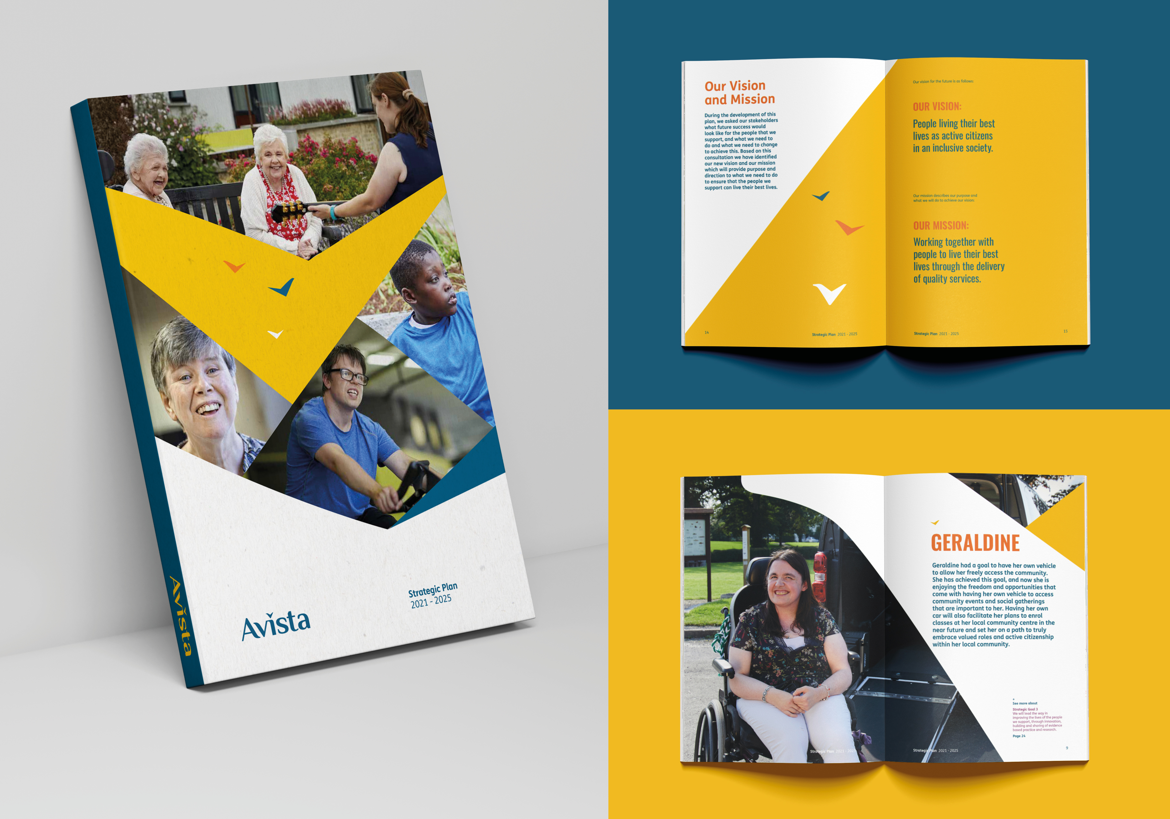
Since 1925 The Daughters of Charity have brought change to the lives of children and adults with intellectual disabilities across Ireland. Our naming and brand work was guided by our their new vision ‘People living their best lives as active citizens in an inclusive society’ and by their core values: service, respect, excellence, collaboration, justice and creativity that underpin everything they do.
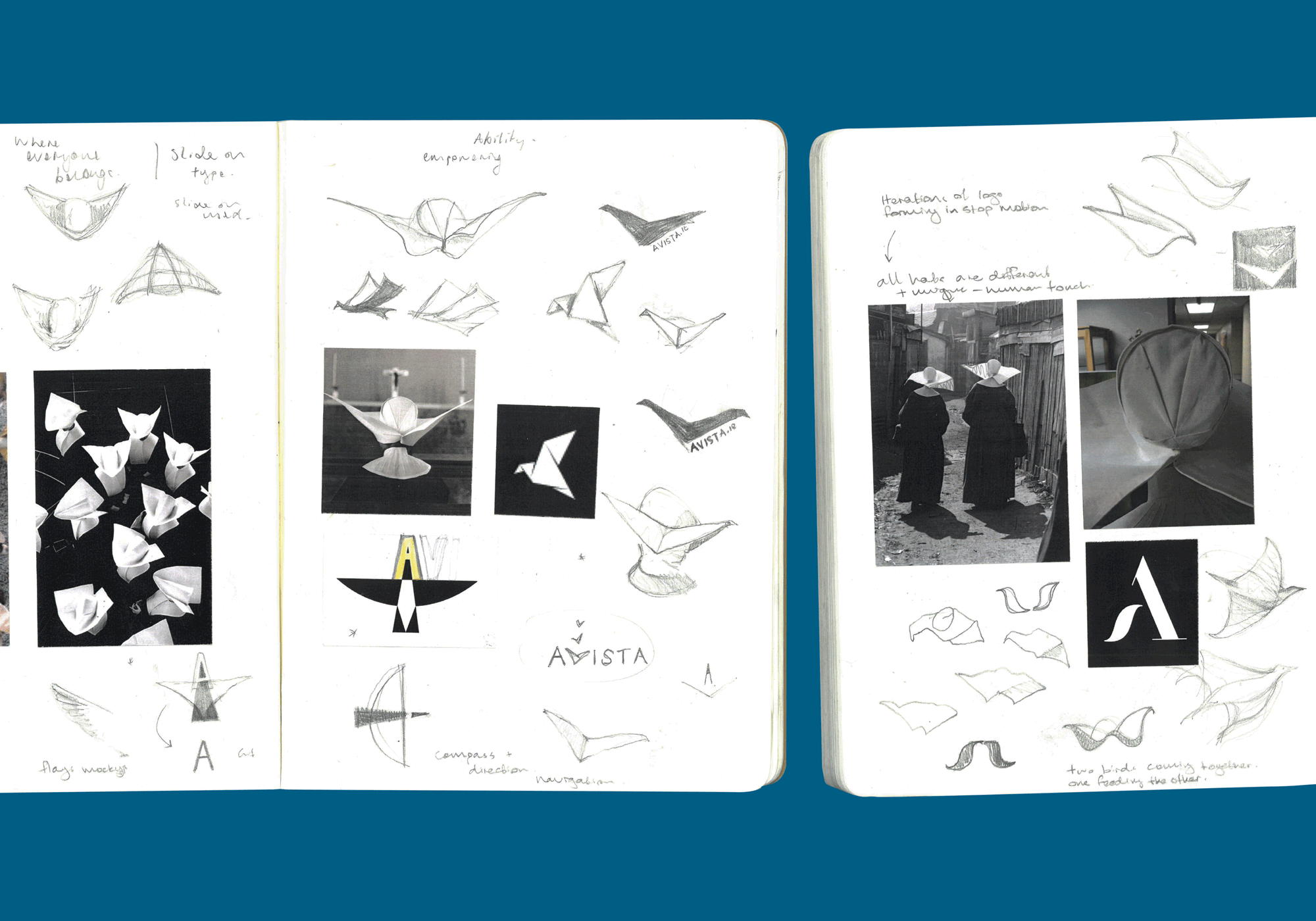
The name ‘Avista’ refers to a broad sweep of the landscape ahead. To new horizons. It speaks to how the Daughter’s approach has always been forward-looking. While researching the daughters rich history for the brand identity, we were drawn to the distinctive headdress that the nuns wore in the 1800s, called a ‘cornette’. The symbol we created drew inspiration from a cornette and is also a symbol for the future of ‘Avista’ in the form of a bird in flight.
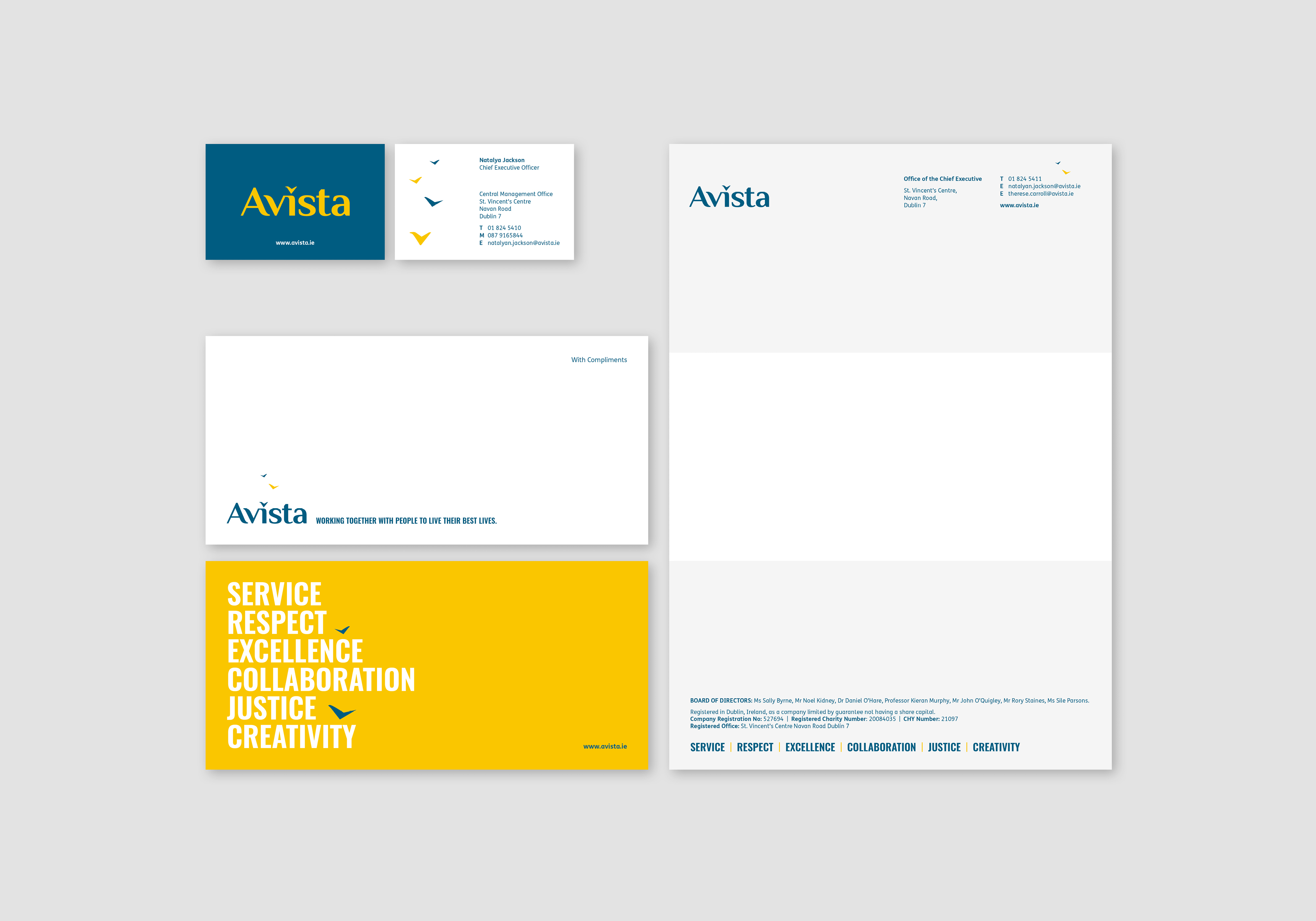
The graphic language is centred around the new logo. Firstly, the fluid arc shapes combined with imagery and colour, create sweeping curves across applications. Secondly, the individual bird shapes paired with dynamic type help to create a sense of momentum for high-level messaging.
The colour palette is warm and positive. Inspired by their values and people, it is designed to work across a broad range of audiences.
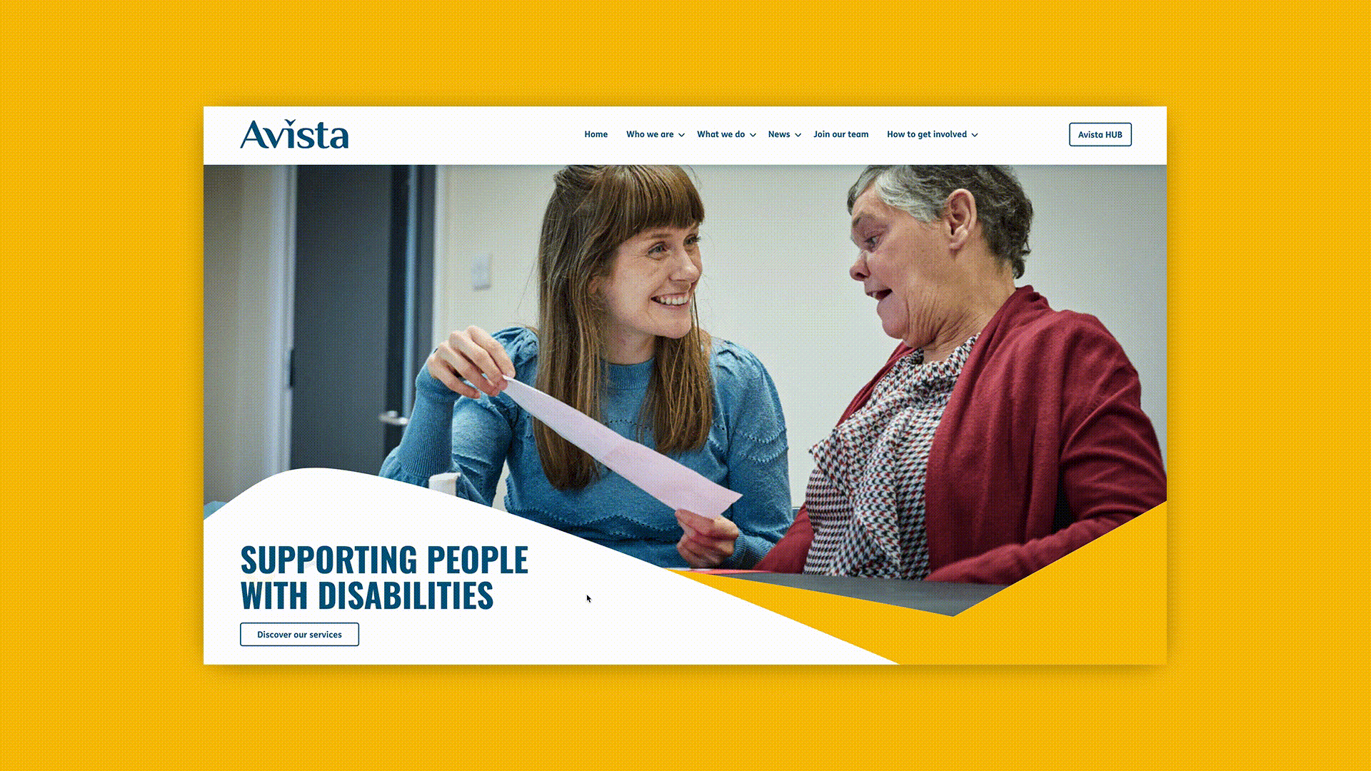
We also designed their new website and strategy to complement their newly branded launch communications.