BlueZone Fitness
Blue Zones are small areas around the world where people live much longer than average. Studies have shown that living a longer and healthier life comes down to the following: regular social engagement, eating a healthy, balanced diet and participating in daily exercise. Wexford-based personal trainer, Cormac Byrne, has developed a series of fitness and nutrition programmes based on this philosophy.
BlueZone Fitness offers four main services: workplace fitness & wellbeing, online training & nutrition, sport’s fitness and personal training. Cormac is particularly focused on the idea of making fitness and nutrition more accessible to people in their daily lives. Pushing the boundaries of traditional fitness, BlueZone offers in-office exercise classes and health seminars. Workplace fitness is becoming increasingly popular and has enormous health benefits, with less sick days and improved employee productivity. Online training is also revolutionising the industry, offering a more affordable and flexible solution to personal training. It has never been easier to workout anywhere (and everywhere!)
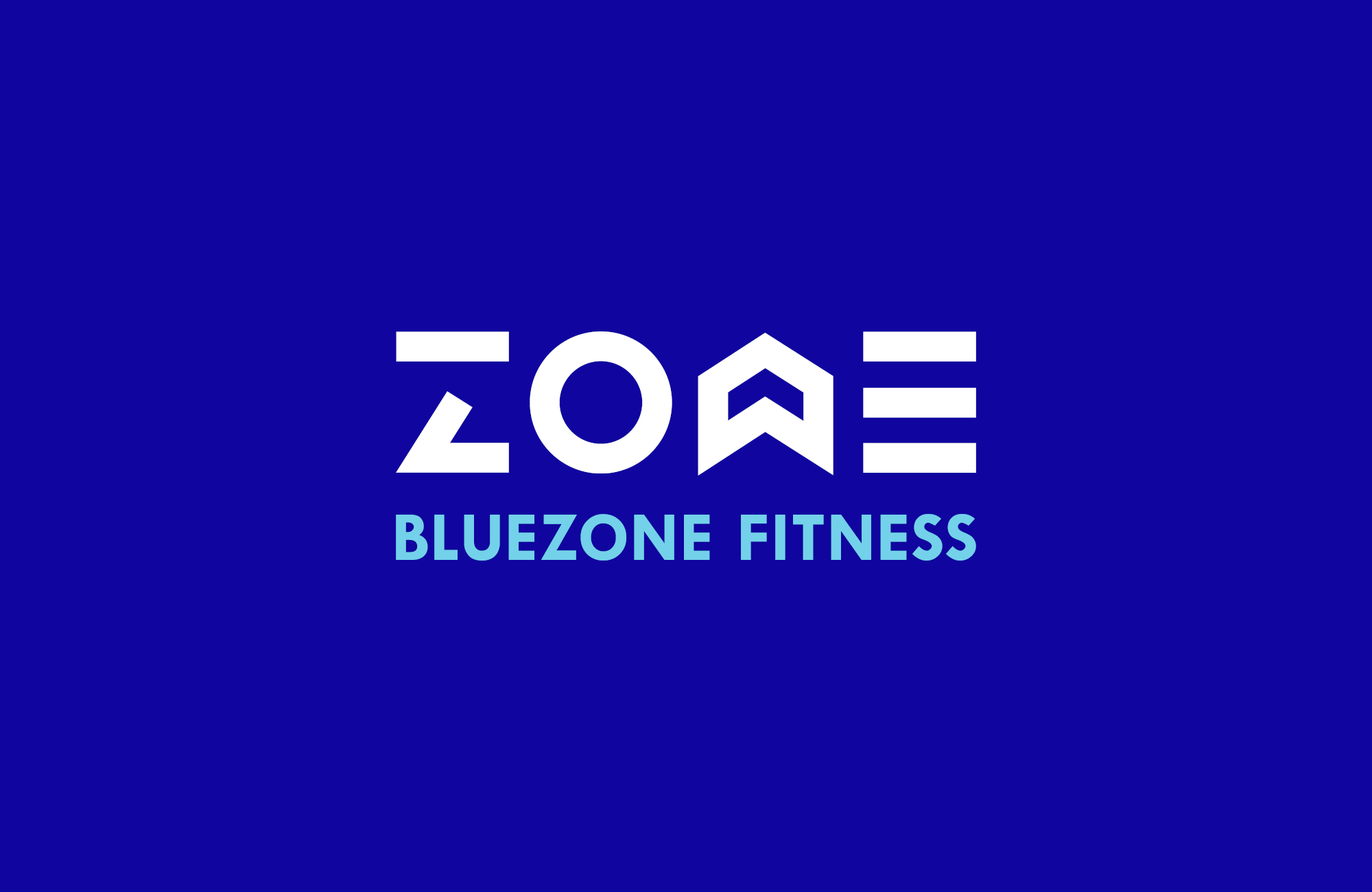
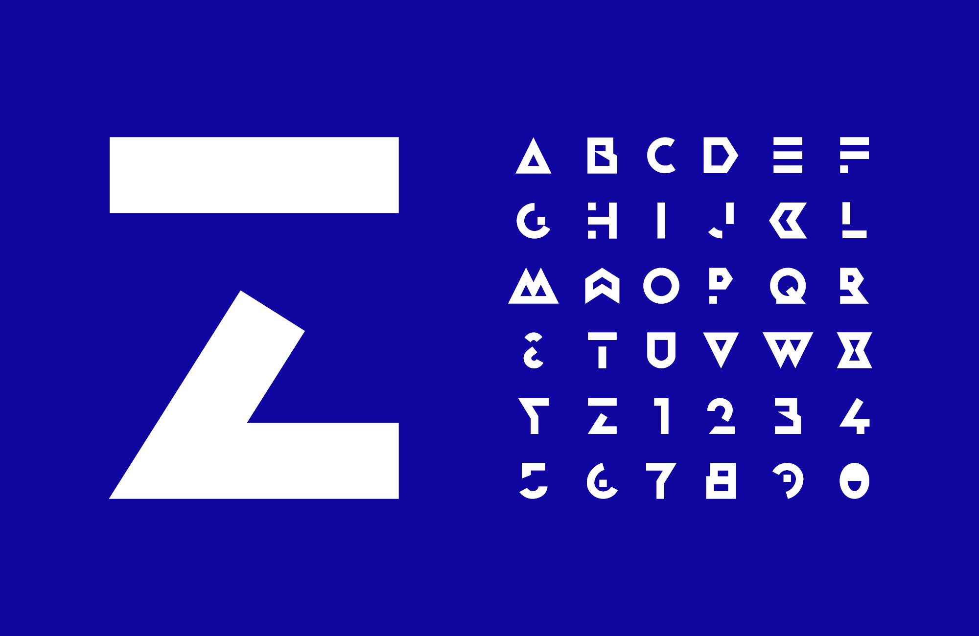
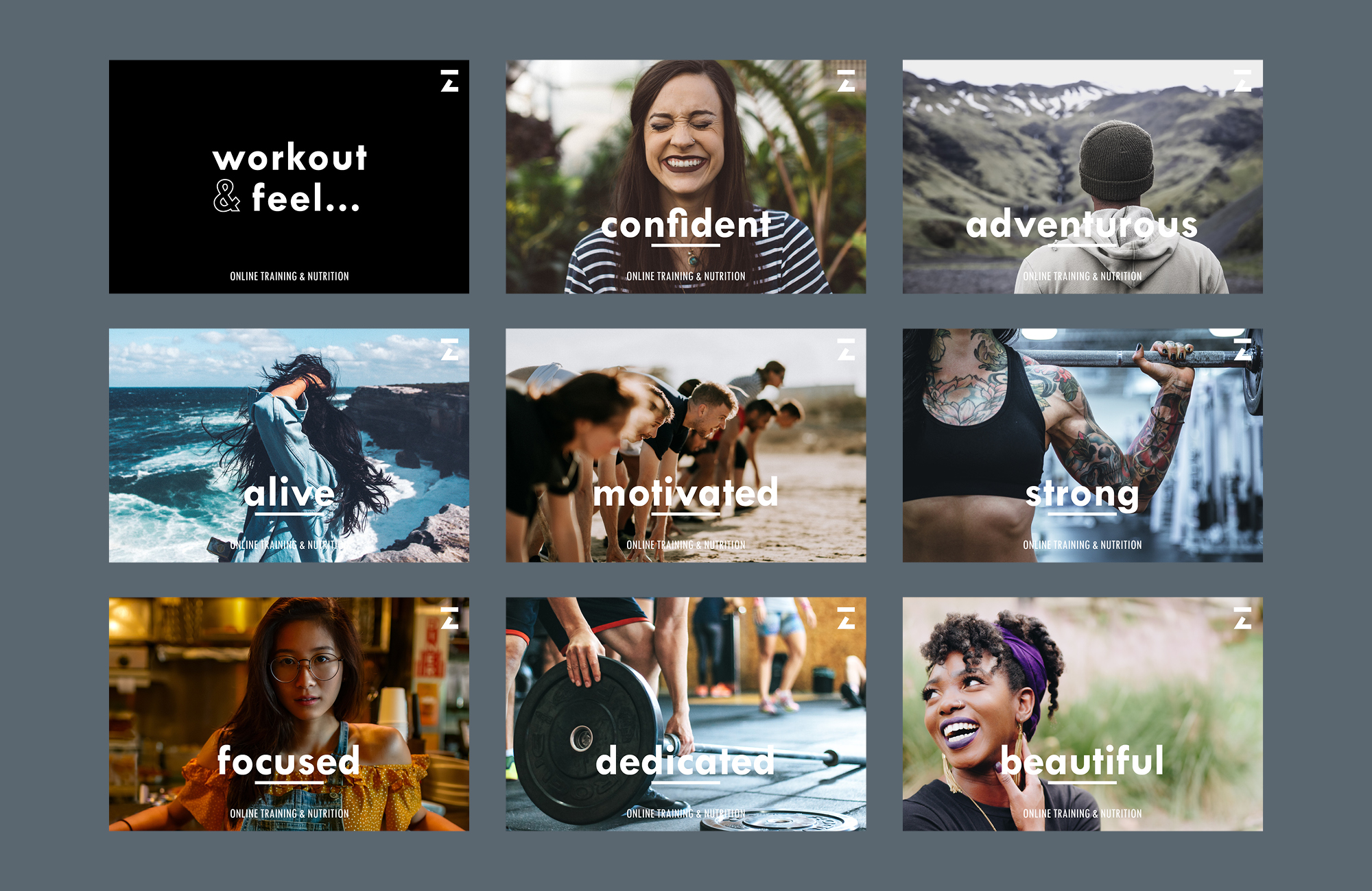
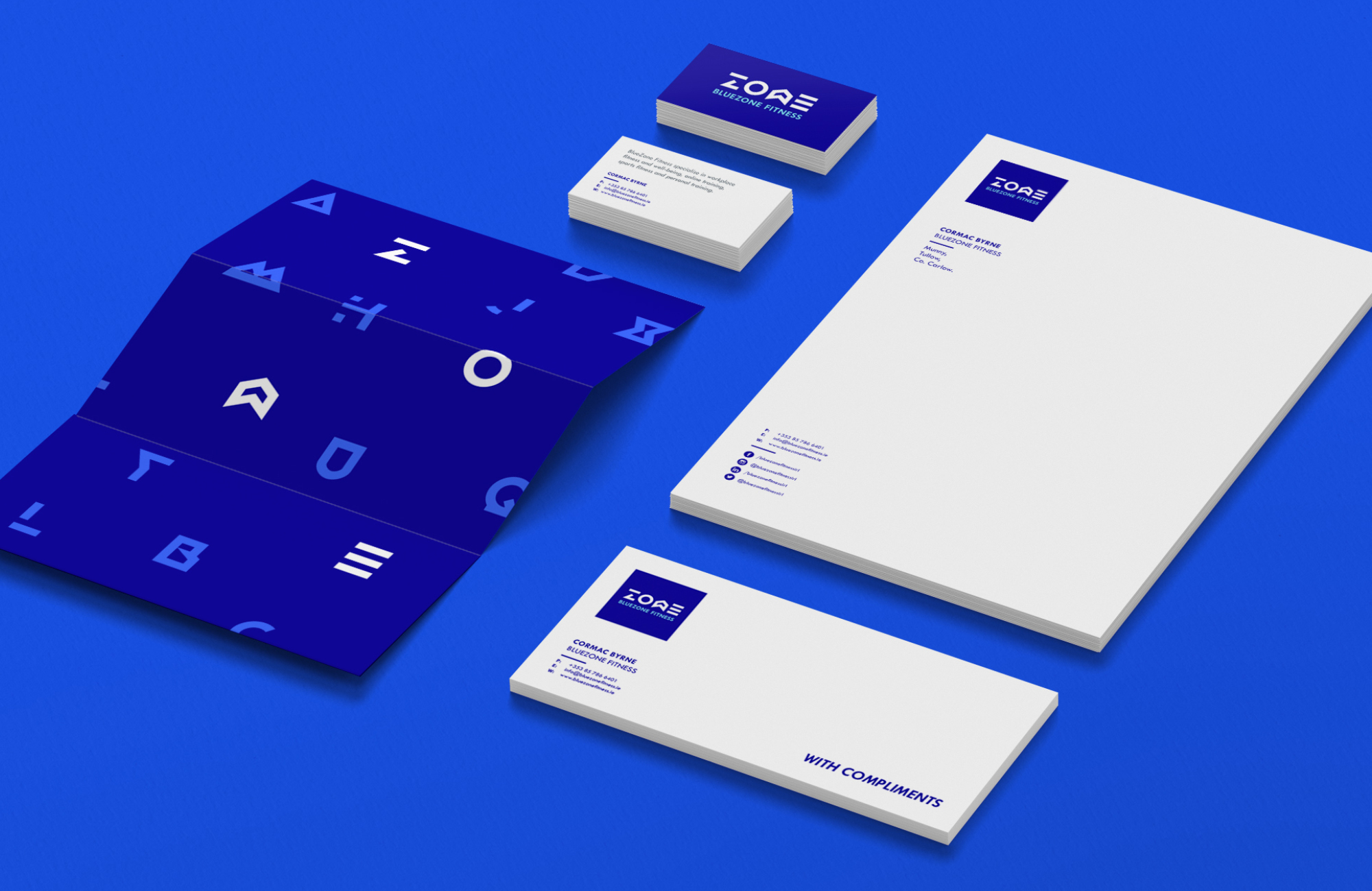
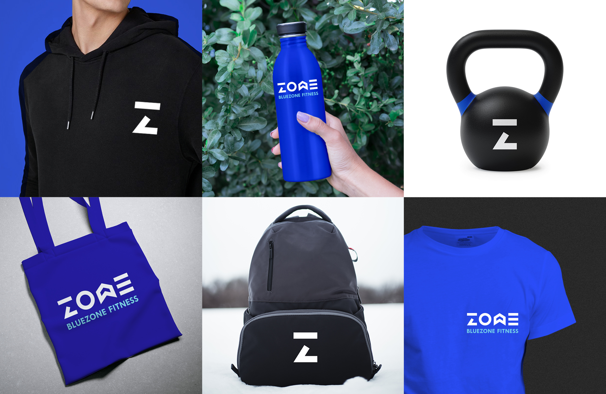
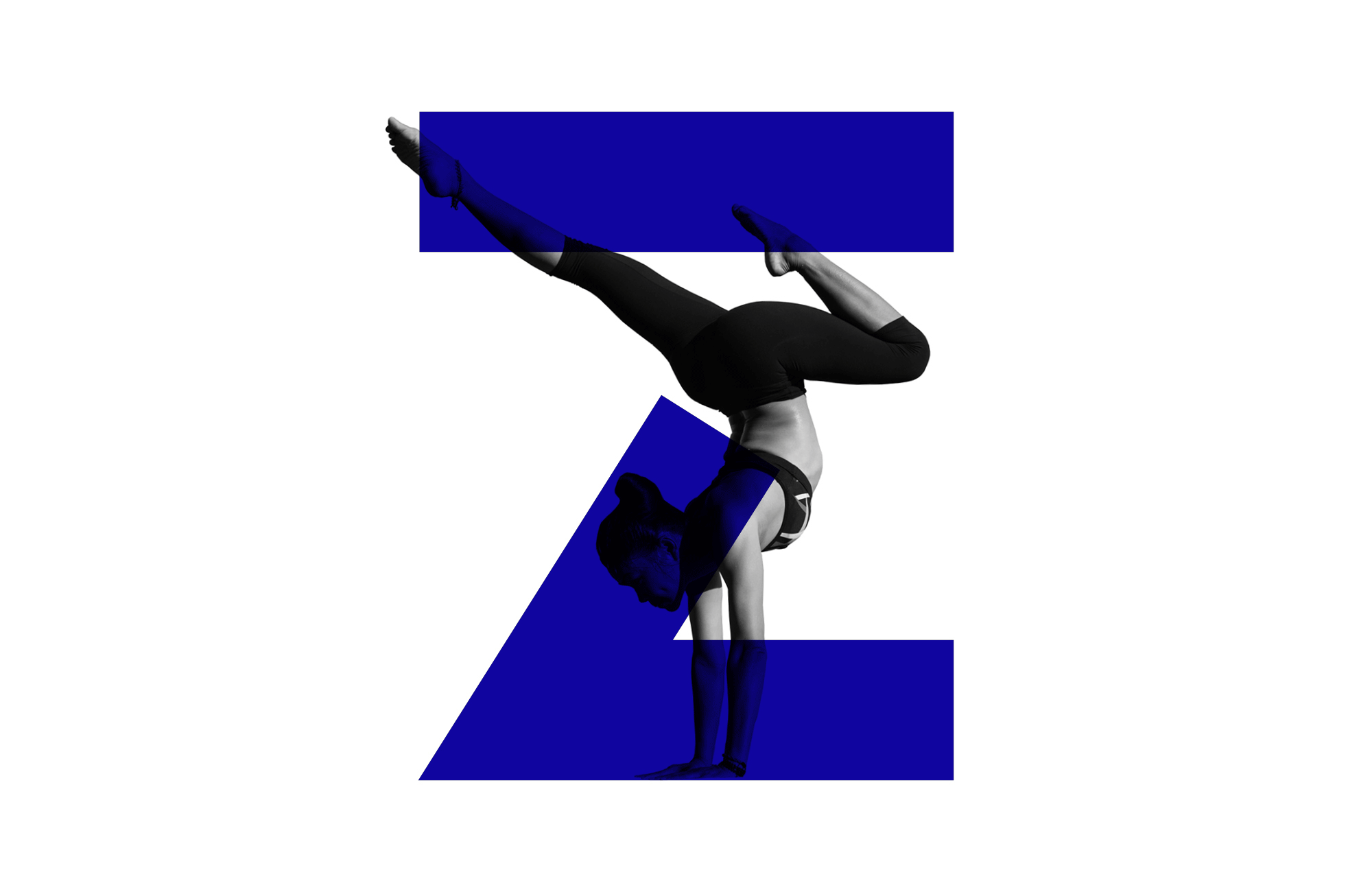
Based on the particular services that BlueZone offer, it was important to create a visual vocabulary that could easily be implemented across print, promotional products, web and social. BlueZone’s visual identity was designed to be energetic, confident and memorable – to stand out in the overcrowded fitness market. The logo was created using a bespoke geometric typeface, developed specifically for the BlueZone brand. It was influenced by directional signage, basic symbols and the structural elements of gym equipment. The tone of voice and imagery were carefully considered to emphasize the positive psychological effects of regular exercise and healthy eating.