BNRG — Identity & Website (2020)
2020
Designed by Eric Lynch at Image Now
Project Management: Amy Herron
Design Support & Strategy: Robin Fuller
Executive Creative Director: David Torpey
Creative Director: Éanna O’Shea
Strategic Director: Emily Carson
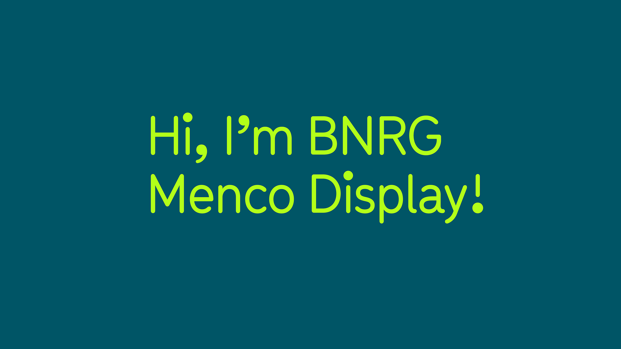
Custom Typeface: Bobby Tannam, Eric Lynch, Tobias Kvant
Website Development: Dave Haughton, Alex Bradley
Print Management: Hyphen
Copywriting: Sheila M. Averbuch
Categories: Website / Identity
Industry: Corporate
Website: bnrg.ie
Overview
This project began with a re-evaluation of BNRG’s internal brand strategy and customer value proposition before embarking on a refresh of BNRG’s visual identity, website and digital / print collateral. Our strategic director and design team worked with the stakeholders to identify a cohesive brand strategy, proposition and core values. This process involved several interviews and workshops with the outcome informing all visual outputs of the project.
The Problem
The main problem identified was a disconnect between BNRG’s brand identity and their ambition, expertise and longevity in the marketplace. Visual touch-points lacked a defined look and feel, and collateral sent to prospective clients and partners wasn’t reflective of the quality of experience that BNRG provides. It was clear to stakeholders that a lack of strategic articulation and cohesive branding was holding them back from achieving company goals. The BNRG website, in particular, was often the first interaction prospective business partners had with the brand, and there was concern that a poor user experience and lacklustre aesthetic was impacting investor trust and engagement with potential partners.
The Solution
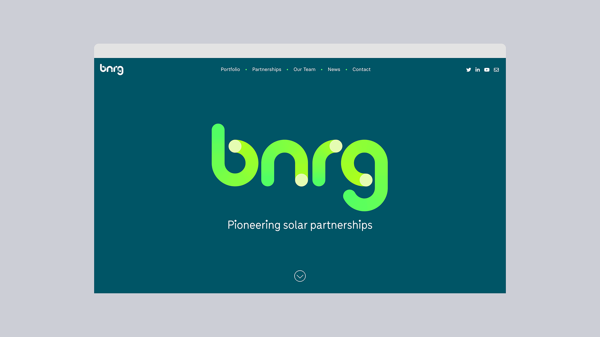
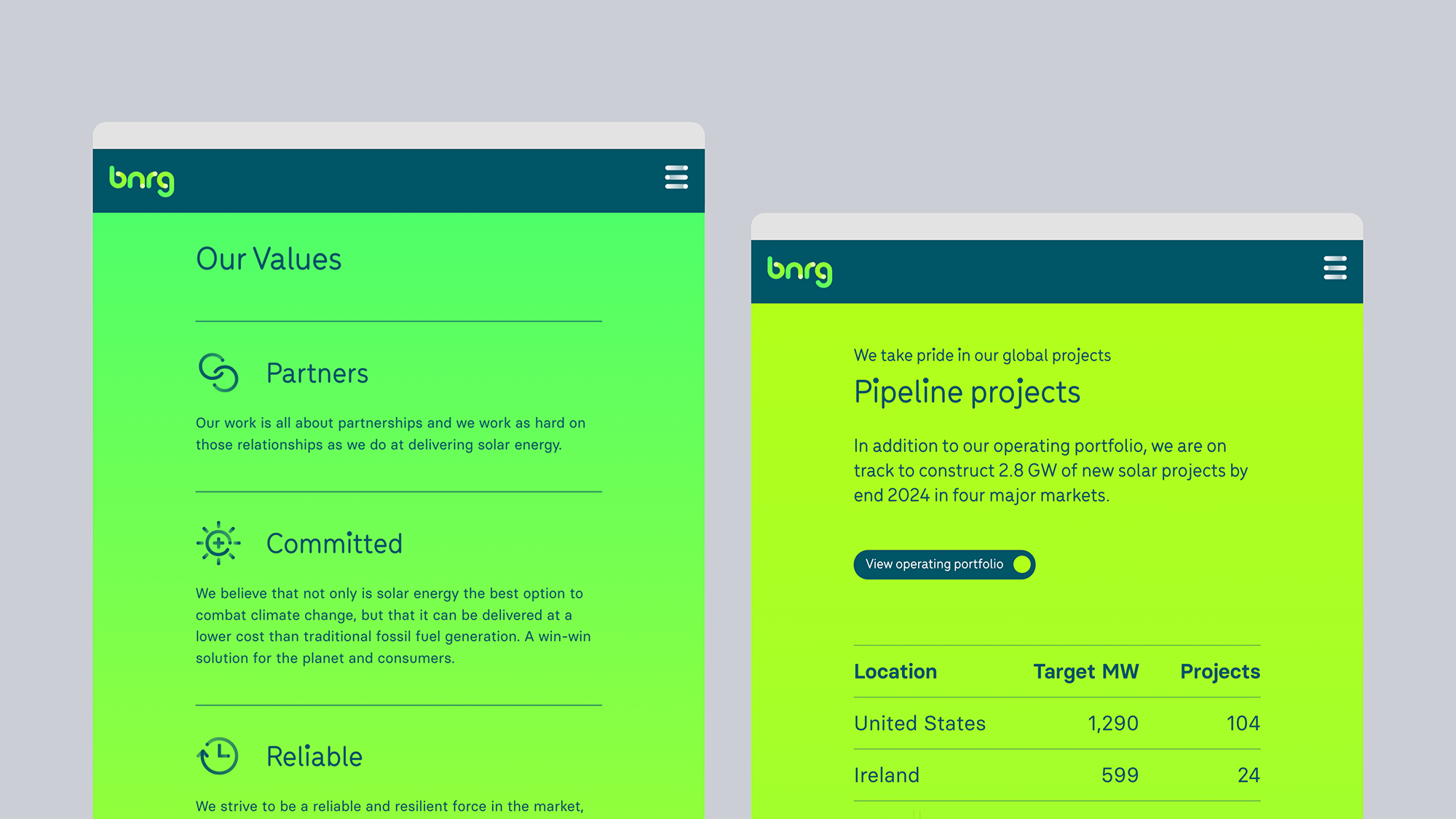
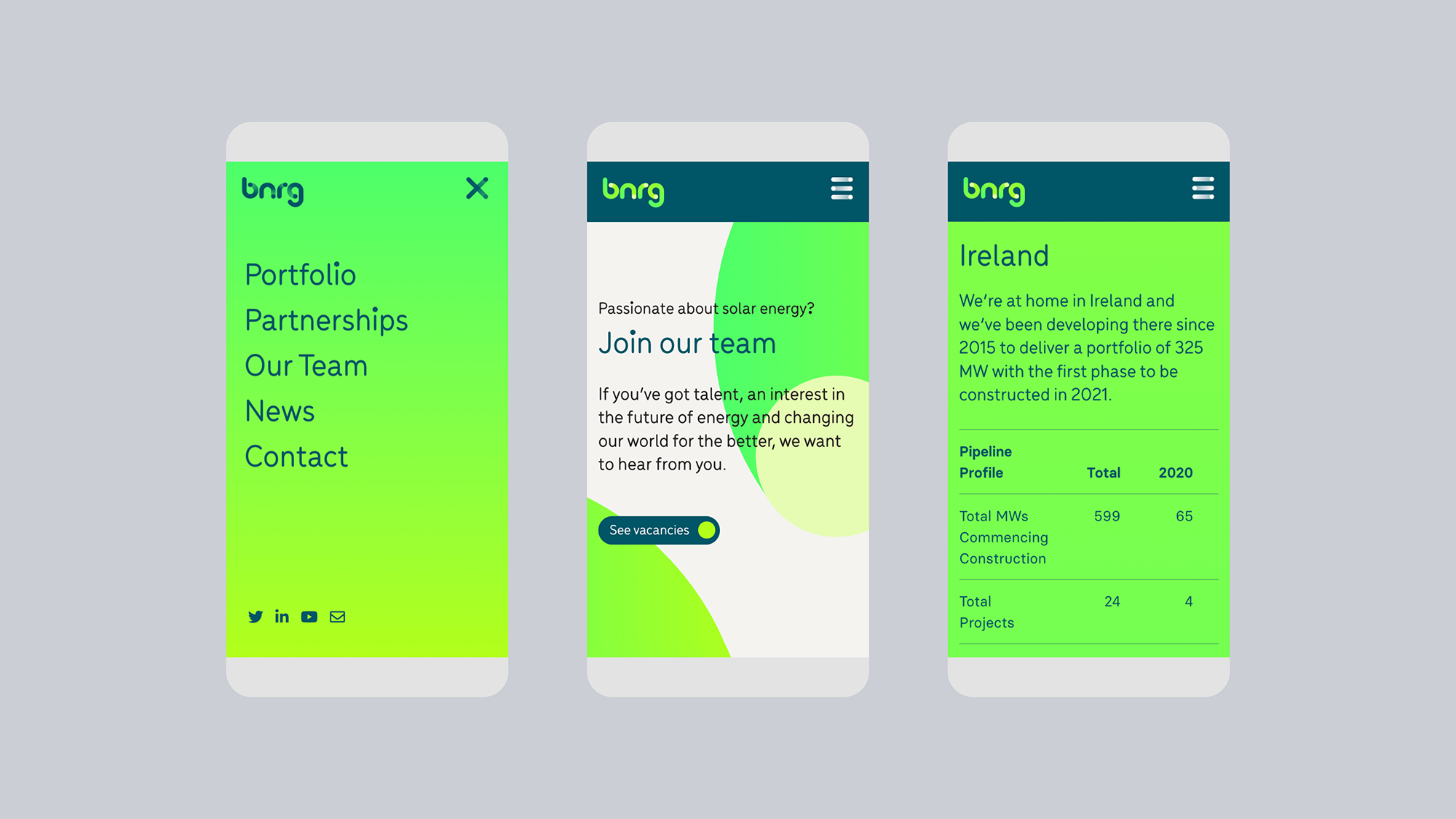
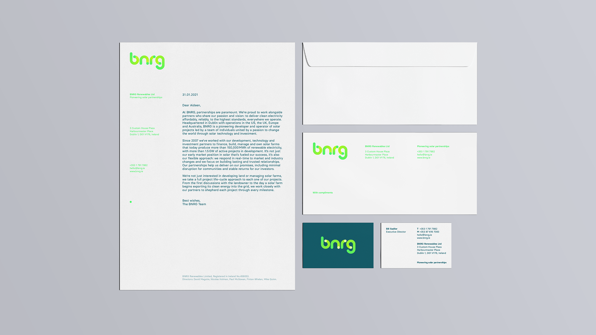
The outcome of the project was the design of a contemporary and dynamic visual identity applied to a refreshed BNRG website and relevant collateral. The tone of voice for all visuals aimed ‘not just to say energy but show it’. This concept was achieved through an animated logotype, which extended into the visual language and interactions of the website and other touchpoints. A custom font and set of icons were also developed, including the enlarged dots and rounded characteristics of the logotype — ensuring a consistent look and feel for all future visual communications.