Brand Identity for Limerick
2020
Designed by Farouk Alao at M&C Saatchi London
Creative Agency: M&C Saatchi London
Production: true Media
Categories: Identity
Industry: Commercial
Tags: Digital / Art direction / Campaign / Rebrand / Branding / Identity / Travel and Tourism / Logo Design
Website: limerick.ie/
In 2020, Ireland became the largest English-speaking nation in the EU. Limerick City and County sought to maximise this opportunity, creating a brand identity to unify everything Limerick does. The mission was to position Limerick as the country’s “go-to” destination for investment, tourism and to study, both at home and abroad. But to do this successfully, it was vital that we threw off its domestic reputation as “Stab City”, ambitiously asserting Limerick’s enduring place in the world and positive relevance today. The success of any brand is defined by its adoption by those closest to it. For too long Limerick has been defined by those who don’t belong to, those who through ignorance have cast the county in an unfavourable light. The development of this new brand was not a crisis management exercise, but rather a moment of vindication. Limerick has much to say, and thus it was key that the creative process was shepherded by a high volume of internal stakeholders, on hand to shape the brand and embody it upon launch. To carve out an authentic identity, every part of creative development had to feel authentically Limerick.
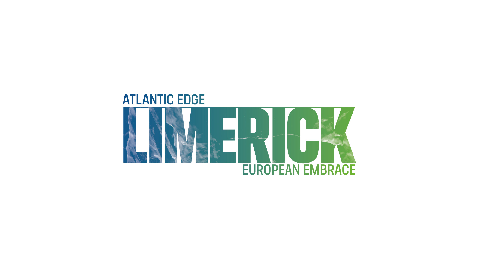
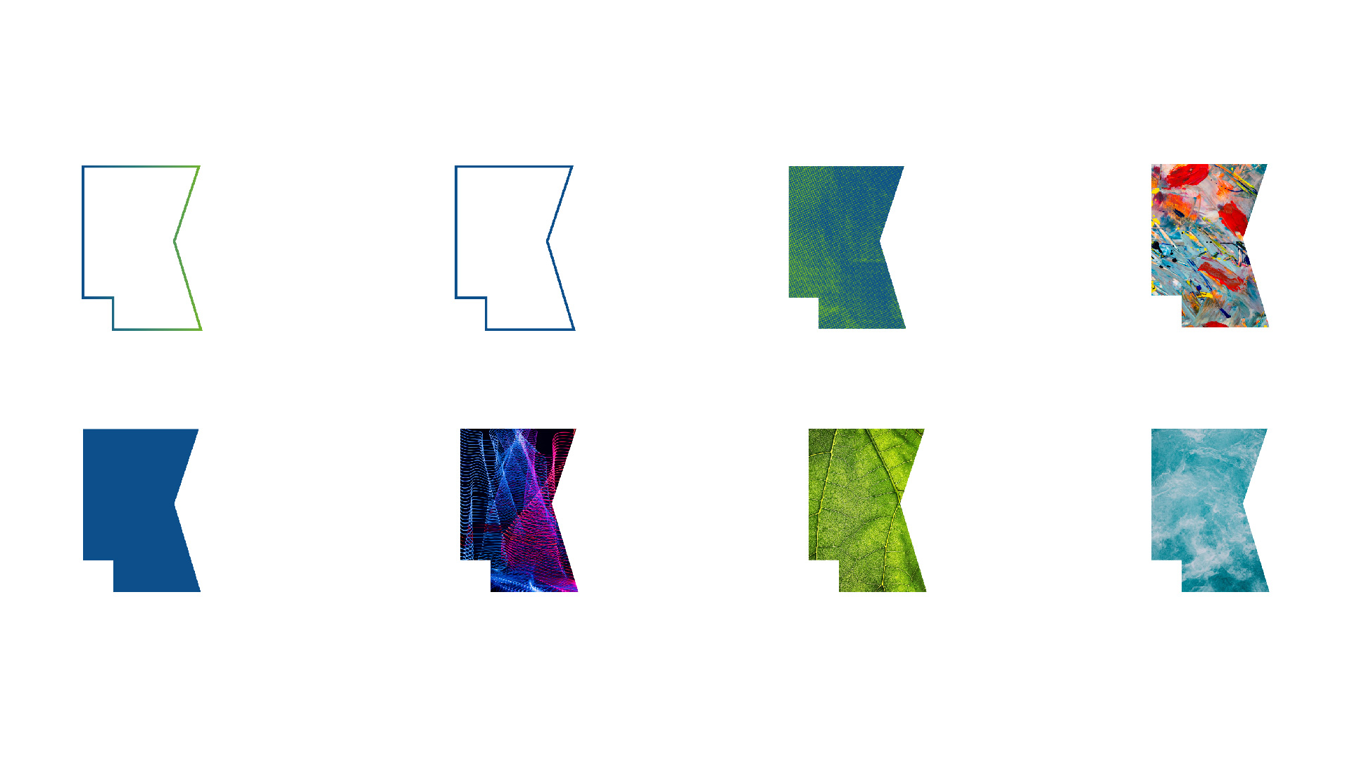
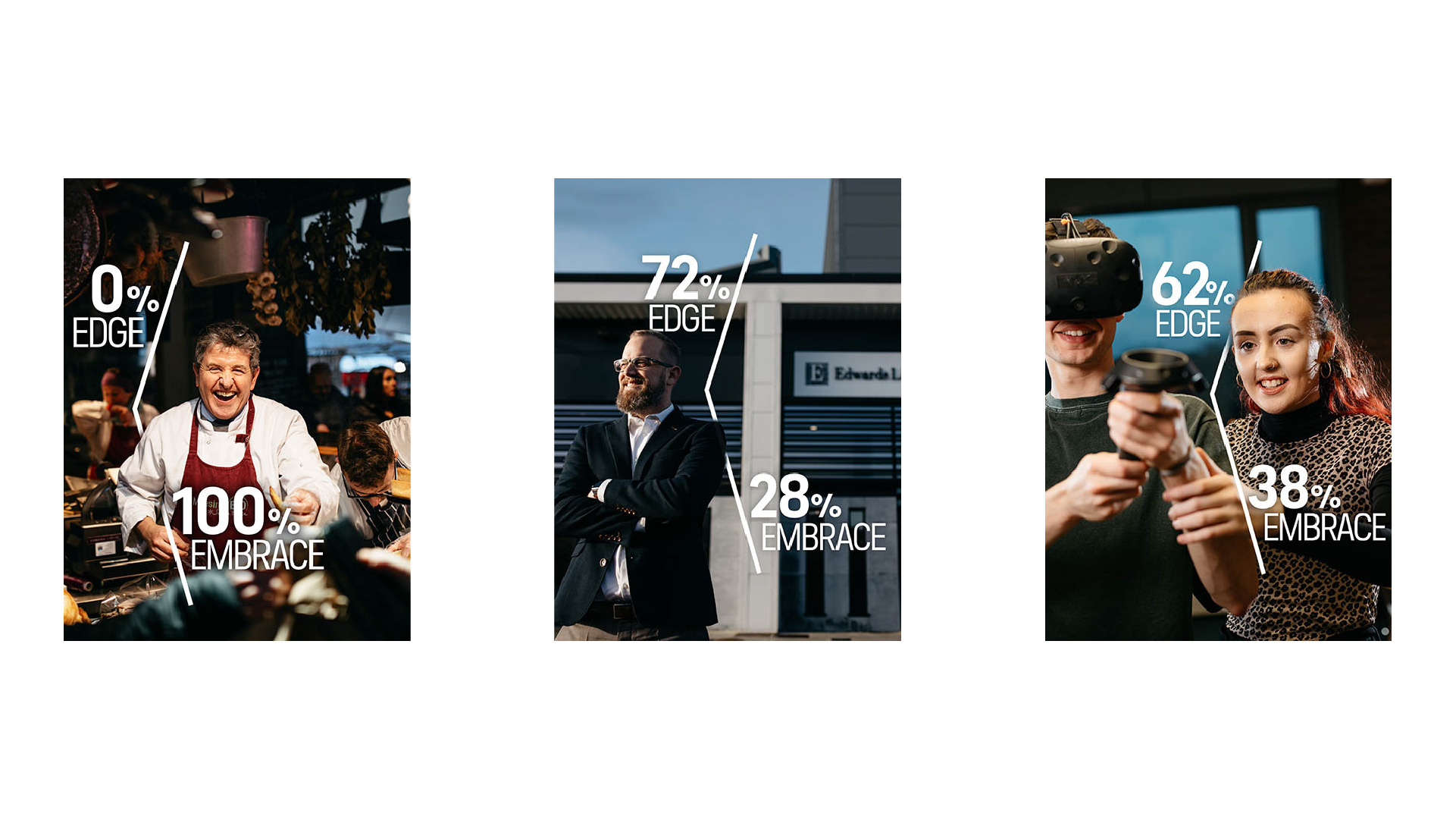
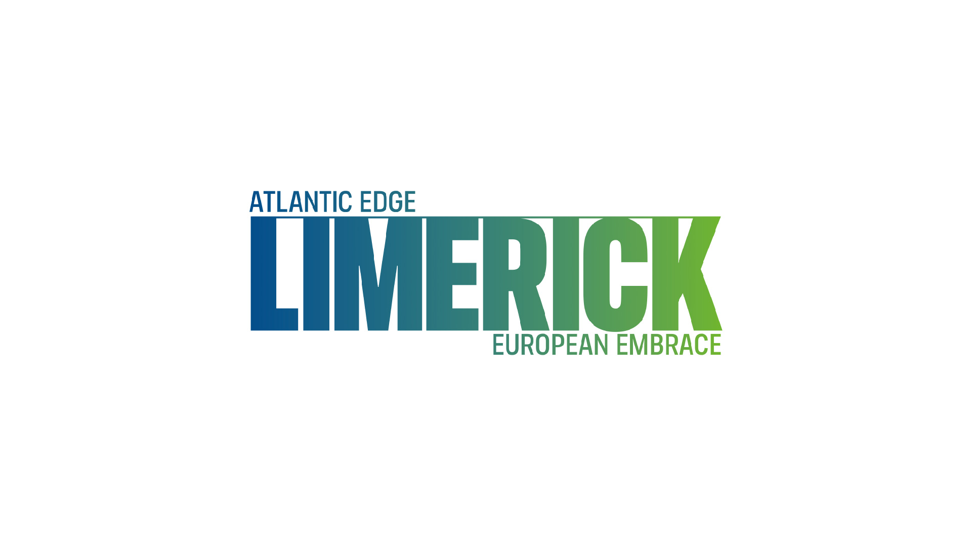
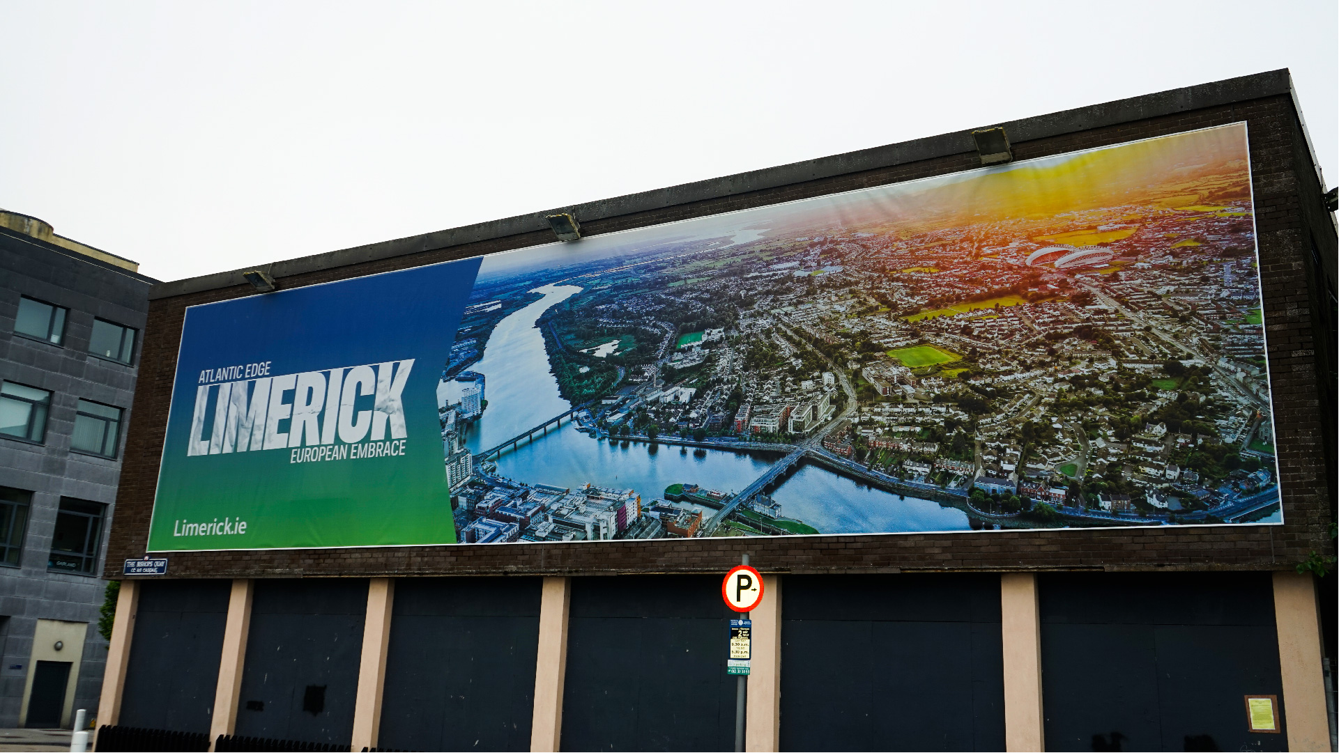
We drew on a number of sources of inspiration. Starting with the deep blues of the Atlantic and the iconic verdant landscape of Western Ireland, we also wanted to imbue the icon with a visual mark that was undeniably Limerick. For this, we looked to the county’s print-making heritage and The Treaty Stone, a historic monument and symbol of Limerick’s resilience, grit, and unwavering solidity in the face of international pressure. We created a 3D model of the Treaty Stone, mapping its texture, grooves and key physical features and used classic printmaking techniques to create an imprint of these details. The spirit of Limerick was embedded into our design, an imprint of authenticity enhanced by a collaboration with students of Limerick School of Art and Design who worked with us on this layer of our design story. This all came together to create a brand identity for Limerick - a succinct and creative articulation of our brand positioning. But we did not stop here. We also wanted the brand to be versatile, with a flexible and customisable asset that could be embraced and enriched by an engaged local community. A contraction of the "L" and "K" of Limerick forms our simple, but distinctive Limerick Icon - a flexible and merchandisable asset which could be used as a frame for imagery and design. This served as the creative bedrock for our launch communications, our ambitious “Percentages” campaign shows the edge and embrace of iconic Limerick sites and citizens. Our launch efforts were supported by a passionate ambassadorial network made up of key sector stakeholders within the community, partner collaborations and organic content from local influencers.