Brereton Jewellers
2013
Designed by Rachel Kerr at CI Studio
Creative Direction: Mel O'Rourke
Categories: Identity / Print / Packaging
Industry: Commercial
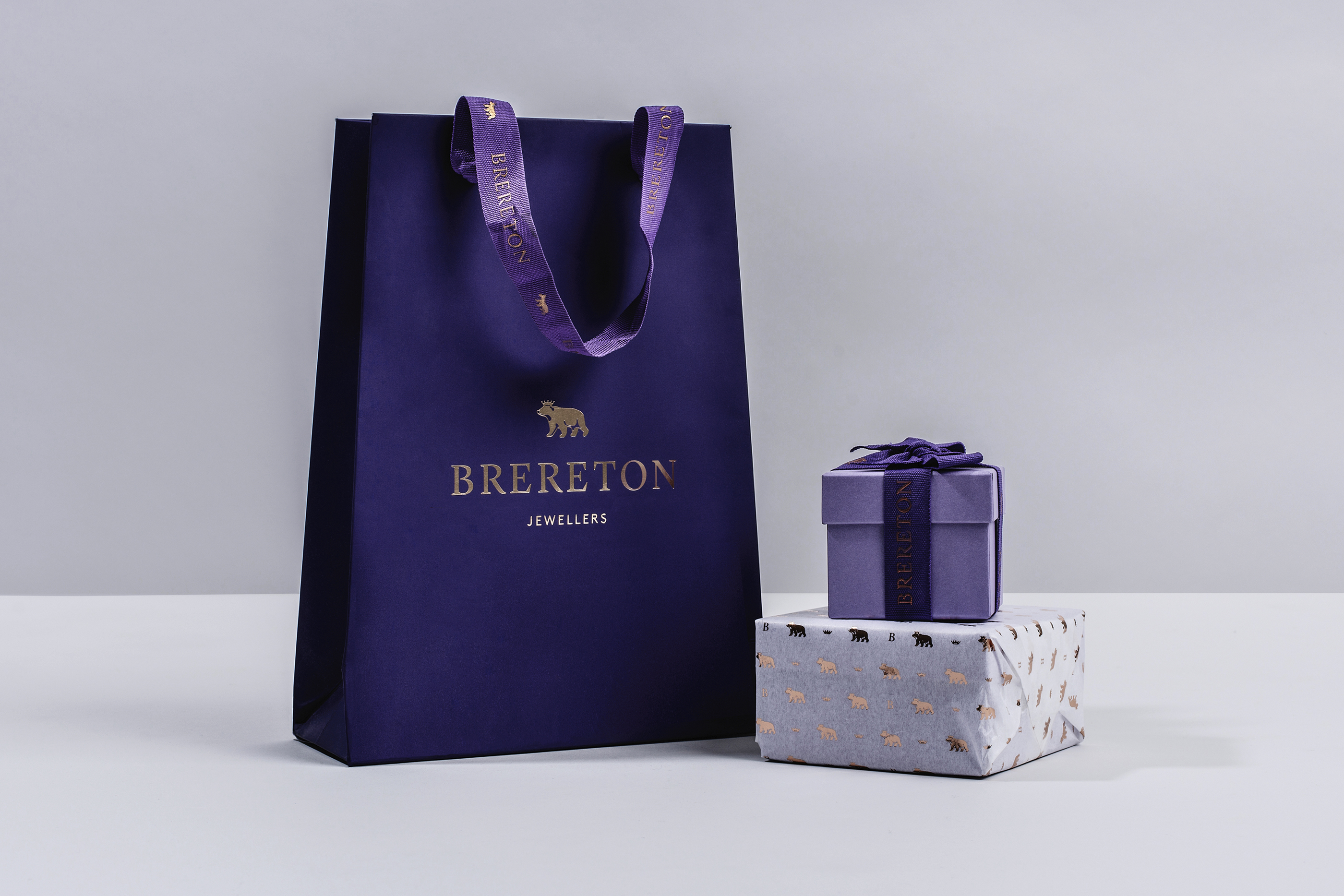
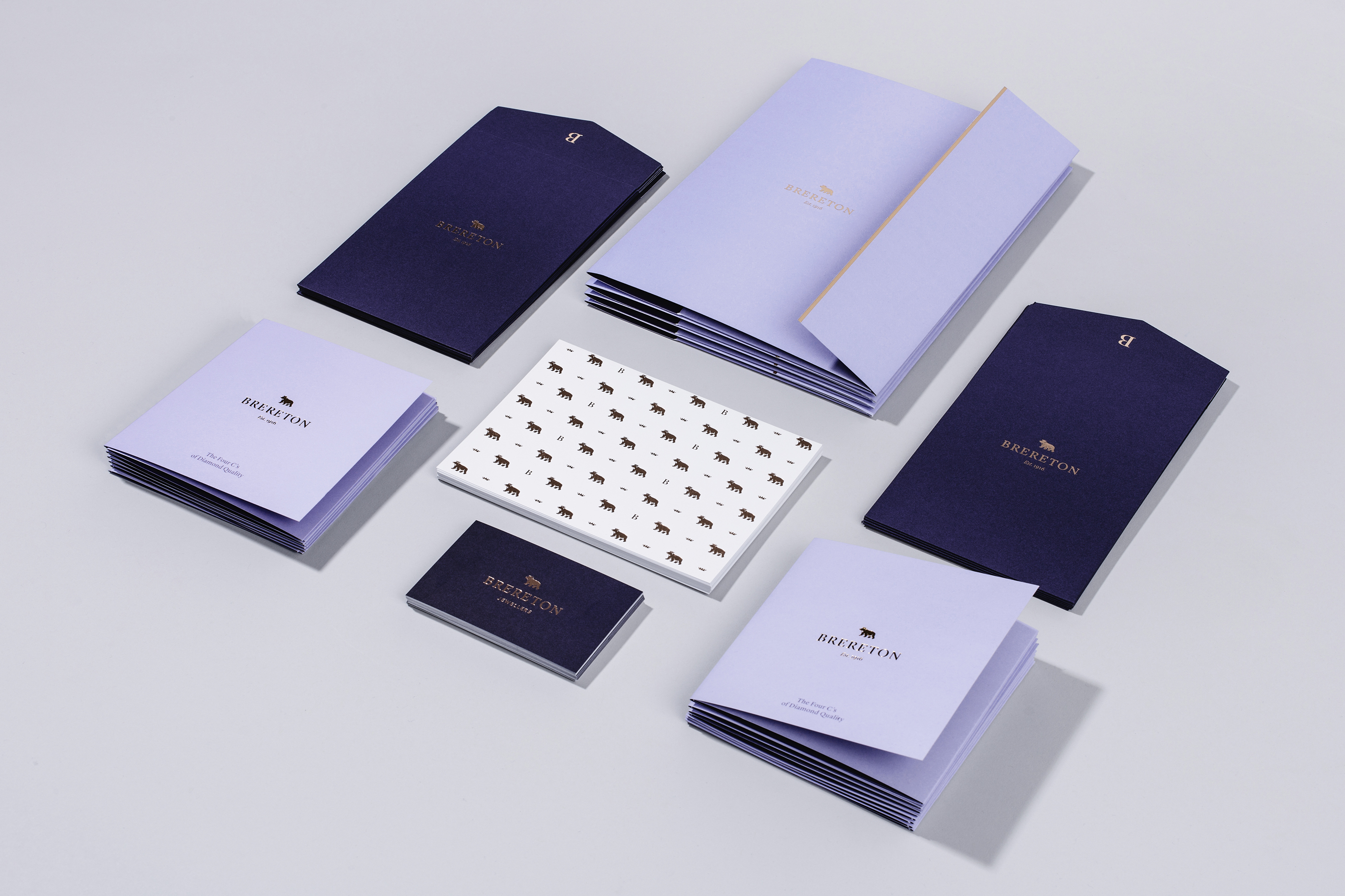
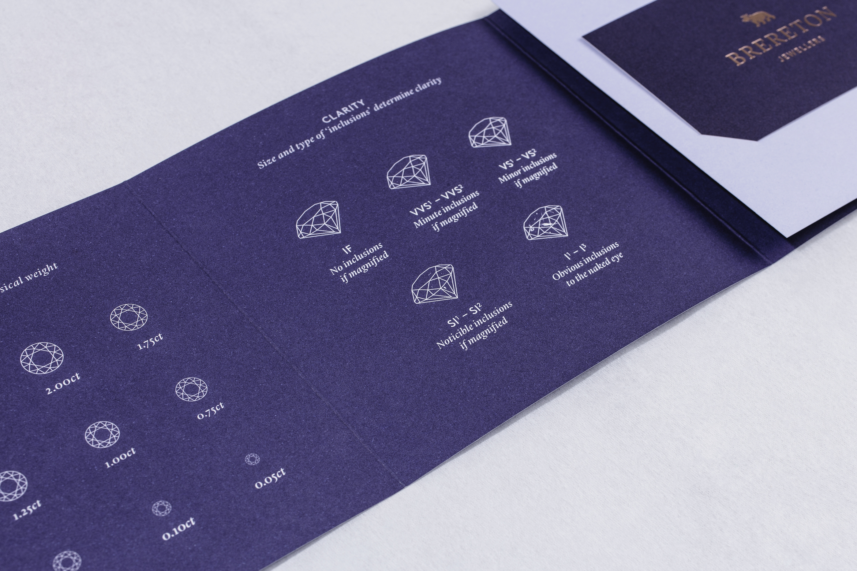
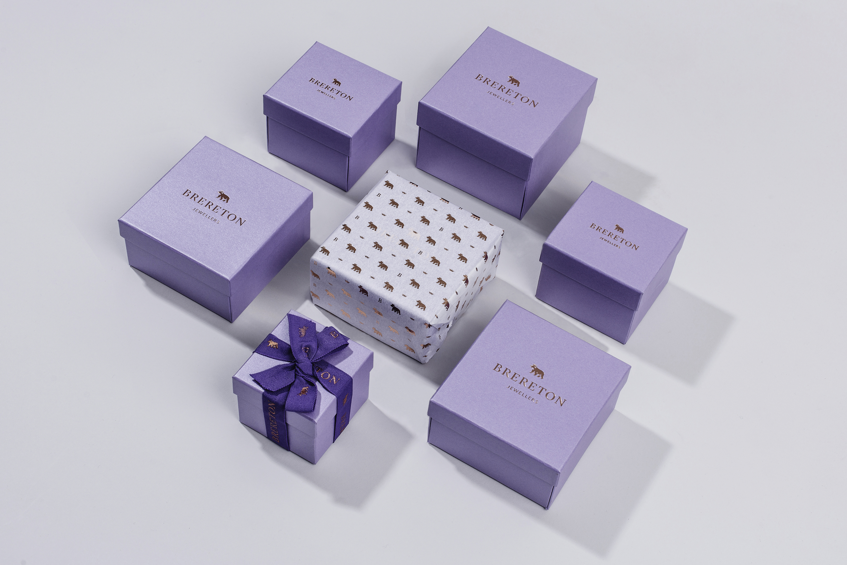
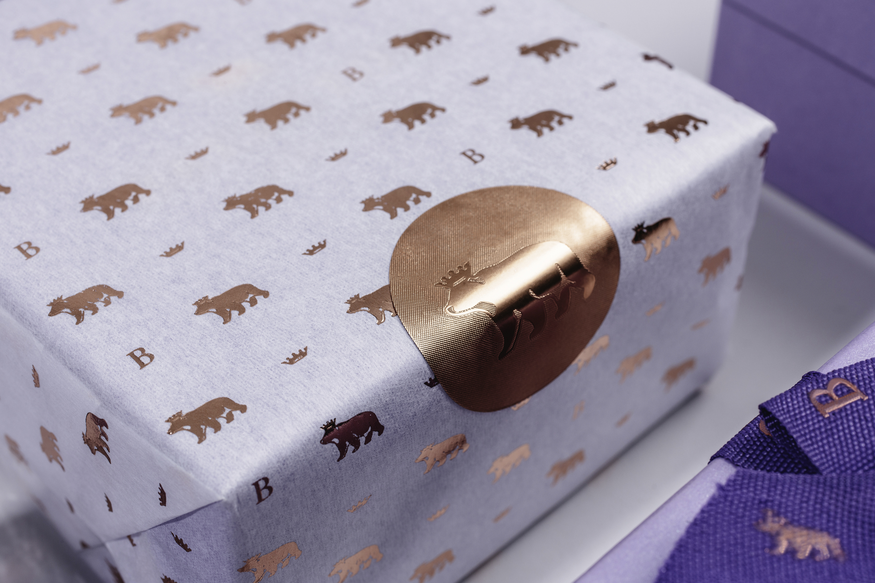
Established in 1916, John Brereton Jewellers wanted to update their brand identity. Their new look needed to convey their specialism in selecting and supplying exclusive diamond jewellery and their long-standing association with craftsmanship. We dropped the ‘John’ from the name to reflect the family business as it stands today.
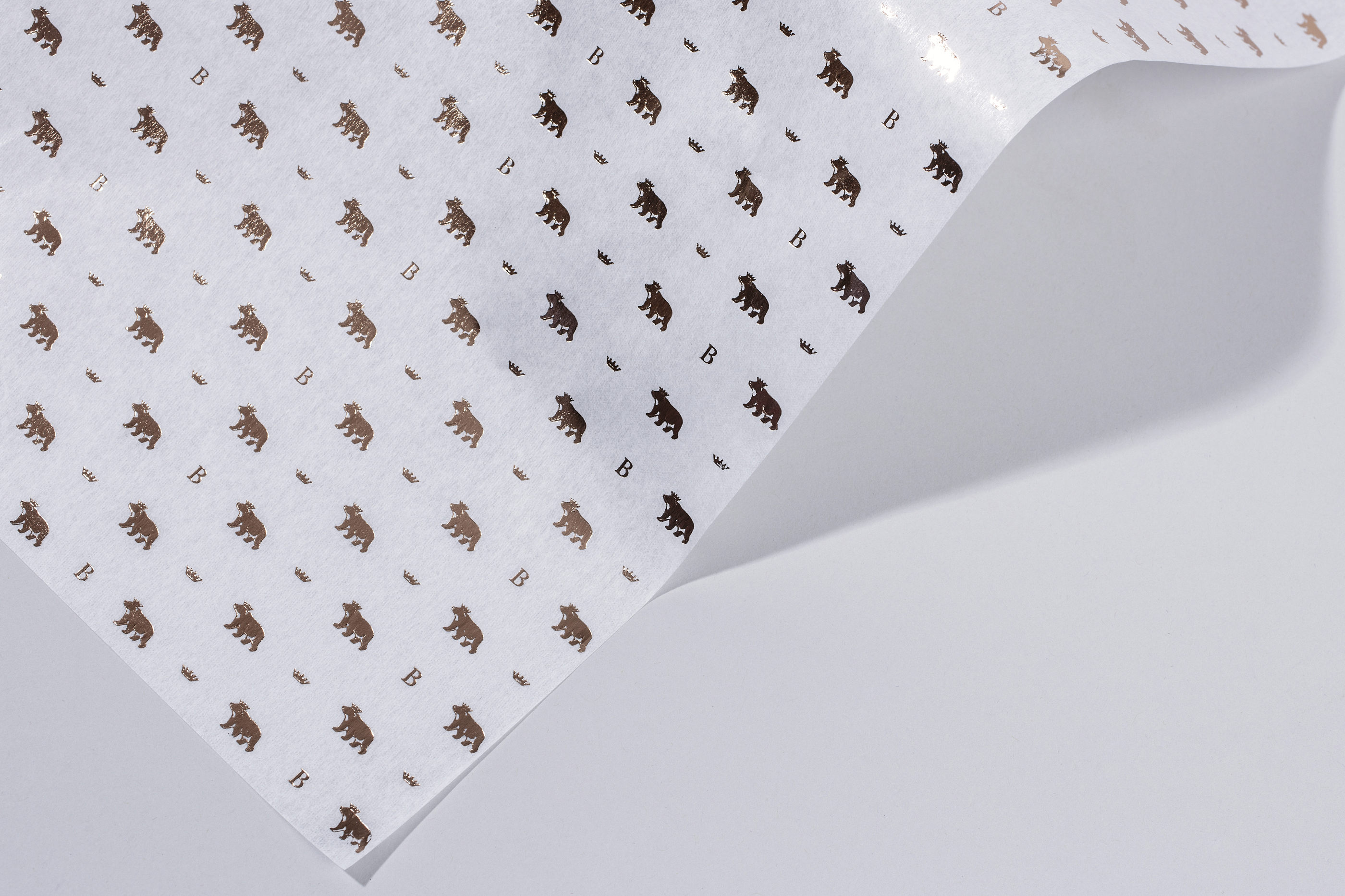
To evolve the identity and have it rooted in their heritage, we explored the Brereton name and family crest. Contained within the crest is a bear’s head in a ducal coronet which we felt could help convey more high-end attributes to the identity. We redrew the bear wearing the coronet, to become a new emblem working alongside a new logotype. Colour was updated from burgundy and gold, to a more contemporary deep violet, lilac and rose gold for a standout look which is classic yet luxurious in tone.