Brightfield – Website Design Refresh
2020
Designed by Paul Devereux at anne+co.
Categories: Website
Industry: Commercial
Tags: Website
Website: brightfield.com/
Featured in this years Inc 5000, Brightfield are a leading augmented analytics company powering the economics of digital transformation in the workplace. They needed their website to reflect their progressive and pioneering approach to the new world of work.
That’s where we came in, throughout 2020 we had been continuously working on improving both the usability and performance of their website. We have achieved this by correcting issues in the website backend, improving and implementing an SEO strategy and looking at key UX methods such as A/B testing and usability testing to design correctly for the user. Brightfield are based in Washington USA meaning all work has been undertaken remotely, which was fitting for the way of working in 2020.
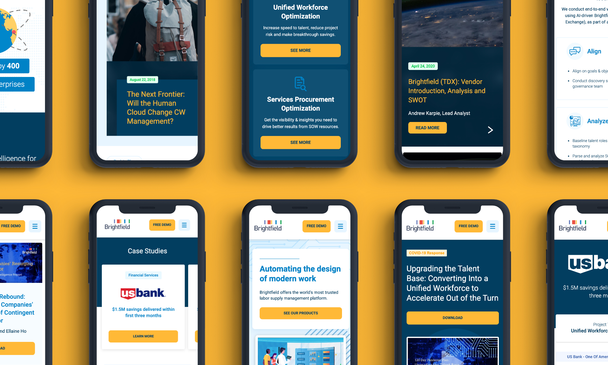
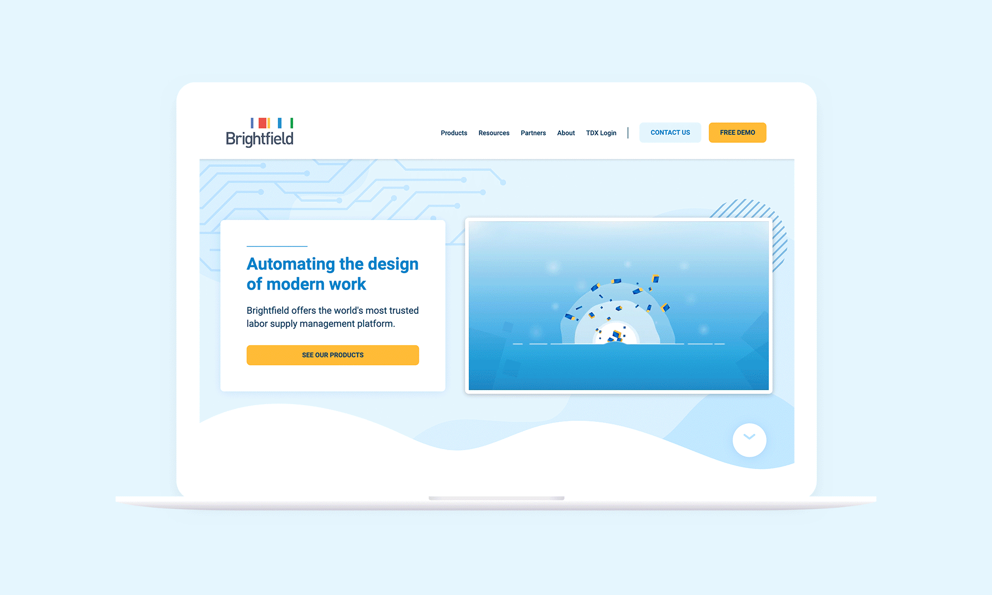
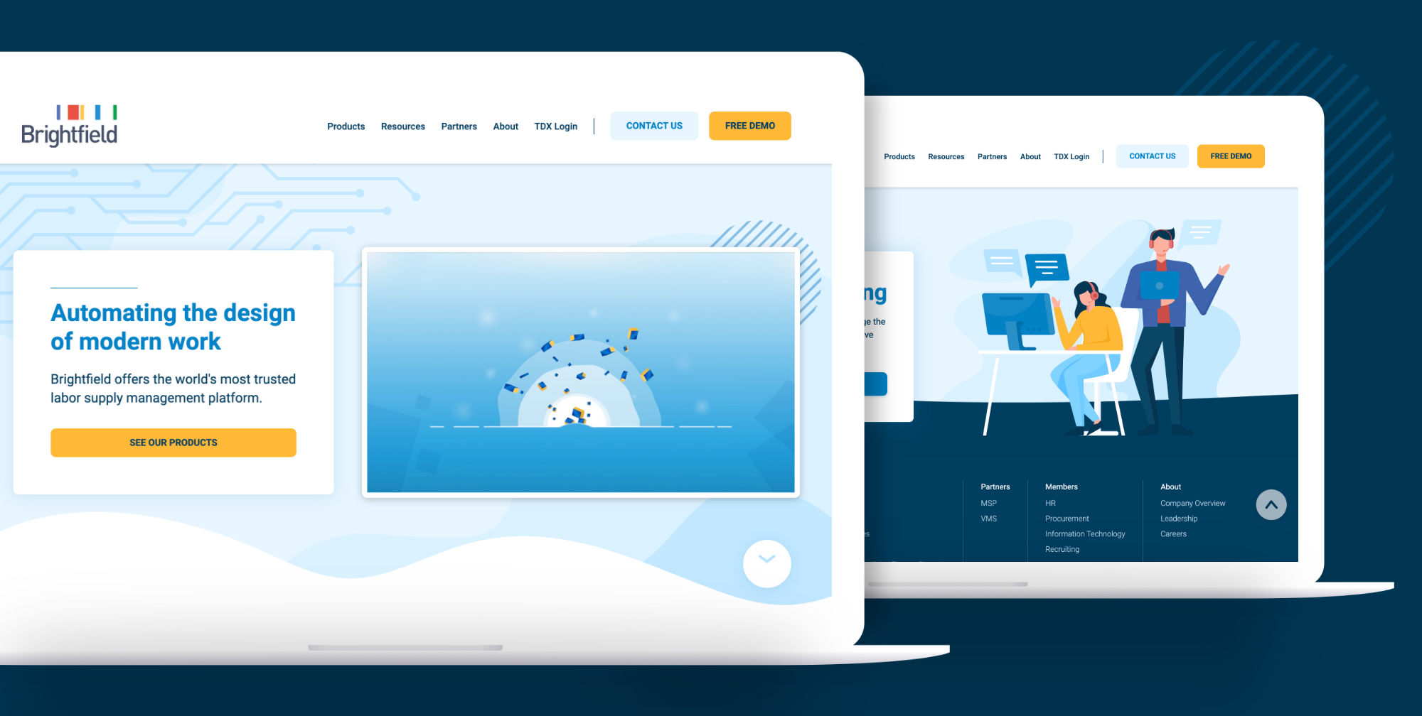
We redesigned key pages throughout the website to reflect the company’s new positioning and to improve key metrics and conversions on each page. This included redesigning the entire navigation system used in both the footer and header - not only visually but also renaming menu segments and labels to be more universal. We used A/B testing to validate any assumptions we had, such as changing the demo button from ‘Request Demo’ to ‘Free Demo’, which saw an increase of 1% in conversion rate. Using A/B testing ensured we weren’t designing based on assumptions but most importantly that we were designing for the user.
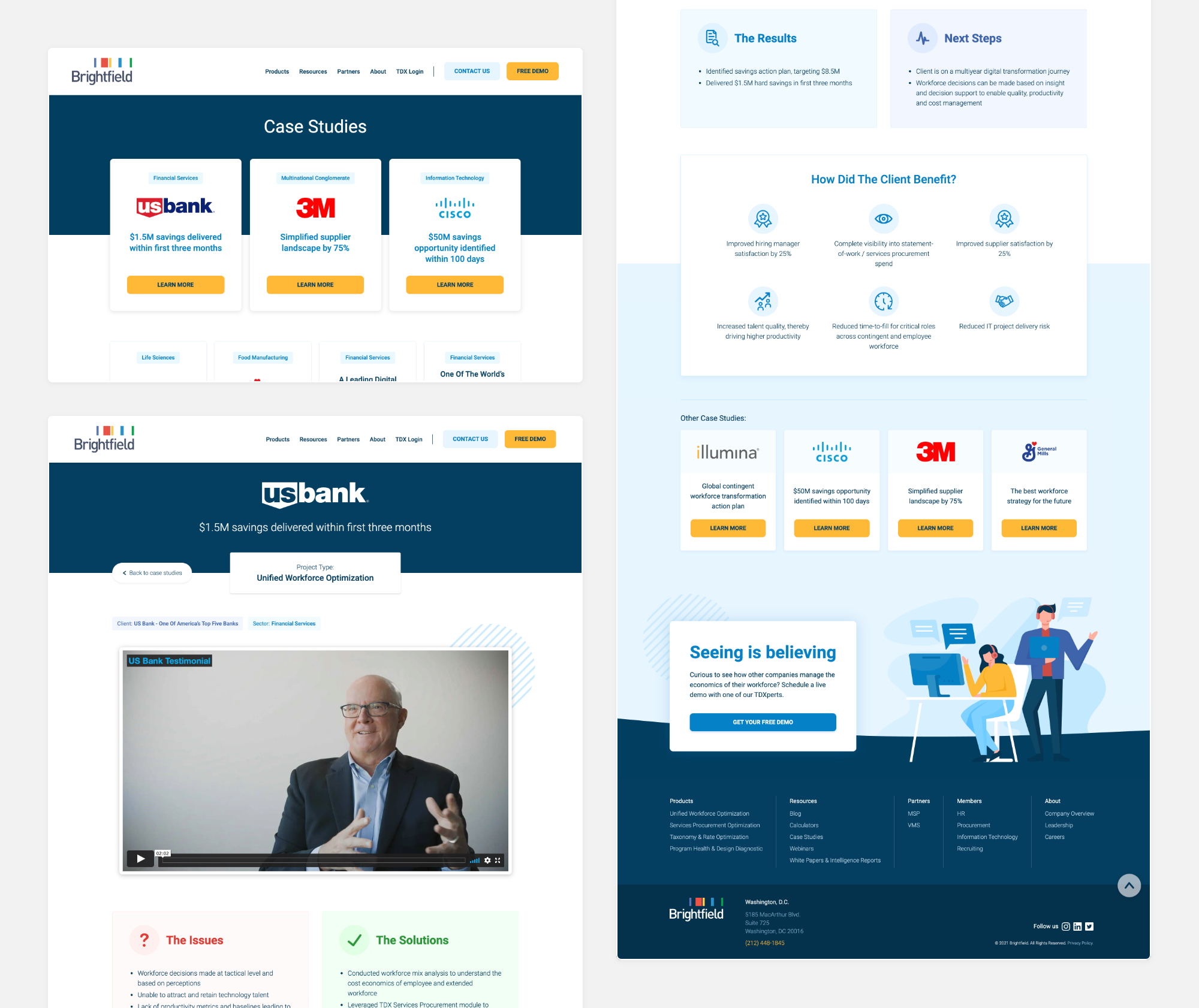
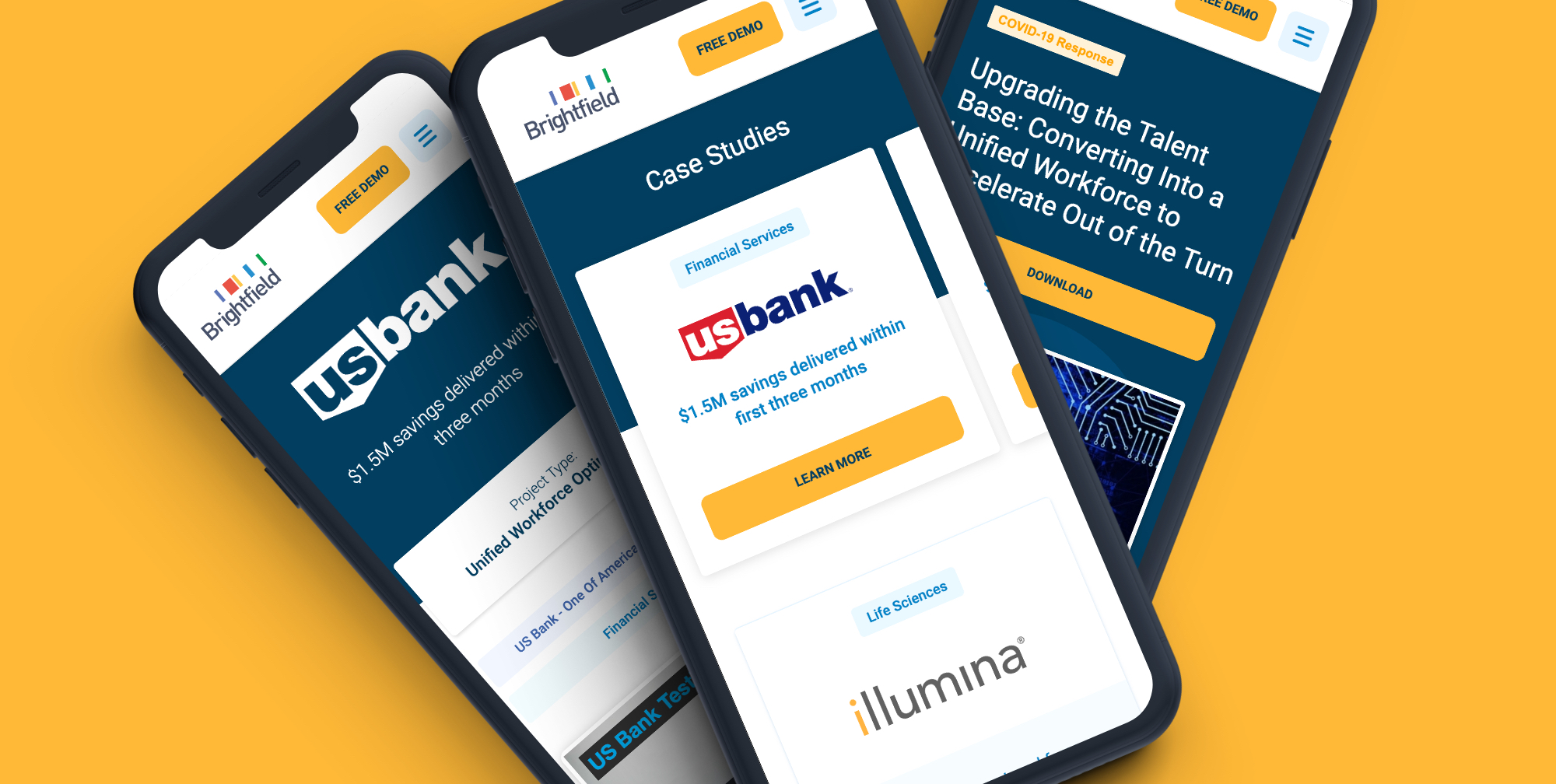
In addition to this, we also ran an A/B test to decide on the best name for the products segment. Originally this section was called ‘Talent Data Exchange’ we felt this needed to be more universal. The action of changing this title to ‘Products’ saw a 13% increase in conversion compared to the original. We also redesigned key website pages such as; request a demo, case studies, blog, calculators and the homepage.
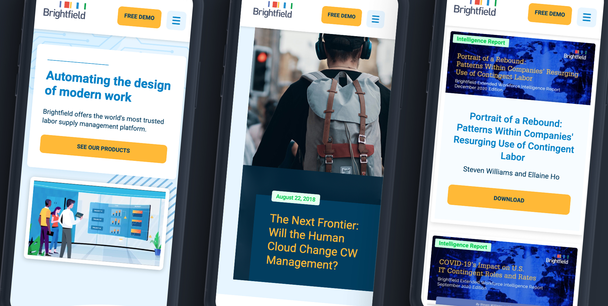
Taking the blog as an example, we introduced a range of key UX and aesthetic elements to increase engagement such as a scroll bar which shows user progress as they scroll down the page and a sticky side navigation with social sharing and a back button. We also added key CTA’s at the end of each blog that specifically related to the type of blog the user was reading.
Some of the results of the redesign included an increase in website traffic and metrics during the period in which we implemented changes on the website. Over a two month period website page views increased from 10,860 to 16,744. Over the same two month period the bounce rate also decreased and the scroll rate increased which means that website users were staying on the website for longer and were more engaged with the content. This project demonstrates the tangible results that can be achieved through intentionally designing for the end user.