BuJo
Designed by Scott Burnett, Kevin Horan, Rory Bradley, Brian Heffernan, Karl Toomey, Stacie Heffernan and Eric Stynes at Aad
Fit out: KaneCo
Artwork: Hen's Teeth
Photography: Finn Richards
Uniforms: Paddy Sheary
Compostable Packaging: Down To Earth Materials
Categories: Identity / Signage
Industry: Commercial
Website: bujo.ie/
Food is big business and a highly competitive market. Burgers are a particularly busy area, available in price points from 2eu to $500, prepared by machines or carefully crafted by Michelin starred chefs. Any new brand in this environment has to add something of value to the conversation.
This thinking helped us win over the owners of BuJo who came to meet us at an early stage. They had a business plan, good ideas and passion but everything else needed to be worked out and developed. They understood the importance of design in achieving their aims, and we felt our process could help them manage the thousands of decisions they’d have to make on route to launch.
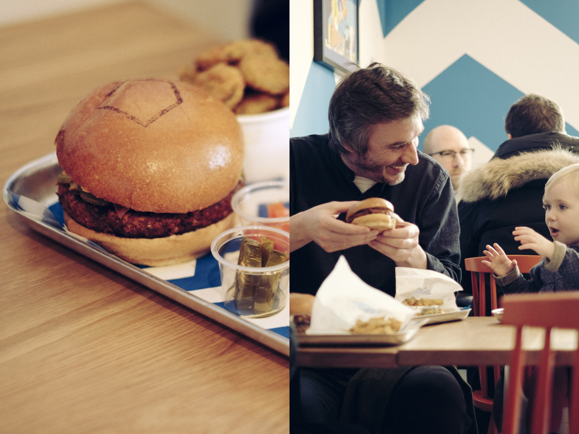
They’d spent a year travelling and trying the best burgers across the US and Europe. Their plan was to establish a fast casual burger chain to be established in Ireland but with a view to grow internationally. Creating a world class product and experience, built on the quality of Irish beef and warmth of our hospitality. And to make not just better burgers, but a better burger business. One that put people and sustainability at the heart of what it does.
We helped them clarify their aims: To make Burgers Better - Passionate about the details. Excited by the possibilities. To create a great experience - Warm, hospitable, enjoyable, memorable. To make a positive difference - to staff, suppliers, community and the world we live in. To create a business and brand that is authentic, exciting & enduring.
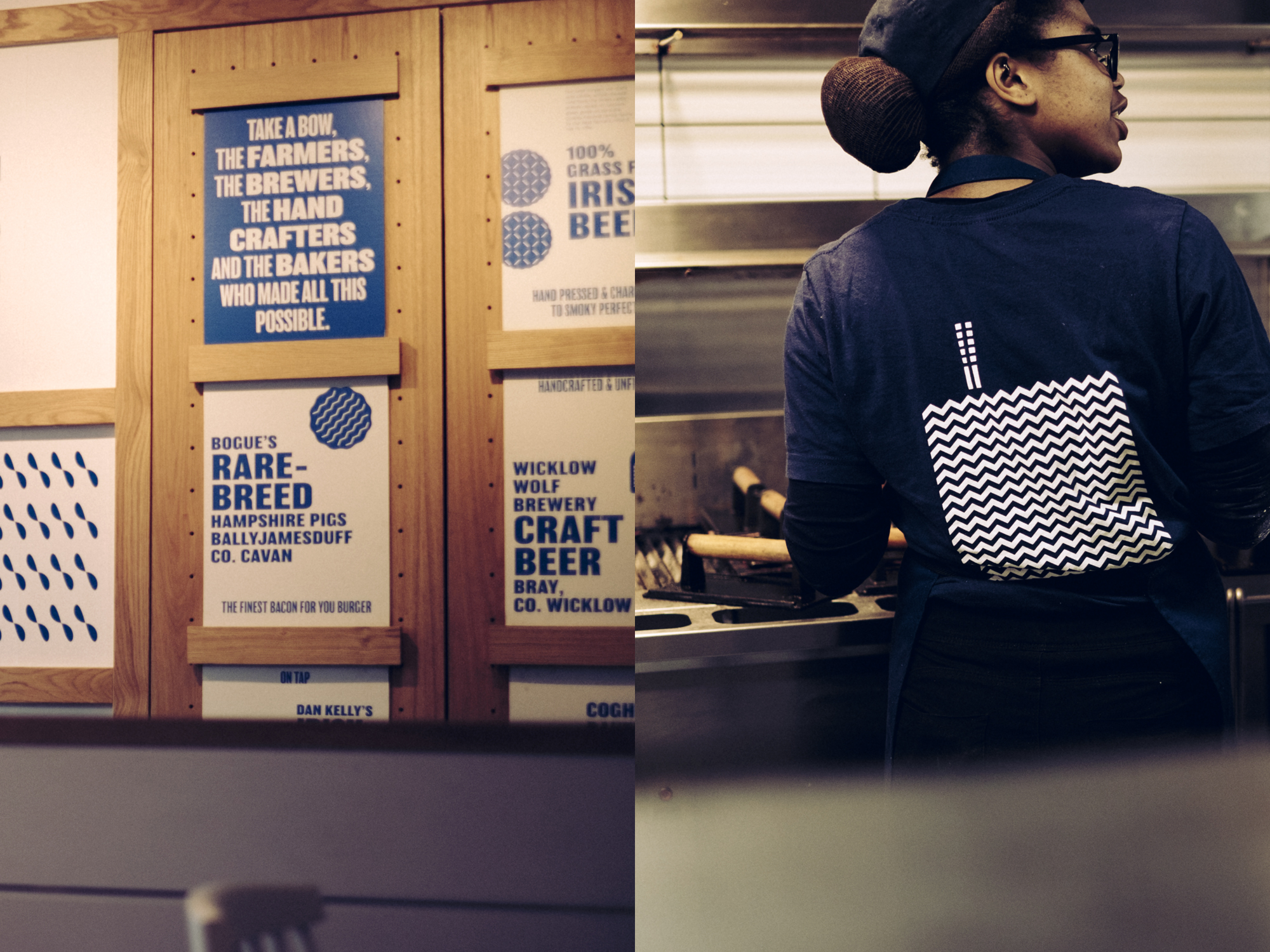
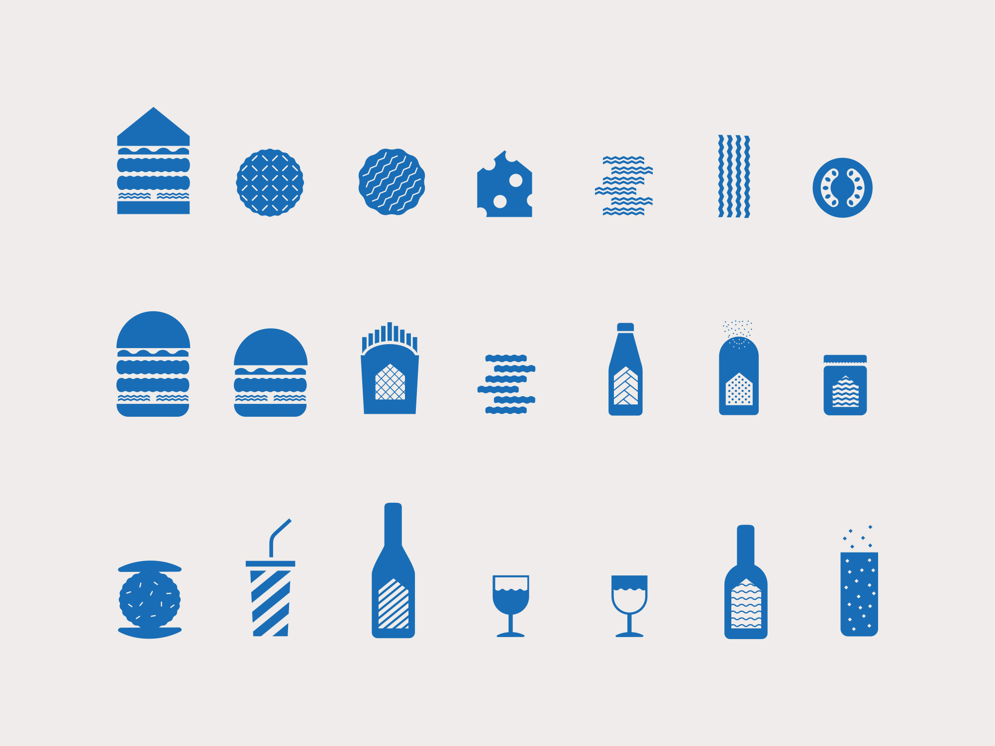
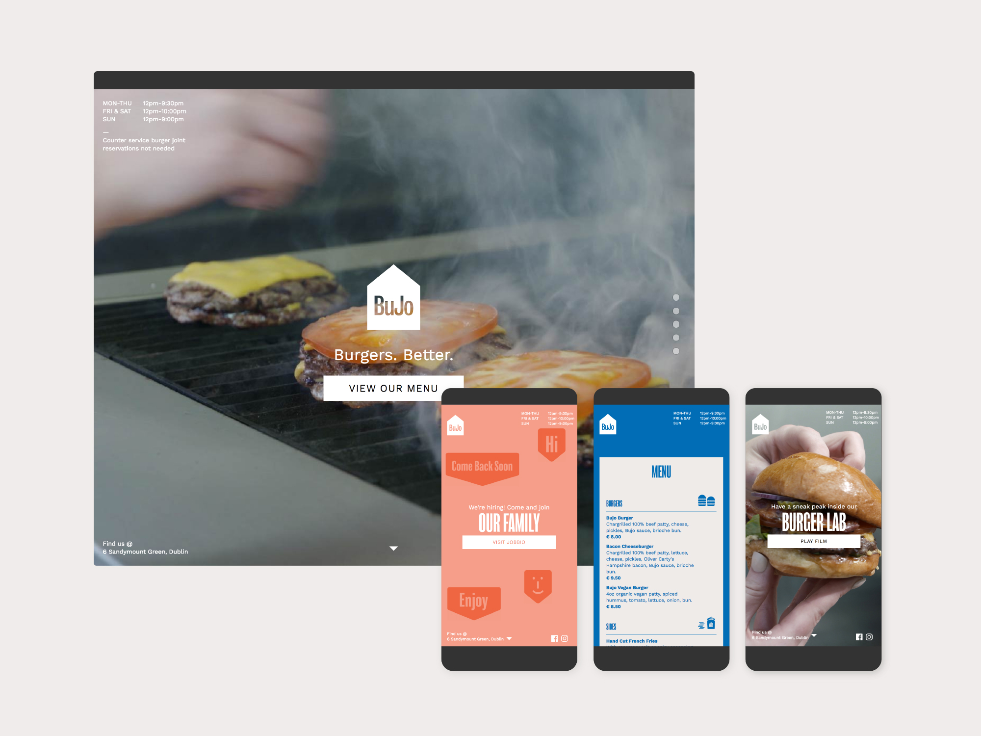
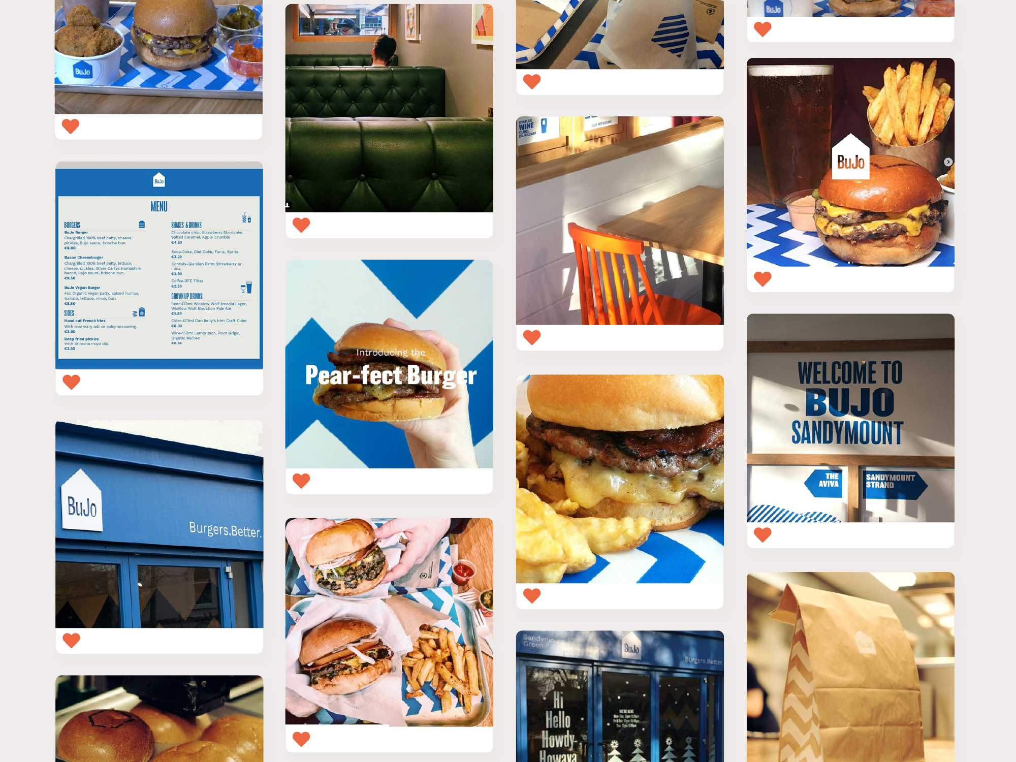
This framework then helped us navigate a 2 year process. From their fundamental offering and creating a name that could be trademarked Europe wide through menu and customer development. To logo above door, 100% compostable packaging, interiors, product names, ingredient descriptions and content strategies. Making sure that every aspect of the business and brand is aligned.
At the heart of the project is a simple idea summed up by their house logo. A warm, friendly and supportive place that upholds a set of standards. Where they can share what they love and be themselves. A balance of warm neighbourhood spot and high end hospitality, or fine-dinering as we call came to call it.