Bunsen Brand Evolution
Designed by Emma Wilson, Sinéad McAleer and Paddy Collins at Slater Design
Photography: Al Higgins
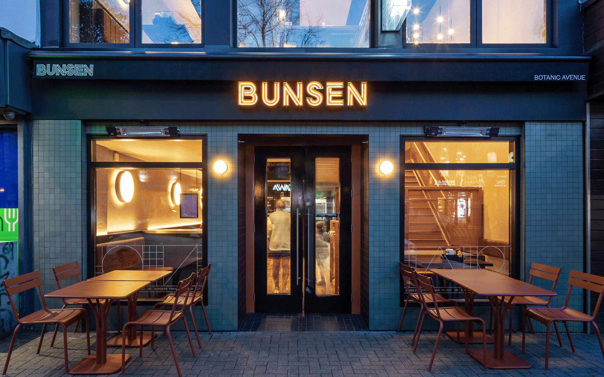
Photography (Botanic Ave.): Ste Murray
Signage: Academy
Web Development: Effector
Printing: Plus Print
Interior Design: LUCA
Signpainter: AG Signs
Categories: Website / Environmental / Print / Identity / Packaging / Moving Image / Signage / Social Media / Screen
Industry: Commercial
Tags: Illustration / Typography / Food and drink / Restaurant
Website: bunsen.ie/
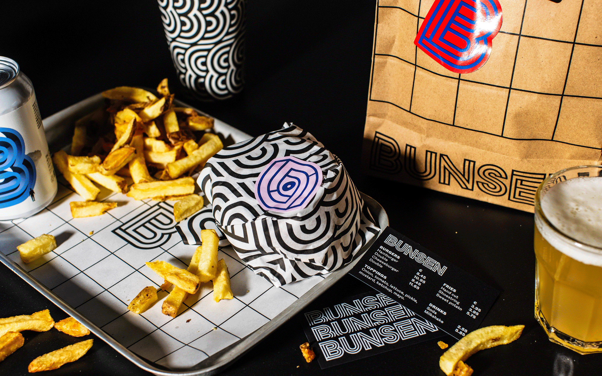
We’ve been working with Bunsen on a refresh of their much-loved burger brand. A restaurant with a (well-deserved) cult following, a recognisable brand, and just a smidgen of mystique— we sought to uncover the core of what people love about Bunsen with the goal of developing a refreshed system filled with flex, irreverence, and a nod to their driving ethos as a company.
Taking inspiration from concepts spanning science, conspiracy, spirituality, internet culture, sci-fi and esoteric New Age nonsense (really, for burgers?), the brand aims to suggest a lot by saying very little, to build intrigue. At the heart the system is a structure that suggests Bunsen’s dedication to doing the simple things right, the approach that has gained their burgers a devout following.
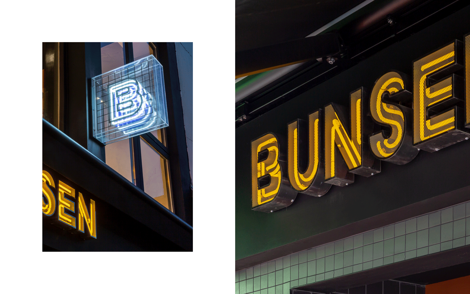
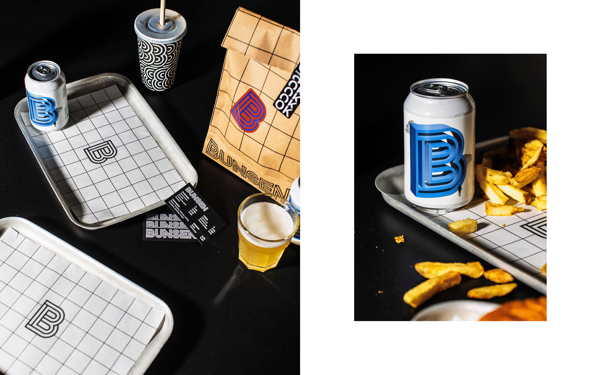
Visually, the brand has been known for its bold use of graphic line, its carefully considered use of materials in environments, and its minimalist yet visually complex approach to its asset palette. We’ve made sure to keep these essential threads running through the refresh, and have allowed ourselves to play with texture, grids, layering and repetition in brand applications, all with this guiding principle of ‘complex simplicity’.
In environments, each Bunsen location has bespoke signage features that speak to the enduring creativity of the brand, where each touchpoint is considered as a key part of the customer experience. Material choices complement and contrast the interiors, of which each outlet has its own unique look and feel.
In digital communications, the brand has a little more fun, with its irreverent personality coming to the fore. To achieve this, we’ve utilised repurposed stock imagery juxtaposing images of deliciously styled food, supported by bold typography, and playful graphic elements.