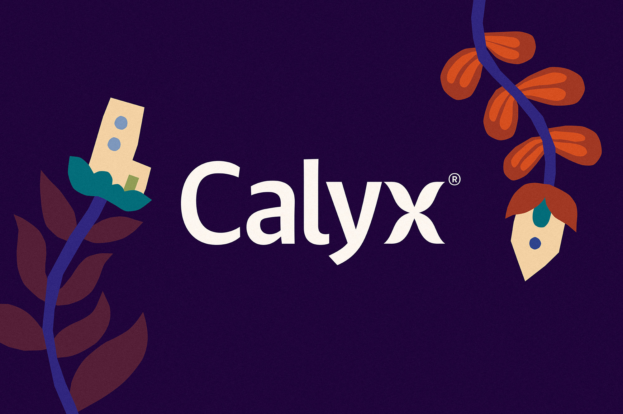
Calyx
Designed by Seán O'Beacháin at So Studio
Illustration: Anna Kövecses
Categories: Identity
Industry: Commercial
Tags: Illustration / Logo
Website: calyx.nyc/
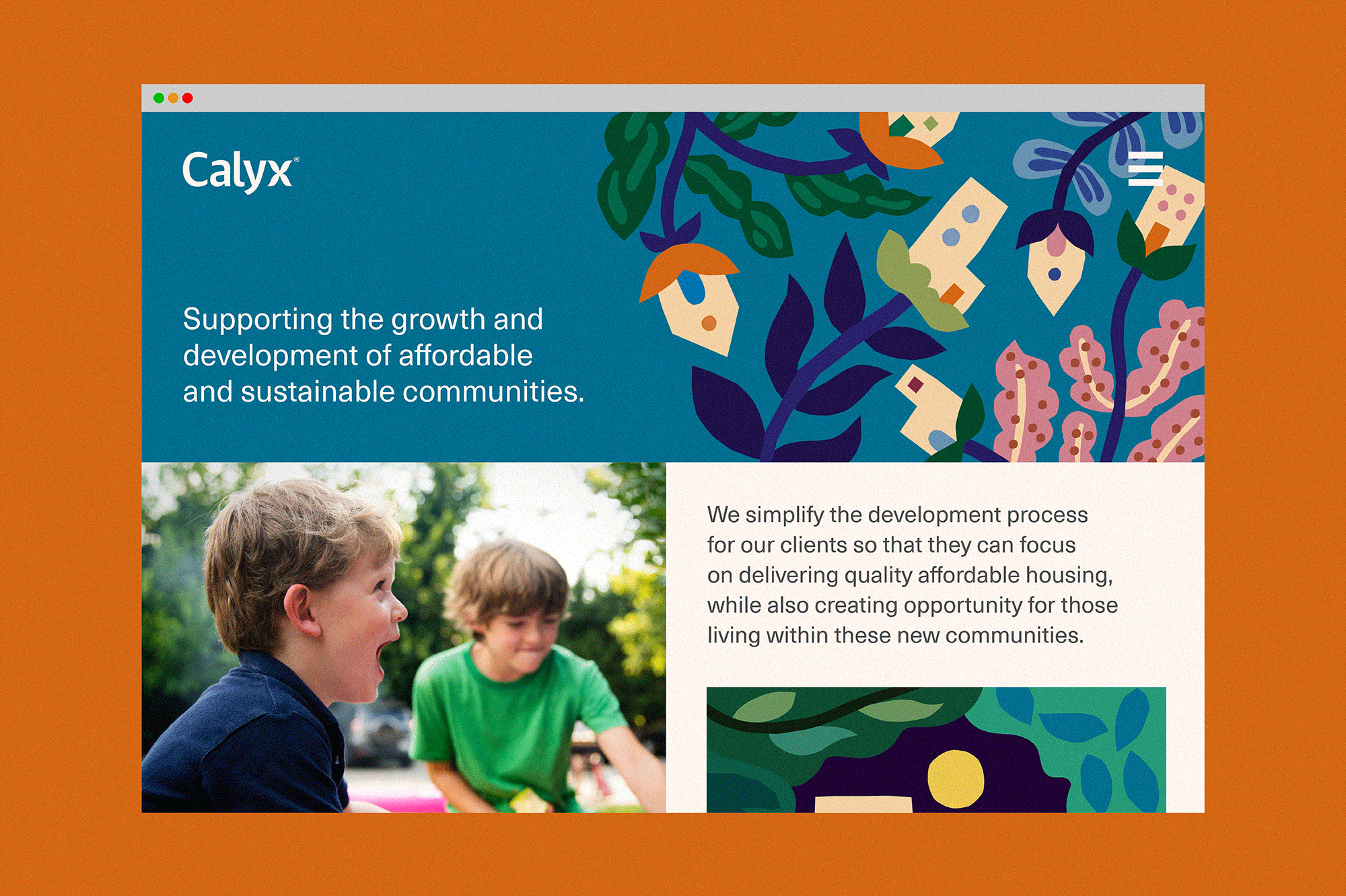
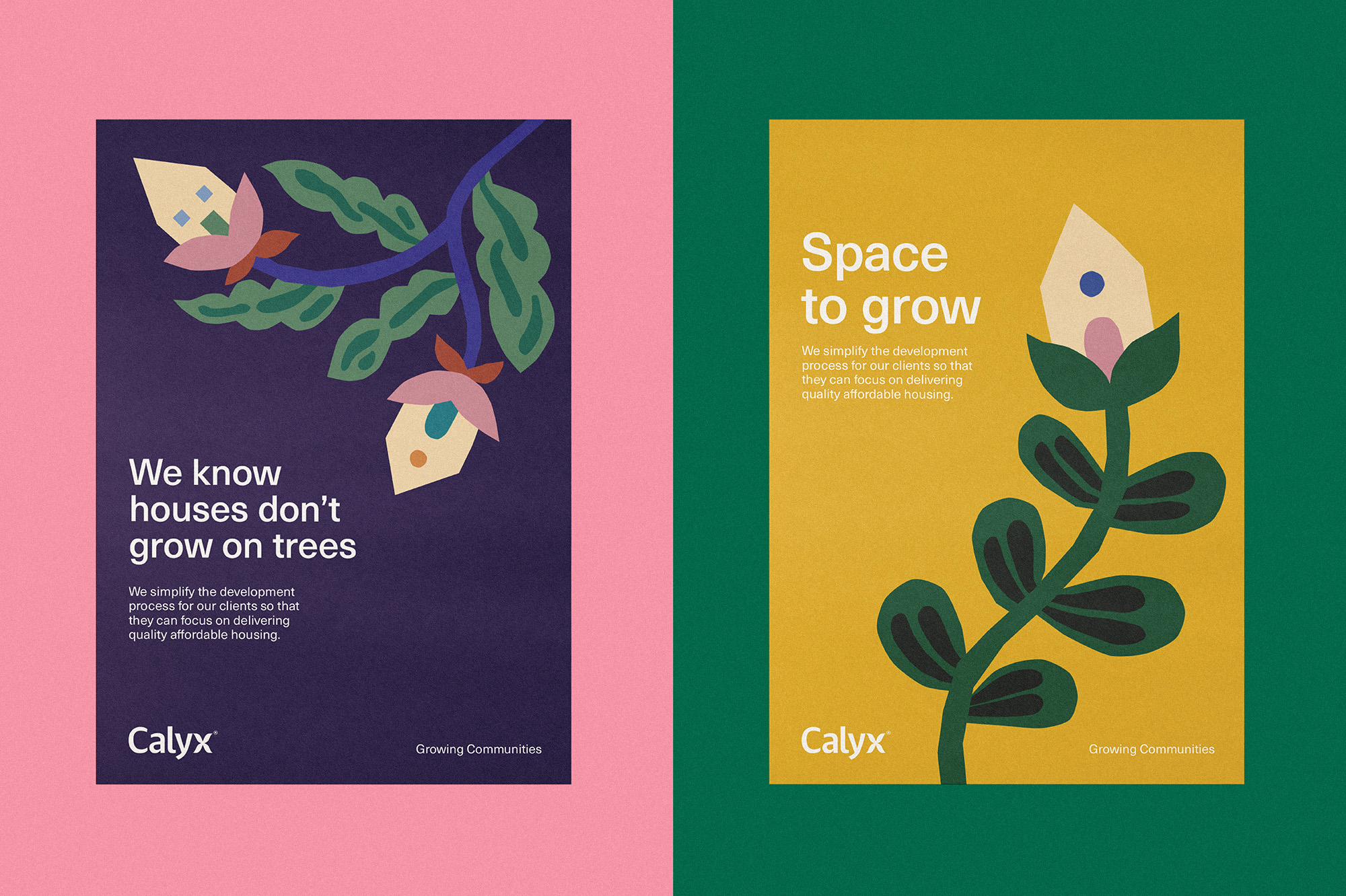
Calyx is a New York based practice seeking to level the playing field and elevate the voices of historically disenfranchised people through the medium of affordable, sustainable housing development and preservation. They act as an owner’s representative for clients who want to deliver impactful community and economic development-oriented housing projects that are sustainable, design-forward and affordable to multi-tiered income groups. Their ultimate goal is to help others grow their communities in ways that make the best use of place and space.
While lots of property-related companies in the US can feel quite corporate or clinical, we felt it was important for the new brand to reflect the human aspect that’s at the heart of its purpose
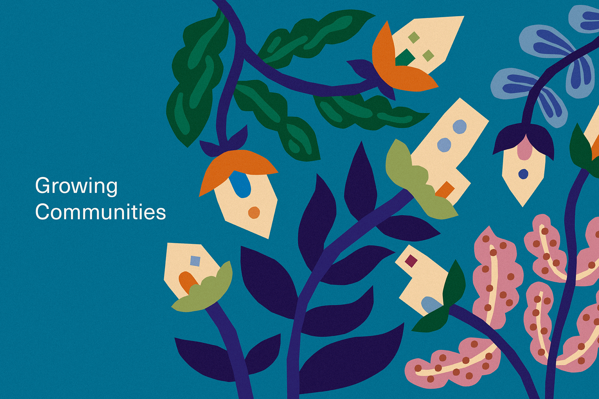
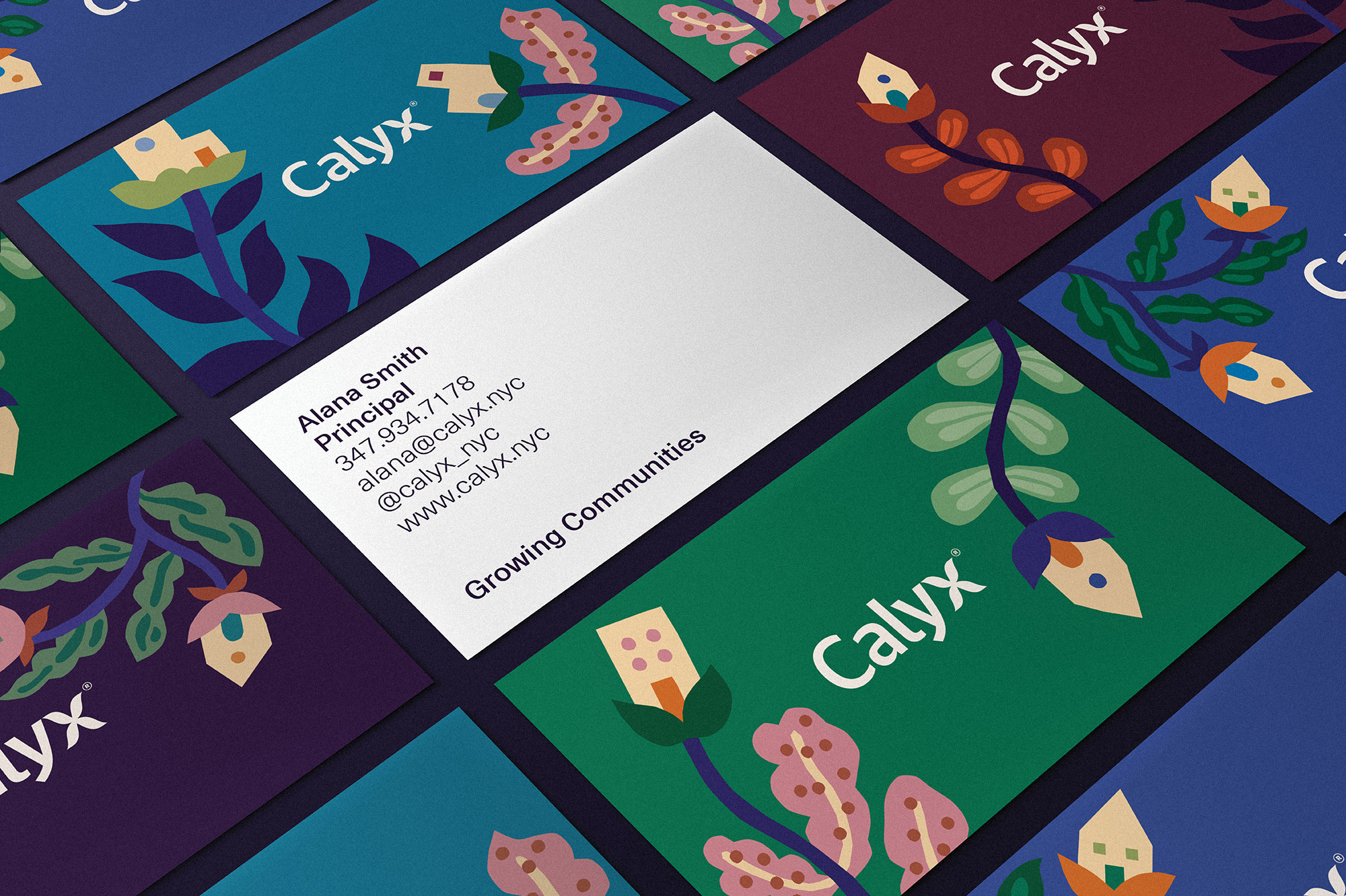
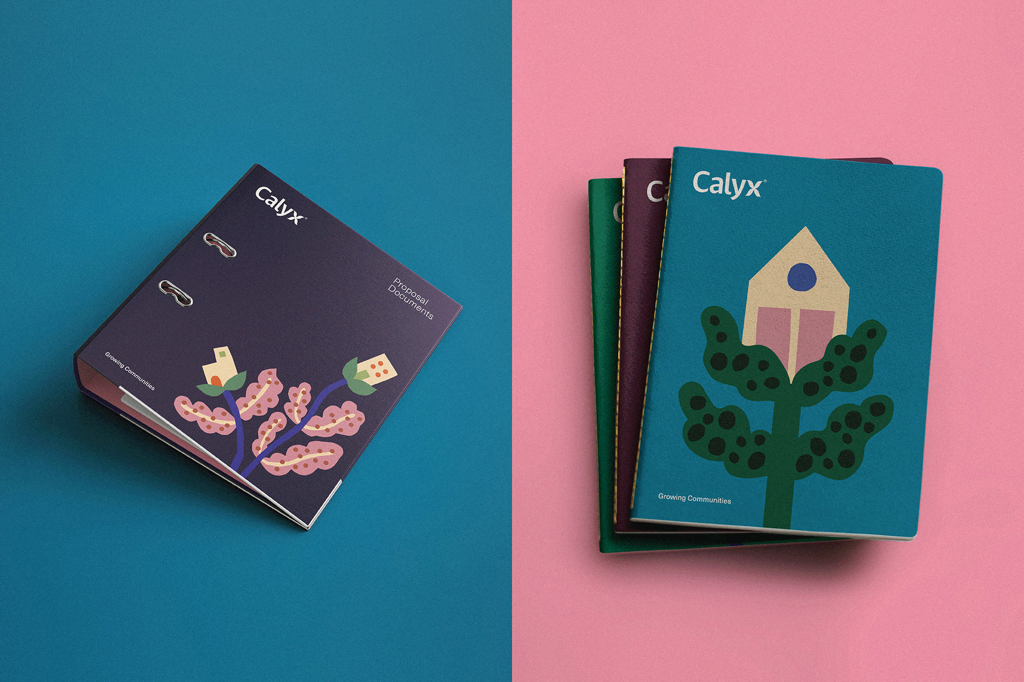
It was clear from early on that illustration should play a key part in communicating a warm and approachable brand personality. The name Calyx, refers to the part of a plant which supports and protects the developing flower. Using this simple idea, we worked with illustrator, Anna Kövecses, to create a suite of surreal, playful illustrations of plants which were literally growing homes.
We created a logo which included an organic, leaf-shaped ‘x’ further emphasising the link to the name, while the strapline “Growing Communities” was developed to continue the theme. A copy style was developed which was friendly in tone, using familiar and playful phrases referencing plants and growth. Any supporting brand imagery also contains elements of greenery and plants to link back to the core idea.