Capital Credit Union
Designed by Mel O'Rourke and Bridget Butler at CI Studio
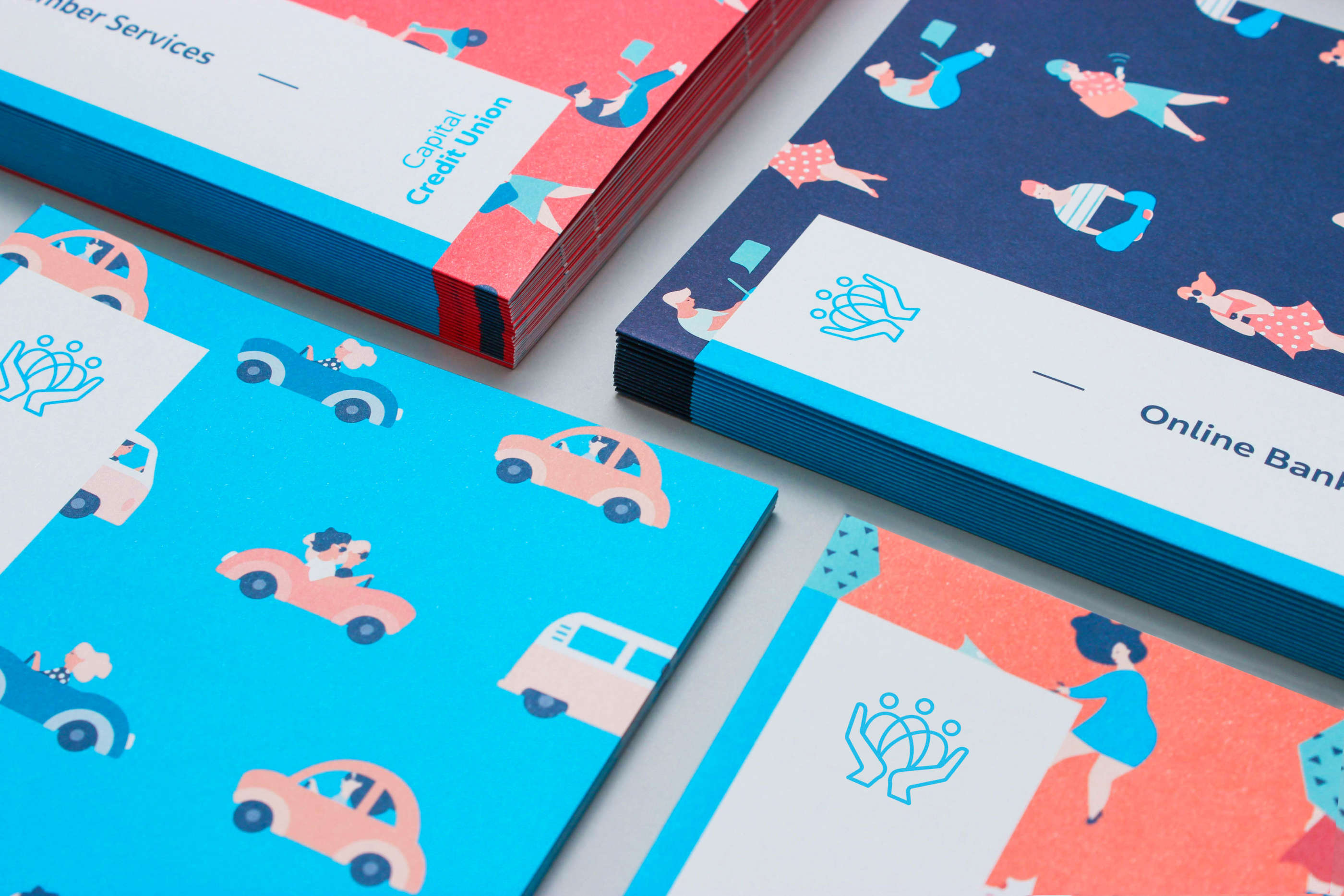
Illustrator: Camille Jouarré
Categories: Identity / Print / Environmental
Industry: Corporate
Tags: Advertising / Illustration
When designing a new identity for a group of credit unions coming under one name, brand research showed that there is a huge amount of goodwill and equity in the original Credit Union mark itself which a lot of newly merged credit unions were throwing away needlessly. We set about designing a new modern version of the older, familiar symbol which would work far better from an application perspective.
The tone of the brand needed to be as polished and corporate as a bank but with a friendliness and sense of community that banks can’t credibly offer. Credit unions are owned by their members and we wanted to capture that local, feel good factor.
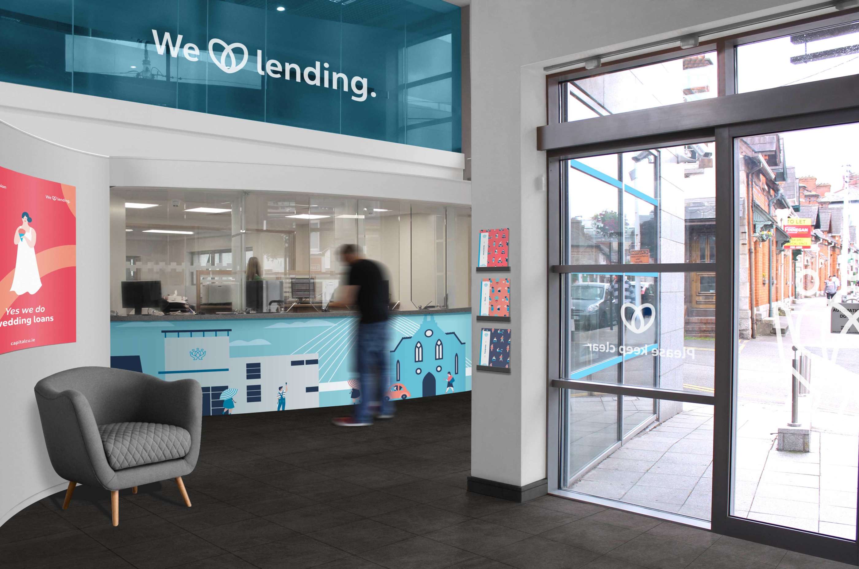
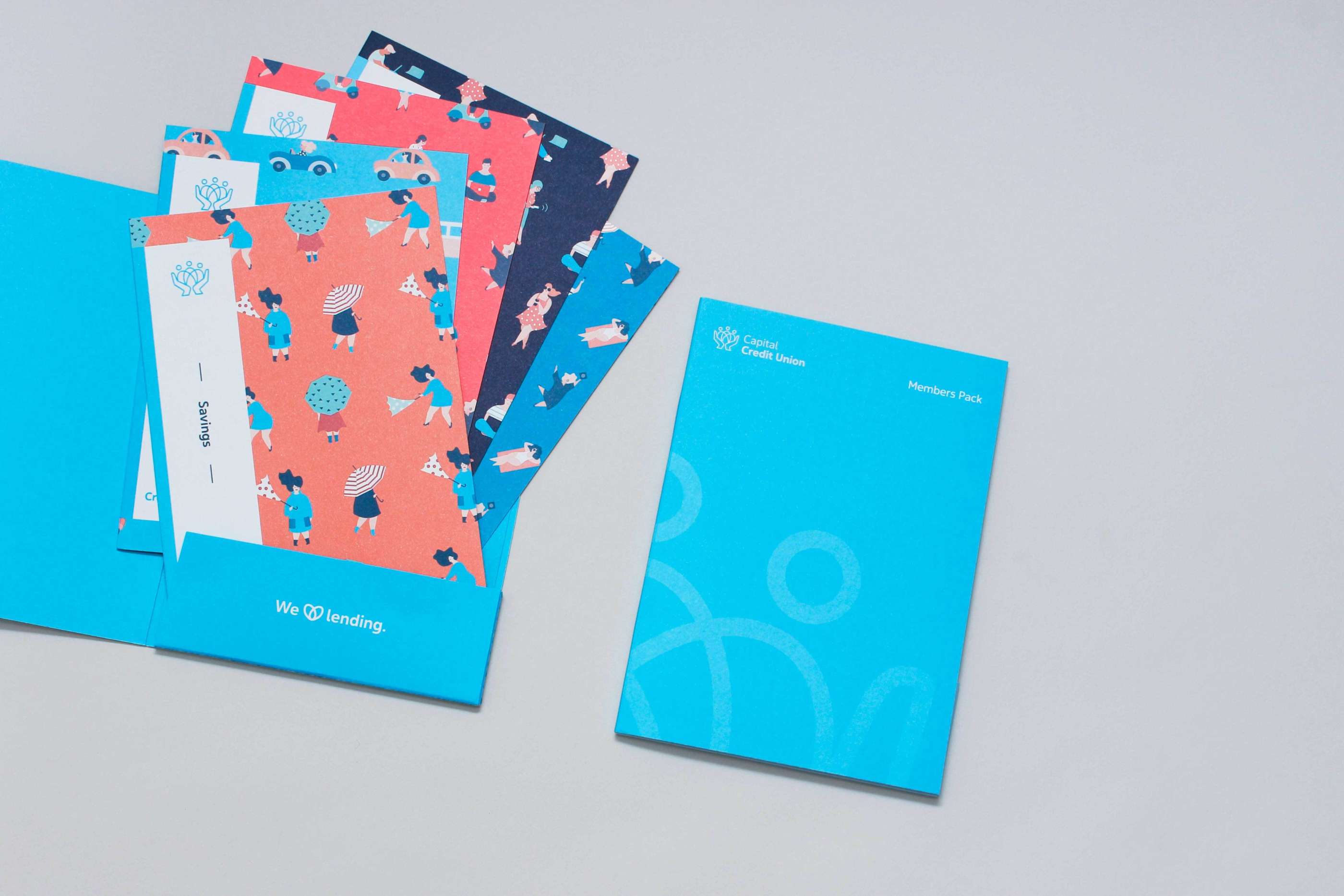
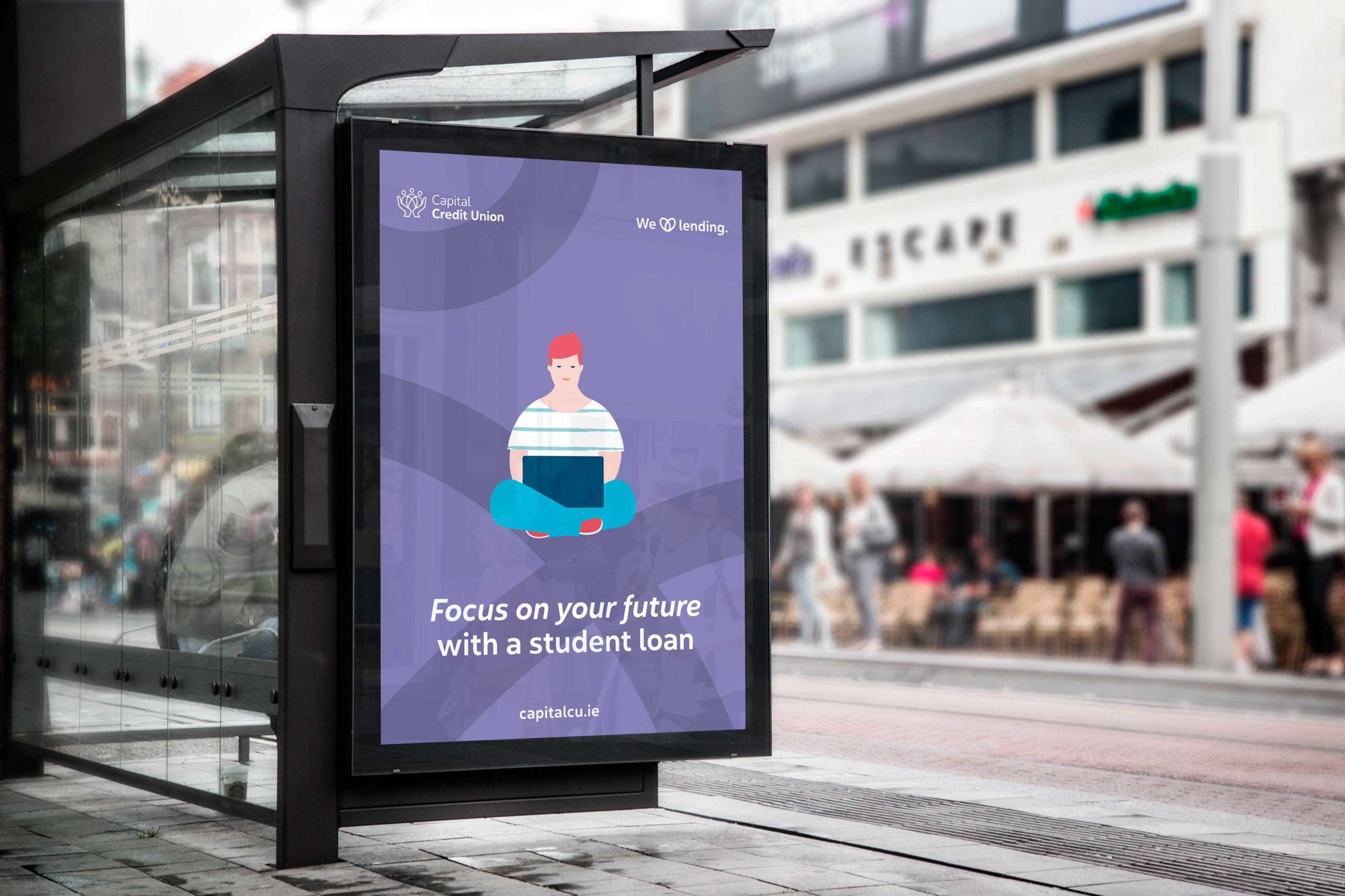
Instead of using photography we felt it was fitting to use illustrations to bring a sense of charm to the identity. We designed and created the illustrations in-studio, using a wide colour palette which complements the bright primary blue. Each local environment has been illustrated in the same style for use internally and to give each branch a sense of location.
Works carried out included brand strategy and narrative around their key services. More than a bank, a community is the line which underpins everything. We developed the existing 'We Love Lending' graphic and aligned it to the brand core. Works also included all print communications, advertising, merchandise, social media and environmental design across each of the five locations.