Catherine Young Dance
2023
Designed by Clare Lynch (Design) at Clare Lynch Design
Web Development: Ciaran Hickey
Additional Coding: Tanel Sepp
Strategy Consultant: Janice McAdam
Categories: Website / Identity / Print
Industry: Cultural
Tags: Poster / Typography / Digital / Visual art / Theatre
Website: catherineyoungdance.com/
For the past 10 years, Catherine Young Dance has been building a significant body of work and influence with both national and international productions, projects and initiatives. Through work with artists, activists and communities, Catherine and the company are focused on “moving hearts and minds towards our common humanity”. As part of the fulfilment of several strategic goals set out in 2021, an identity and website were designed to give voice to the company’s mission, values and purpose.
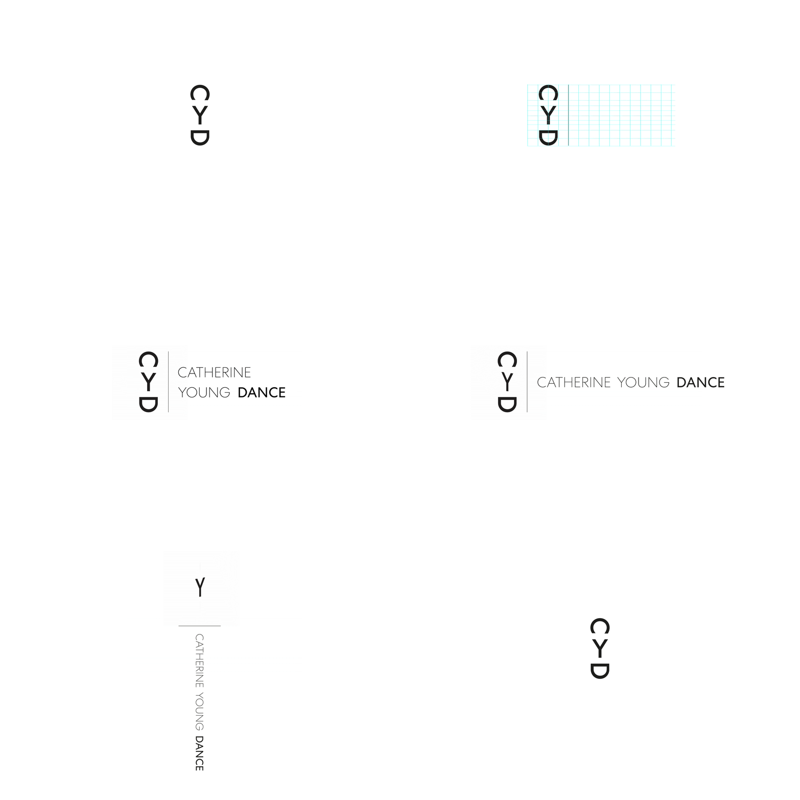
Research into Catherine’s practice revealed a core influence of African forms of dance, and more broadly into the semantics of dance and visual notations used to represent movement. The logo aimed to communicate some of the themes — connection, community, flow — and represent them in a form that reflected the clarity of the company’s ideals.
“The Earth speaks to the Sky and receives answers through the things which grow upward upon her. The dancer is one of her voices. The dancer is the connection between Earth and Sky.” — Pearl Primus
The resulting logotype took a cue from this quote by an American choreographer and influence on Catherine’s practice. By rotating the letters within the anagram, the C becomes the sky, the D the earth and the Y, a dancer with upstretched arms. In much the same way as tribal symbols communicate, the letterforms become a pared-back representation of the identified themes.
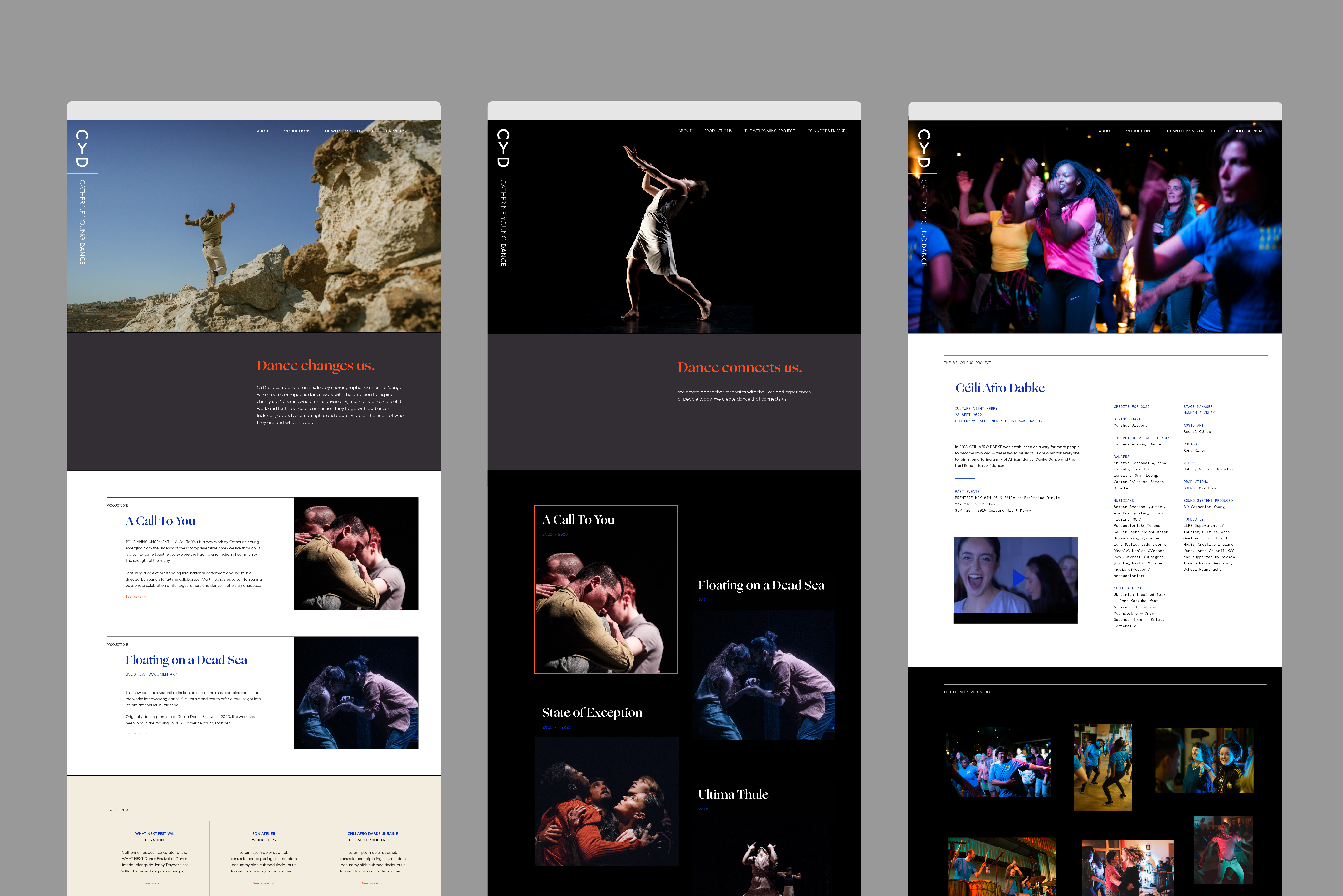
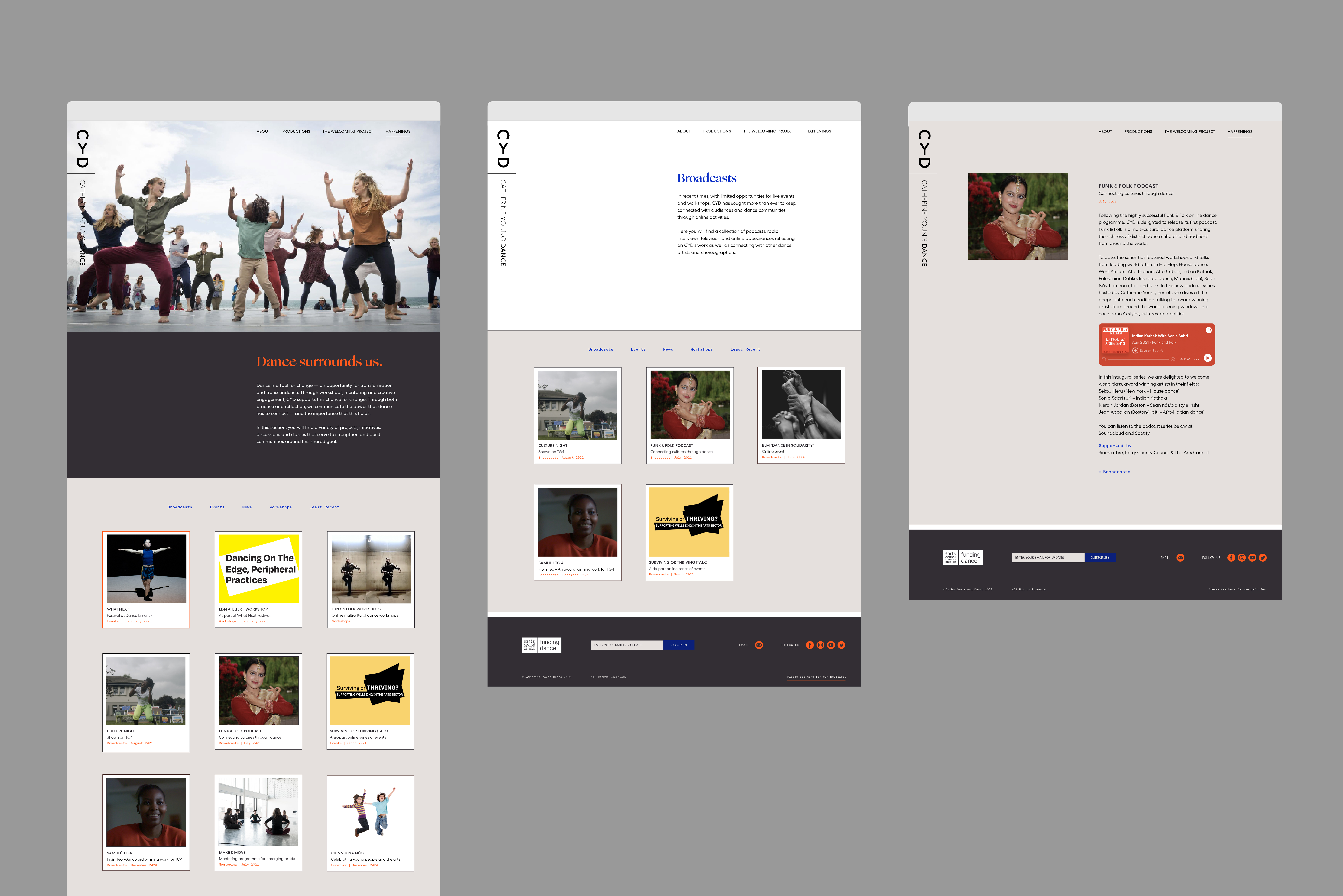
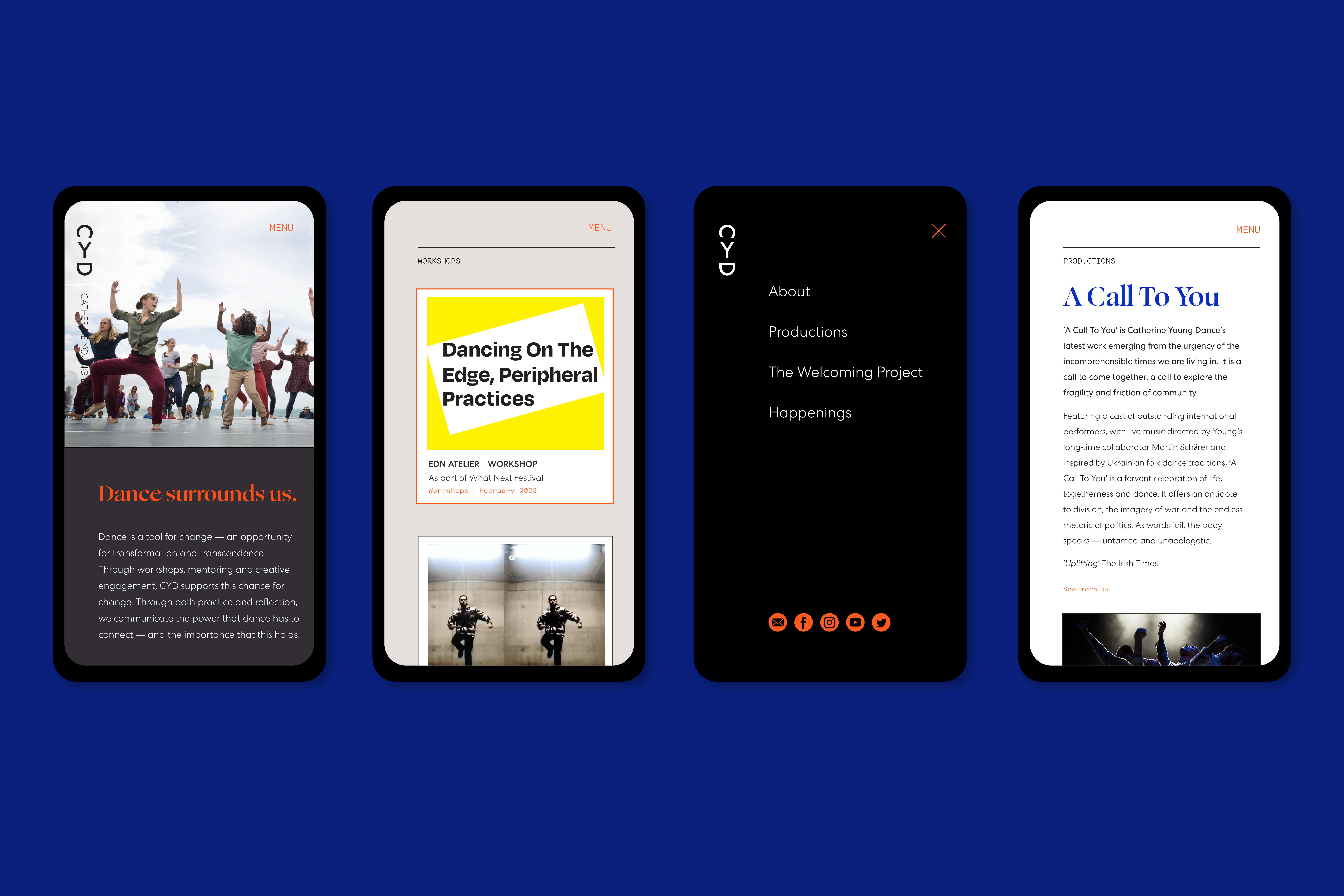
An audit of the previous site and the breadth of CYD’s output determined that a website with significant flexibility was needed. The documentation and promotion of the company’s Productions needed to sit alongside The Welcoming Project (a community-building initiative of events and workshops). And a third area (Happenings) would contain announcements (podcasts, online events, festival curation, mentoring programmes).
The site houses this range of content in a unified manner that gives equal weight to each and does so within a structure that can expand comfortably over time. A key objective was that the site will eventually function as a resource and archive for the wider community.
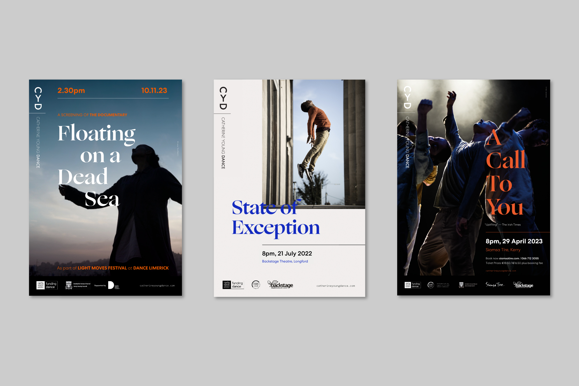
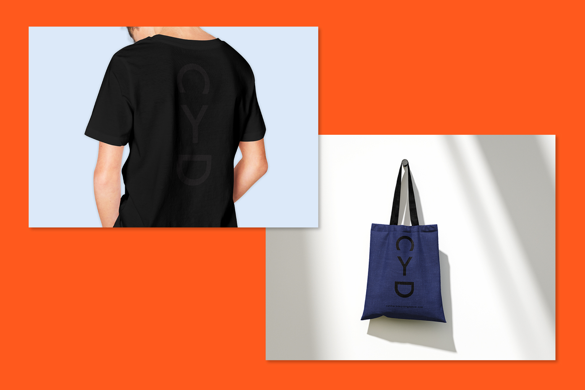
A series of posters was designed for touring productions and events, while t-shirts and bags featuring the CYD anagram were produced for company members and associates. A transparent gloss ink was used on black t-shirts so that the effect was subtle enough for performers to wear them during rehearsals and performances.
