Chirp: making families worlds friendlier
2024
Designed by Rachel Broaders and Max Kruseman at Image Now
Project Management: Darrell Kavanagh, Eimear Boushel-Payne
Categories: Identity
Industry: Commercial
Tags: Digital / Art direction
Website: chirpfamily.com
Chirp, formerly known as Cilter, was established as an innovative and future forward company with the aim to transform child protection software online. With big ambitions and a software that could revolutionise the industry, Cilter required a brand that could reflect this bold vision.
A significant part of the project took place in the naming of the brand. The decision to rename was born from a clearly identified need that the product required a name that would signal its ambition of supporting families to thrive, better their lives and allay fears of threat and danger.
The aim was to focus on the positive impact this new software can and will have on families. Reducing worry and concerns for the user was the primary priority in the renaming and identity development process. We wanted to showcase the brand as a helping hand in this ever-changing technological age through reflecting qualities of positivity, expertise and assurance.
The brand name and system was designed to represent both the functional and emotional sides of the brand through its connection to a family dynamic within nature, one based on protection, support and nurturing.
As a result we arrived at Chirp, making families worlds friendlier.
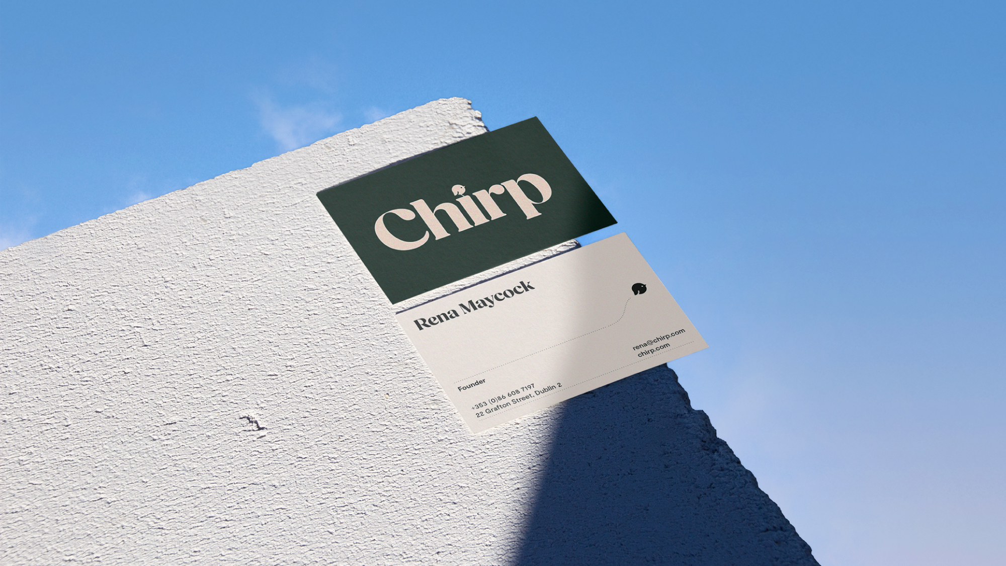
The typeface pairing of Fields Display and Moderat were chosen to represent the 2 sides of the brand – the nurturing, reassuring presence of a parent/guardian, as well as the intelligent, technical and protective functionality of the software. Our primary typeface was the perfect fit to project Chirp’s friendly and warm voice of wisdom and reason, while our secondary typeface backed everything up with the hard facts and technical knowhow.
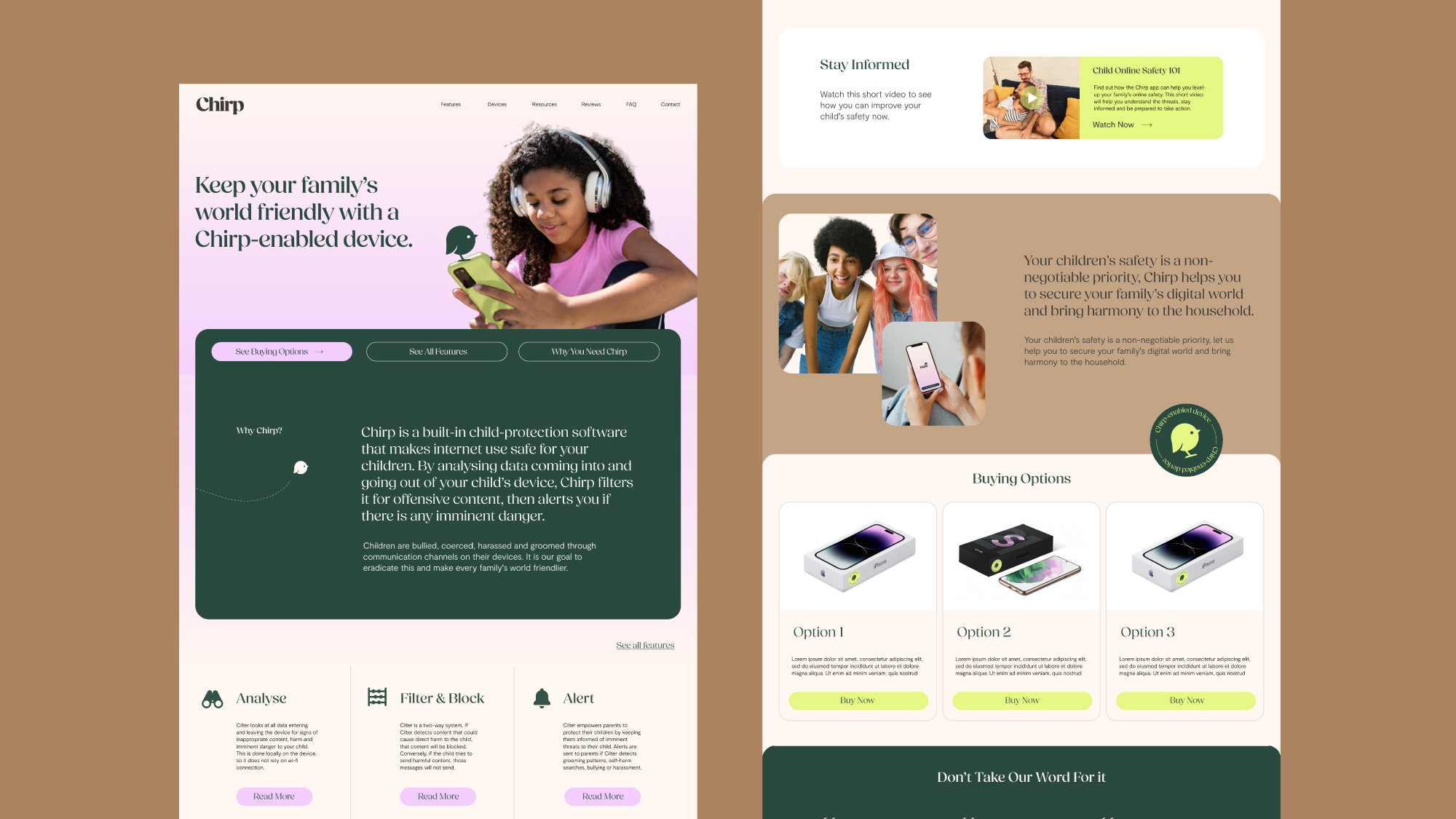
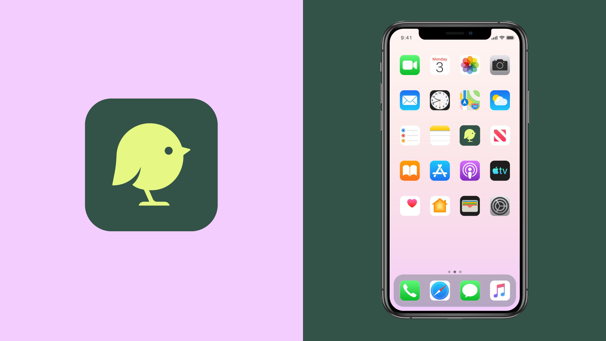
The rounded qualities of the logo and type were translated into soft curved modules and buttons in our website UI system, as well as rounded corners on image frames to create an easeful and approachable experience for the user.
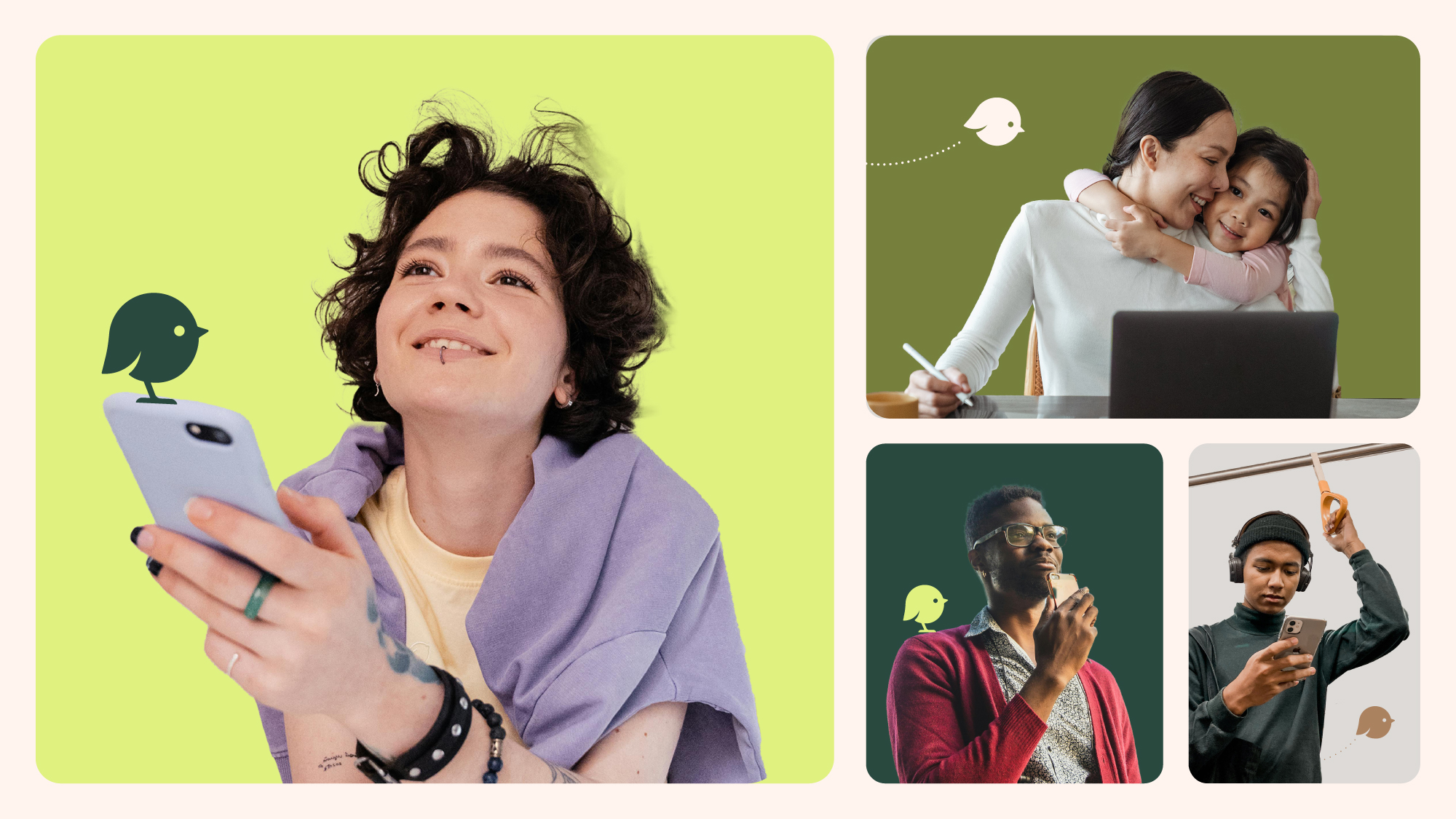
Our friendly robin mascot swoops around printed and digital pages leaving dotted dividers and lines in his trail, while also making an occasional appearance in our imagery – caught in frame as he subtly drops by to check in on his family.
Our colour palette is a mix of mature and youthful shades to represent the different ages of our users and allow us to curate bespoke communications relevant to both.
The style of art direction used was intentionally diverse, inclusive and representative of all types of families. Images of children having fun and enjoying interactions with their devices was a sharp but integral departure from what preceded it. The symbolic move in attitude from fear-mongering to confident reassurance was key to the success of the art direction, as well as the brand as a whole.